A Long Day's Journey Into Sunrise (fueled by non-alcoholic beverages)
Not to mention a certain aspect of 20s Mies come to life nearly half a century later
Fans of Stern have used such words as “exquisite” and “elegant” to describe
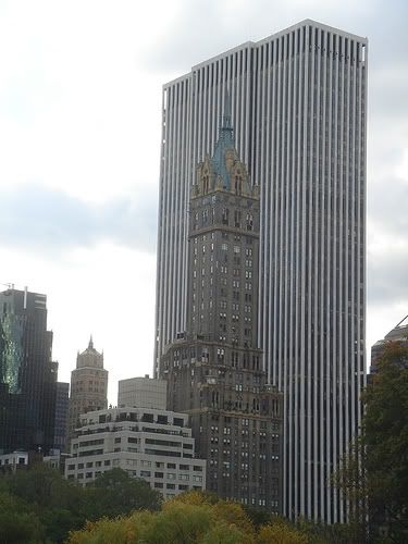
One St. Thomas. When successful, Classicism achieves these accolades by the proper mix of setbacks, window treatments at each level, reinforced verticality by a proportionally elongated central shaft with strong soaring elements. Some architectural historians have gone so far as to place this style under the category of progressive architecture. Curious to adopt a label like progressive and then set it beside classicism, these words seem to be at odds - like say new and traditionalist.
Classicism in skyscrapers dates from the 1920s, but Stern’s take at
One St. Thomas is more akin to a later period, as late as the 1940s or 1950s. True, the building I compared to 1ST, the
Louisiana State Capitol, was erected in the early 1930s, but with little effort one can find closer resemblances in the skyscraper detail of the late Classicism period, near mid-twentieth century – not to be confused with the present period's aspirations.
The precursors to the “International Style” - as the so-called collection of styles were called - started at about the same time in Europe. This other “style” experimented with skyscrapers, but it was more often horizontal low risers at first that gained their attention. Then out of the Bauhaus branch, came a young Mies van der Rohe.
Adma has left us with Mies van der Rohe's 1922, unbuilt, Berlin "study model," often cited as the inspiration for
Lake Point Tower in 1968:
It may sound odd, but that study model which Mies van der Rohe students – George Schipporeit and John Heinrich – used as motivation to build their Chicago skyscraper, was radical even for Mies who created it as an act of experimentation with form. And words that were broadly the equivalent of progressive at the time, “modern” or “moderne,” were floating around in the architectural lingo not firmly attached to any one style, did not take note of Mies' ideas. In retrospect, we see that modern/moderne is attached more clearly to descendents of Mies, and all the others, who finally threw away ornamentation and delved into the raw shapes, and structural elements, as the only expressions needed for the built form.
Schipporeit and Heinrich eventually transposed the curves of Mies' model into their tripod or three-wing design. As a matter of fact, they started out with four extentions, then dropped down to three. Their actions were tied to a an area of concern: the privacy "issue". With only three pods or wings, each could be spaced 120 degrees "dead center" from the next pod/wing, on either side, making views at the same level of neighbouring extentions, nearly impossible! This touch of genius in the translation of curves and angles kept on giving. As a default, vistas were dramatically increased. Design was elevated into the loftier realm of elegance. And they did this without resorting to any taper, or tricks of their style to emphasize verticality (like raised mullions, using exposed I-beams). The Mies legacy was there, because they still thought it relevant, with exposed I-beams and a recessed podium at the base. But there was nothing that hinted at copy in this inspiration, everything was rethought and judged against the demands of the present.
Two other salient factors that arguably increased the elegance of
Lake Point Tower:
Proportionally Tall – isolated away from other skyscrapers, out on the waterfront, was a selling point. But also became an "engine starter" to build taller (at the time it was the tallest all-residential building in the world – a title that will be given eventually to Calatrava’s Chicago Spire). Building taller, in turn, made the proportions more elegant in relation to the shape, a lesson well learned in all good architecture. The study model was considerably shorter, and largely irrelevant for this decision.
"Tuxedo-Like" Glass Tinting – Physical isolation on the lake would expose residents to unrelenting sun glare on many days, especially at sunrise. The architects addressed this with darkly tinted glass. (I can tell you from direct experience, that shades are also necessary to deal with the sun when low in the sky.) One writer thought the dark glass gave the building its final “tuxedo-like” look, a bit fanciful, but not too off-centre. Nowhere is glass more forceful, when done correctly, than on a modernist building. Technology made it more possible by the late 1960s for the window wall to appear like continuous glass, and these architects took advantage.
That is the way I like to see a legacy evolve, this just happens to be a modernist legacy. I am no Horace Greeley, but I would phrase my view in a facsimile of his voice: "press forward, do not rest, do not become so overly respectful of the past that you do not have the will, nor the capacity, to either update, perhaps redefine, or if necessary and possible, transcend that legacy altogether, and forge your own."
.