You are using an out of date browser. It may not display this or other websites correctly.
You should upgrade or use an alternative browser.
You should upgrade or use an alternative browser.
- Thread starter Surrealplaces
- Start date
UrbanWarrior
Senior Member
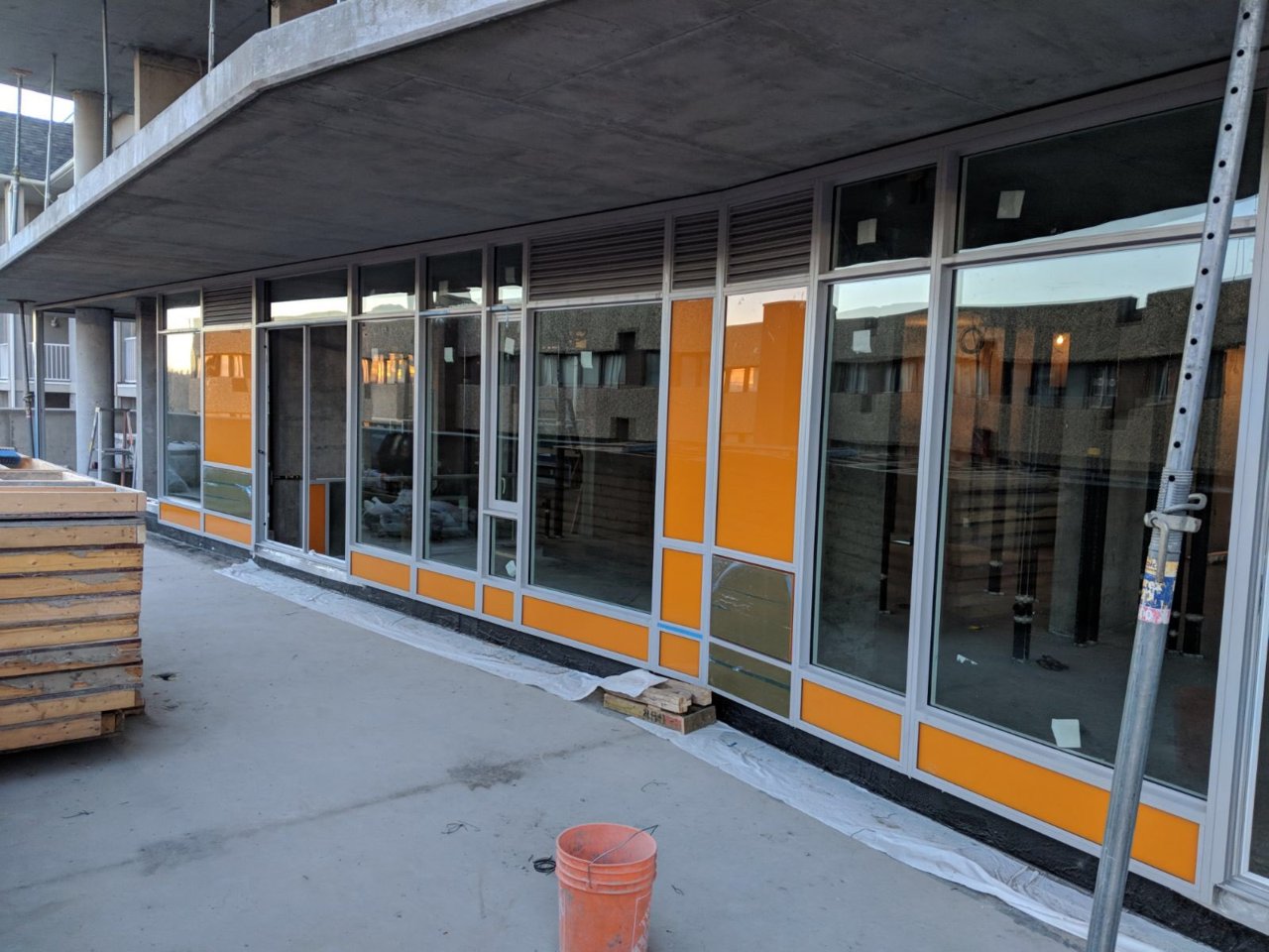
First pieces are being installed now on the North side!
We posted a photo on our Instagram today.
Yay! I'm excited. A lot of people seem to dislike how colourful many of Calgary's buildings are; the Auras, Pixel, Mark on Tenth, The Colours, et al. And while I personally do not like the Auras, I love the rest. I think INK is going to be the best of them all, with a distinct pastel colour on each side. Very excited to see the cladding on this one take off.
I actually find the colourfulness of many of Calgary's residential projects to be quite fun and playful. Considering the surrounding terrain is brown/dead for nearly half the year, it's nice to spice things up. It's actually similar in effect to the colourful houses in Newfoundland.
Just build it
Active Member
I might be down in that area tomorrow, if I am I'll stop by and take a couple pictures. This'll be my first time seeing purple spandrel 
Last edited by a moderator:
Alex_YYC
Senior Member
I was by there earlier today and glass was up.
First few pieces going up are orange. Judging by the pic of them loading the windows it might be Orange and Blue.
From Twitter
https://twitter.com/chrispollen

From Twitter
https://twitter.com/chrispollen
Attachments
UrbanWarrior
Senior Member
Each face of the tower is a different colour. There is (I believe) orange, red, purple, and blue.
maestro
Senior Member
It's a nice orange colour. I'm not quite there yet on the application. The glass is clear. The mullion caps are grey. It's only the spandrel.
UrbanWarrior
Senior Member
It's a nice orange colour. I'm not quite there yet on the application. The glass is clear. The mullion caps are grey. It's only the spandrel.
I agree.
maestro
Senior Member
Yay! I'm excited. A lot of people seem to dislike how colourful many of Calgary's buildings are; the Auras, Pixel, Mark on Tenth, The Colours, et al. And while I personally do not like the Auras, I love the rest. I think INK is going to be the best of them all, with a distinct pastel colour on each side. Very excited to see the cladding on this one take off.
I actually find the colourfulness of many of Calgary's residential projects to be quite fun and playful. Considering the surrounding terrain is brown/dead for nearly half the year, it's nice to spice things up. It's actually similar in effect to the colourful houses in Newfoundland.
Colour accents are so often thrown together that they end up clashing with the rest of the design or each other. The bolder the colour accent the more delicate the approach needs to be. Sometimes the best is to go full out over some last minute accent panels. (University City) My impression is the opposite. People want more and more colour to the point that they will even settle for ugly tints and bad ideas.
Cowtown
Senior Member
Yep. So far the orange looks good.Each face of the tower is a different colour. There is (I believe) orange, red, purple, and blue.
Attachments
Da_Master
Active Member
I wish this thing would be 121 floors high
Thanks for an update
Attachments
-
 00-2017 Jan 6 001.JPG203.2 KB · Views: 489
 -
 00-2017 Jan 6 002.JPG146.5 KB · Views: 499
 -
 00-2017 Jan 6 006.JPG279.7 KB · Views: 490
 -
 00-2017 Jan 6 010.JPG232.8 KB · Views: 495
 -
 00-2017 Jan 6 013.JPG261.9 KB · Views: 487
 -
 00-2017 Jan 6 049.JPG172.9 KB · Views: 481
 -
 00-2017 Jan 6 053.JPG147.1 KB · Views: 491
 -
 00-2017 Jan 6 056.JPG217.6 KB · Views: 463
 -
 00-2017 Jan 6 057.JPG158.9 KB · Views: 498
googspecial
Active Member
Which direction does the orange face? Only one I'm not really digging so far, but still think it'll look good.
battistellachris
New Member
Which direction does the orange face? Only one I'm not really digging so far, but still think it'll look good.
The orange faces north.


