Glenco
Senior Member
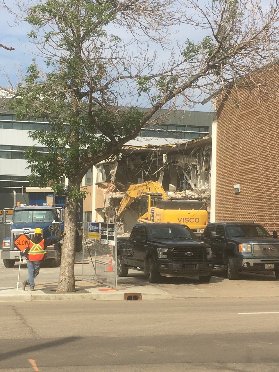
Norquest demolition

Last edited by a moderator:
View attachment 348956
Coming along.
The old rendering of the original project from many years ago now.Norquest is looking to building a mixed use building, this time at the NW corner of 102 Ave and 108 St. It will be called the 'Teaching and Research Continuing Care Centre'.
View attachment 344480

Haha what is it with Edmonton and an agreed upon pallet of beige and random colours with what looks like stucco? Did a bunch of groups in Edmonton get together at one point and agree on the least aesthetically pleasing pallet to build with? This, Regency and their Edgewaters and 121 West, Langham with Icon and Fox, everything on The Symphony that's not glass, The Venetian.The old rendering of the original project from many years ago now.
View attachment 349065
I remember going there in the early eighties to apply for E.I. Very bad memories I for one am glad its gone.There is a lot I like about what is happening at Norquest - their new building on the north side of the block is great and they have improved their old one with some cosmetic changes. I am a bit sad to see the old two storey building being torn down, I have memories of visiting it many years ago when it was a Federal government office, but having that open area with trees and grass in the south east part of the block will be great for everyone.
With regards to that multi colour building on 108 St, a bit of colour is good, but lets not get carried away. I would suggest one additional accent colour and stick to it. How about a reddish shade to match the panels on their building across the street?
This was the image from a couple of years ago.
View attachment 349064