What do you think of the design of Southpark?

  • I like it a lot

    Votes: 14 27.5%
  • I like it

    Votes: 25 49.0%
  • I neither like nor dislike it

    Votes: 8 15.7%
  • I dislike it

    Votes: 1 2.0%
  • I dislike it a lot

    Votes: 3 5.9%

  • Total voters
    51
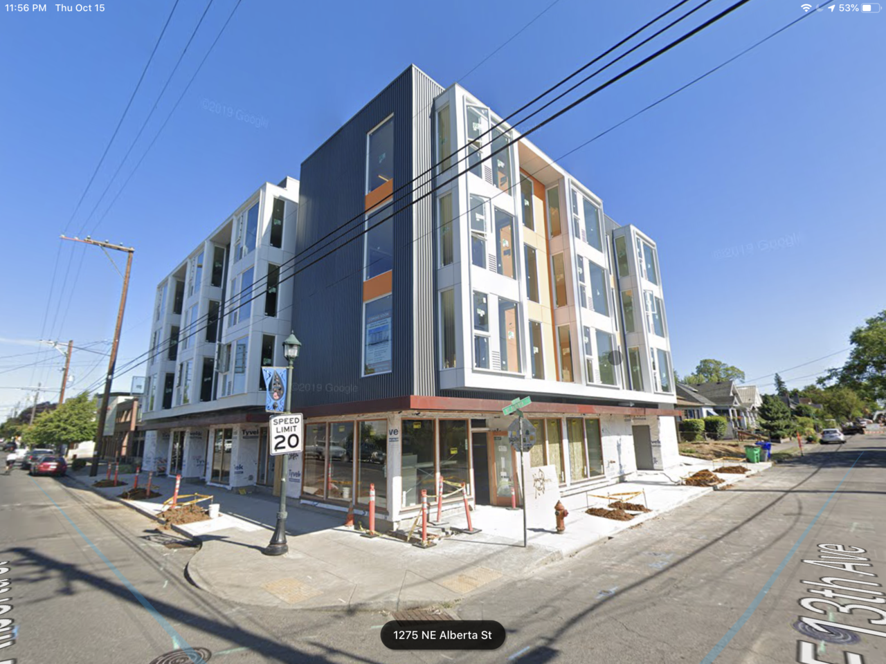
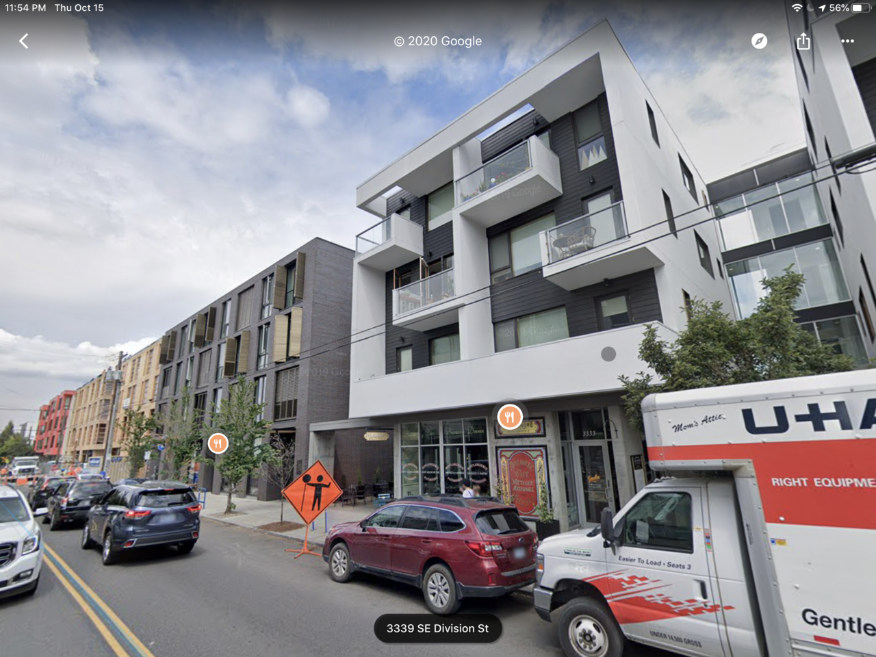
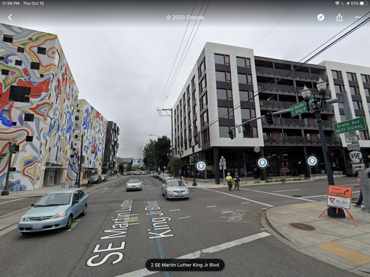
honestly, the more i look at it, the more it’s ... ok. i don’t hate it and it’s pretty faithful to the updated renderings. it reminds me of a more bare-bones offering of some of the nice, human-scaled developments that have gone up on high streets in portland, like se division, ne alberta, east burnside, etc. while not every development can be amazing, whyte ave, especially in this stretch, and given the massive opportunity these former car dealerships and parking lots give that cannot be given a do-over easily, should have something of a higher calibre. perhaps i’d be less bitter if raymond block (which does create some nice density and scale, but is also rather bland) turned out better. some examples from portland of what it feels like this phase of southpark is reaching for but ultimately just misses:
1602824583205.png


1602824641411.png


1602824699580.png
 
@Clearshades I can see what you're saying, but I personally quite like the kind of look, feel and scale this has for Whyte and I think it'll be a welcome addition to the streetscape.
 
@ Platinum 107.

The building is certainly not ugly, but it missed by a milestone interms of intregrating into the theme of this street and complimenting its historical neighbors; the "Raymond Block' would be a good example of how to do a monolithic structure but coexisting into a historical area. Its podium was revised after looking very similiar to this. project. they simply reconfigured the scale of the podium into an illusion of smaller store front which is what this area is...This is how you know who is a really good architect designer.

.
 
ooooh I'll have to go see this one in person again now that it's unwrapped. I feel like the ground floor might end up feeling ponderously tall and looming on the corners, but other than that, i like this. The fenestration is pleasant, lots of glass, the massing is nice and proportionate, and both street frontages are addressed. The brick patterning is a wonderful touch, the hits of colour are welcome; if anything, it needs a bit more crazy imo. that red fin could be twice as big, with triple the neon; slap a lightup thermometer on there just for funsies. It's Whyte Ave, get freaky.
idk, i like this building, if anything i think it could use a bit more personality. maybe once people move in and the building comes alive it will be more lively.

If I remember correctly, the original neon Southpark sign from the dealership will be installed on either this building or the next phase on the east side of 106 Street.
 
I drove past about an hour ago, no pics as well (I'm waiting for more of a reveal at street level. I agree that the quality of materials are good, nice to see. Helps give me faith for the following phases & look forward to the density of the 81street side and activated laneway.
 
Didn't get pics, but drove past today. It actually looks pretty good in person. The quality of materials really makes a difference.

100%. It's a lot better in-person than the photos would have you believe. The variation in the material and even the texture makes it a lot more dynamic than I expected - I don't think that comes across very well in most pictures. Having the stepback at the second storey for most of the building is also quite nice. Makes it feel a bit less overbearing than Raymond block. Also the windows on the upper floors are a lot bigger than I expected.

I was pretty harsh on this one when the renders came out, but it's kind of won me over.
 
I think the detail on the brick is quite nice. It is something it was hard to see in the initial pictures how well that would turn out, but it actually is better.

I also think that while it is does not have historic features, the building fits in very well to the immediate nearby area size so I think it will stand the test of time well.
 
@David A I've long been on record saying modern buildings shouldn't try to fake being historical. It is almost never convincing, and only serves to water down our actual historical buildings, which we still haven't learned to properly value.

I mean, why worry about saving a real piece of history like the Minchau when we can just replicate old buildings from Amsterdam?
 

Back
Top