News   GLOBAL  |  Apr 02, 2020
 9.6K     0 
News   GLOBAL  |  Apr 01, 2020
 41K     0 
News   GLOBAL  |  Apr 01, 2020
 5.4K     0 

1702150949900.png

That is a lot of lights. Are we sure that wont induce seizures?

They need to adopt the white transit signals that have no conflict with the street signals. You can tell that this was designed from a purely "additive" perspective. No new use case affects the old solution. There are 11 new lights required to say "cars can't go straight", plus a myriad of signs. Lights and signs removed = zero. In the end the drivers will still see a green arrow pointing straight ahead if they don't see the transit signal sign, and a green arrow instructing cars to run over bicycles. We did it!!
 
Last edited:
View attachment 525941
That is a lot of lights. Are we sure that wont induce seizures?

They need to adopt the white transit signals that have no conflict with the street signals. You cant tell that this was designed from a purely "additive" perspective. No new use case affects the old solution. There are 11 new lights required to say "cars can't go straight", plus a myriad of signs. Lights and signs removed = zero. In the end the drivers will still see a green arrow pointing straight ahead if they don't see the transit signal sign, and a green arrow instructing cars to run over bicycles. We did it!!
Not to prolong this never-ending discussion, I suggest that there are several connected problems that confuse some drivers and let others 'pretend' they are confused.

1. You see a solid Green Light ( which most people assume means you can always go straight ahead) but on King (at most intersections) you cannot go straight ahead and can only turn either right and left or only right or left. We do not use
TWO arrows (only).
1702154248090.png

2. We do not use transit only signals.

3. We allow SOME vehicles (taxis) to go straight through on King, at least at certain hours. This confuses the SIGNAGE situation.
1702154691801.png


Of course, ENFORCEMENT is essential but we also need to look at SIMPLE rules with few or no exceptions and thus far simpler signage.
 
Last edited:
2. We do not use transit only signals.
And this, right here, is the key problem at the heart of it all.

No amount of regular traffic lights adorned in transit only signage are going to be idiot proof. There's always gonna be someone who thinks the lights apply to them. The only way out of this mess is for the nimrods at the MTO to look beyond the tips of their own noses and realize that there's a whole wide world out there that has the solutions we are looking for.
 
For the colour blind people, a solid red background behind a black arrow. In Germany...

1702158861753.png

The amber is a flashing solid yellow background behind a a black arrow, but the green is a green arrow on a black background.
 

Attachments

  • 1702159112863.png
    1702159112863.png
    5.6 KB · Views: 53
Last edited:
For the colour blind people, a solid red background behind a black arrow. In Germany...

The amber is a flashing solid yellow background behind a a black arrow, but the green is a green arrow on a black background.
The solution to sights for color blindness existed in North America for a long time, but I think the implementation of it is actually decreasing which makes no sense.

1702166414873.png
 
The ultimate goal here should be turning King Street into a dedicated LRT. George Street in Sydney is similar in so many regards being one of Sydney’s “main streets” and the removal of car traffic has been an economic catalyst for the street and surrounding businesses.

58045-269572997.jpeg


It seems like such low-hanging fruit on a corridor that already has incredibly high demand but astronomically bad service.

I should clarify I mean LRT in the Waterfront LRT sense and not the Eglinton or Finch sense
 
Last edited:
Sometimes (repeat sometimes, not always) see a larger red signal light. Few and far it seems, likely because of costs.
View attachment 525977
No, the larger signals are 12" signals, with 8" yellow and green indications. Nowadays, we don't see the size differentiation because they just exclusively use 12" signals, so cost doesn't apply here. I believe this is for visibility concerns.
 
This conversation on traffic signals for colour blind people is a little bit unnecessary. Traffic signals in both orientations have only 1 pattern.

Horizontal traffic signals: From left to right: Red, Yellow, Green
Vertical traffic signals: From top to bottom: Red, Yellow, Green

No reason to overcomplicate it. Sometimes less is more. On the other hand, I can think of other situations where traffic signals could be hard for a colour blind person to distinguish between two different type of signals (e.g. single flashing red light vs single flashing yellow light)
 
This conversation on traffic signals for colour blind people is a little bit unnecessary. Traffic signals in both orientations have only 1 pattern.

Except for the fact night tends to show up daily and complicate things... then you just see round lights.

1702280094807.png
 
  • Like
Reactions: PL1
Sometimes (repeat sometimes, not always) see a larger red signal light. Few and far it seems, likely because of costs.
View attachment 525977
That photo is a perfect example of creating a Regulation that complicates the signage. Why have a 30 minute difference between Monday to Friday and Saturday? (Make it Monday - Saturday 7am - 7pm) or even why not just 7 days a week? In signage, the more details there are the harder it is to understand (particularly if driving).
 
That photo is a perfect example of creating a Regulation that complicates the signage. Why have a 30 minute difference between Monday to Friday and Saturday? (Make it Monday - Saturday 7am - 7pm) or even why not just 7 days a week? In signage, the more details there are the harder it is to understand (particularly if driving).
Actually reading, comprehending and deciding how to comply with that signage is basically impossible for unfamiliar drivers. I wonder how many non-UT types (non city nerds) even understand how King St works.

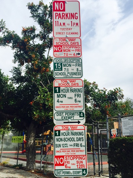
It's the same thing with insane parking signs.

2015-07-01-1435790910-1195277-FullSizeRender6-thumb.jpg

from:
 

Back
Top