News   GLOBAL  |  Apr 02, 2020
 9.6K     0 
News   GLOBAL  |  Apr 01, 2020
 41K     0 
News   GLOBAL  |  Apr 01, 2020
 5.4K     0 

If Ontario were to get a new flag, and I like the idea of a proper provincial flag I'd like something simple.

If I was forced to come up with something, I'd take the Pearson Pennant, move the two blue bars from vertical to horizontal, representing the Great Lakes/St. Lawrence and Hudson Bay/James Bay, to represent north and south. The triple maple leaf (often used to represent three founding peoples - First Nations, French and British) would come from the provincial crest, rather than the style used in the proposed national flag (which is now the logo of Dominion City Brewery in Ottawa).

The best US state flags are either simple and distinctive, or just very distinctive. Texas, New Mexico, South Carolina, and Colorado do simple and recognizable well (it's hard to beat New Mexico's). Maryland and Arizona are also very distinctive (though both are a bit busy) and they are very popular. California's is at least rooted in historical precedent.

Colorado's I think is a bit tacky, just because it has a "C" emblazoned within it. But like your idea of putting Pearson's vertical bars as horizontal to mimic the north and south waters forming our border.

What do you guys think of Ontario's Coat of Arms...would that be appropriate to fit in a flag? I just started sketching something out, and I really like the crest. Think it could work. Having trouble figuring whether a trillium should be included. Also would a medicine wheel make a good de facto representation of First Nations people? Was thinking the flag of the Iroquois Confederacy, which could arguably tie into US-Can relations, but I guess that excludes FN people from the rest of the prov.

*k, sketched this out. Does the crest and organic shapes of animals make it too busy? One thing I like about Canada's flag is the geometric simplicity. A kid could draw it, and it's easily digitized.

44N-Ontario-flag-2.png
 
Last edited:
Colorado's I think is a bit tacky, just because it has a "C" emblazoned within it. But like your idea of putting Pearson's vertical bars as horizontal to mimic the north and south waters forming our border.

What do you guys think of Ontario's Coat of Arms...would that be appropriate to fit in a flag? I just started sketching something out, and I really like the crest. Think it could work. Having trouble figuring whether a trillium should be included. Also would a medicine wheel make a good de facto representation of First Nations people? Was thinking the flag of the Iroquois Confederacy, which could arguably tie into US-Can relations, but I guess that excludes FN people from the rest of the prov.

*k, sketched this out. Does the crest and organic shapes of animals make it too busy? One thing I like about Canada's flag is the geometric simplicity. A kid could draw it, and it's easily digitized.

View attachment 164330
Still too busy. Maybe just the three maple leafs in the middle.
 
If anyone wants to propose a flag design, you should watch this TED Talk and adhere the the 5 principles it preaches:
  1. Keep it simple, so simple a child can draw it from memory.
  2. Use meaningful symbolism.
  3. Use two to three basic colors.
  4. No lettering or seals of any kind.
  5. Be distinctive or be related.

Asking a child to draw the Saudi Arabian flag would be fun to watch.

AoD
 
Yes my flag is quite busy. I kinda like the animals from the coat of arms, and was trying to keep it in line with level of details found on other province flags. Which is a reason I wouldn't fully adhere to that list of five principles. Having said that am picturing something like that Pearson Pennant, but with a simplified trillium in the centre and two leaves on the side.

edit: Now having watched the TEDtalk I get what he's saying. Still though I really enjoyed looking at maps with complex shields and small details when I was a kid. Sure I couldn't draw it easily. But doesn't mean 6yo me didn't didn't like what I was seeing in Britannica's flag section.

Made a few new ones with an attempt to be simple. These are all based on my simplificiation of the trillium (it's been reduced to a series of basic geometric shapes: circles and triangles). Also the maple leaf was lifted from the Pearson Pennant. It's rigid and geometric, which I like. Wondering if the trillium is a bit polluted since it's so tied to government. Perhaps something else like eastern white pine, or common loon, could work well instead.

44N-simplified-Ont-flag-1.png

44N-simplified-Ont-flag-2.png

44N-simplified-Ont-flag-5.png

44N-simplified-Ont-flag-6.png
 
Yeah they're no good. But I really don't think there's anything that can be good, or rather something that could get 80% support. Even 50% support. What would it be? Simple, ok so two colours. Oh well, how many flags have that. In a vertical or horizontal format, maybe diagonal, doesn't matter. So three colours, same thing. A circle or star, well those have been done too. The first point in the criteria of great flags is to be simple, third is 2-3 colours, and the last point is to be distinctive. Considering how many flags there are in the world a lot of this seems to be a self-contradictory fool's game. Or at least it seems that way.

On that topic I don't like Toronto's flag. Metro was good but a tad bit complicated for a kid to draw. Current one...forms a T, and shaped like city hall. A bit tacky. Anyway cuz I like playing around with geometric shapes, what about this. It's a white background, with blue rectangles that simulate the five Great Lakes to the south, and Arctic Sea to the north (w/ indents for Hudson Bay and James Bay). With the white space between maybe something down the middle, likely red. Circle, square, diamond, maybe Cdn flag.

44N-water-themed-flag-1.png


44N-water-themed-flag-3-1.png


44N-water-themed-flag-4.png
 
@ShonTron

You forgot Ohio's state flag, which is notable for not being rectangular (the same can be said about the Nepali flag). Squares are technically rectangles that happen to have equal-length sides.
 
If anyone wants to propose a flag design, you should watch this TED Talk and adhere the the 5 principles it preaches:
  1. Keep it simple, so simple a child can draw it from memory.
  2. Use meaningful symbolism.
  3. Use two to three basic colors.
  4. No lettering or seals of any kind.
  5. Be distinctive or be related.
If you want simple, then be inspired by the Cleveland Browns. There "logo" is just blank orange with nothing on it.
 
It looks a little contrived - e.g. why the second box around the maple leaves - and the maple leaves look like an afterthought that would be better off not being there.

AoD
 
Colorado's I think is a bit tacky, just because it has a "C" emblazoned within it. But like your idea of putting Pearson's vertical bars as horizontal to mimic the north and south waters forming our border.

What do you guys think of Ontario's Coat of Arms...would that be appropriate to fit in a flag? I just started sketching something out, and I really like the crest. Think it could work. Having trouble figuring whether a trillium should be included. Also would a medicine wheel make a good de facto representation of First Nations people? Was thinking the flag of the Iroquois Confederacy, which could arguably tie into US-Can relations, but I guess that excludes FN people from the rest of the prov.

*k, sketched this out. Does the crest and organic shapes of animals make it too busy? One thing I like about Canada's flag is the geometric simplicity. A kid could draw it, and it's easily digitized.

View attachment 164330
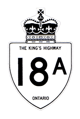
I kind of like this one - but remove that multi-coloured circle and put back the St. George red cross, or add a king highway type crown in this space.
I might go with a slightly darker shade of blue.
With the animals, this is a bit more complex of a design, so the complex trillium (trillia?) are needed.
hwy18A.gif
 

Back
Top