News   GLOBAL  |  Apr 02, 2020
 9.6K     0 
News   GLOBAL  |  Apr 01, 2020
 41K     0 
News   GLOBAL  |  Apr 01, 2020
 5.4K     0 

This was posted on this very thread a few years back. If the colours were a bit richer gold/green, I think it would be perfect.

View attachment 164606

I get what you mean about changing the colours to richer green on that. Feel like it might be hard to have yellow and green side by side without a buffer, but other flags do it to okay.

With the 60s era trillium I'm not a fan of it being included. Stumbled on an Ontario Vexillology page with lots of user ideas and seemingly most contain that trillium. I think it works well as it was designed - within the rounded square box. It was harmony. Taking it out of that isn't all that great imo. Also I think using a gov't logo shouldn't be brought into a flag. The other way 'round is a diff story, but as it stands it's largely a logo tied to a single provincial party.

I kind of like this one - but remove that multi-coloured circle and put back the St. George red cross, or add a king highway type crown in this space.
I might go with a slightly darker shade of blue.
With the animals, this is a bit more complex of a design, so the complex trillium (trillia?) are needed.
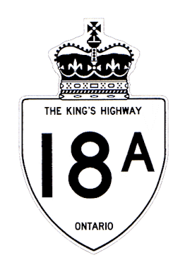
hwy18A.gif

The shade of blue is definitely off, would change. The medicine wheel was a quick inclusion, and don't really know the meaning. The animals were a vector image from our coat of arms taken off Wiki, not sure how official it is since I've yet to see an identical one anywhere else. The official gov't one is a lot more detailed, with another gov't version with less detail and all in black. The latter may be a better option for a flag, and could mimic something like Albania. The trillium I think could be simplified to good effect since it's a simple geometric shape. I'm okay with keeping the St George's cross fit in some way. But right now I'd like to see something simple but bold that stands out from many flags. How that could be I have no idea and have yet to see a good one.

Earlier I mentioned using an Eastern White Pine, Ontario's official tree. Stumbled on this: the flag for Norfolk Island, an external territory of Australia. Not saying I like this specifically, but if the tree was simplified it could be good. Though it's already been done in this case so that's out the window.

https://upload.wikimedia.org/wikipe...land.svg/800px-Flag_of_Norfolk_Island.svg.png

800px-Flag_of_Norfolk_Island.svg.png
 
I kind of like this one - but remove that multi-coloured circle and put back the St. George red cross, or add a king highway type crown in this space.
I might go with a slightly darker shade of blue.
With the animals, this is a bit more complex of a design, so the complex trillium (trillia?) are needed.
hwy18A.gif

It is my understanding of heraldry that the crown must surmount all other elements.
 
Given that this thread was moribund for a couple years, then raised again late last year, I think I will add my 2 cents worth.

Replace our provincial flag, why exactly? I genuinely don't get it. Could anyone help me out on this?

From what I've read 'colonial' has cropped up for a reason but unfortunately that's perplexing. Over 50 years since Maple Leaf flag was adopted, 150 years since Confederation and exactly 180 years since Responsible Government, have we not moved past that whole colonial thing? Really. There is such a bygone, retro 60s feel to that argument that has absolutely no appreciable relevance to this day and age. We are Canadian with a distinct national flag, but provincial ones that speak to our historic origins.

A genuinely open question to anyone, one way or another, because I am genuinely ignorant of any relevant argument to change Ontario's flag (apart from change for change's sake...?).
 
There's nothing wrong with the provincial flag, but we should have nicer licence plates. Red/navy plates (perhaps with a hint of green) would be nice, taking inspiration from the flag. The current ones are so generic and forgettable.
 
There's nothing wrong with the provincial flag, but we should have nicer licence plates. Red/navy plates (perhaps with a hint of green) would be nice, taking inspiration from the flag. The current ones are so generic and forgettable.

I agree our licence plates could’ve more exciting (logo/design) but the colours have to be practical. Blue on white easily is read and identified.
U.K. plates, whilst of a standard European design (black on yellow/white) has incorporated the year of the car manufacturer.
 
A genuinely open question to anyone, one way or another, because I am genuinely ignorant of any relevant argument to change Ontario's flag (apart from change for change's sake...?).
I'd say lack of recognition.
How many people can tell Ontario's flag apart from Manitoba's or Canada's old flag?.

What are the important things to keep?
  • Historic connection to Britain - with one or more of England cross, UK cross, crown.
  • Other symbols - triple maple leaf, trillium, coat of arms (deer, bear, moose).
,

A far from unique problem, even internationally. Solution, make the maple leaf shield larger?
5471DA14-C8F8-43A0-82F9-47C2888F70B2.jpeg
 
I think the recent NZ flag referendum provides some interesting material. Firstly, an irate Kiwi (New Zealander) writng a comment to The Guardian on the touchy topic of similar flags:

I personally don't give a f*** that people confuse it for Australia's flag, I don't suffer from the common Kiwi condition of a massive f***ing chip on the shoulder about Australia. Do Poles bitch about their flag being mistaken for Indonesia's, do the Irish give a tin of s**t that people might mistake their flag for Cote D'Ivoire's?
National inferiority complexes are really tiresome. There is nothing wrong with the flag we have. Link
here.

Secondly, this thread is wayyyyyyy too serious - so how about use our iconic national icon, with a Kiwi-style twist (& apologies to Brant County), how about this for a memorable flag?

194767


Any other crazy ideas for our Province???
 
The current Ontario and Manitoba flags need to be replaced. The Ontario flag is a "revenge" flag when Canada got it's Maple Leaf flag. Just like the State of Mississippi's flag is a "revenge" flag.

flag.jpg

From link.
 

Back
Top