News   GLOBAL  |  Apr 02, 2020
 8.6K     0 
News   GLOBAL  |  Apr 01, 2020
 39K     0 
News   GLOBAL  |  Apr 01, 2020
 4.8K     0 

The Waterclub condos at 8 York Street/208 Queens Quay. (Not so much the towers as the podium.)
 
The Toronto Star Building, both parts.

Re-cladding won't help.
In my world, move remaining operations of The Star to Vaughan (print media is almost dead), developer buys land for office/condo/hotel (who cares), demolish and launch a competion for something that knocks us dead. Finance, sell, build. We can finally be proud of One Yonge Street.
 
HBC at Yonge and Bloor would be an important project because of its uninspiring all concrete-clad podium at such a prominent intersection. The tower is bland too. Even if you like Brutalism, you may find that the concrete cladding seems generic. The recent makeover of Bloor makes the "bunker" stand out more with its subpar window-less design.

I can't say the same for the distinctive 2 Bloor West. It's among the more memorable towers in Toronto, with its rigid concrete 'ribs' and pronounced mechanical sections (nicely integrated into the architecture, of course), interspersed with an unusual grid of windows.

While I agree that 2 Bloor is more distinctive, and has the potential to be way more interesting than HBC, I think the poo-brown cladding makes it more visually offensive when looking down Bloor street and it would be my number one choice for a make-over.
 
I agree 2 Bloor W looks like it could use some TLC (and perhaps a reclad), but I'd hope the colour/design survives. When I was a kid it was one of my favourite towers because it kind of reminded me of a calculator (the windows look sort of like buttons), and there's something about the colours that just screams 70s (in a good, representative manner).

The biggest change I'd really make on it would be a reversion to the old CIBC logo up top. The new one clashes with the roof line, but the old one fit in so well it was as if they designed the roof to match the logo

I can appreciate that there is likely a nostalgic component for many people with respect to this building, as it used to be one of the city's biggest buildings for quite a while. Again I think the building itself is interesting but I just can't get over the brown.
 
Any/all of the 80s/90s buildings that went with white anodized aluminium panels in their cladding (I'm thinking specifically the former Holiday Inn on King, the Madison Centre in North York, and The 250/One Dundas West at the Eaton Centre). It's not the architecture I take issue with but rather the execution. I find those panels look awful after a few years of exposure to the elements, and I'd like to see them replaced with white glazing which would hold up much better.

Holiday Inn, I can understand--but the others, and *especially* the Eaton Centre towers (again, that "Zeidler heritage" thing), would be better cleaned/burnished than reclad. (Another in that cladding genre: Citi at 123 Front.)
 
The Strathcona Hotel!
 
Holiday Inn, I can understand--but the others, and *especially* the Eaton Centre towers (again, that "Zeidler heritage" thing), would be better cleaned/burnished than reclad. (Another in that cladding genre: Citi at 123 Front.)

It isn't my taste, but I do understand and respect the Zeidler heritage thing. But would it be so contrary to Zeidler's vision to replace a sheet of aluminium with a sheet of glass? I actually think Zeidler himself would have elected to go with the glass over aluminium had cost not been a factor. It would have more fully captured the gleaming futuristic spaceshipy look he was going for.

And yes, Citi is definitely in the genre, but it's held up much better. I can't recall offhand if it's stainless or grey anodized, but both tend to hold up better than white anodized. It's no different than a car, really. White (and black) cars are awful for their tendency to show any sort of damage to the finish.
 
The Strathcona Hotel!

Which, like so much that's been aluminum-sided, is more of a decladding candidate--of course, given our EIFS era, don't absolutely expect anything new to be much better than what's there now...
 
I think the biggest blight on the cityscape right now are the condos and apartments put up in the 80s and early 90s - the ones with the beige/light brown fake brick panels (ie: the three harbour point condos south of the CN tower). Probably too expensive for condos to re-clad though.
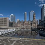
 
I think the biggest blight on the cityscape right now are the condos and apartments put up in the 80s and early 90s - the ones with the beige/light brown fake brick panels (ie: the three harbour point condos south of the CN tower). Probably too expensive for condos to re-clad though.

Why would it? It'd only involve applying Mayor's Tower Renewal logic to something more recent...
 
That brown condo pile immediately north of 38 Avenue Road, north of Yorkville on the west side of Avenue Road.
 

Back
Top