News   GLOBAL  |  Apr 02, 2020
 9.4K     0 
News   GLOBAL  |  Apr 01, 2020
 40K     0 
News   GLOBAL  |  Apr 01, 2020
 5.3K     0 

Mutual Street between Maitland and Carlton is fantastic, such a dense and eclectic mix of radically different styles and developments - arts, institutional, modern townhomes, classic old Toronto homes, 80s-ish townhomes, public housing - all in such a short stretch of the street! The only problem is the overwhelming stench of urine at the corner of Wood and Mutual, where every dog in the neighbourhood seems to enjoy relieving itself. Nothing to be done about that, though - and other than the urine issue, the dogs are a very welcome part of the neighbourhood.
 
Mutual Street between Maitland and Carlton is fantastic, such a dense and eclectic mix of radically different styles and developments - arts, institutional, modern townhomes, classic old Toronto homes, 80s-ish townhomes, public housing - all in such a short stretch of the street! The only problem is the overwhelming stench of urine at the corner of Wood and Mutual, where every dog in the neighbourhood seems to enjoy relieving itself. Nothing to be done about that, though - and other than the urine issue, the dogs are a very welcome part of the neighbourhood.

I couldn't agree more, Mutual Street is terrific.
Something that I don't ever recall being discussed or documented (with photographs) is the brilliant renovation/addition to the National Ballet student residence at Maitland & Mutual Sts. Add the incredible landscaping that now surrounds it only adds to it's visual appeal ten-times fold.

I'm not buying the idea that Radio City townhouses are going up for sale in response to assisted housing. As the TCHC building is nearing completion, the street is only getting better.

I made that comment and I meant it to be sarcastic. Reading it back I didn't convey that. I'm sure the townhome sales have/had nothing to do with the new TCHC development and if they did, it's their loss for moving away from a great area, plus those townhomes are incredible inside and out.
 
Aug 23rd Update

6 photos stitched together to capture the whole project


Click on the thumbnail to enlarge, then click again on the image for full size.

 
Daily Commercial News

Toronto rental housing project mixes old and new
August 31, 2009

140.jpg

WILLIAM CONWAY/PROGRESS PHOTOGRAPHY

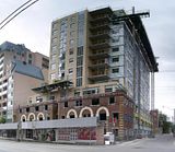
Work continues on an affordable rental housing project at 92 Carlton Street in Toronto that is incorporating the building’s original heritage facade.

H & R Construction Management Ltd. has completion of the 12-storey, 110-unit green-designed building, with two levels of underground parking, scheduled for October 2009.

The owner is Toronto Community Housing and the project was designed by Stanford Downey Architects. Consultants are: Quinn Dressel Associates (structural); Dillion Consulting (civil); Coffey Geotechnics (building envelope); Tarra Engineering Inc. (shoring consultant); Smith & Andersen Consulting Engineers (mechanical/electrical); and Ferris + Associates Inc. (landscape). Subtrades include: Terrasan (demolition); Aecon Utilities (site work); Roni Excavating; Shor-Cais Foundations Contractors (shoring); Delgant Construction Ltd. (formwork/precast concrete); Mississauga Iron Inc. (structural steel); Gilbert Steel Ltd. (rebar); Limen Masonry; University Plumbing & Heating; Full Service Electrical; Allan Windows Ltd. (glass/glazing); Rainbow waterproofing ltd. (roofing/waterproofing); Schindler Elevator Corp.; and Zinco Canada Inc. (green roof) :).


http://www.dcnonl.com/article/id35131
 
Saving these elderly and underwhelming building facades merely for the sake of saving them, rather than replacing them with something contemporary and better, strikes me as an admission of design defeat - especially when many of them are such uneasy new/old marriages.
 
I agree with you in principle, but in this case I find the facade easier on the eyes than the new structure. Of course that's not saying much. This one's pretty bland all around.
 
Boy is that addition brutally ugly (pun intended). It looks like leftovers from Bloor Street Neighbourhood.
 
Yup, this is not TCHC's finest architectural moment. Why didn't they go Teeple or aA here like they have elsewhere?

42
 
Pretty underwhelming for sure. It would've been nice if they matched the brick colour on the new structure to the lighter bricks on the old facade. It would've added some unity at the very least.
 
It's frightful no matter what colour it is.

42
 
Saving these elderly and underwhelming building facades merely for the sake of saving them, rather than replacing them with something contemporary and better, strikes me as an admission of design defeat - especially when many of them are such uneasy new/old marriages.

And perhaps as an alibi to "cheap out" on the new elements, too.

It's like heritage exploitation--or more properly, exploitation of the idea of heritage, maybe a pretty-face way of treating this more as a tax-saving/affordable-housing-saving "renovation" than a "demolition"...
 
An uneasy marriage it has become, but I'll still take this over the elimination of the original facades that will at least retain some character to this section of Carlton Street. I can see some restoration has been done along the top of the facades, let's see what happens once the scrubbing is complete and the windows are in. It's disappointing on some levels, certainly not TCHC's greatest visual achievement but it's hardly a failure when all is considered.
 
Last edited:
The tower portion is an utter failure when compared to other recent TCHC buildings: this one looks very immediate-post-WWII hospital institutional, not residential. Well, I suppose jails are residential...

42
 

Back
Top