News   GLOBAL  |  Apr 02, 2020
 8.6K     0 
News   GLOBAL  |  Apr 01, 2020
 39K     0 
News   GLOBAL  |  Apr 01, 2020
 4.8K     0 

  • Thread starter billy corgan19982
  • Start date
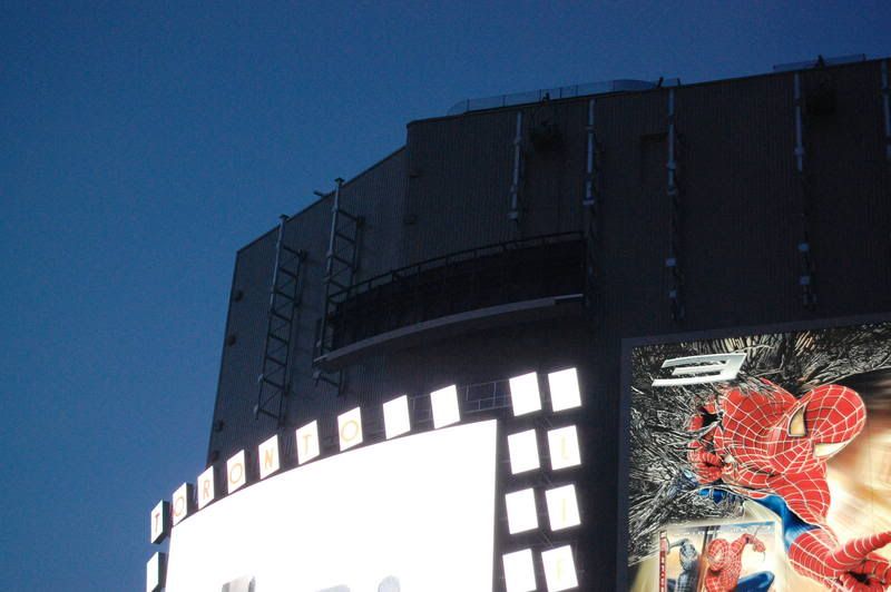
They had the big crane out there tonight and what looked pieces for the tri-vision screen. Nothing was lifted up as of just after midnight, but it was being prepped
 
Thats great to hear! I can't wait to see the trivision ad.
Hopefully somebody can snap a photo today.:D
 
I was there last nite as well. And to me it looked like there was more than one peice of the trivision destined to go up. But maybe the cold was too much, and they only installed the one piece that is up so far.

or......

maybe the thing is so damn huge, that even two or three pieces put togther just look small.
 
I am kinda surprised they only put one part on, though this is going to be one hell of a display.

DSC_2225.jpg
 
PenEquity seems to love updating their website with this Garbage. When it was them responsible for the work, the website never seemed to get updated. ( Or the updates were measured in months)

Now that the subcontractor (Provincial Signs) seems to be progressing quickly with the exterior signage these knuckleheads are updating their website, seemingly everyday.
 
As the installation of the ads progress, its becoming clear that this is just going to look like a jumbled mess of signs.

There's absolutely no attempt at symmetry. Signs are misaligned in relation to one another, there are blank grey spots with missing windows, some ads have a decorative tubing below, others don't.
Just about the only thing they have in common is that they're all a bland grey.

As much as I'd hate to see PenEquity profit from this mess, I'd love for somebody like Cadillac Fairview to snap this off their hands just as Rogers took Torch.

I'm hoping that advertisers such as Sharp buys permanent signage real estate and invest in higher quality signs.

An example:

piccadilly_circus.jpg

Piccadilly Circus - London, UK

P.S. By the way, Sharp's ad has put their brand at the front of my mind now that I'm shopping for an LCD tv. I used to be SONY all the way, but because of their sign, I was coerced into looking at the Aquos displays and I'm leaning towards one now. Way to go Sharp!
 
The fact that there is no symmetry is what really bothers me about it.
Others here have said that over time the signs will change, etc. I really hope that's true, but even still, I don't think anything can save this thing from being ugly.
 
I gawk at the people gawking at this thing from across the street. It's really quite facinating that as "ugly" as people might say this building is, the tourist can't seem to get enough of it's fancy light show.
 
The fact that there is no symmetry is what really bothers me about it.
Others here have said that over time the signs will change, etc. I really hope that's true, but even still, I don't think anything can save this thing from being ugly.
Yeah the layout of the signs is pretty bad, regardless of their quality. Why they put 5 feet of dead space between signs is beyond me.
 
Guys, guys, guys. There are still 4 signs to come.

And then on top of that, all the individual signage of the retailers.

And then on top of that, all the finishing treatments for the named sponsor (Toronto Life Magazine)
 
Cal, look at the space beneath the tri vision sign. That's a good 5ft of space where you'll be able to see the craptacular grey corrugated backing.

Now look at the spacing between the screen and the Sharp sign. None. They're practically touching.. yet there is tons of space beneath that sign.

This is what we mean about lack of symmetry. It's annoying, specially to designers like me.... and specially to OCD nuts ...like me.
 

Back
Top