News   GLOBAL  |  Apr 02, 2020
 9.4K     0 
News   GLOBAL  |  Apr 01, 2020
 40K     0 
News   GLOBAL  |  Apr 01, 2020
 5.3K     0 

  • Thread starter billy corgan19982
  • Start date
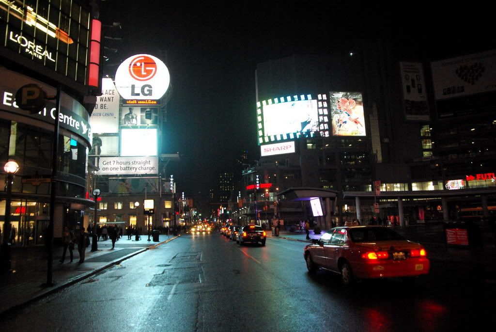
I find that there are WAY TOO MANY of those light posts. I think it kind of junks up the street.
 
Eugene S on flickr.com posted this...

2073956674_d3ab07bf60_o.jpg
 
I am SO glad that the star-bursts are not present in the middle of the square this year. Those were UGLY. I kind of like the tree (pretty much only at night though), but agree that it is kind of small for the square. I would like to see a MUCH larger version in the centre of the square.

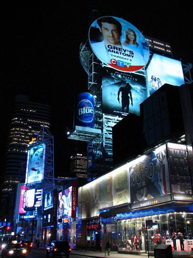
From the pic above, I got an idea for something that would look pretty cool. The tower (1 Dundas I believe) has 2 floors half way up that are reserved for air conditioning units, mainframes, whatever.. Basically there are no offices there. You can see this where there are 2 floors of no lights in the windows. It would look amazing if a 2 story ticker wrapped around the tower at this height. Images could scroll across the screen like inside the SkyDome/ACC etc.

I have said it before, and I will keep saying it. That raised "bus shelter" that lines Dundas Street needs to go. There is no point to having it there. Before it defined the north edge of the square, but TLS does that now.
 
That's actually a really good idea. A ticker wrapping around that tower look awesome and fill some of that void looking east (and direct some attention away from stupid, embarrasing Metropolis).
 
Yeah, an LED display stretching around the building would look even better, but that would probably be very expensive, and judging by that crappy media tower on the Eatons podium, I doubt Caddilac Fairview is willing to spend much money on something like that.
 
courtesy of Taller, Better on SSC

fc0c5ac2.jpg
The Atrium blows Metropolis out of the sky without even trying.

The advertising space on the Atrium looks like a natural urban evolution, while Metropolis looks like the city was trying too hard with pathetic suburban results.

The media tower looks industrial and utilitarian. You could flim a Batman scene danging on the framework between the signs. Metropolis looks like a stupid gray lump with ads covering a little more than 1/5th of the total surface (even when it's complete as planned).
 
The Atrium blows Metropolis out of the sky without even trying.

The advertising space on the Atrium looks like a natural urban evolution, while Metropolis looks like the city was trying too hard with pathetic suburban results.

The media tower looks industrial and utilitarian. You could flim a Batman scene danging on the framework between the signs.Metropolis looks like a stupid gray lump with ads covering a little more than 1/5th of the total surface (even when it's complete as planned)

Well, you said it: " The Atrium evolved "

And we all know it didn't start out looking like that. Look up the street and Aura and Bloor East could become the media squares of the future in the same way as the Atrium and the Eaton Centre took it to another level with custom renovations.

As for Metropolis, there is always hope that the city may become a bit forgiving and allow a variance to allow more signage one day. We can always hope
 
I'm not sure many would notice a ticker that high up at 1 Dundas St. W., that's kind of out of our field of vision. As is, I rarely notice the ticker above the media ads over the Y&D entrance of Eaton Centre.
 
Yeah it's old. And Taller tricked it out. But it hasn't changed much since then, other than the advertising.

to be honest, that's a pretty impressive streetscape. unless you were from new york, you'd likely look a that and say "hey, where's this happenin' city? why can't me city look like this?"
 
Sure, if the measure for "happening" is bright lights and advertisements.

I see a grand total of two people in that photo. They must be REALLY, REALLY cool dudes to make that scene qualify as "happening."
 

Back
Top