It's an odd one, because in person, the materials don't look as bad. Yes there's lots of them, of different colours and textures, but I think it deserves some time to grow taller, because the hight might visually elongate some of the cluttered lines.

Park in the wait and see pile for now.
 
So after looking and shooting at The One, the thing that sticks out on this project which would make a big difference is the window/façade. If they had gone through with larger and less partitioning with the panels then it would look drastically better. Currently there’s just too much commotion going on with the partitioned window/façade. “Less is more” would apply to this situation.

BBDE7E9C-5832-4446-99DD-471D1A72EB64.jpeg
 
Ya know, it may also have some art deco vibes too.
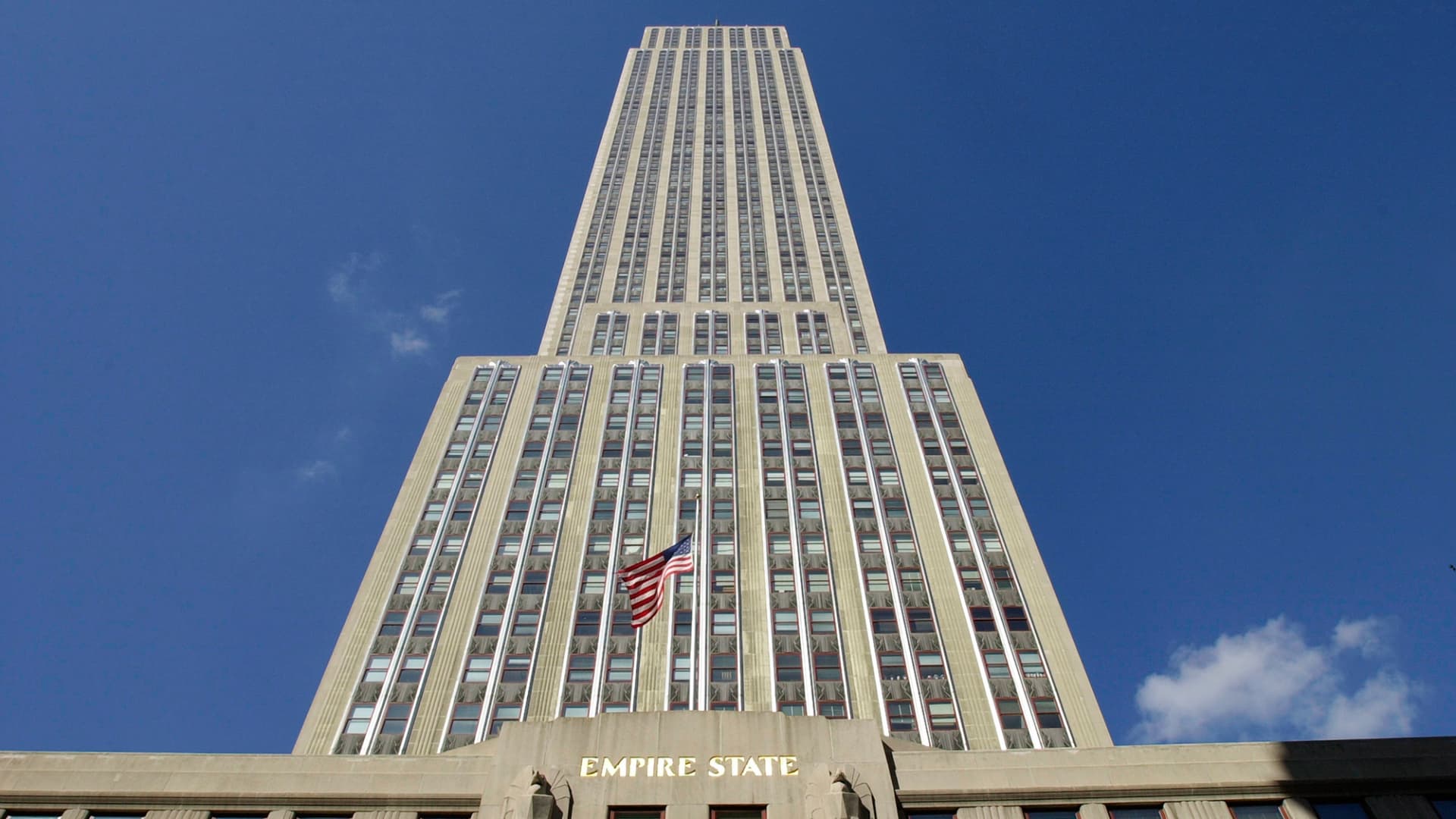
Compare to the Empire State Building facade (oh look, silver and beige?)
May be better than just another glass box (?)

101081470-126451421.jpg
I dunno. If those cheap looking window panels had some custom art deco metalwork and the building materials were comparable, sure it'd be great. This doesn't look like that imo. We'll see. I would love for this to turn out for the better though.
Forgive me if I'm using the wrong terminology, I'm not in the industry. But, I think you know what I mean.
 
I'm trying really hard to like it as I think they were going for something different - but at this point, complete execution failure ? :)
 

Back
Top