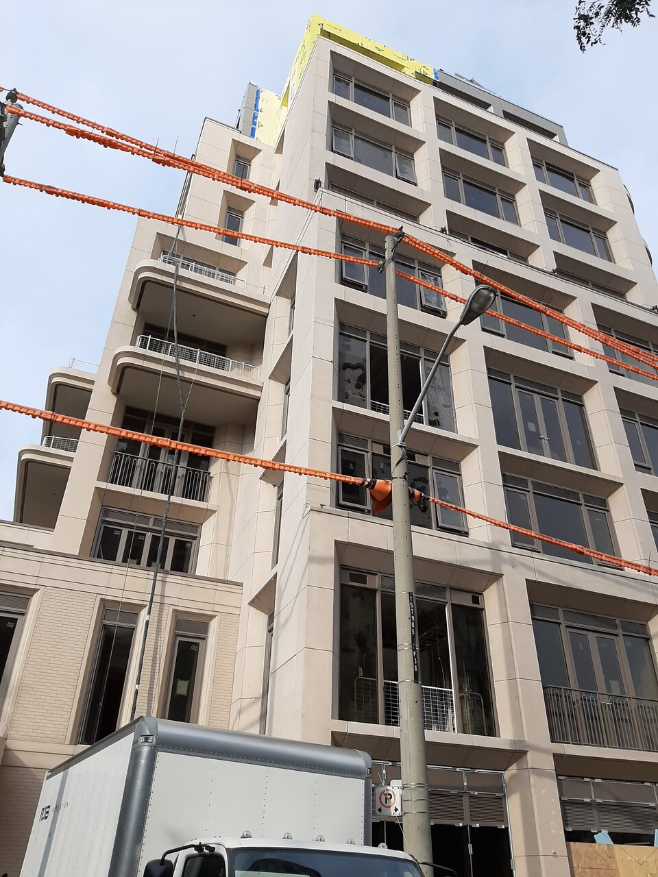
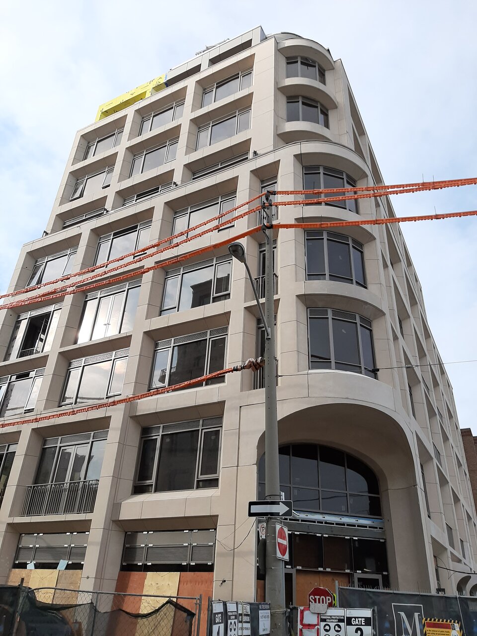
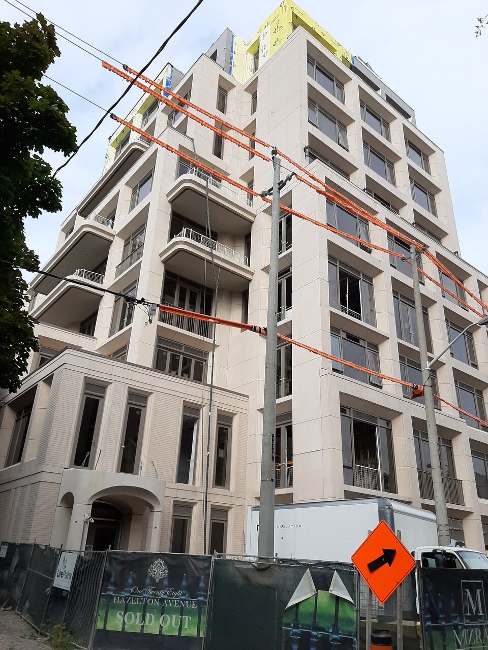
Ongoing work to fill in the patch along the east side where the construction elevator used to be:

Sept 27, 2020
20200927_095121.jpg
20200927_095131.jpg
20200927_095150.jpg
 
the thick precast must have been expensive, but the deeper window look is great. i think it looks better than 133 (*except the window frame color)
 
The deep windows and balcony shapes are really nice. I'm probably being too picky, but I wonder if there was a nicer way to do the window mullions at the front entrance, especially since the main feature is really nice.
 
For me, the choice of pre-cast and design made a welcome organic evolutionary step in the tiresome Stern'esk McMansion style that has been inflicted on our scape since the 80's (along with the grey spamdrel movement)...

...until they got me with the choice of window materials (see: spamdrel again). It's with that that completely threw this development off, IMO. So marginal thumbs down for me. While "A" for the effort of giving us something at least interesting with this type of PoMo genre.

Hope Mr. Sam doesn't flub it like this with The One. /sigh
 
The deep windows and balcony shapes are really nice. I'm probably being too picky, but I wonder if there was a nicer way to do the window mullions at the front entrance, especially since the main feature is really nice.
I believe a half-moon window would've been more appropriate.
 
This is turning our beautifully IMO
The precast punctured windows facades like this always look great in my opinion! I think we need a zillion of these mid and highrise looking buildings in this city. To balance the scale with the all glass one in the downtown core etc .
 
  • Like
Reactions: xy3
This building is proof that precast can look beautiful with the right proportions. It's starting to come together with the elegant railings , awning. It will really look fitting once trees are planted and started to bloom in the spring.

I prefer the greige crown over the overbearing dark colored crown in the rendering. It also looks miles better than the glossy plastic spandrel crown on Mizrahi's earlier development next door.

I would love to see the shabby 5 story brown building next door redeveloped. Somthing like Audley Square House with a beautiful courtyard or something like Passage Verdeau (going perpendicular from Hazleton to Avenue Road maybe) would be dreamy.
 
Last edited:
What a handsome building!! Walked by the other day and you can see some damage to the edges of the concrete blocks, corners etc. I'm assuming they'll plaster/patch these issues before move in. the edges need to be really sharp for the design to pop.
 
  • Like
Reactions: xy3

Back
Top