You are using an out of date browser. It may not display this or other websites correctly.
You should upgrade or use an alternative browser.
You should upgrade or use an alternative browser.
- Thread starter Filip
- Start date
Red Mars
Senior Member
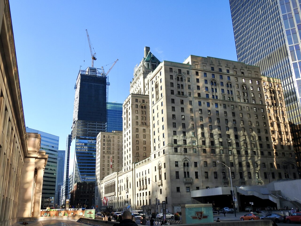
Catching CIBC and TD in the same sight line.
Dec 8, 2022

Dec 8, 2022

Red Mars
Senior Member
Dec 8, 2022
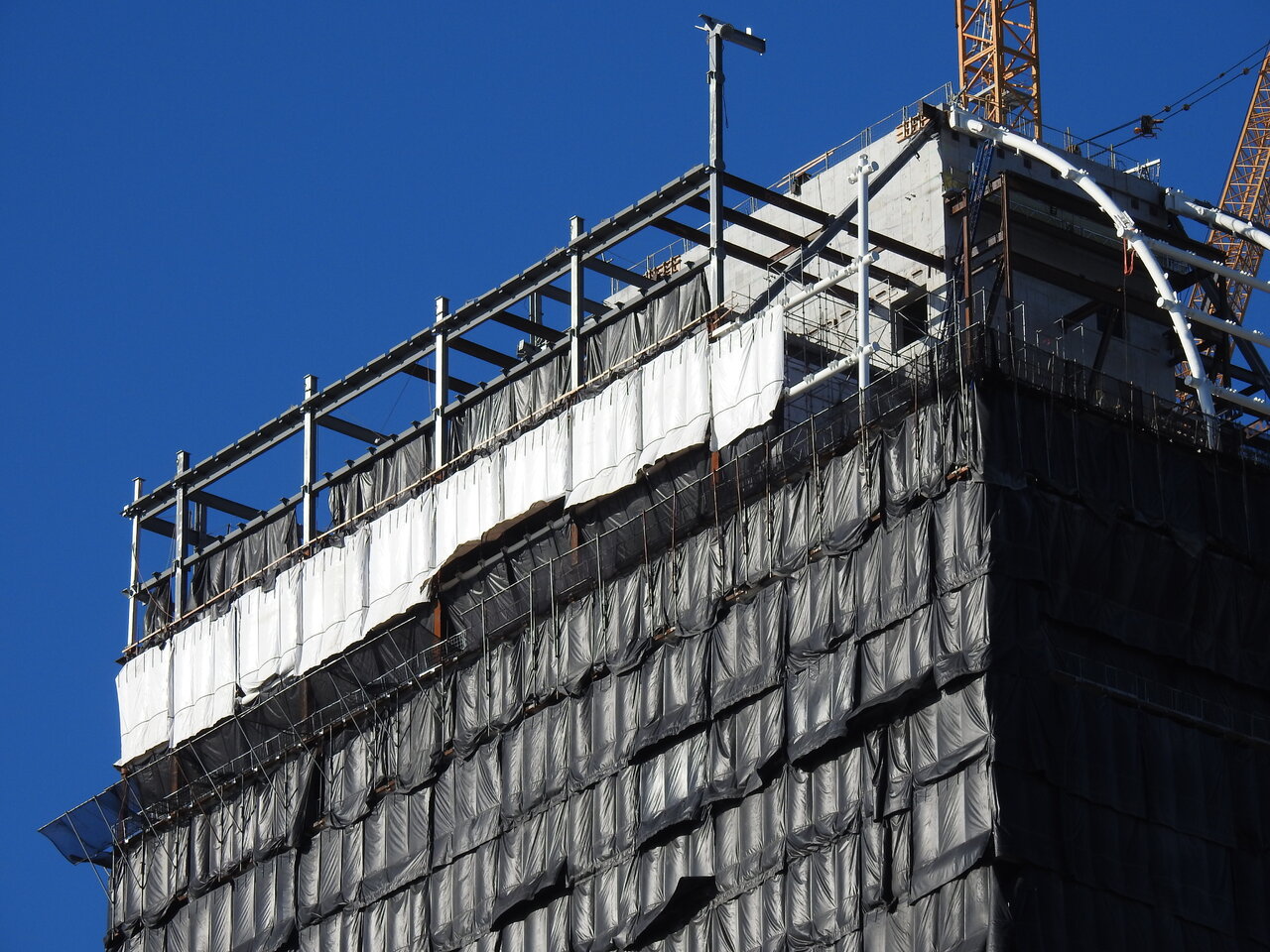
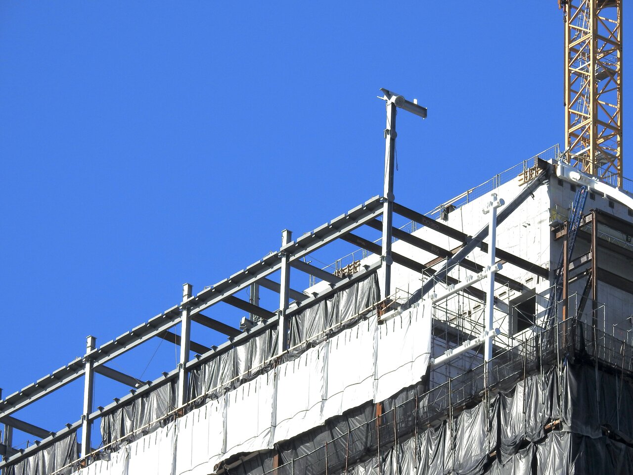
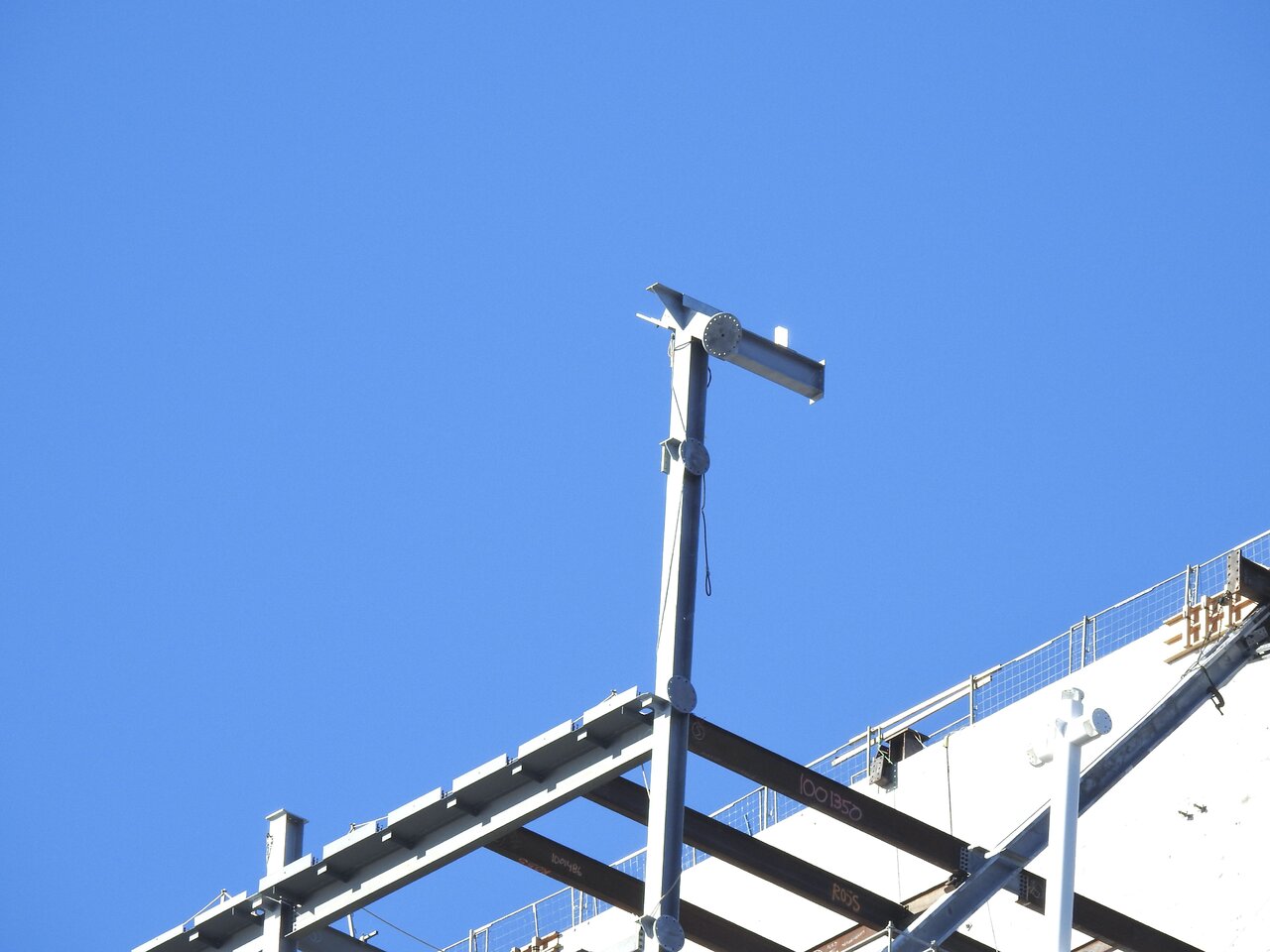
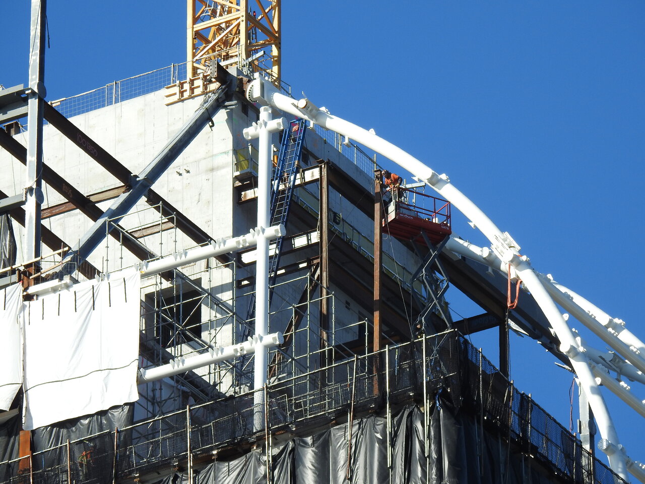

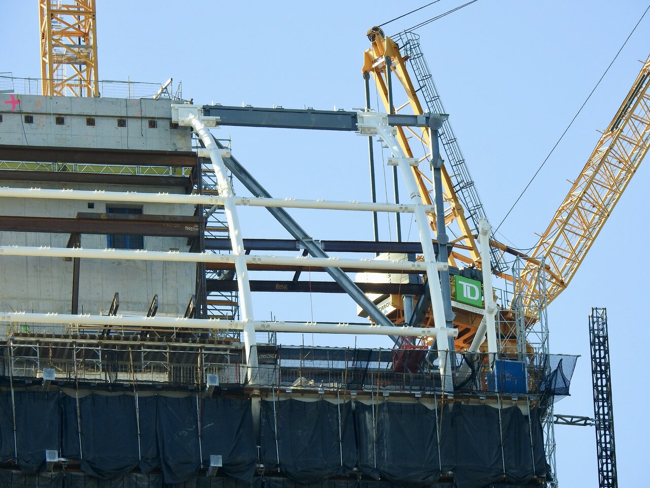
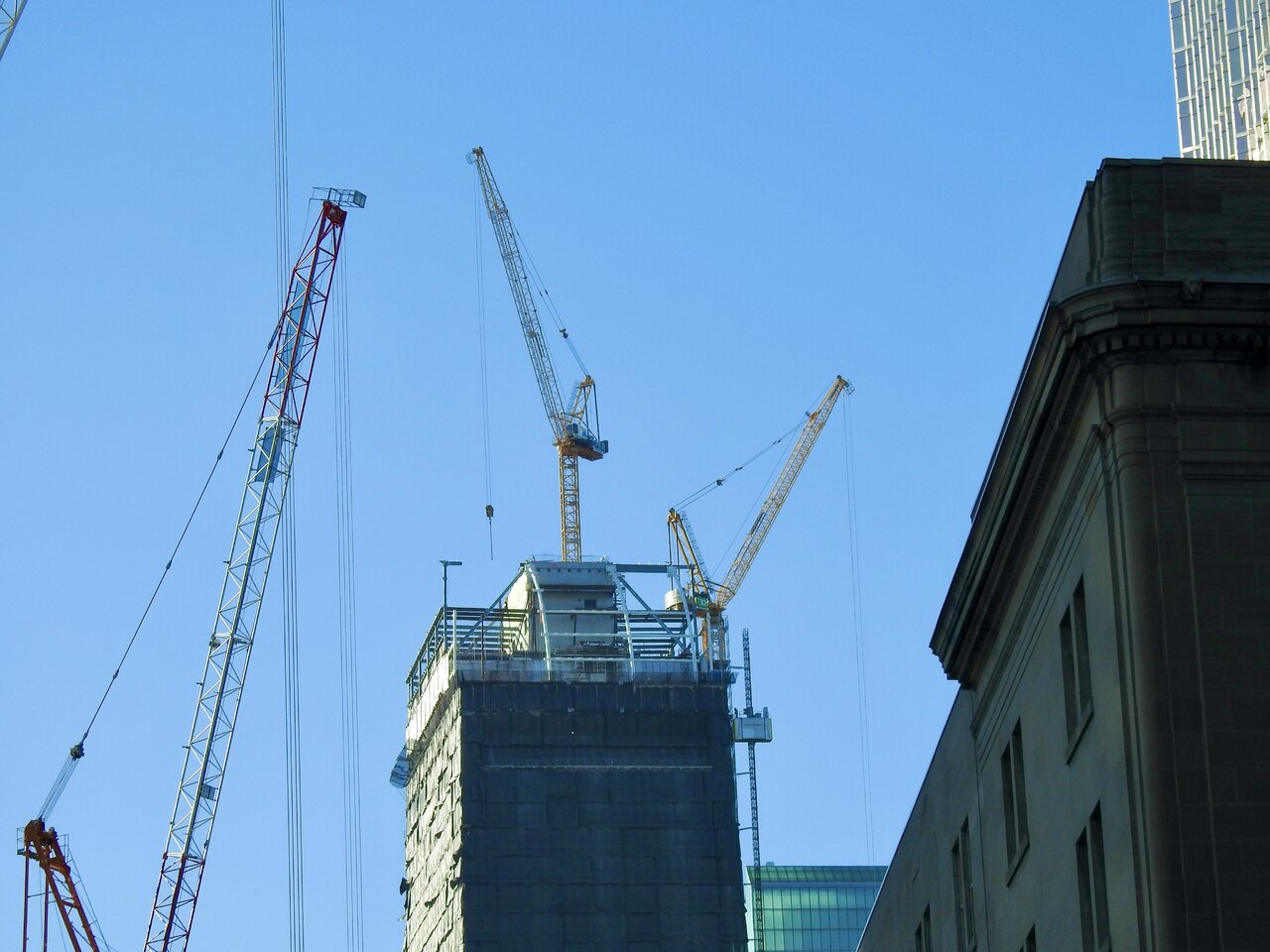
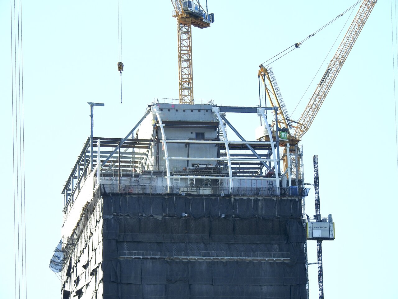
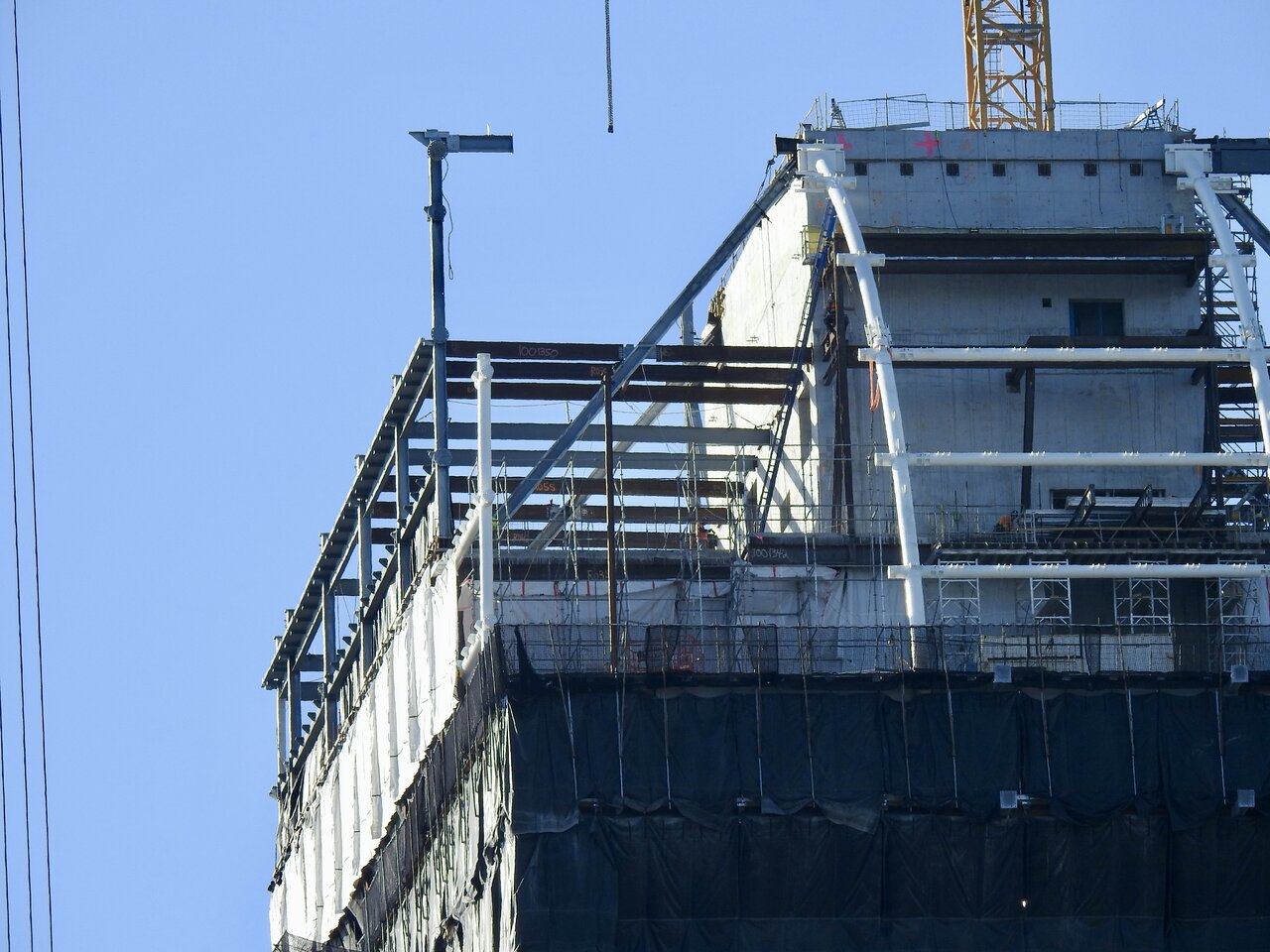
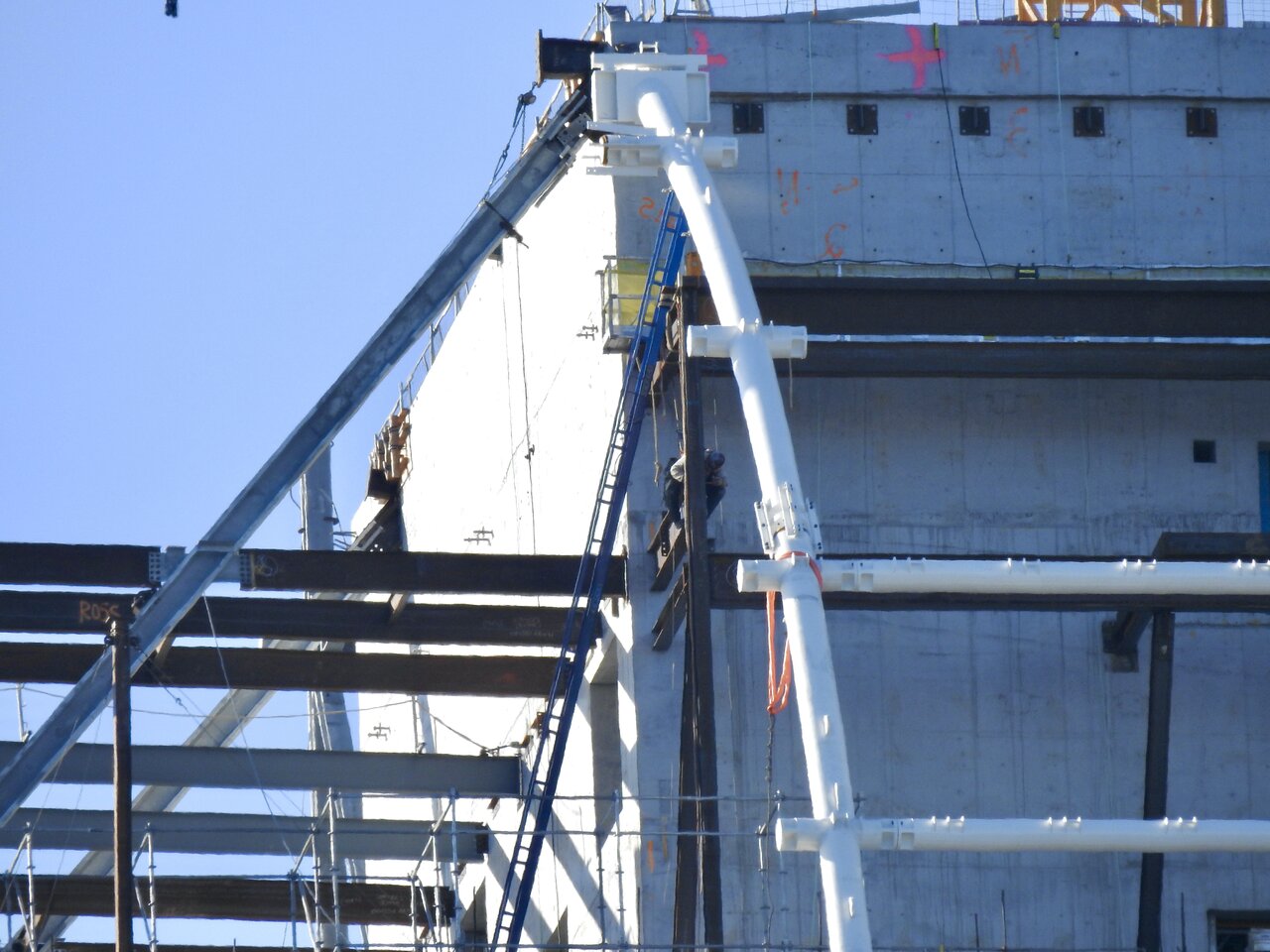
Same pic as in the previous post but in B&W.
"Catching CIBC and TD in the same sight line."

Same pic as in the previous post but in B&W.
"Catching CIBC and TD in the same sight line."

Red Mars
Senior Member
Dec 8, 2022
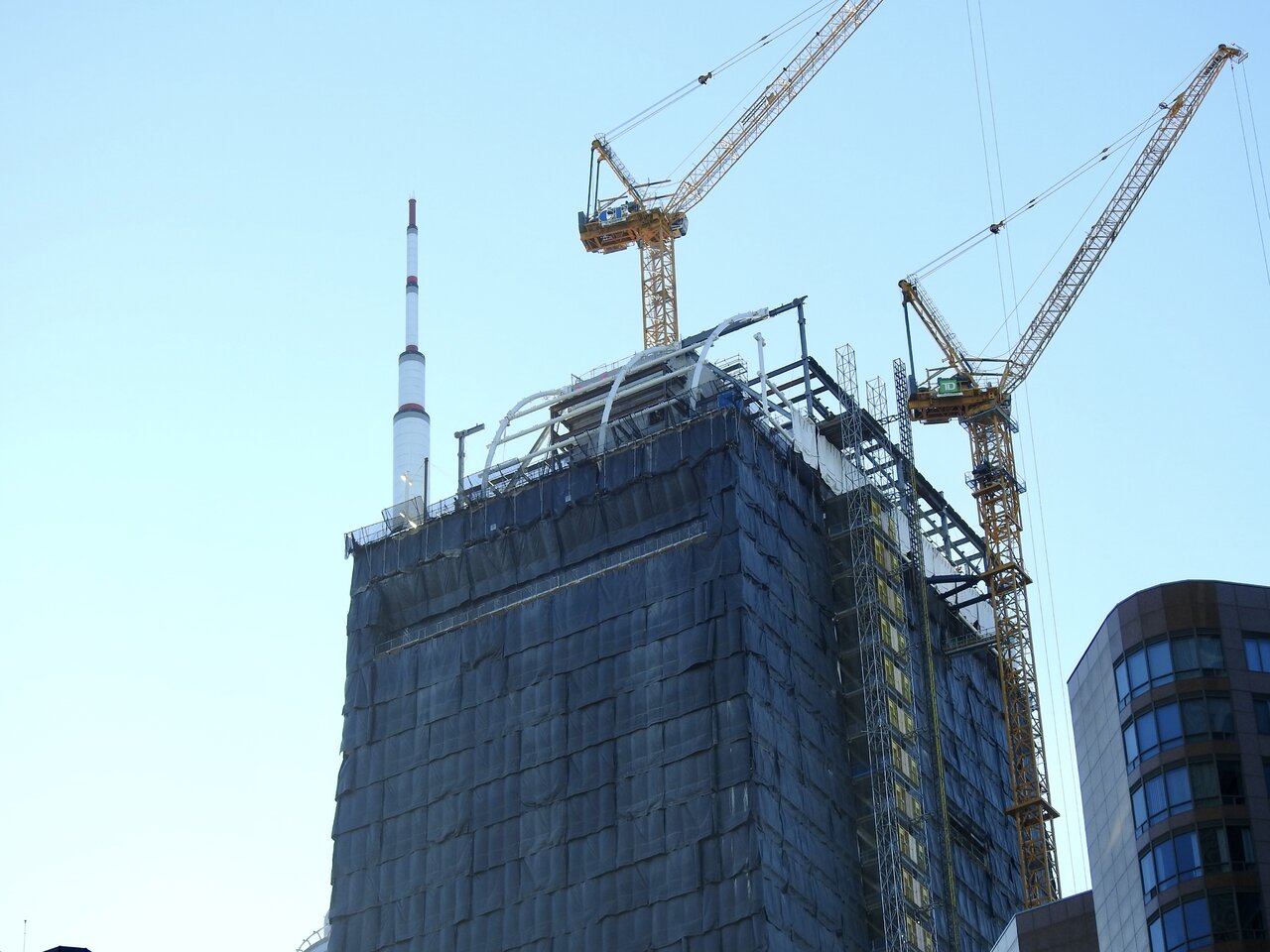
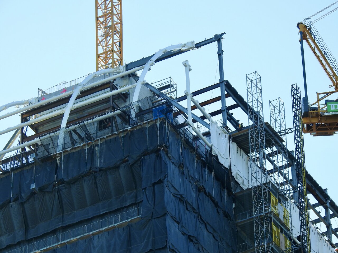


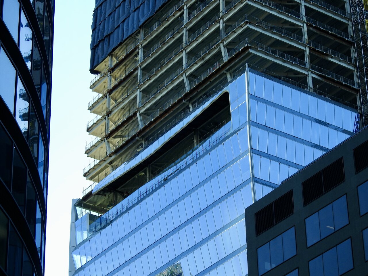
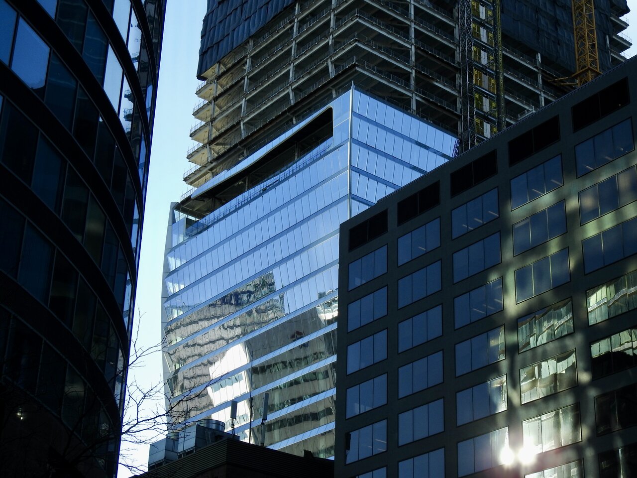

Red Mars
Senior Member
Dec 12, 2022

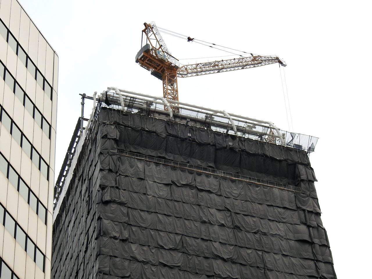
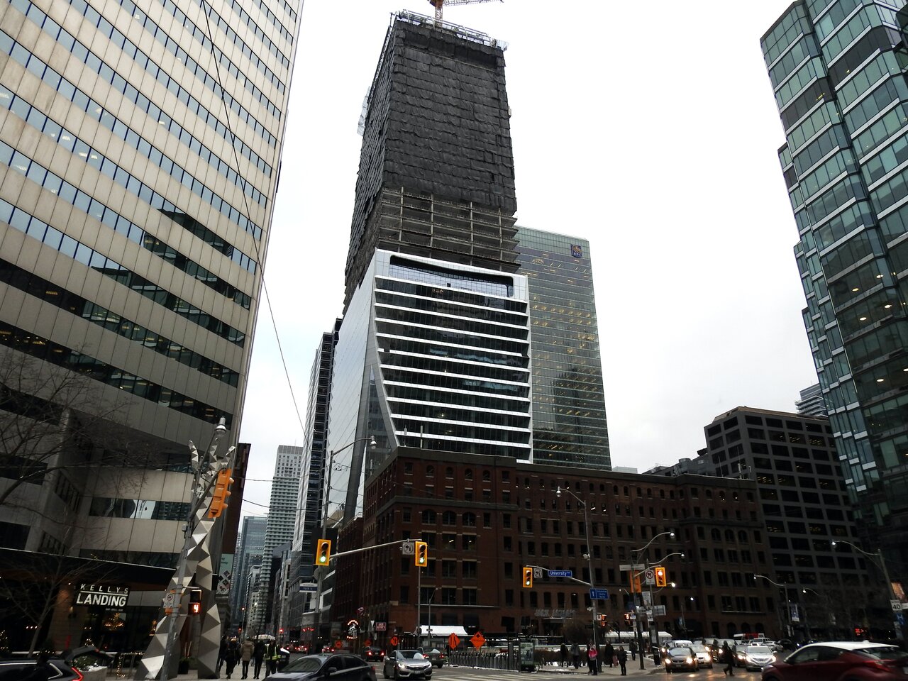
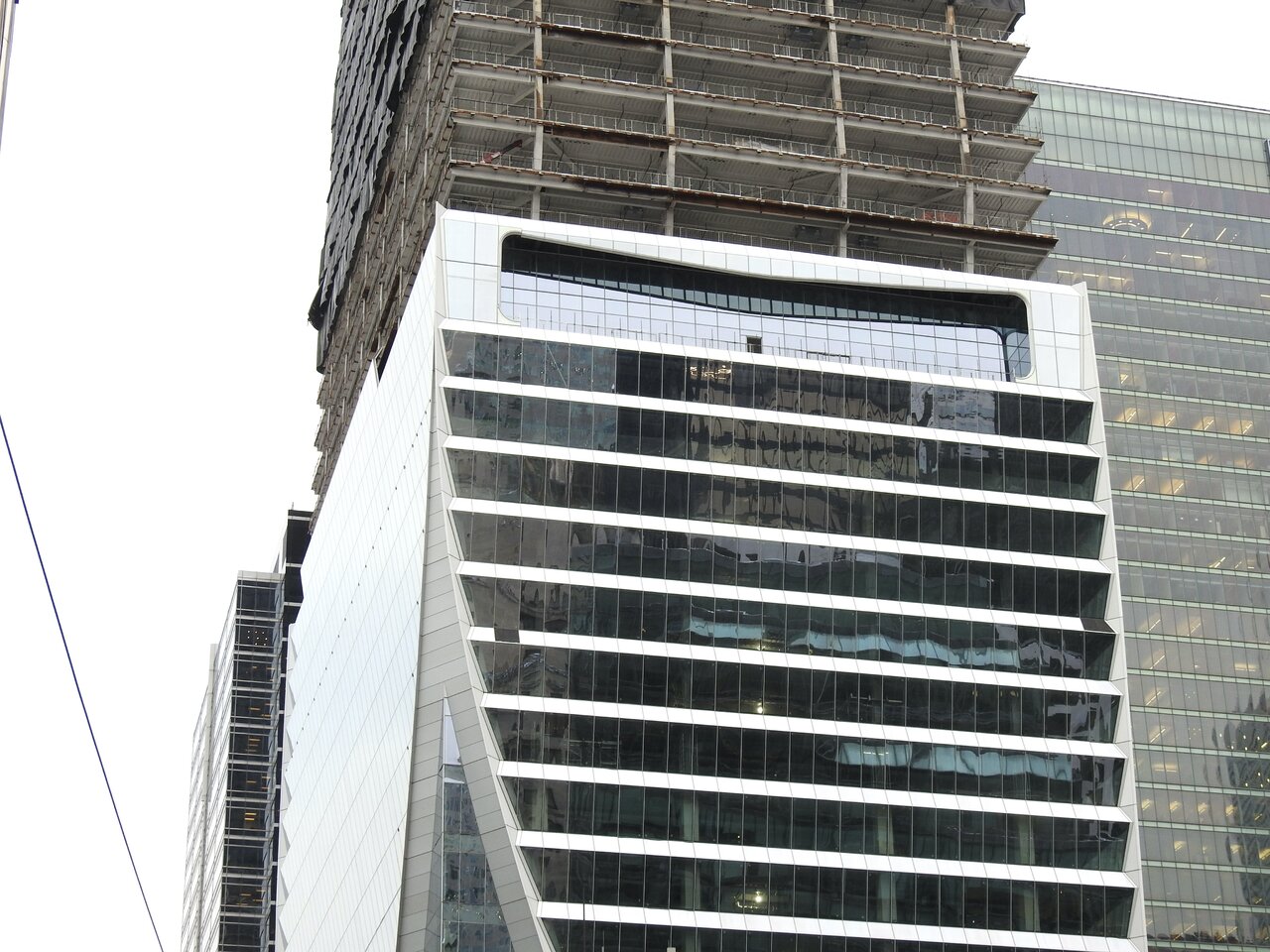

Rascacielo
Senior Member
Today
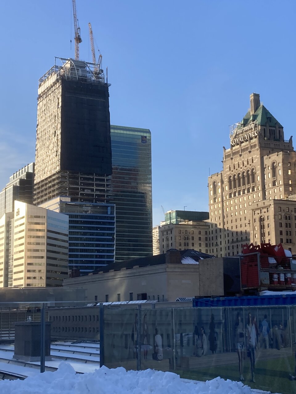
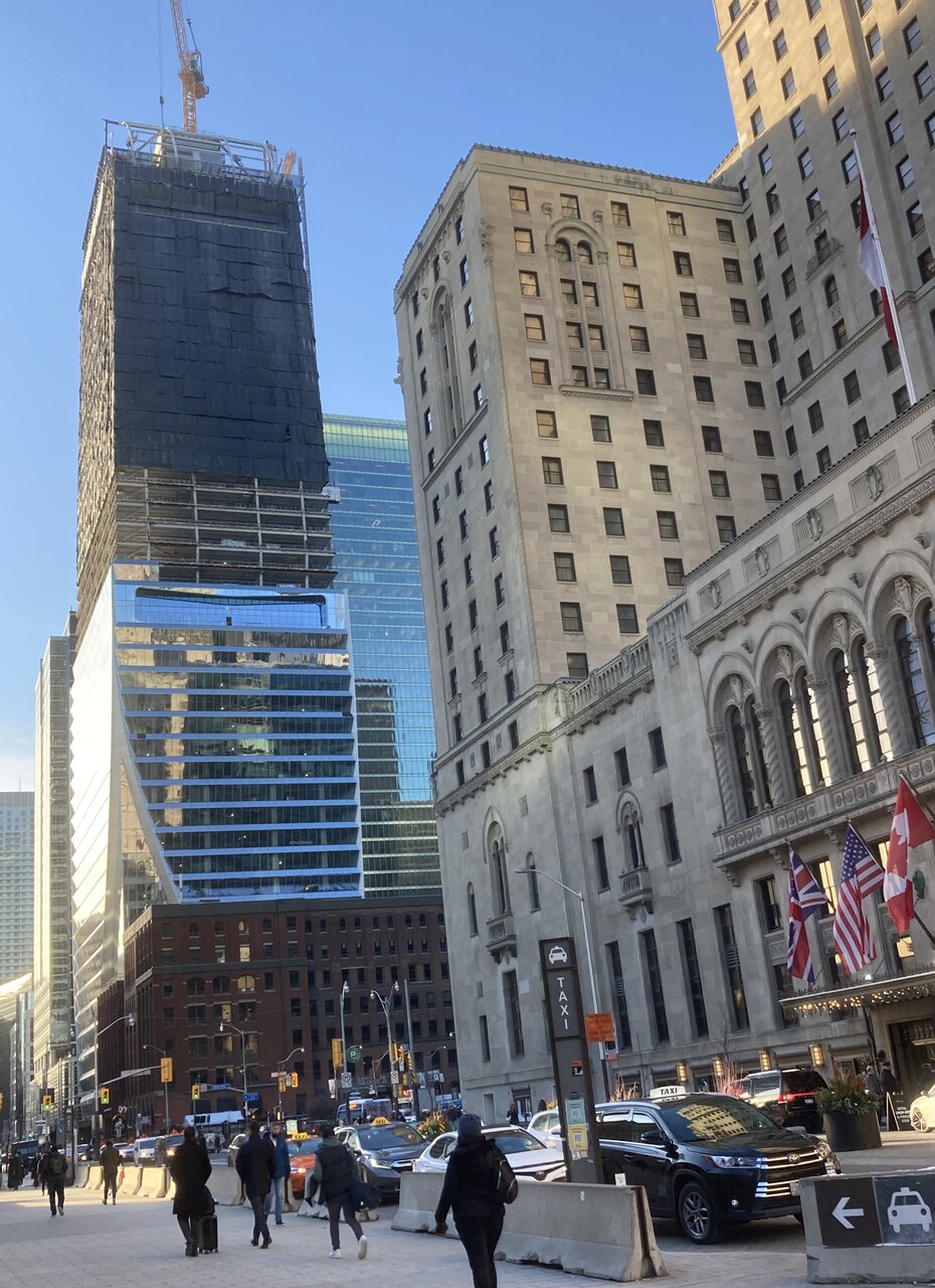
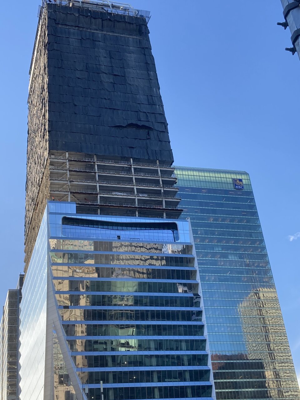
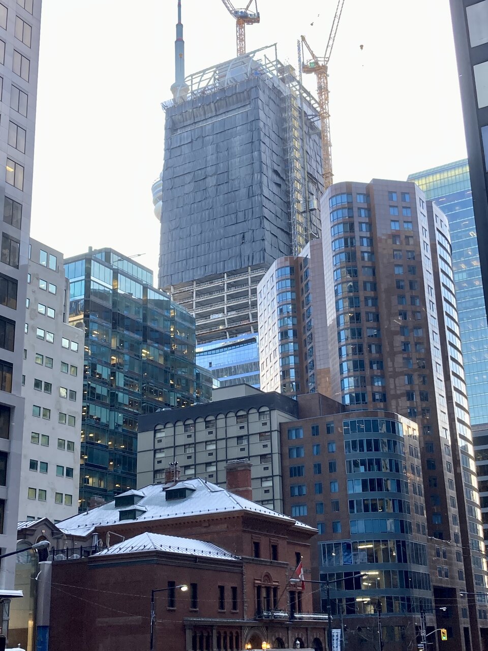
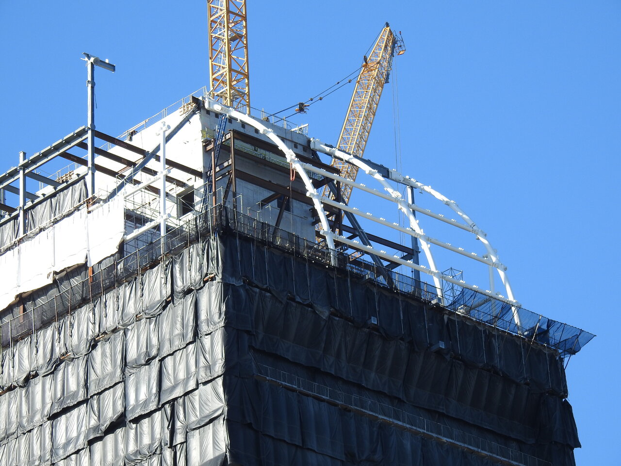
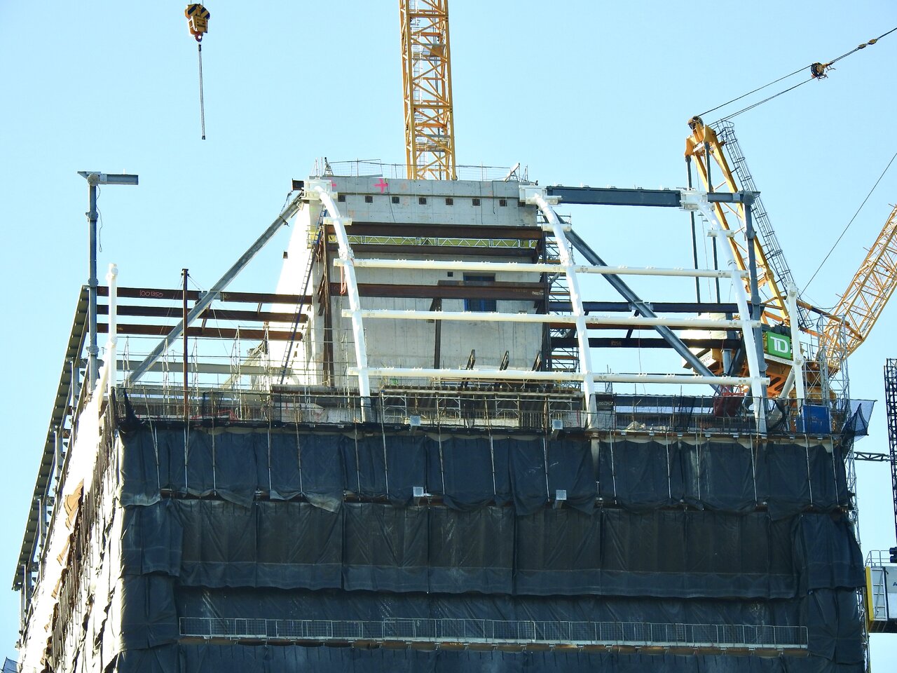
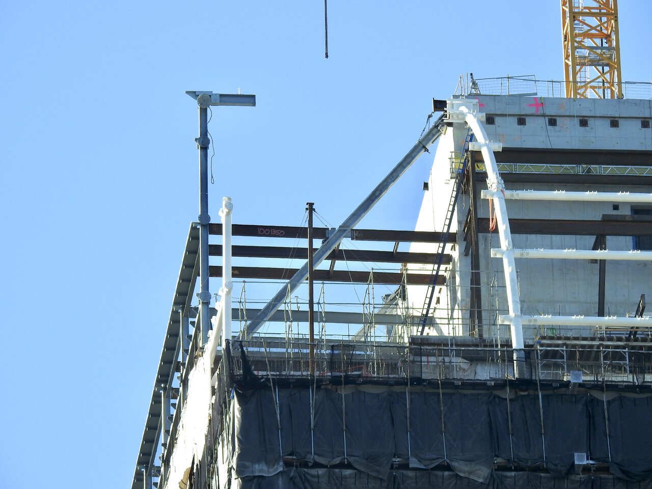
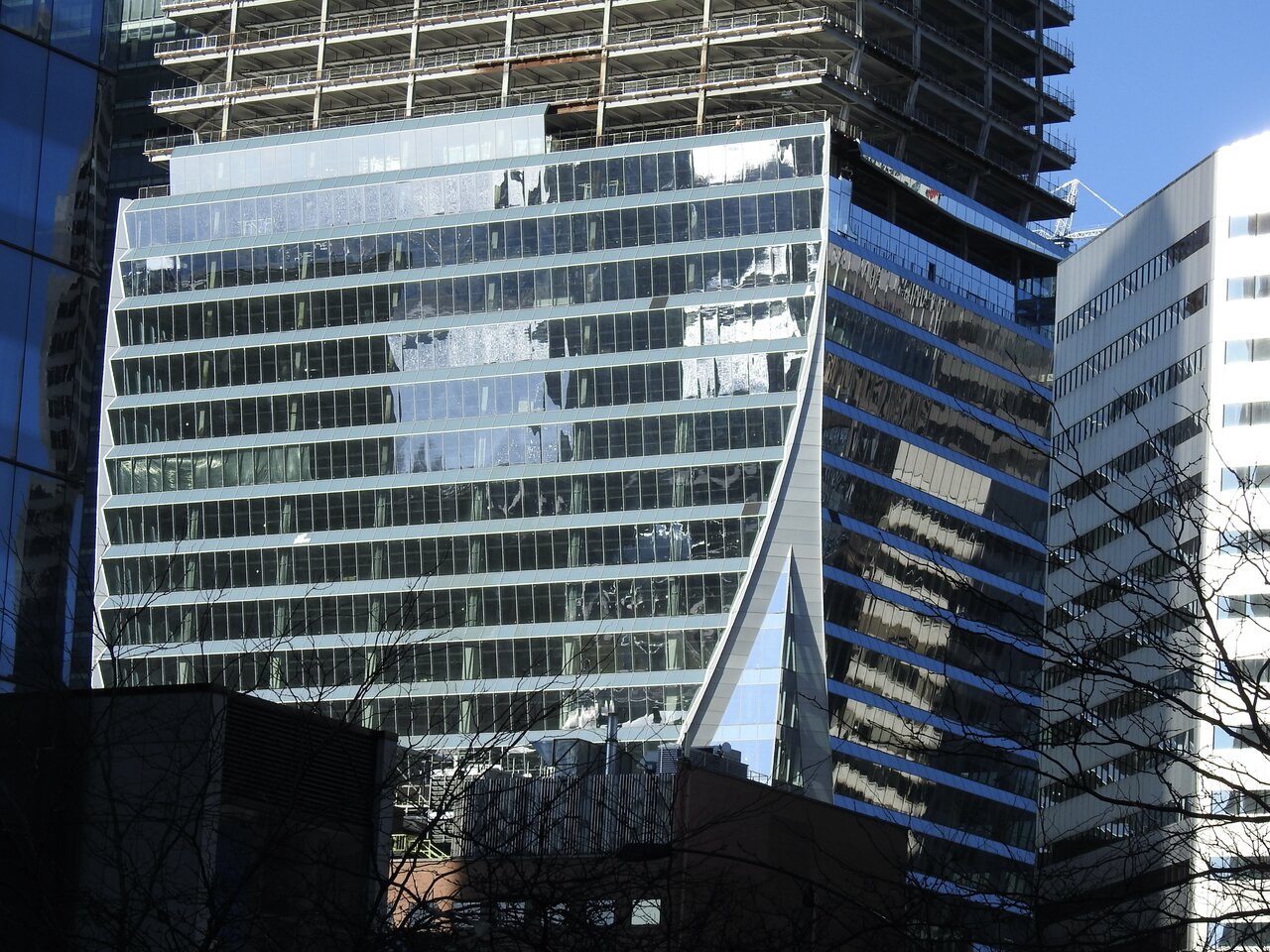
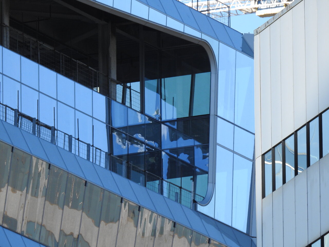
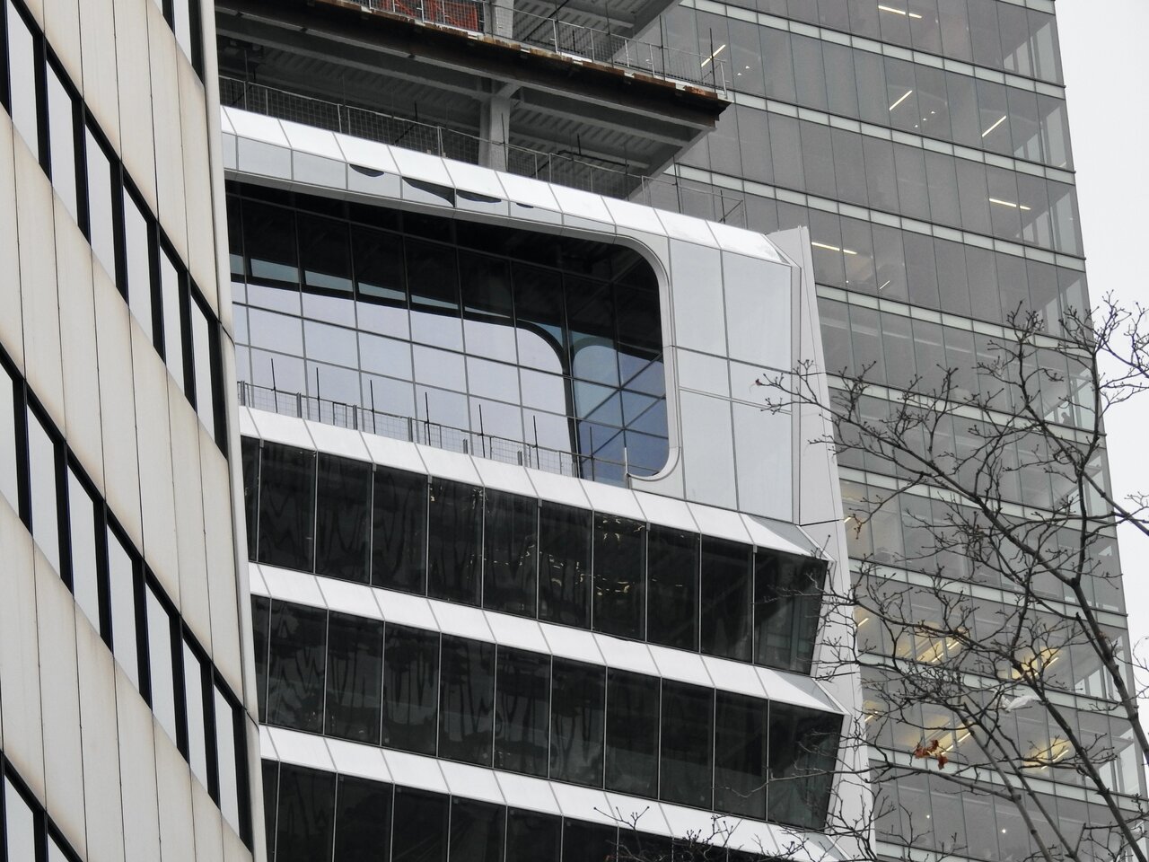
While the prominent east-facing ‘mouths’ will steal the show, there are also west-facing ‘mouths’, somewhat hidden (especially the lower one) by Simcoe Place
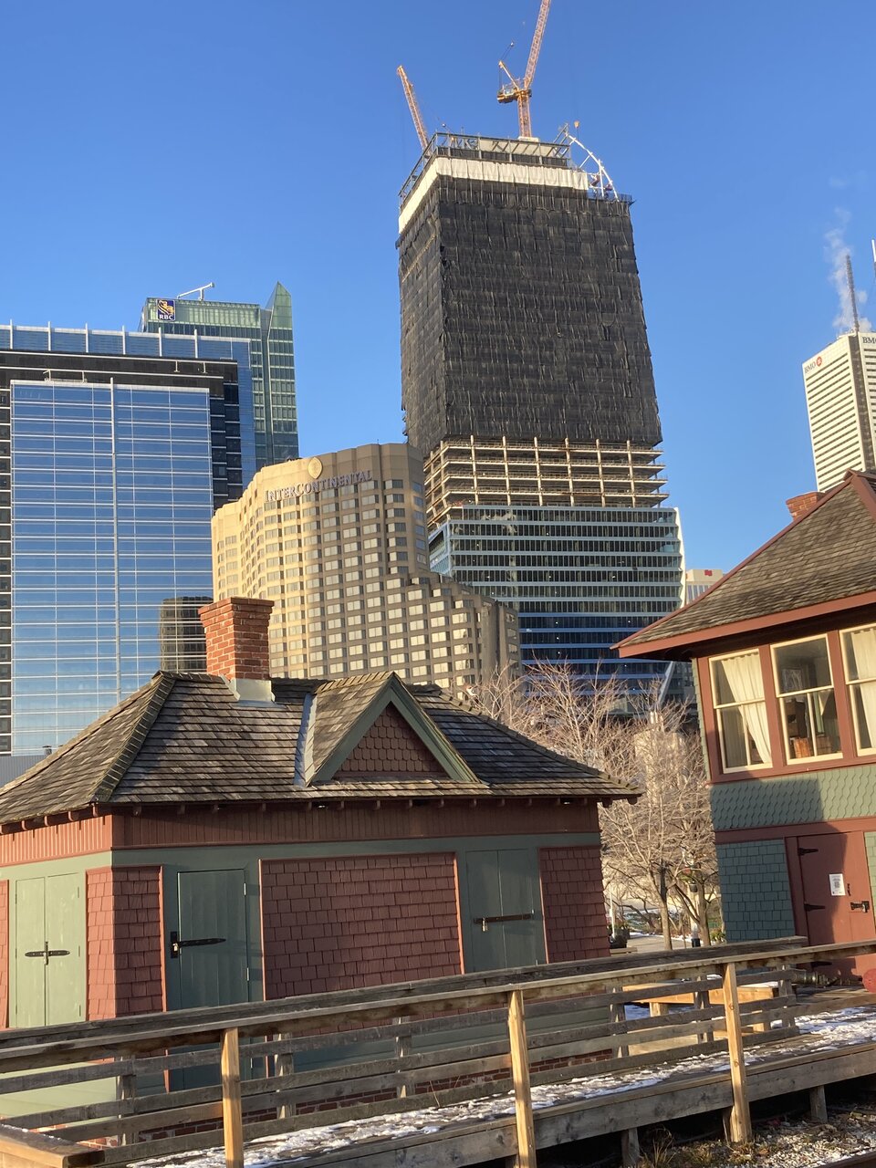
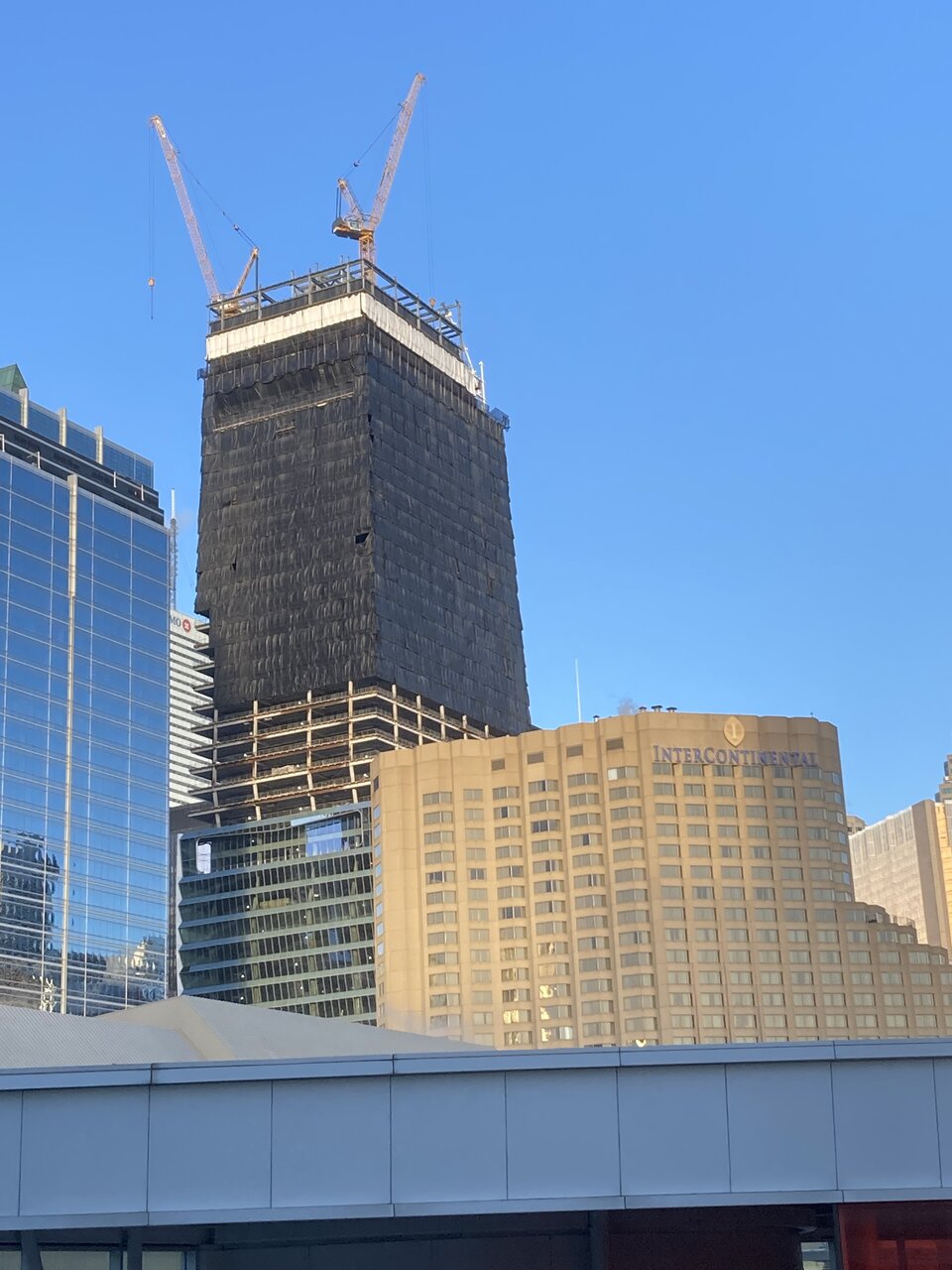
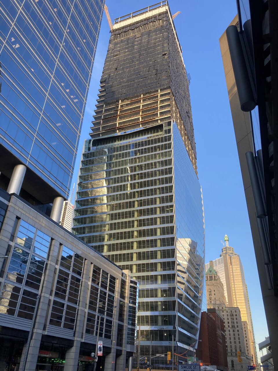

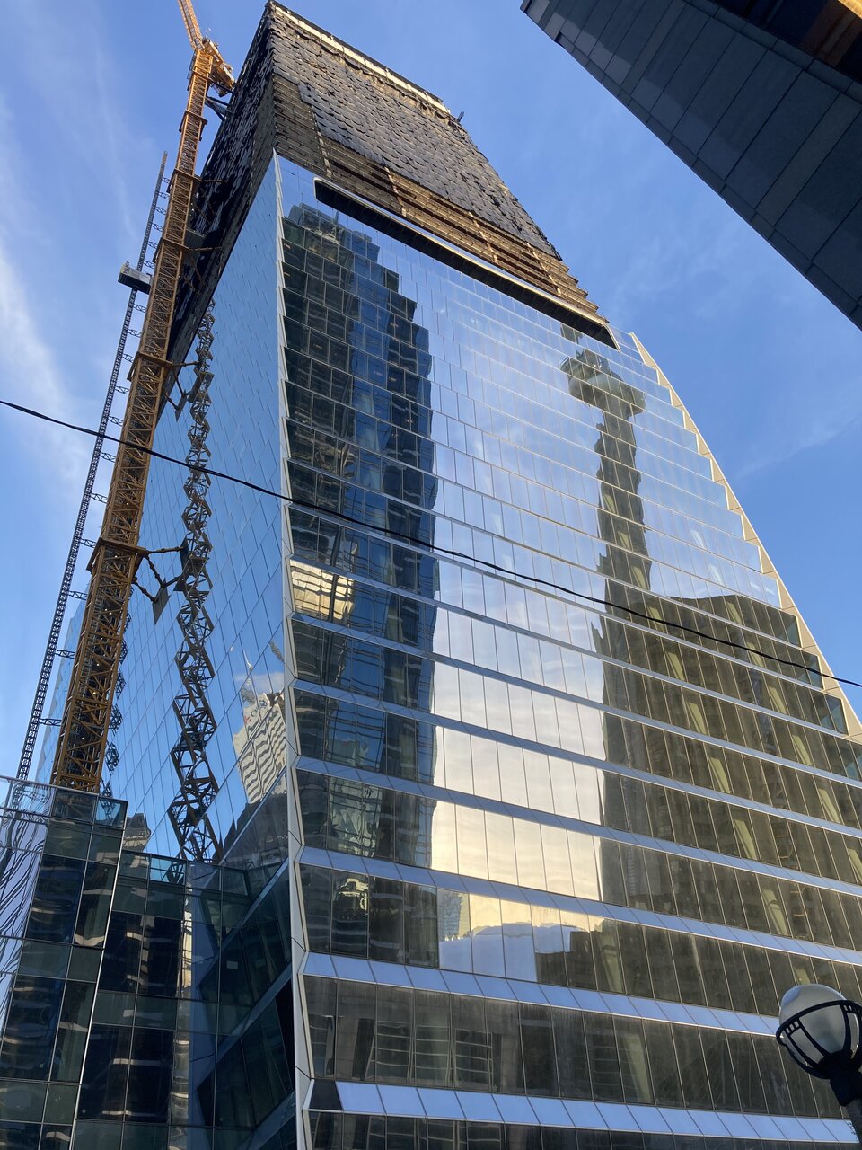
While the prominent east-facing ‘mouths’ will steal the show, there are also west-facing ‘mouths’, somewhat hidden (especially the lower one) by Simcoe Place
westtoeast
Active Member
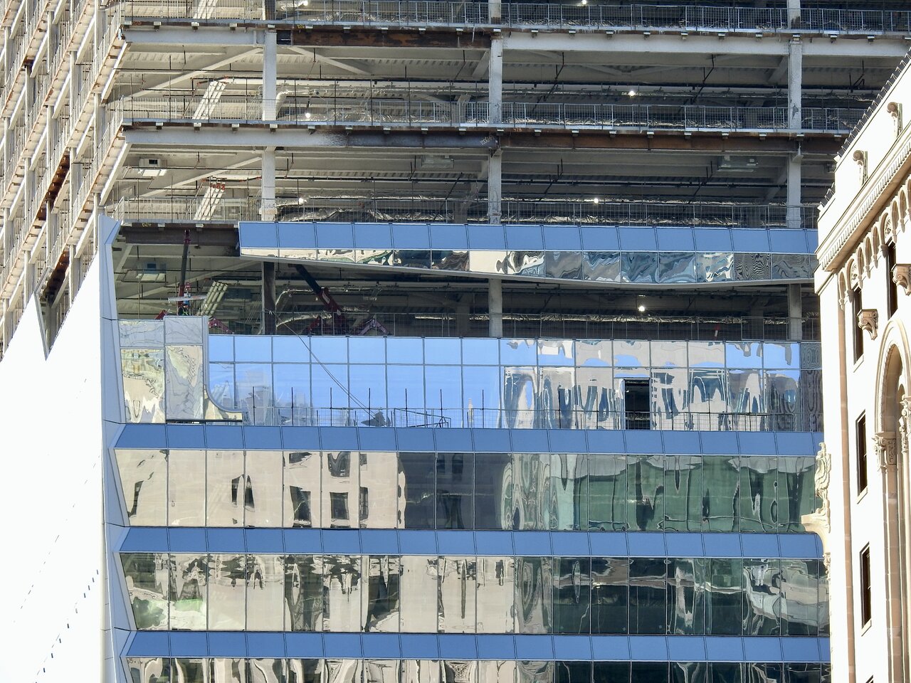
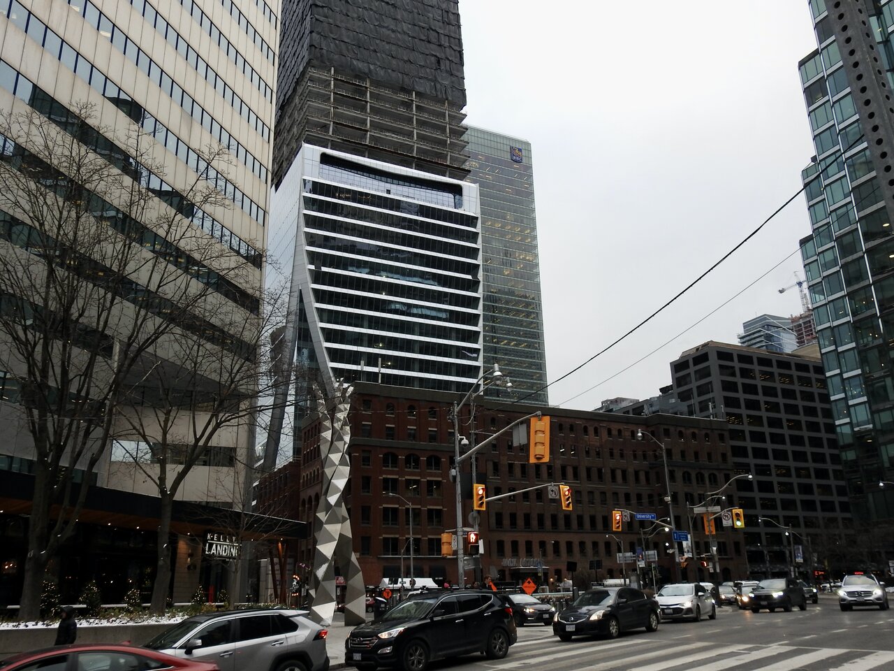
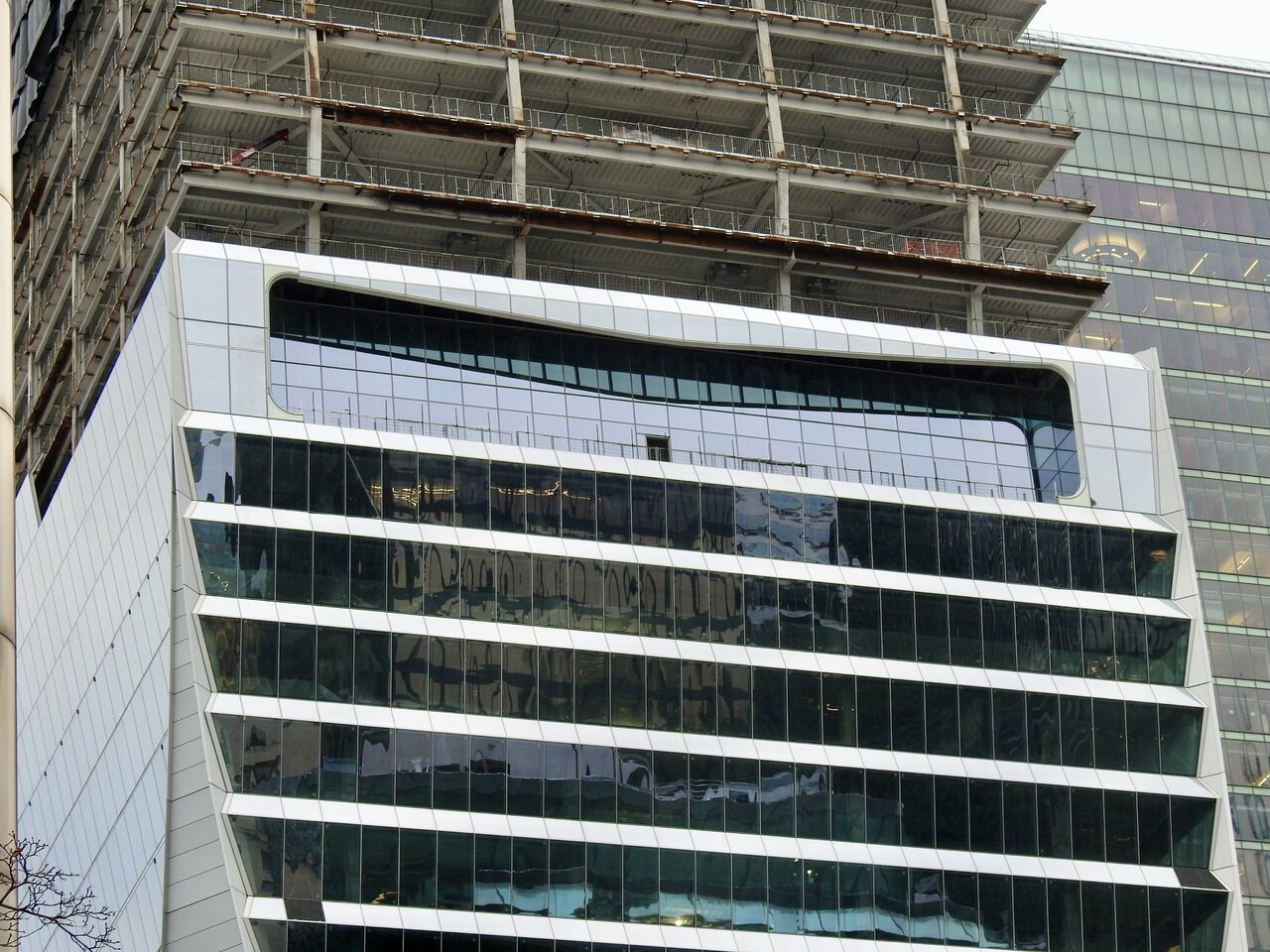
I really underestimated how much I'd like the crown of this! Obviously the effect is not the most pronounced right now, but I'm thinking the tapering and asymmetry of the top of the building will really set it apart amongst the typical resolutions we see downtown.
Undead
Senior Member
Today:
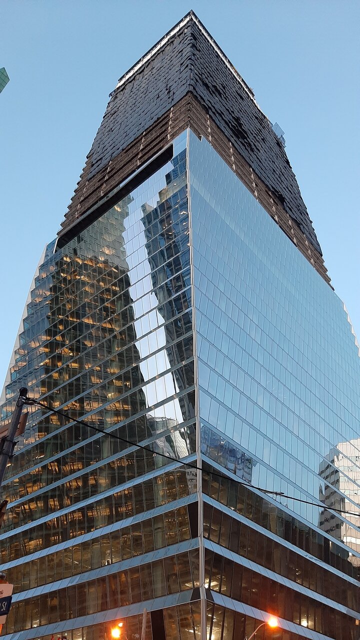
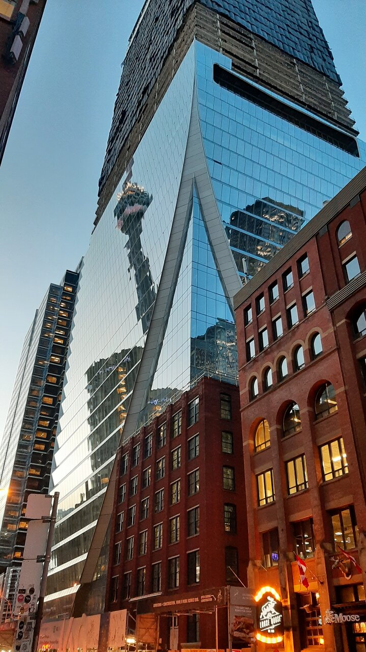
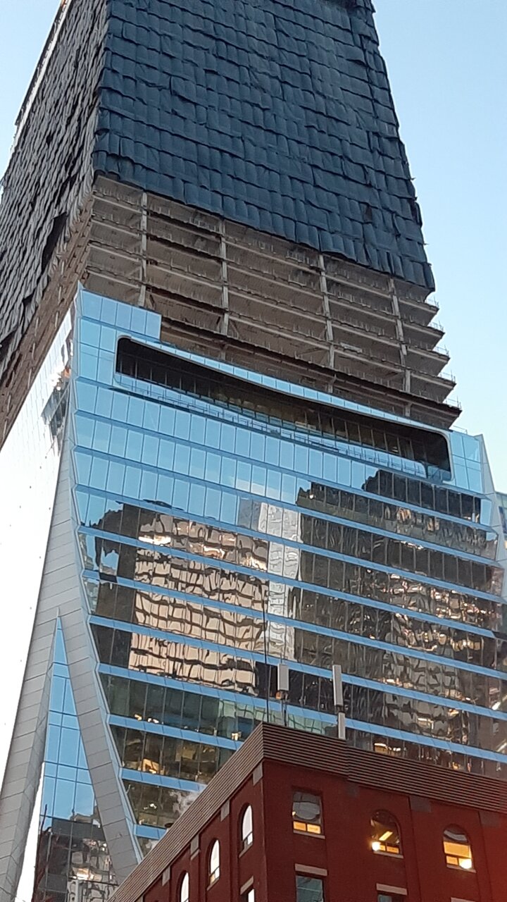
Northern Light
Superstar
Just a couple today, December 13th, 2022, from a distance, coming into view from Adelaide, looking across the eastern flank of the 19 Duncan site:
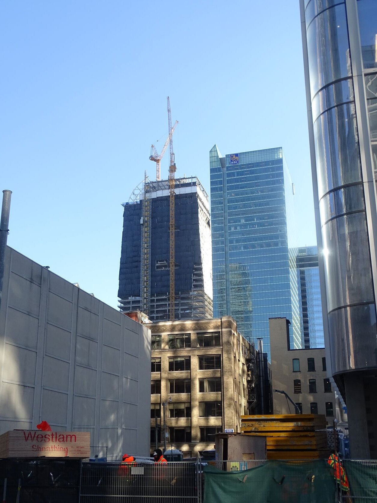
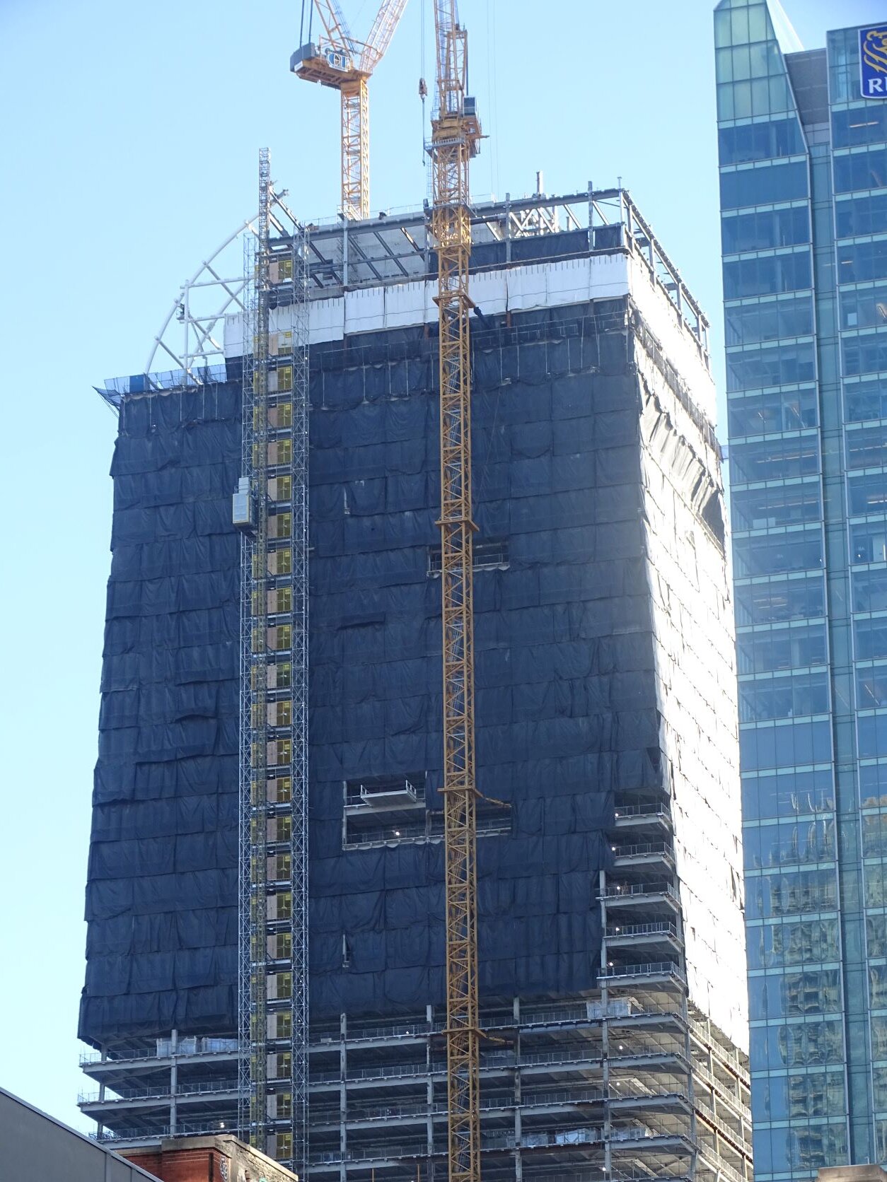
Johnny Au
Senior Member
Part 1 of 2 of night shots taken on December 14, 2022:
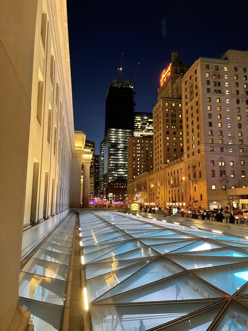
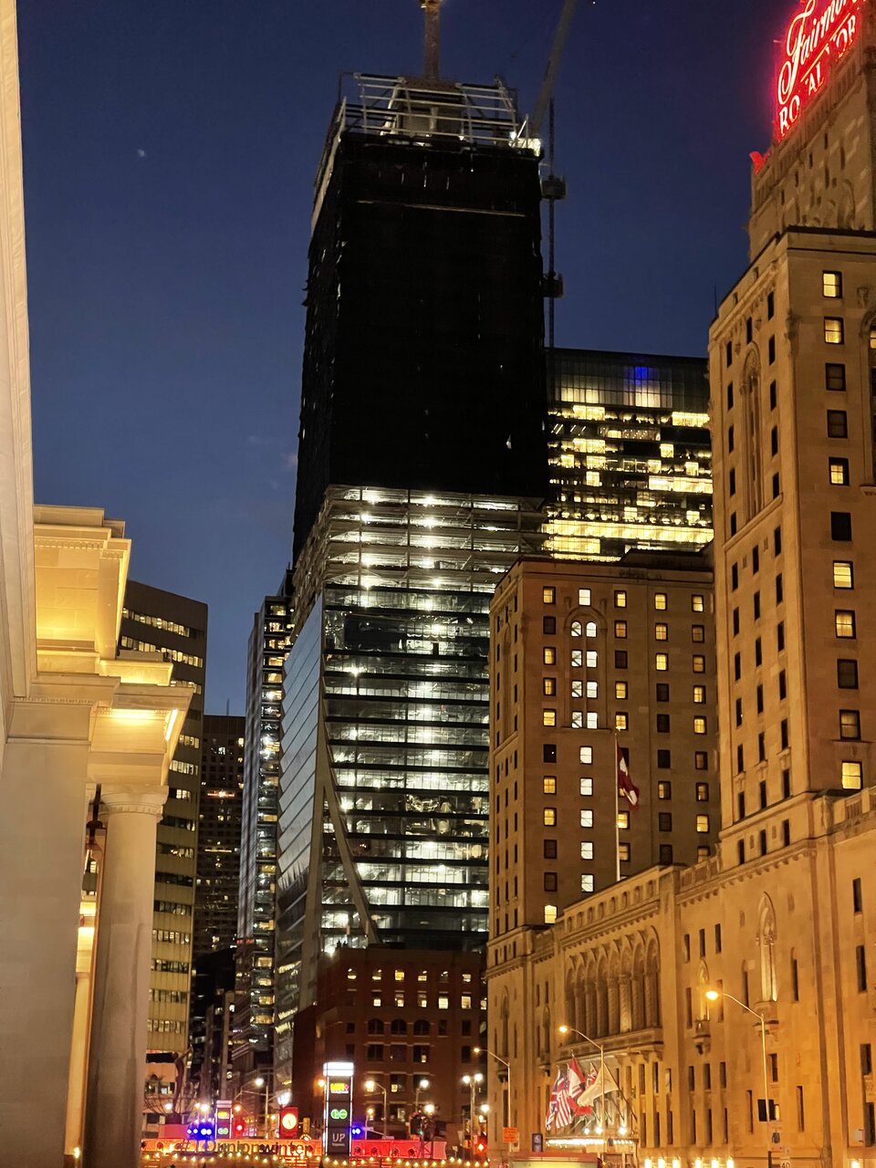
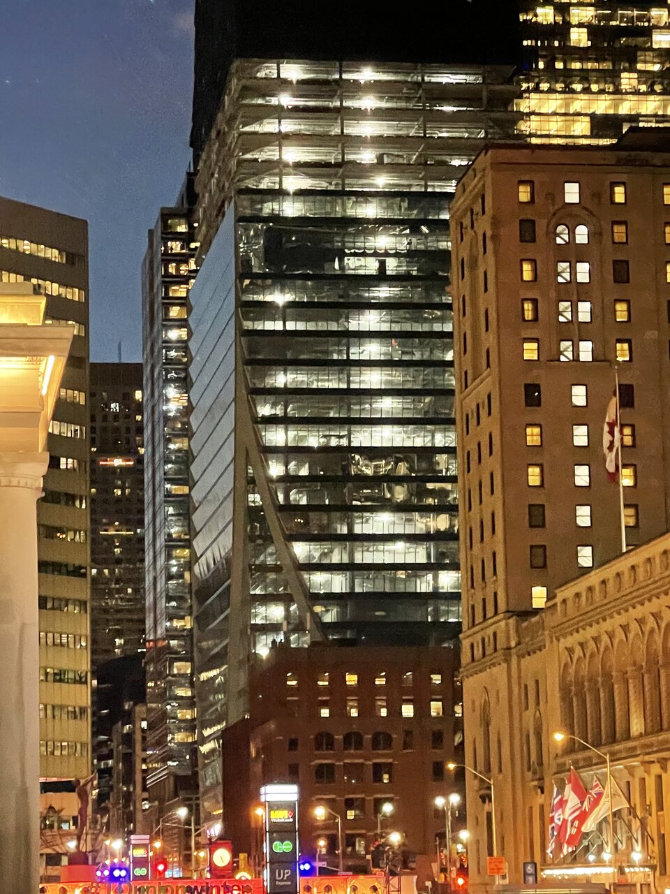
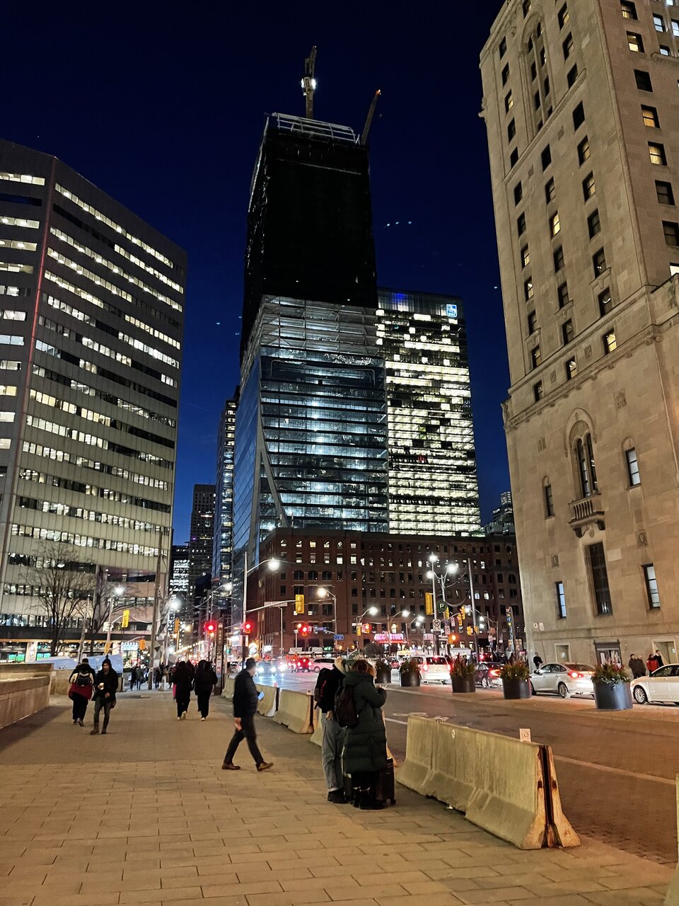
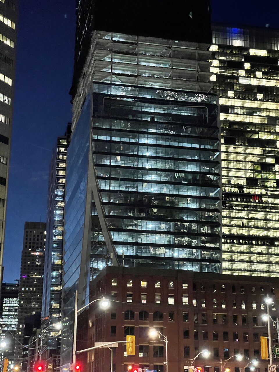
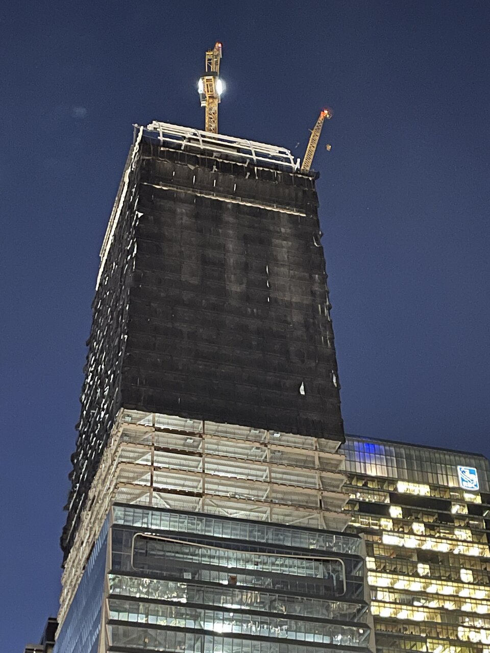
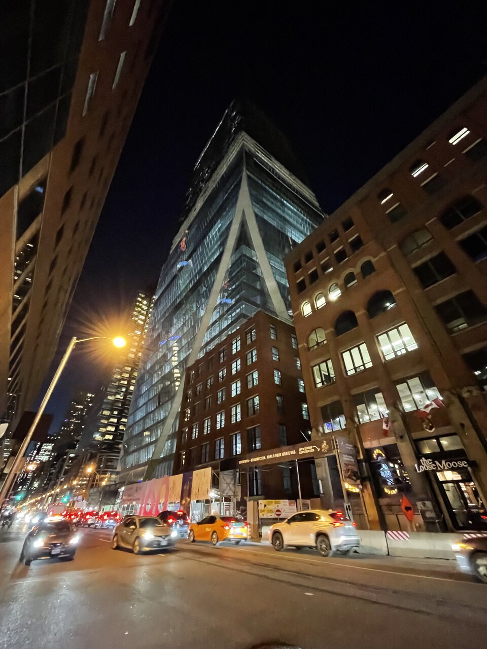
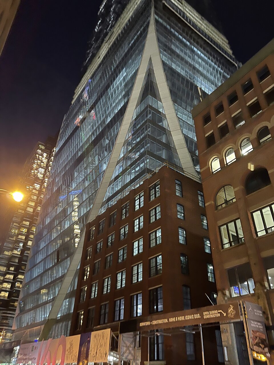
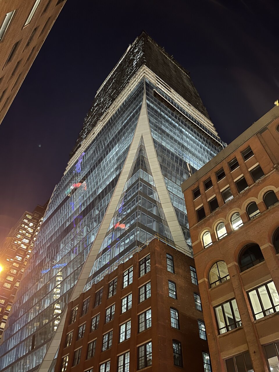
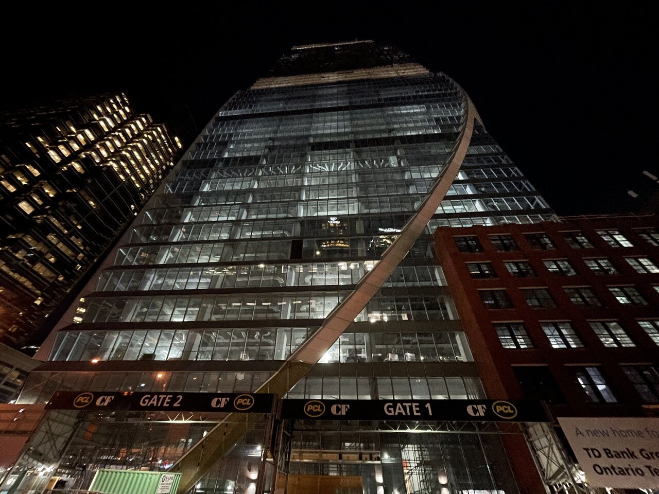
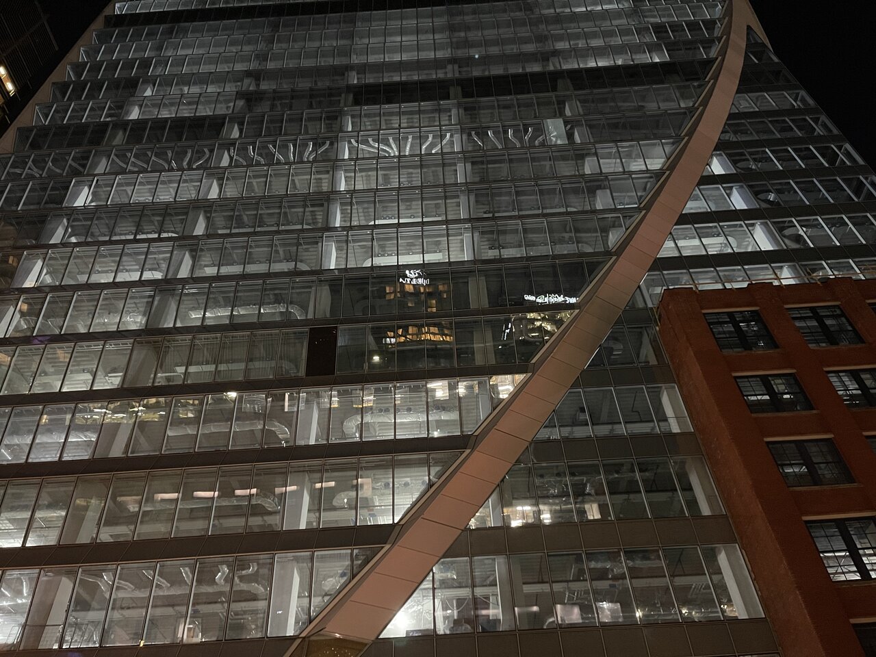
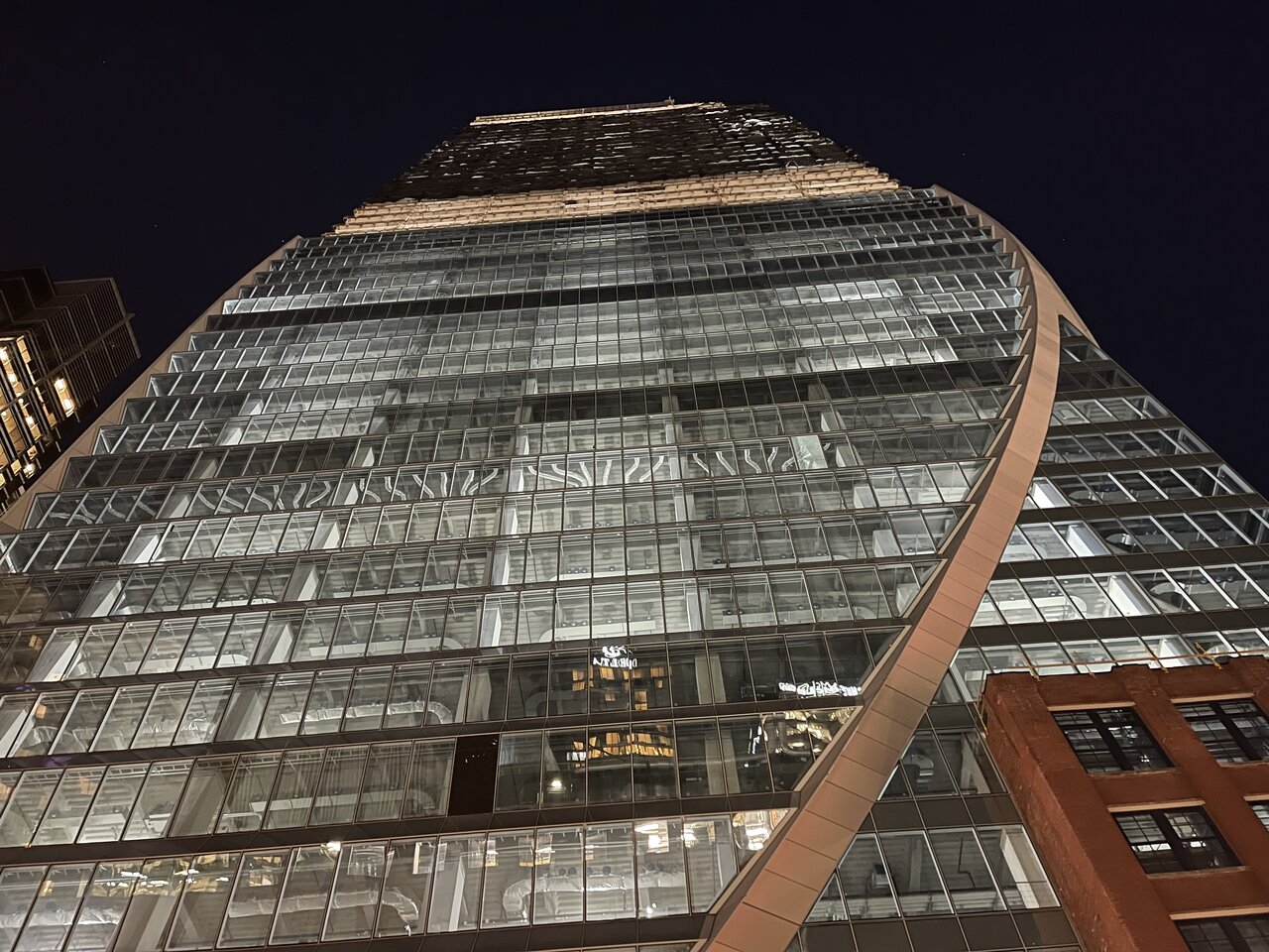
Part 2 will be posted tomorrow.
Part 2 will be posted tomorrow.
Last edited:
emphurent
Active Member
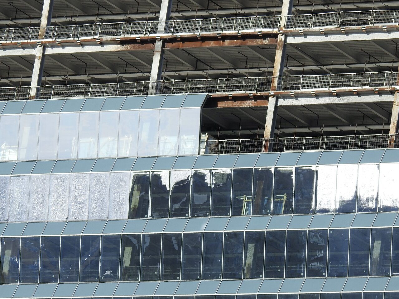
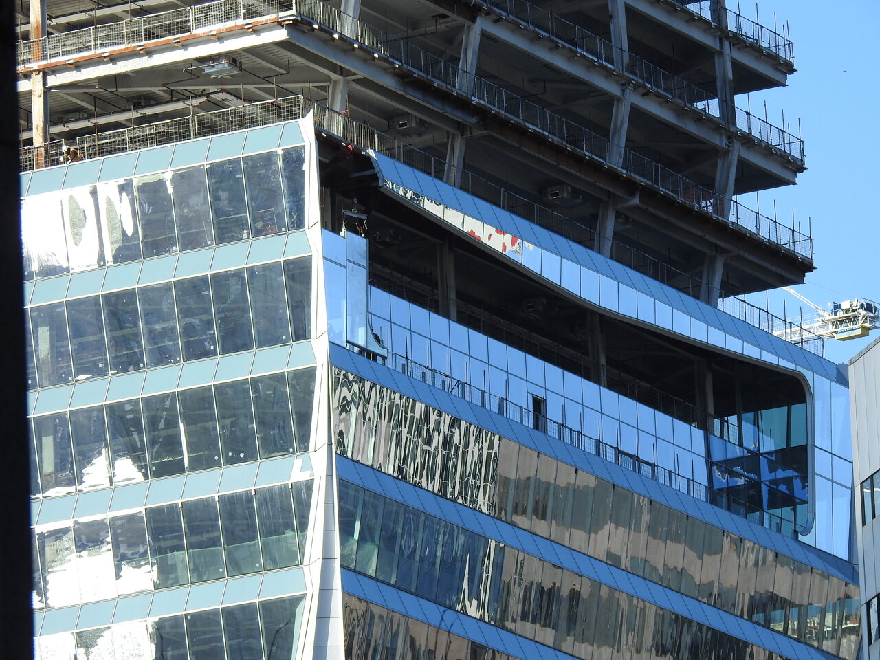
I really think they should've gone with something other than glass for the little bit on this side, feels so out of place besides slightly leaning out.
It's a classic case of not wanting the one smaller piece to compete with the showcase component… and then going too far to subordinate it, to the point where it actually detracts from the whole.
42
42
UtakataNoAnnex
Senior Member
...but it's so off to the side though that from most prominent angles it will be largely unseen. And for what that's worth.It's a classic case of not wanting the one smaller piece to compete with the showcase component… and then going too far to subordinate it, to the point where it actually detracts from the whole.
42
condovo
Senior Member
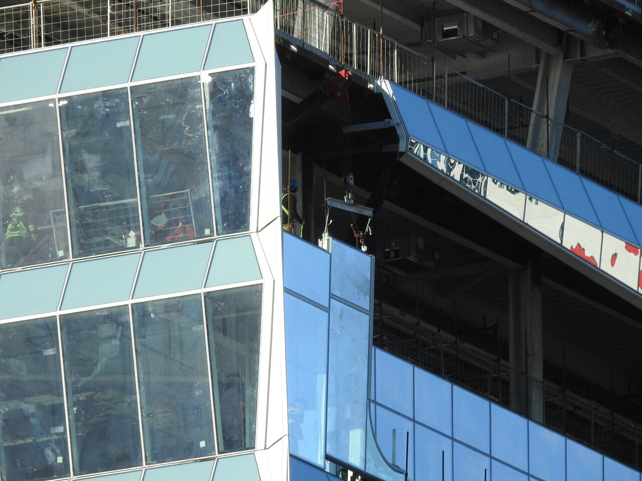
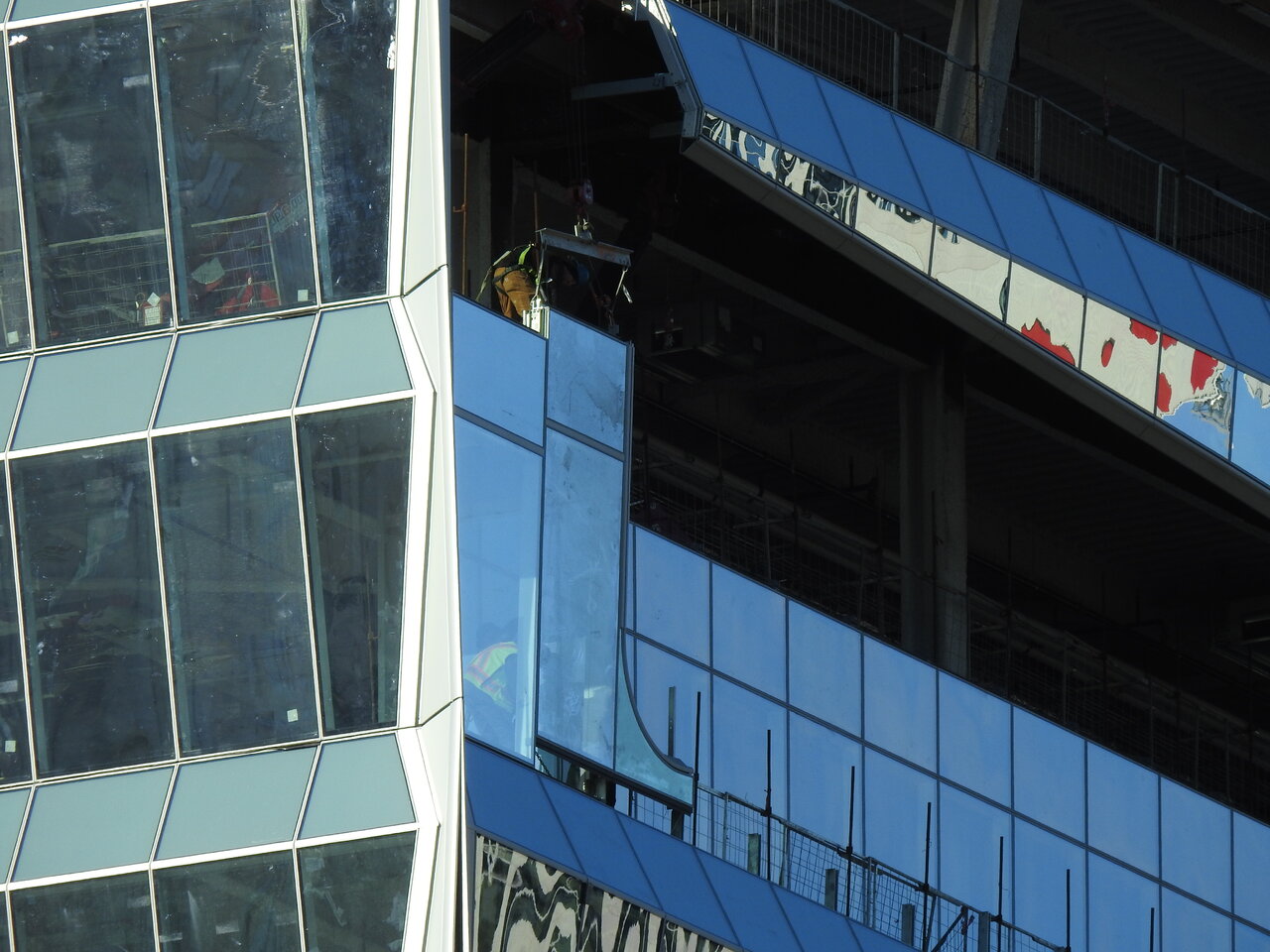
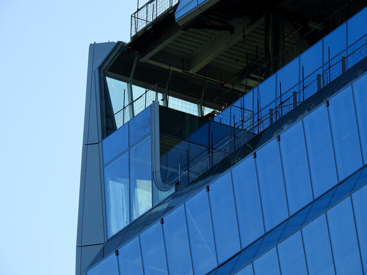
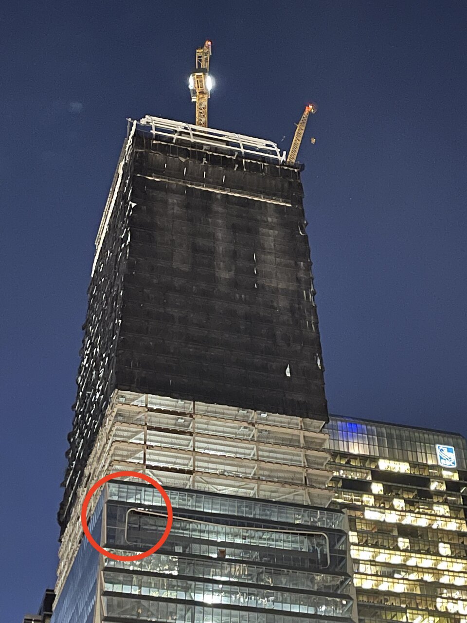
Something's amiss here. One of the panels is off. The curve of the maw / inlet isn't smooth. The surrounding panels seem to fit properly though.

Pic by @Undead
Pic by @Johnny Au
Pic by @Undead
Pic by @Johnny Au
Johnny Au
Senior Member
Part 2 of 2 of night shots taken on December 14, 2022:
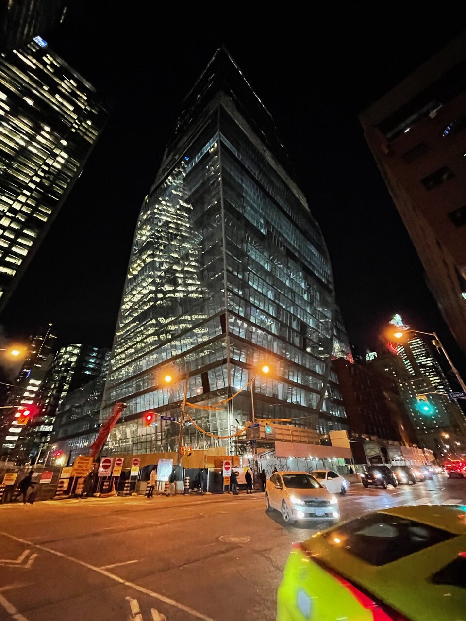
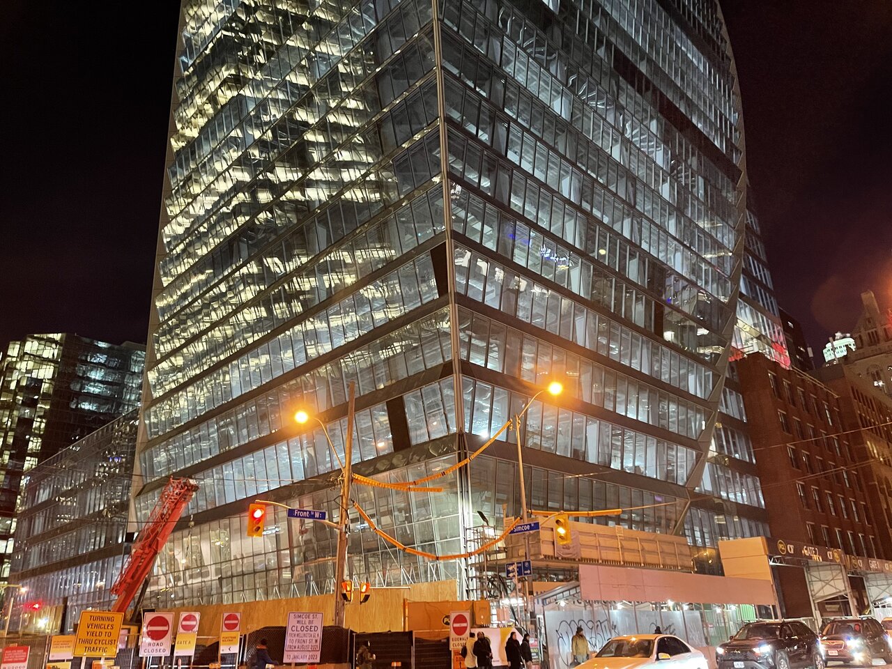
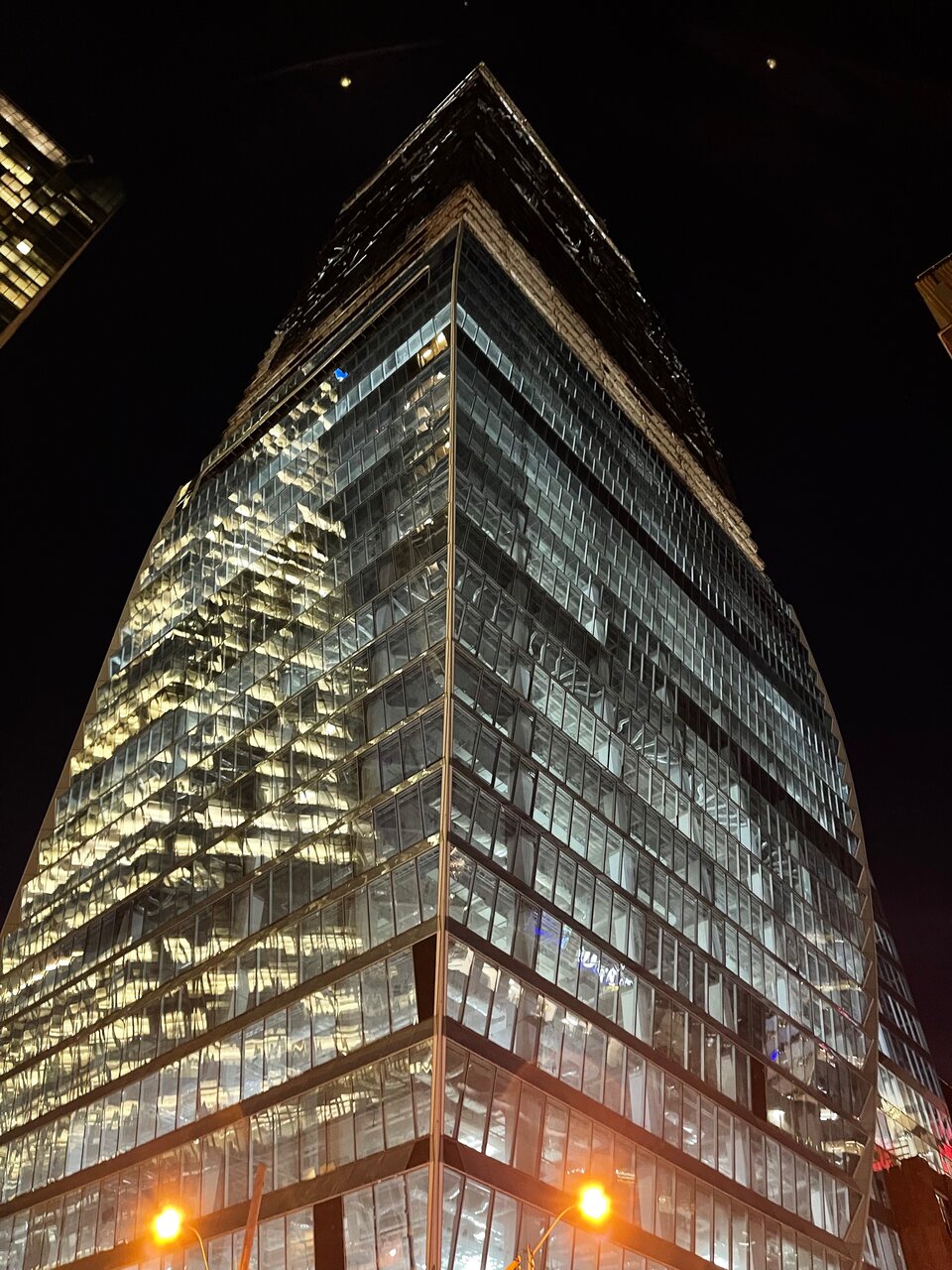
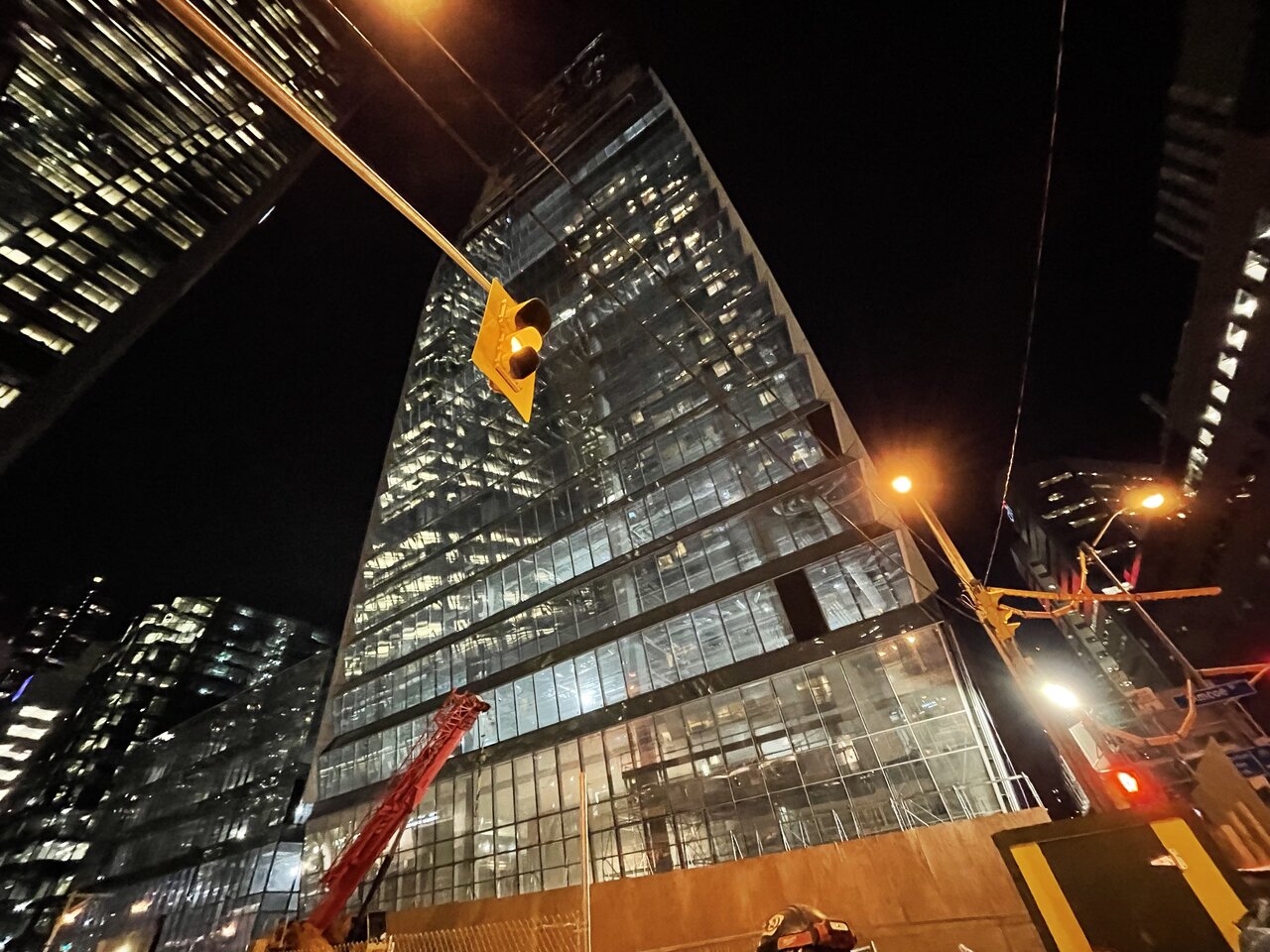
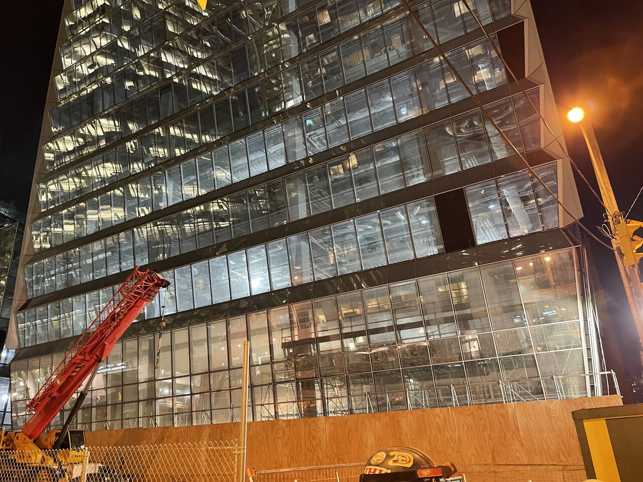
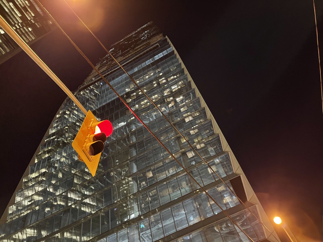
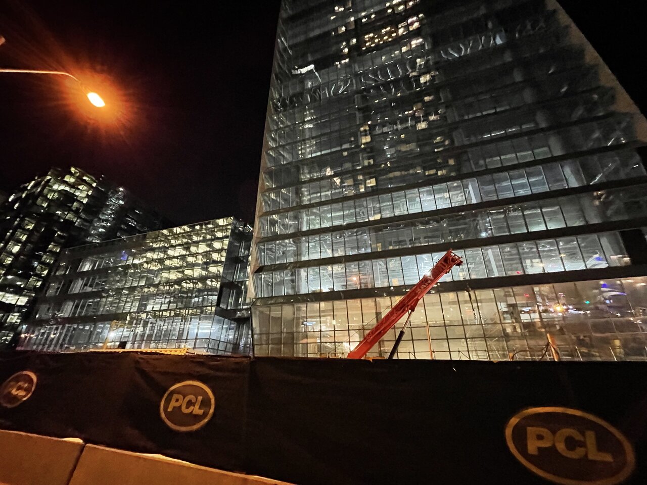

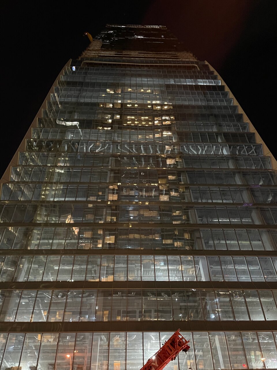
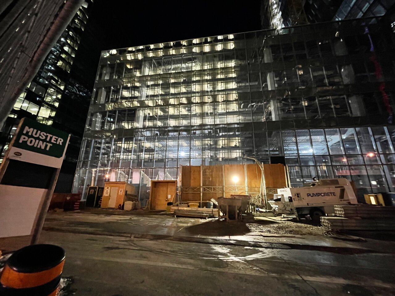
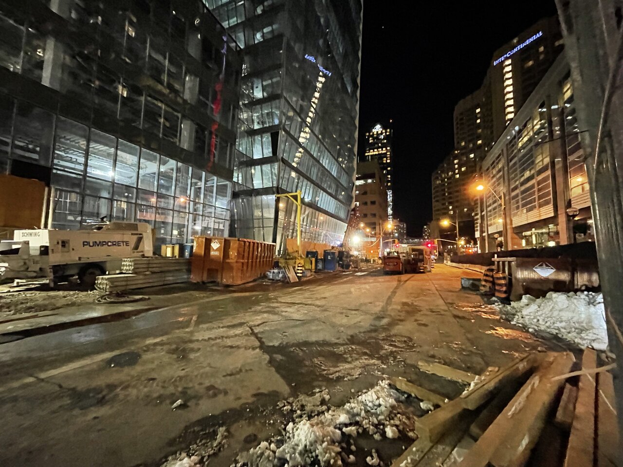
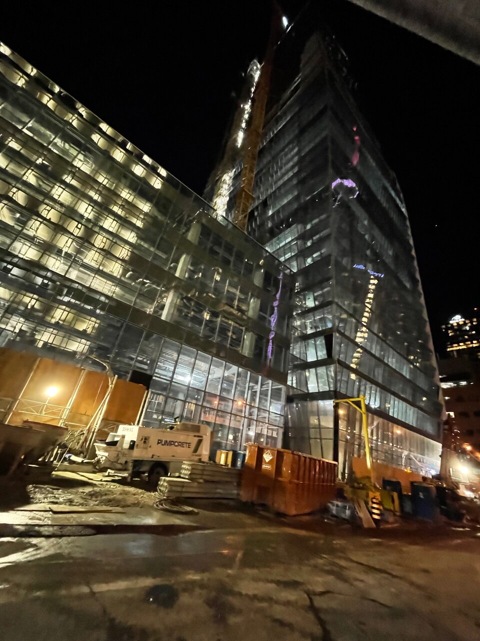
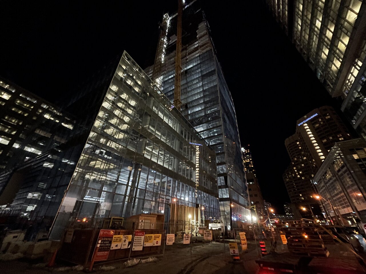
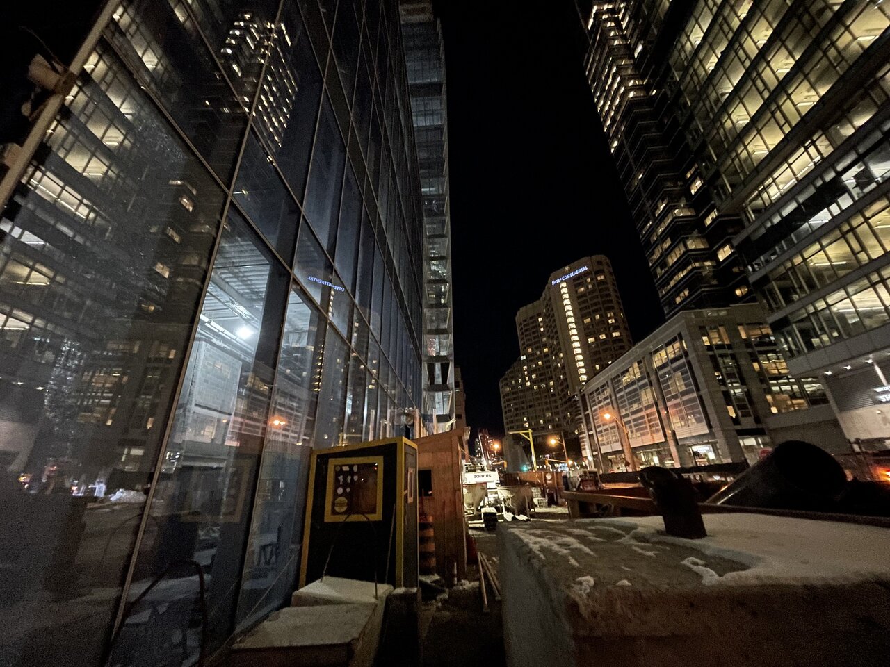
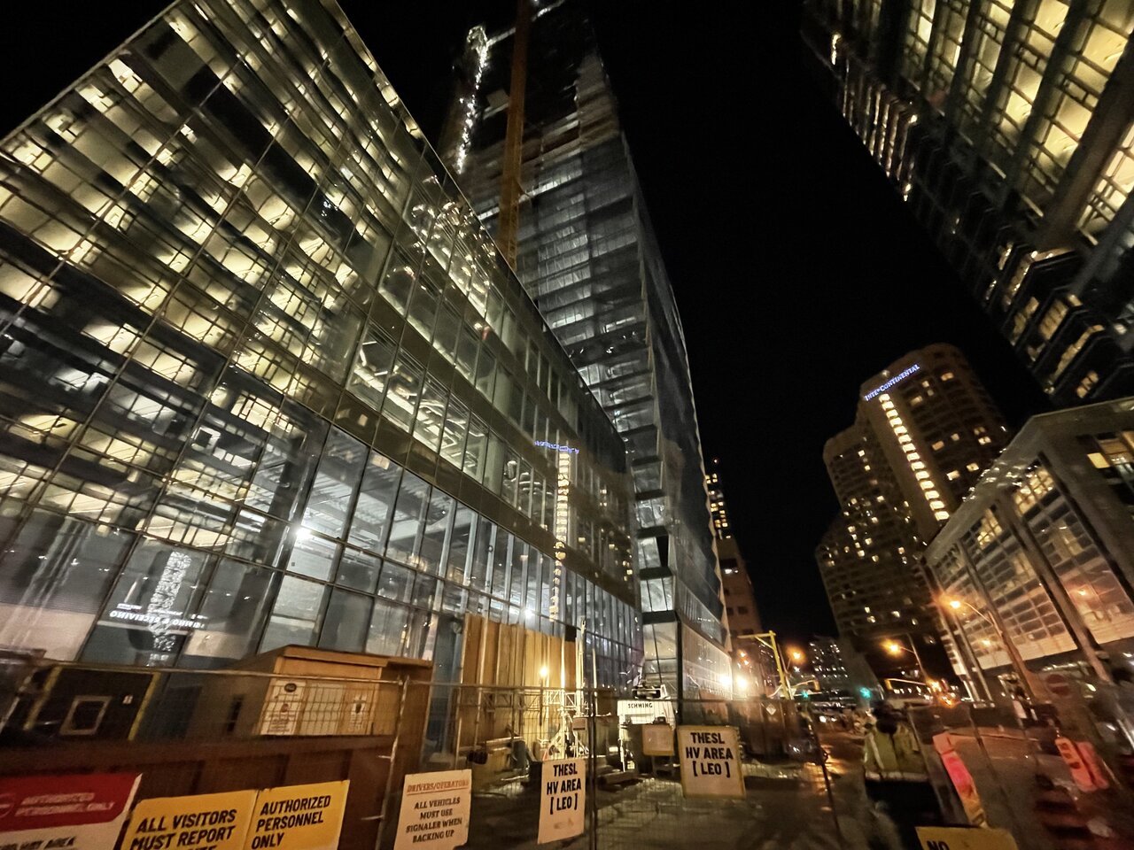
One of the construction workers told me that the PCL logo cannot be photographed. Well, too bad for them because the PCL logo isn't sacred.
One of the construction workers told me that the PCL logo cannot be photographed. Well, too bad for them because the PCL logo isn't sacred.
Last edited: