Today

IMG_1077.jpeg


IMG_1078.jpeg


IMG_1080.jpeg


IMG_1081.jpeg


IMG_1079.jpeg


IMG_1082.jpeg
 
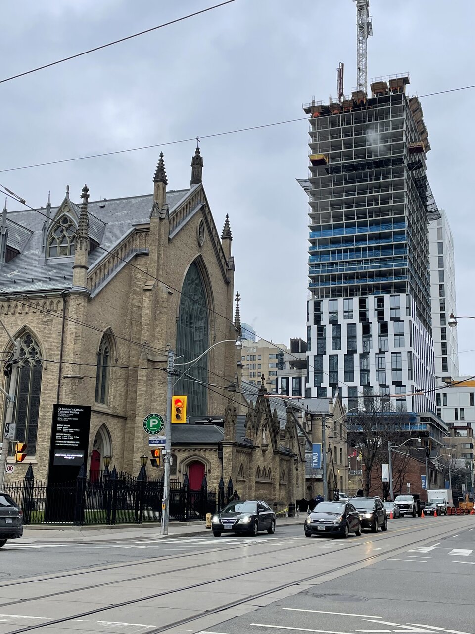
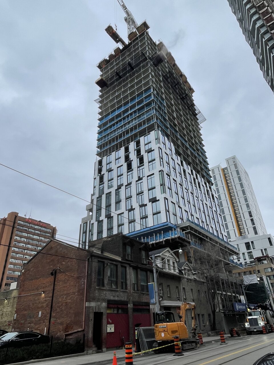
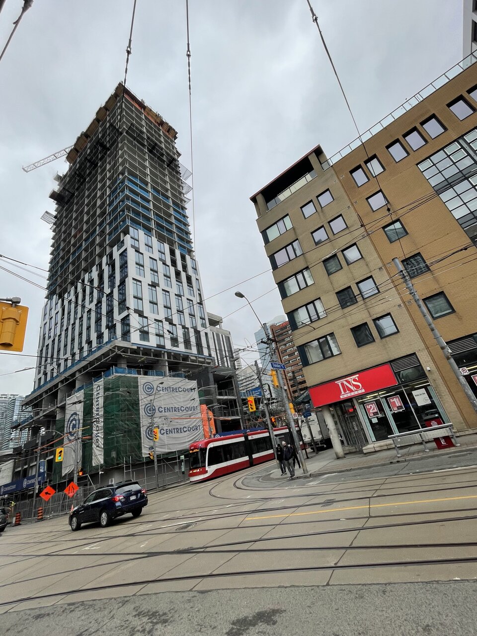
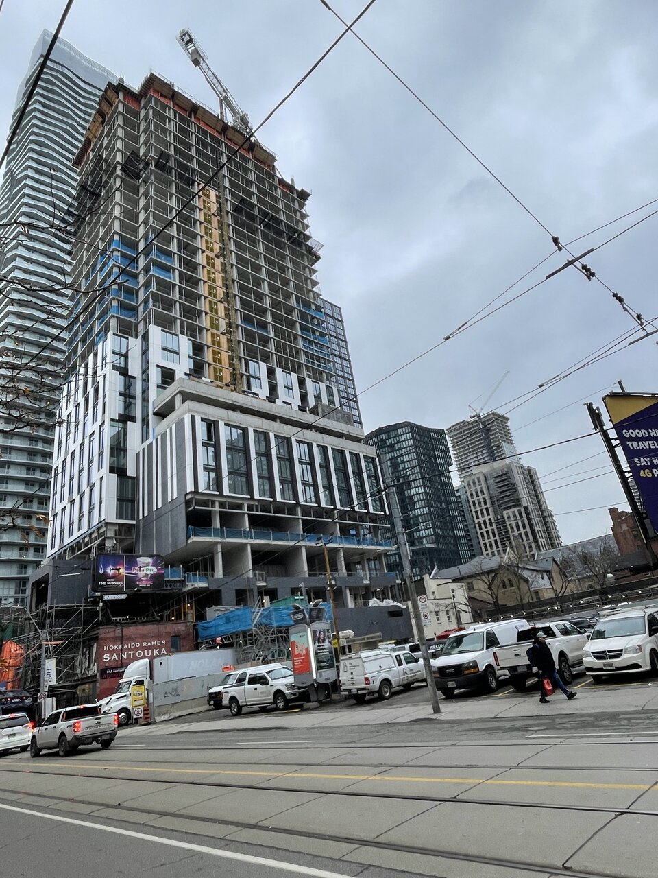
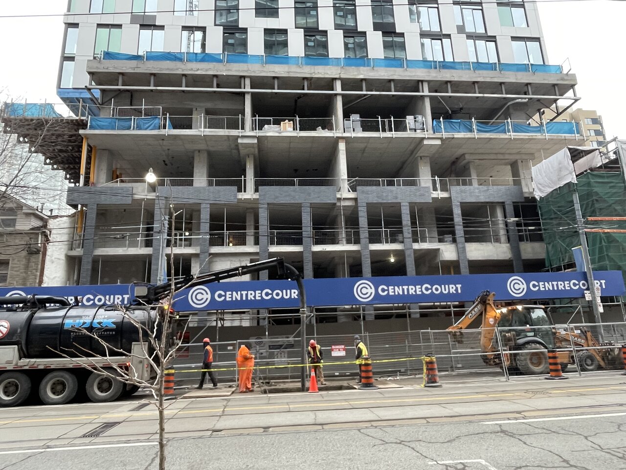
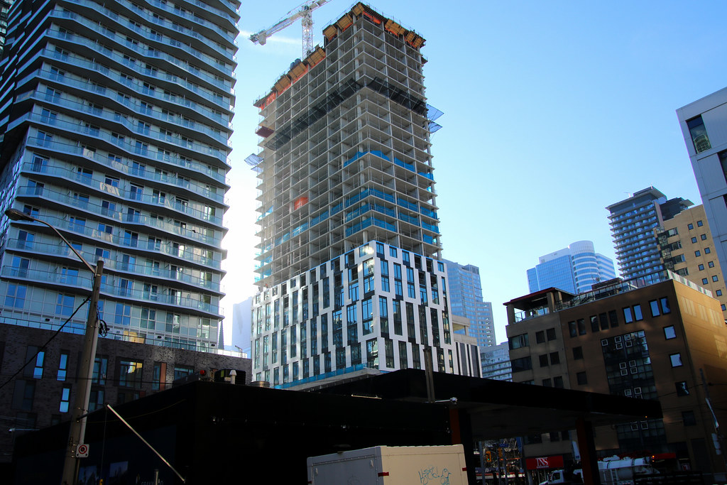
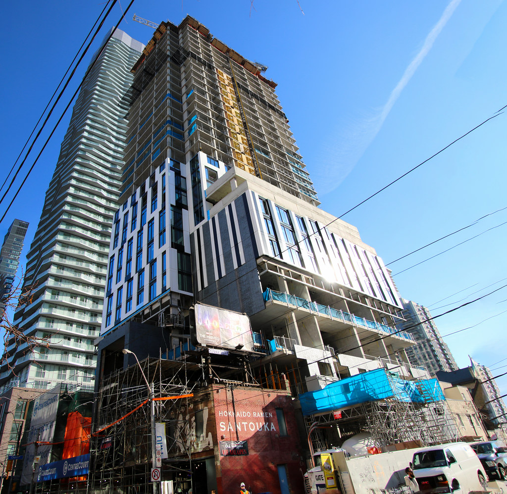
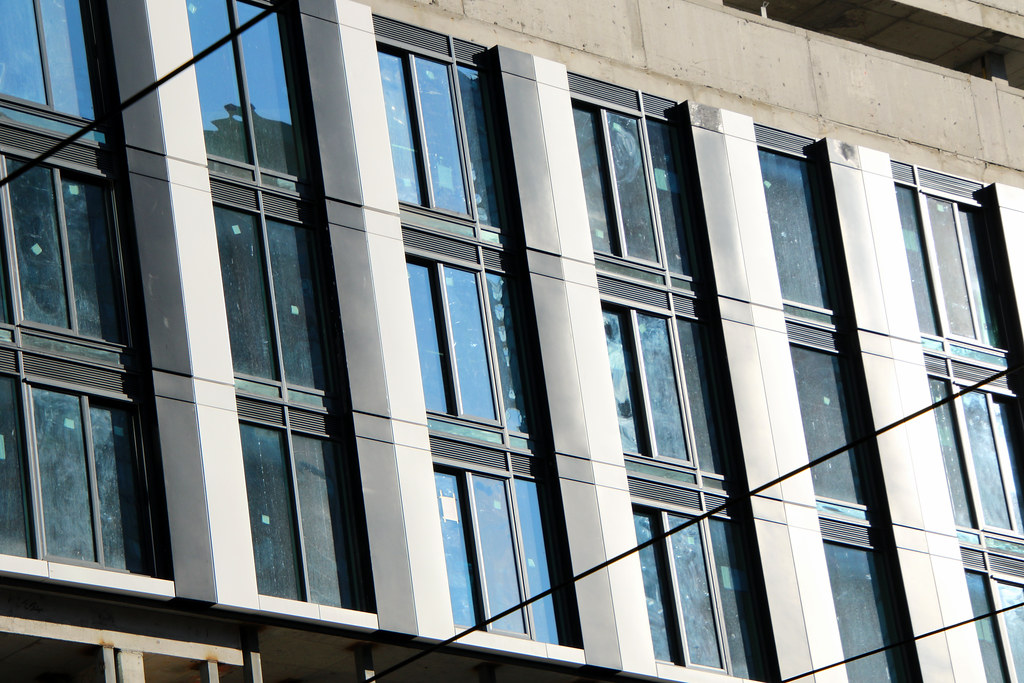
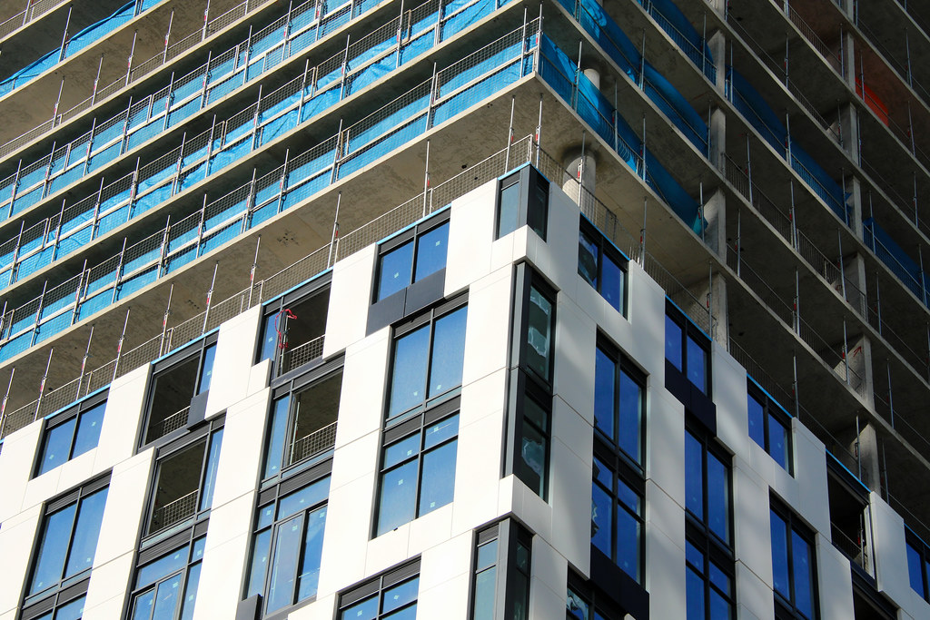
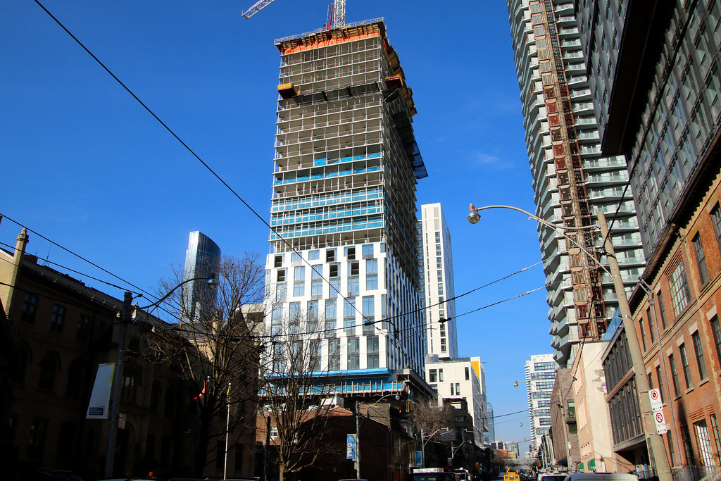
Just needlessly fussy and poorly detailed - pay attention to the window widths. Poor materiality, relentlessly monochromatic.

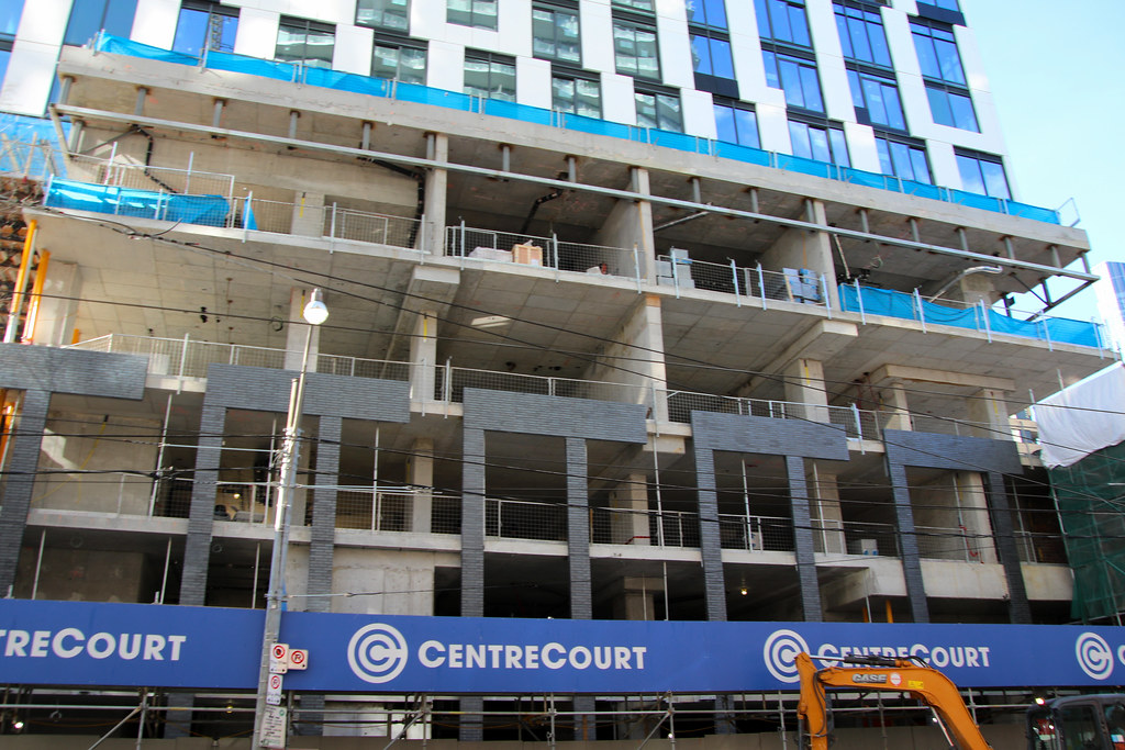
Black and white towers seems to be centrecourt’s “thing” and based on their model of selling primarily to investors I doubt this will change since the formula appears to be working

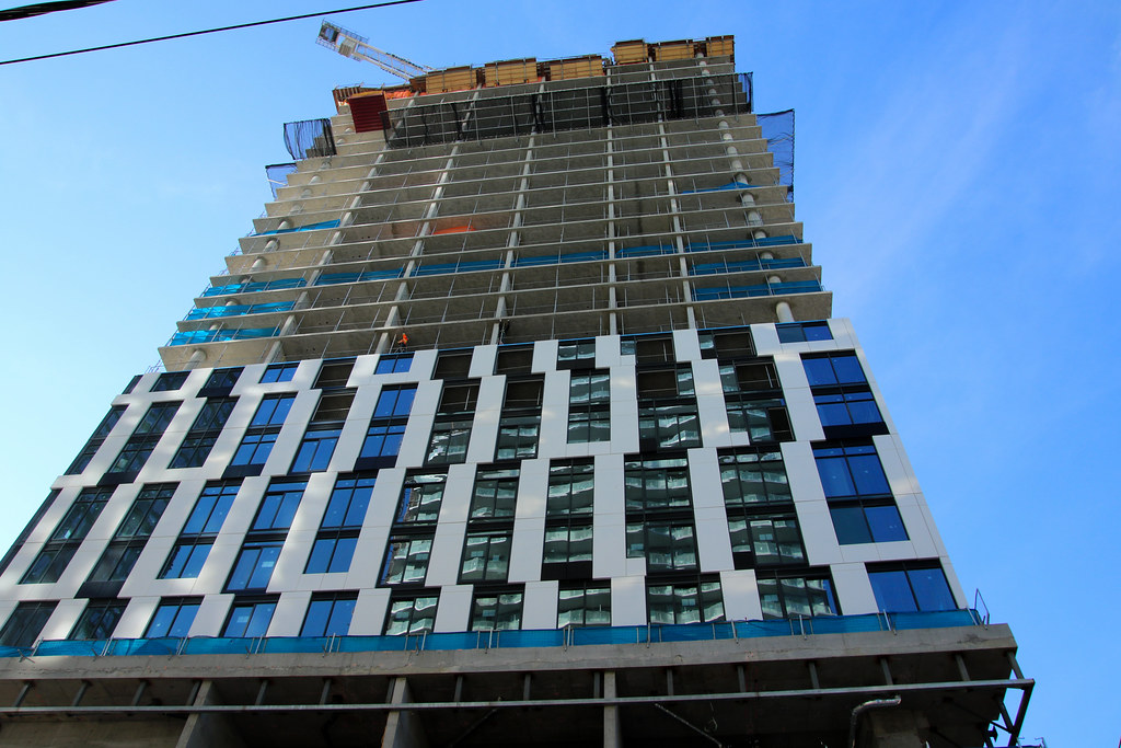
I find the choice to stagger the windows here (not line them up in columns) annoying. Visually it gives you that busy feeling w/o giving anything back. It feels like the reason was 'just cause'.

While I'm otherwise unimpressed, thus far; I think if that were addressed I could cheerfully ignore any other shortcomings on the tower, because 'At least its not 'Social''.
 
I could be wrong, but I believe the white panels shrink in width as it goes up, which accounts for some of the variance in the windows

It kinda works in context. I like that it looks somewhat solid, and doesn't read as another glass box. I like the lack of balconies. It plays off of the Ryerson building to the north. It's by no means an excellent tower, but looks like it could be one of the better additions to that node
 
I find the choice to stagger the windows here (not line them up in columns) annoying. Visually it gives you that busy feeling w/o giving anything back. It feels like the reason was 'just cause'.

While I'm otherwise unimpressed, thus far; I think if that were addressed I could cheerfully ignore any other shortcomings on the tower, because 'At least its not 'Social''.

It’s the result of trying to keep the same design language as the original design before it was VE’d.

Buildings always look better when they're built as they're designed (even if the initial design isn't a show-stopping stunner) rather than being drastically altered. Architects/developers should develop feasible designs from the get go, but understandably they’re all trying to market and sell to win.
I am not sure if they even went with that design they would of addressed the issues that Mr. Capizzano raised...beyond maybe looking less painful to look at.
 

Back
Top