salsa
Senior Member
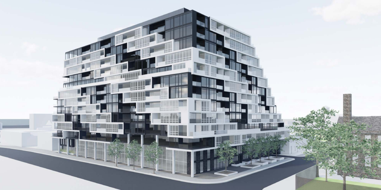
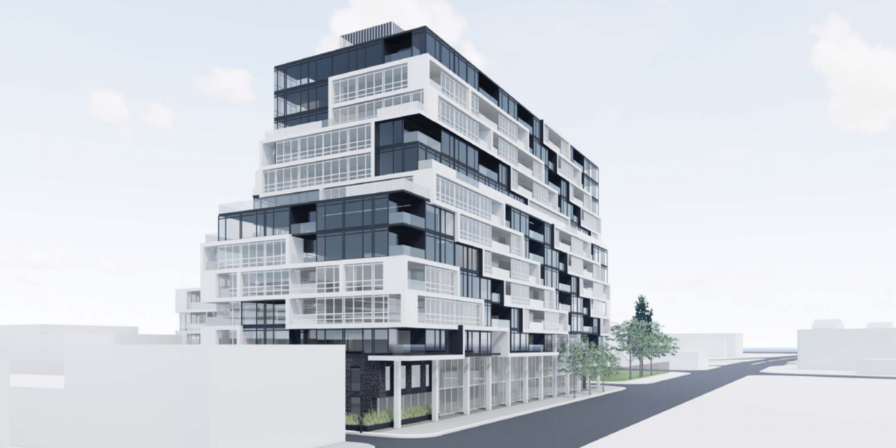
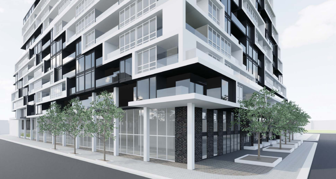
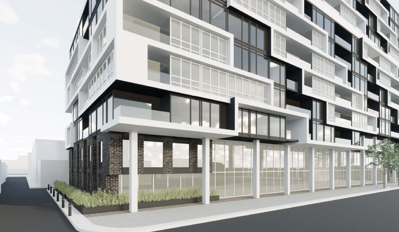
Some renderings:


Somewhat reminiscent of the fairly new building at Eastern/Front just west of Trinity.Looks pretty stodgy-bulky. Not a lot of refinement there.
I'm not convinced by the latest rendering that this is being value engineered so much as just getting a final look: there are fewer mullions on the windows now, so larger panes of glass which are more expensive (and look better), and if that's brick-embedded precast panels that they'll be facing the non-black portion with, that looks like a step up to me too. I'd like to see some of that at ground level too though, so here's hoping the final design improves on how the building meets the street.Alterra may still be busy value-engineering any elegance out of this design, but a giant black "Coming Soon" sign's just appeared on the site suggesting sales aren't far off: View attachment 233843
