I know I'm asking a very stupid question, but, isn't there any danger in living right beside a substation? Does it not generate a huge EMG field? I know from a health care point of view, these fields can have some pretty serious side effects on the human body, depending on the field strength that is. Does anyone know anything about this? I hope I'm just being paranoid, but personally, aside from the hideous aesthetics they chose to clad this tower, you couldn't pay me to live beside a substation. Way to go Tridel, remind me why they are allowed to build in the core?

This substation will likely be dismantled once the new one at the roundhouse is built.
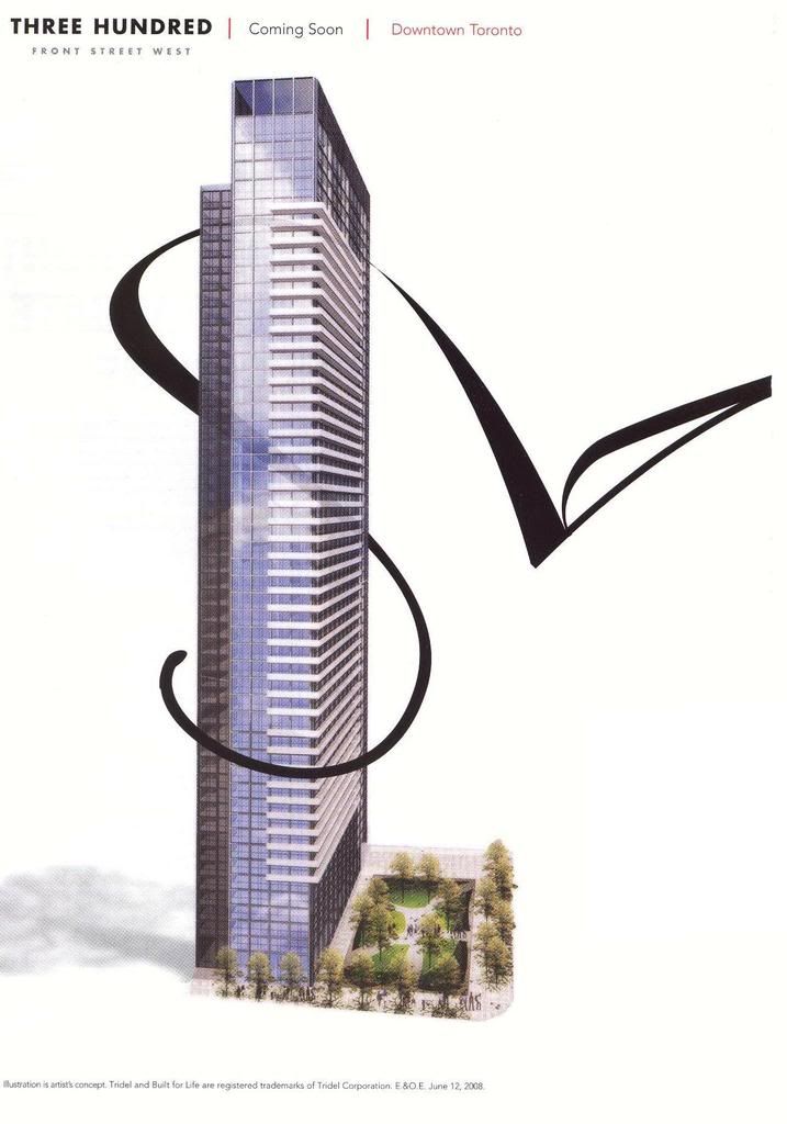
 
The problem with this building is definitely that the light grey wall panels look darker than the framing, and that the windows are not reflective or frosted or anything that would get it close to the light grey it is surrounded by. The dark sections of this building look fine. The light sections looks seriously cluttered because the lighter frames stand out so much. Definitely a fritted balconies will help but on the side of the building without balconies and with a mix of light and dark grey panels will not be saved at all by that.
 
I don't quite see the bait-and-switch in this project. The problem lies in the fact that the render deceitfully depicts the windows on the white portion as being much lighter than they really would be.

That sounds like a bait and switch to me. They could easily have used a more reflective glass on the lighter sections.

300-2.jpg
 
See at the bottom left in the mice type where it says "Illustration is artist's concept" - well, that's what it is! No one is saying the final product is going to be EXACTLY as shown. That's kinda ridiculous. IMO, as long as the interiors are as sold, I don't think the average person really cares what the outside looks like down to every last detail.
 
See at the bottom left in the mice type where it says "Illustration is artist's concept" - well, that's what it is! No one is saying the final product is going to be EXACTLY as shown. That's kinda ridiculous. IMO, as long as the interiors are as sold, I don't think the average person really cares what the outside looks like down to every last detail.

"I don't think the average person really cares what the outside looks like down to every last detail."

and that's precisely why no one who is commenting on how incredibly ugly this building is cares what the "average person" thinks. because this "average person" hasn't a clue.

anyway, why are you putting yourself forward as a 'representative' of what the "average person" thinks?

do you have a freelance lobbying gig with AveragePerson Inc.? or are you yourself an "average person"?
 
They can't possibly be leaving the north wall like that.... can they???

Maybe they will treat the north wall like Tridel did with Element's west wall (lower 12 floors or so) before Fly covered it up? On Element, it was either painted or covered with precast panels. It wasn't the greatest, but a marked imporvement over the exposed concrete that is currently on 300.
 
This substation will likely be dismantled once the new one at the roundhouse is built.

The Windsor sub-station will undergo refurbishment after the new one south of Bremner is built after which it will be put back into service. The new sub-station at Bremner will not replace the Windsor station, but rather is need simply to support increasing power needs in the area.
 
See at the bottom left in the mice type where it says "Illustration is artist's concept" - well, that's what it is! No one is saying the final product is going to be EXACTLY as shown. That's kinda ridiculous. IMO, as long as the interiors are as sold, I don't think the average person really cares what the outside looks like down to every last detail.

"Illustration is artists concept" - so then, they use an artists concept to sell a product that doesn't end up looking like that illustration. That sounds a bit misleading, no?

If I was buying into 300 Front, I sure as hell would want the building to look good, both inside and outside. 300 Front was to be a landmark tower for Tridel, but the Del Zotto brothers failed us once again with their hardon for spandrel. For a company with so much history, success, so much money - they sure are great at building mediocre buildings.
 
Re: Renderings & "bait & switch":

I think I end up posting this same explanation once a year to this ongoing silly debate about rendering and so called "bait & switch" tactics.... Maybe the rendering looks slightly different from reality because an artist is hired to draw a vision of what the building may look like in the future. The rendering for 300 Front Street is almost exactly what is being built. I still don't understand why anyone expects a drawing or painting based on possibly some initial blueprints and a creative imagination to be an exact replica of the future. As I've said before, the artist that did the rendering is not the architect, the artist did not design the building - they merely interpret the plans that they are given and add some shine to it given that renderings are for marketing purposes (Does a beer ever pour as perfectly or look as perfect as on a tv commercial with the Swedish bikini team dancing around?)

When the rendering was done it is also very likely that few decisions such as the orders to manufactures for windows or exterior treatment were actually made - these decisions, along with many construction related contracts are often made further along in the process than initial sales & marketing promotions.

For those complaining about the renderings - well they serve a sales and marketing purpose to give a general idea of what the building will look like. So far the renderings are pretty well dead on (especially the more detailed one that differentiates between spandrel and window applications). The buildings are the same shape and use the very similar looking materials - how could anyone expect the glass to have the same artistic qualities of a painting/drawing - I suppose I should be upset the sky isn't the same blue as the background of many renderings and complain how crappy the sky in Toronto looks in the photos posted, or perhaps I should be upset there isn't a bird flying by because that is what I saw in an artistic rendering to promote a project.

If viewers would look at the rendering for what it actually is... maybe they would find that in this case so far the rendering has been very accurate, right down to the window pattern.

Please note I'm not defending the particular outcome in terms of material quality for the project - I'm simply describing some of the sales & marketing process vs actual tendering of contracts and the ridiculous standard that some people place on a piece of marketing fluff to give purchasers a general idea of the product they are buying based on an "artistic" rendering.
 
In a less imperfect world, the architect and developers would look at the render and get the artist to redo the render to more accurately depict the final product.
And I have only been on this forum a year so I didn't mean to bring up a topic previously explained. My bad.
 
In a less imperfect world, the architect and developers would look at the render and get the artist to redo the render to more accurately depict the final product.
And I have only been on this forum a year so I didn't mean to bring up a topic previously explained. My bad.

The tower has been virtually sold out for a couple of years... why would the developer or architect re-commission a drawing that is entirely for the purpose of sales & marketing? (because really that is all the rendering is utilized for - it has nothing to do with the land-use planning approvals process and online forums really aren't high on the priority list of stakeholders).

Also I didn't mean to be difficult about the topic coming up again - most topics tend to do that.
 
You entirely misinterpreted me. I meant that they should have revised the renders before releasing them years ago...nobody with half a mind would have suggested that the renders be remade at this stage of the game.
 

Back
Top