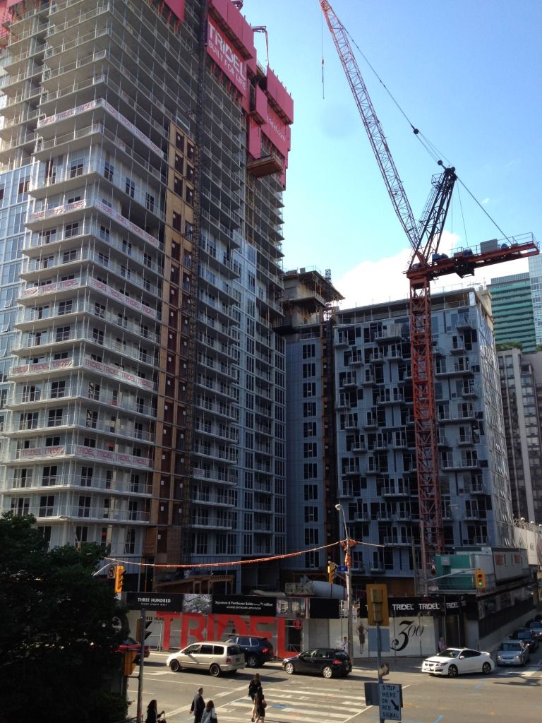
Thanks for all the information, to both Mike and Tridelwebmaster.

In the end, despite spandrel being LEED accredited, durable etc... it still looks like crap. I had to say it! (it's my urbandreamer moment).


Agreed. Tridel is free to post an entire report on how spandrel glass is the more expensive and/or energy efficient option, and I'll believe it. It still makes their buildings look like uninspired suburban sh*t.
 
The Condominium Act provides that if a change, or series of changes, occurs to the condominium project or to any of the information set forth in the disclosure statement, then the purchaser has a right to rescind the contract within 10 days of the later of:

  • the date on which the purchaser received a revised disclosure statement reflecting a material change, or notice from the declarant confirming a material change has occurred; and
  • the date on which the purchaser became aware of the material change

Upon receiving notice of rescission from the unit purchaser, the declarant is obliged to promptly refund all money received from the purchaser and credited towards the purchase price, together with interest thereon calculated at the prescribed rate, accruing from the date such monies were received, to and until the date that the declarant has refunded same.

"A material change" is expressly defined in the New Condominium Act as a change, or a series of changes, that a reasonable purchaser, on an objective basis, would collectively regard as sufficiently important to the decision to acquire the unit, that it is likely that such purchaser would not have entered into the contract, or would have exercised the right to rescind same, if the disclosure statement had originally contained said change or series of changes....

I would think a purchaser would have a hard time arguing that the shade of the spandrel would constitute a material change - as for the amount of spandrel vs clear vision glass, the floor plans would fairly accurately depict where windows are vs where walls are located - I don't know the exact details regarding this project, but I would be surprised if this particular developer suddenly replaced a large percentage of windows with solid walls - that would constitute a material change for which purchasers could back out of the contract.... especially given that the rendering is not included in the purchase and sale agreement and is not legally binding, it is an "artistic" rendering, not a legal document - however floor plans are included in the p&s agreement and are part of the contract.
Great post, although if I were to play lawyer in some imaginary suit I'd definitely chalk up some billable hours crafting some arguments for why changes to the spandrel counts as a 'material change.' After all, if we trim the legalese in the definition, a 'material change' is defined as whatever is important enough to persuade a reasonable person to buy or not buy the unit. I think super crappy exterior design is such a thing.

Though you do raise another interesting point about what should be admitted as a legal document portraying the intended design of the building, and I admit that 'artist's illustration' doesn't quite cut the judicial mustard here. And without such a document, there's nothing on which one can base the claim that there's a material change from what the building was originally supposed to be.

But at that point I might attempt to launch some counter-argument that such an artist's illustration, if used extensively in marketing and promotion, should, for all intents and purposes, be admissible as evidence to ground the 'material change' argument above.

Yes, if I were a lawyer I'd likely be evil.
 
^^ Of course, if you buy a building because you love the look of it, including the colour, and then you end up with a building like Crystal Blu, you would have every reason to be pissed and demand your money back. For something as important as buying your home, you want to get what you were promised. Developers should be forced to stick to the design and even colour, that was promised. If you love the colour blue and end up with ugly grey, that is a significant material change to me. It's false advertising and it needs to stop.
 
....Spandrel is considered a premium finishing material that adds to the cost of the building in two ways.....

....spandrel leads to a better high performance building and should not be construed as a sign of a 'cheap', poorly designed or constructed building or an expedient way to cut corners as this is completely false. Our use of spandrel is intended to provide our purchasers with a superior condominium home.

In the construction of our buildings, a large number of our own design build team and Toronto's top professionals collaborate on bringing the best building they can to the market.....

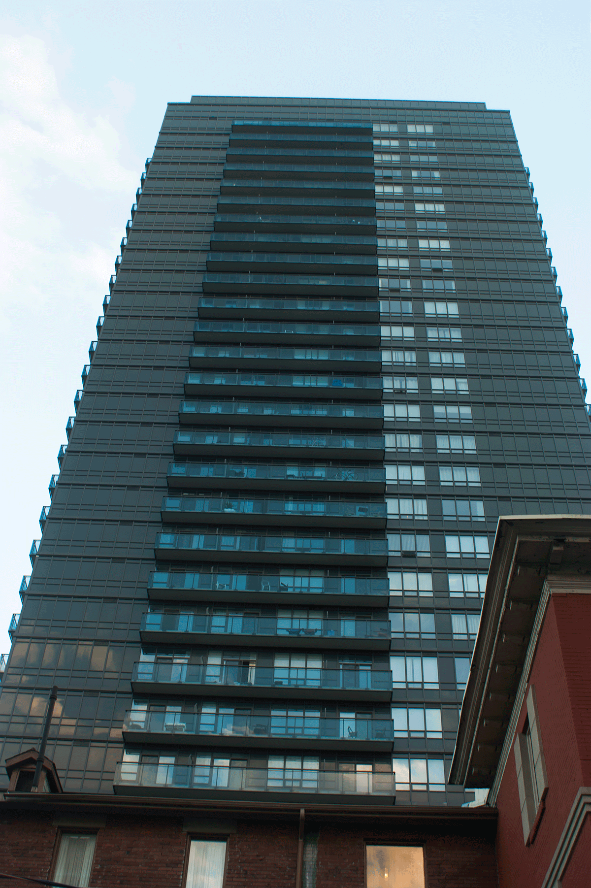
its really difficult to make these kinds of arguments when you end up with an entire wall of spandrel that looks like this.

i drive by James Cooper Mansion everyday and i remain stunned at how unremittingly dead, dull, unpleasant, and yes, 'poorly designed' this side of the building is--the very side that faces Bloor Street, one of the major thoroughfares in the city.

based on examples like this, it's not surprising that there are a lot of people out there who have their antenna up with regards to Tridel's commitment to quality design.


0e655da3.gif

9613dbdf.gif
 
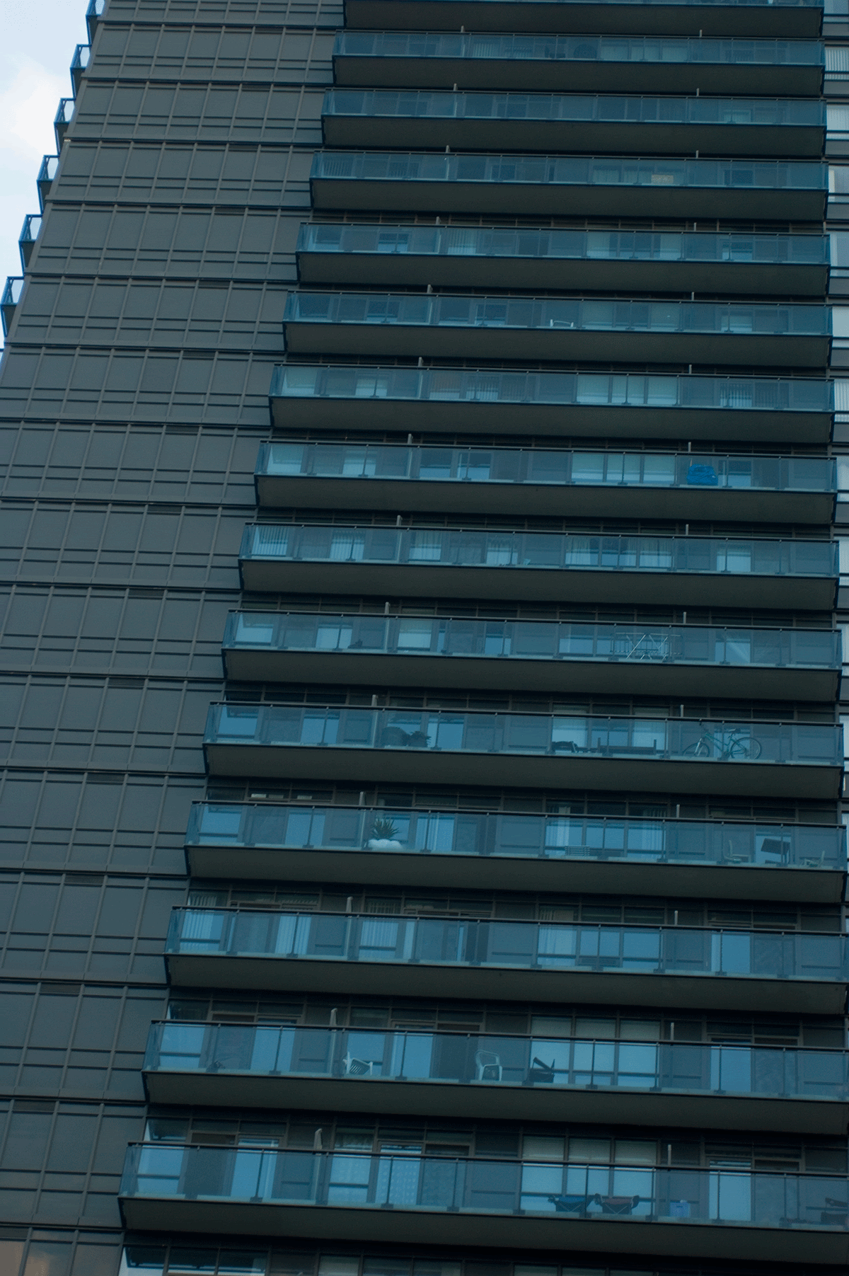
As bland as that spandrel is, my biggest problem with the above photo is the balcony clutter. Nothing can be quite as ugly as a random peppering of overturned patio furniture, bicycles and a lone out of place shrub.
 
As bland as that spandrel is, my biggest problem with the above photo is the balcony clutter. Nothing can be quite as ugly as a random peppering of overturned patio furniture, bicycles and a lone out of place shrub.

That doesn't look like clutter at all (some patio furniture and outdoor plants are not a problem). May be some people's "choice" in patio furniture is a lot to be desired, but that picture really doesn't show any clutter (at least to me it doesn't). Bicycles are not allowed on balconies in most new condos, which I am sure is the case with this condo. I remember living at X, there would be messages constantly stating that people are not to bring their bicycles up the elevator to their units. The concierge would enforce this rule and people with bikes were to use the outdoor racks (which were free) or purchase bike racks in the garage area.
 
From earlier this evening...

IMG_2728.jpg


And a little higher up...

IMG_2736.jpg


I realize that I'm in the minority based on reading so many negative reviews of this project, but I'm sure that it will look fantastic on this corner when complete!

I have a "thing" for black and/or white buildings vs. green glass or grey glass/spandrel...so I'm loving this project (just not as much a River City, but I AM baised after all haha :))
 
Last edited:
its really difficult to make these kinds of arguments when you end up with an entire wall of spandrel that looks like this.

i drive by James Cooper Mansion everyday and i remain stunned at how unremittingly dead, dull, unpleasant, and yes, 'poorly designed' this side of the building is--the very side that faces Bloor Street, one of the major thoroughfares in the city.

based on examples like this, it's not surprising that there are a lot of people out there who have their antenna up with regards to Tridel's commitment to quality design.

I agree, it's not JCM's better side but I think it's a pretty good project otherwise. If the Selby Street project goes forward on the next street north we can hope for something that will make the north side of JCM less prominent from that POV (Bloor Street).
 
Often spandrel like this, but especially this particular design, reminds me of a building that belongs in Tonka village--you know, Tonka trucks and such. I think the building will get better, not worse, with the balconies; but still, I'd be shaking my head if I already bought here.
 
That doesn't look like clutter at all (some patio furniture and outdoor plants are not a problem). May be some people's "choice" in patio furniture is a lot to be desired, but that picture really doesn't show any clutter (at least to me it doesn't). Bicycles are not allowed on balconies in most new condos, which I am sure is the case with this condo. I remember living at X, there would be messages constantly stating that people are not to bring their bicycles up the elevator to their units. The concierge would enforce this rule and people with bikes were to use the outdoor racks (which were free) or purchase bike racks in the garage area.

The problem I find with bicycle racks is that they're always full. The more you add, the more it gets used up quicker. There's never enough of them. They either end up on balconies or tied to trees or poles due to lack of bicycle racks.
 
The bike racks at Pinnacle are free but you have to register your bike and attache an almost indestructible registration sticker thingy to your bike. Bikes without stickers are tagged and then removed within a day or two. Mostly the bike areas are very messy looking but there seems to always be spaces available. There is also an indoor bike storage area that is available.
 
Trying really (and I mean REALLY) hard to say something positive about this, but it's truly horrible. This is not what I would expect from Wallman, or Tridel. As crazy as it sounds, the parking lot that was there before was actually more appealing.
 

Back
Top