You are using an out of date browser. It may not display this or other websites correctly.
You should upgrade or use an alternative browser.
You should upgrade or use an alternative browser.
- Thread starter grey
- Start date
JSO
New Member
i passed by this development recently and it doesn't look as bad as it does in the picture. In fact, it looks pretty good.
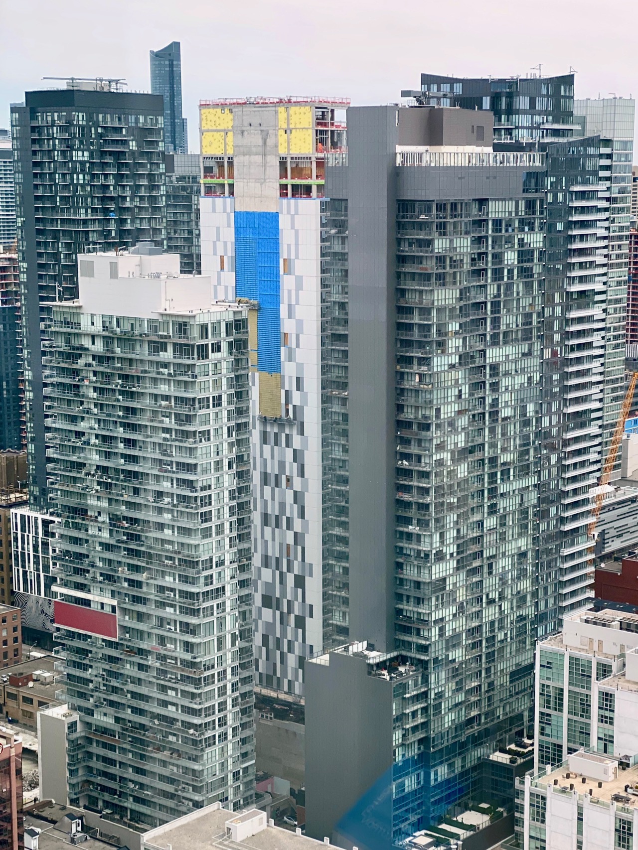
Here's the pixelated party wall coming together, as seen from The Well, with the White Balance corrected to compensate for the green windows:
42
42
AlbertC
Superstar
Niklas
New Member
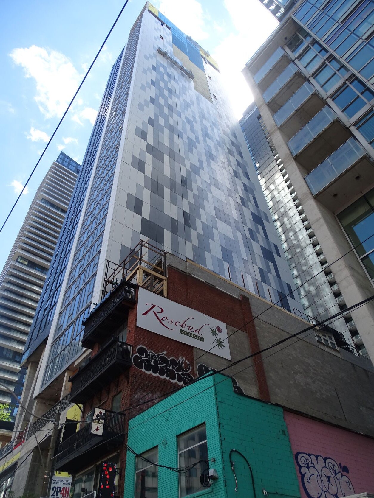
Why can’t the mosaic be some nice colour instead of just shades of grey..
stjames2queenwest
Senior Member
Such a missed opportunity for colour
tstormers
Senior Member
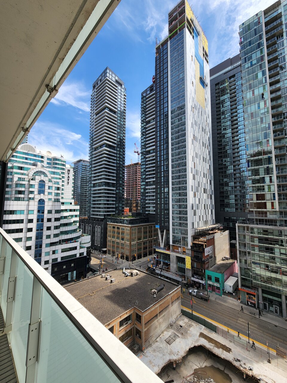
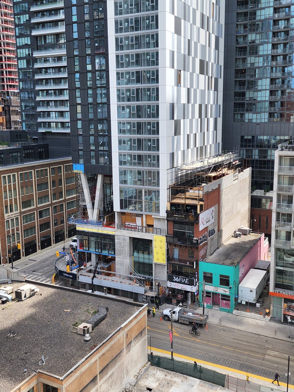
Here are a few from yesterday.
Red Mars
Senior Member
May 11, 2022
More hoarding removed.
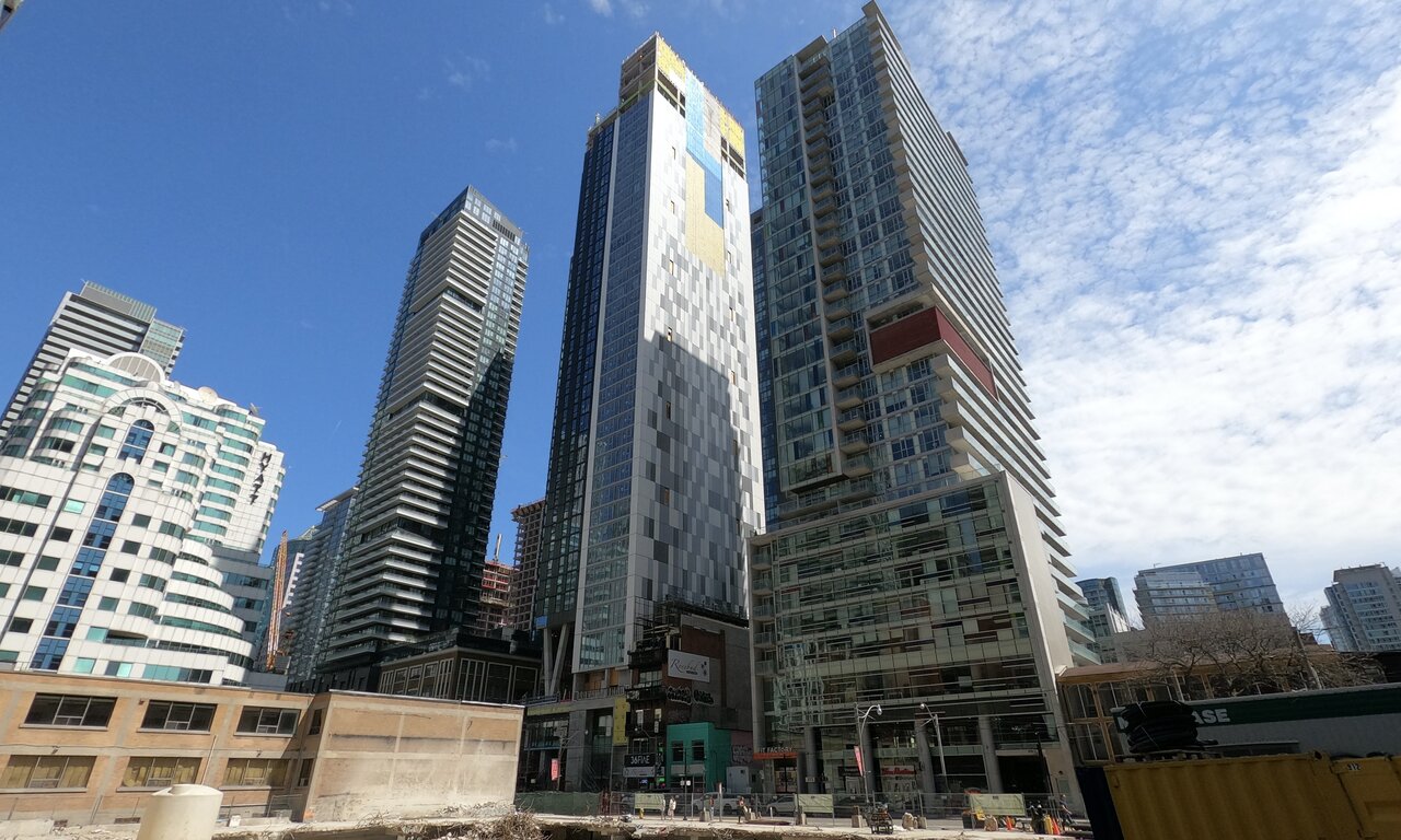
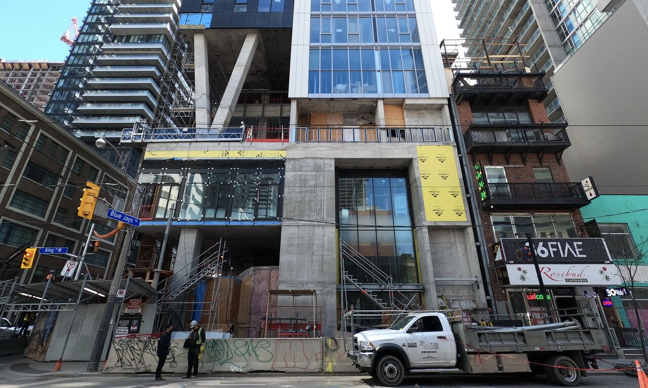
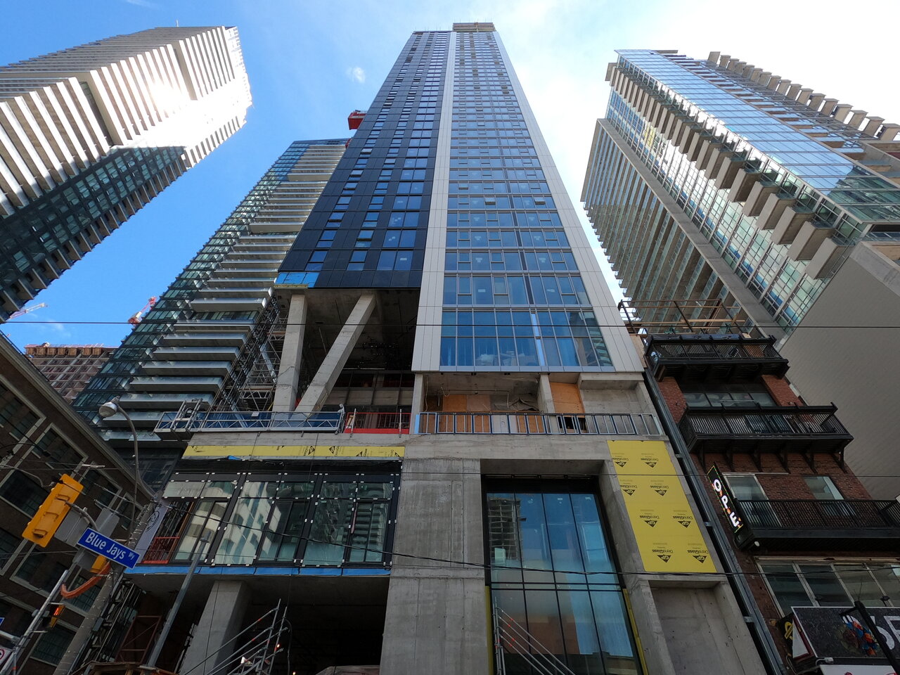
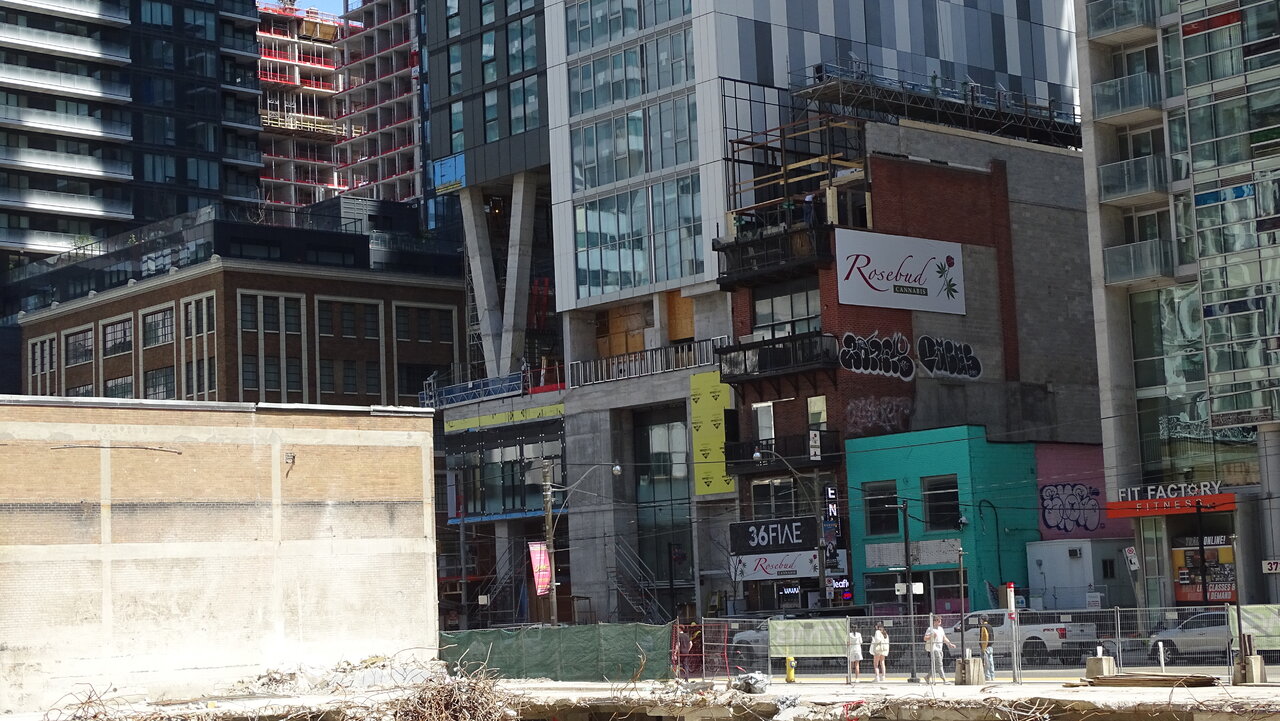
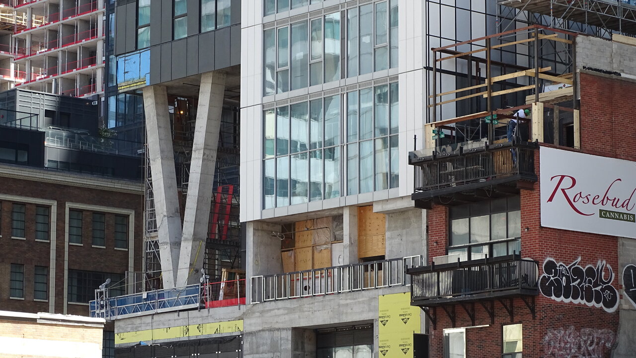
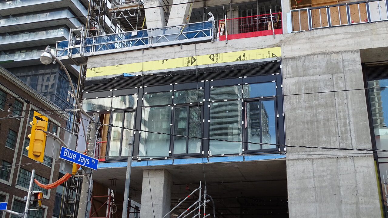
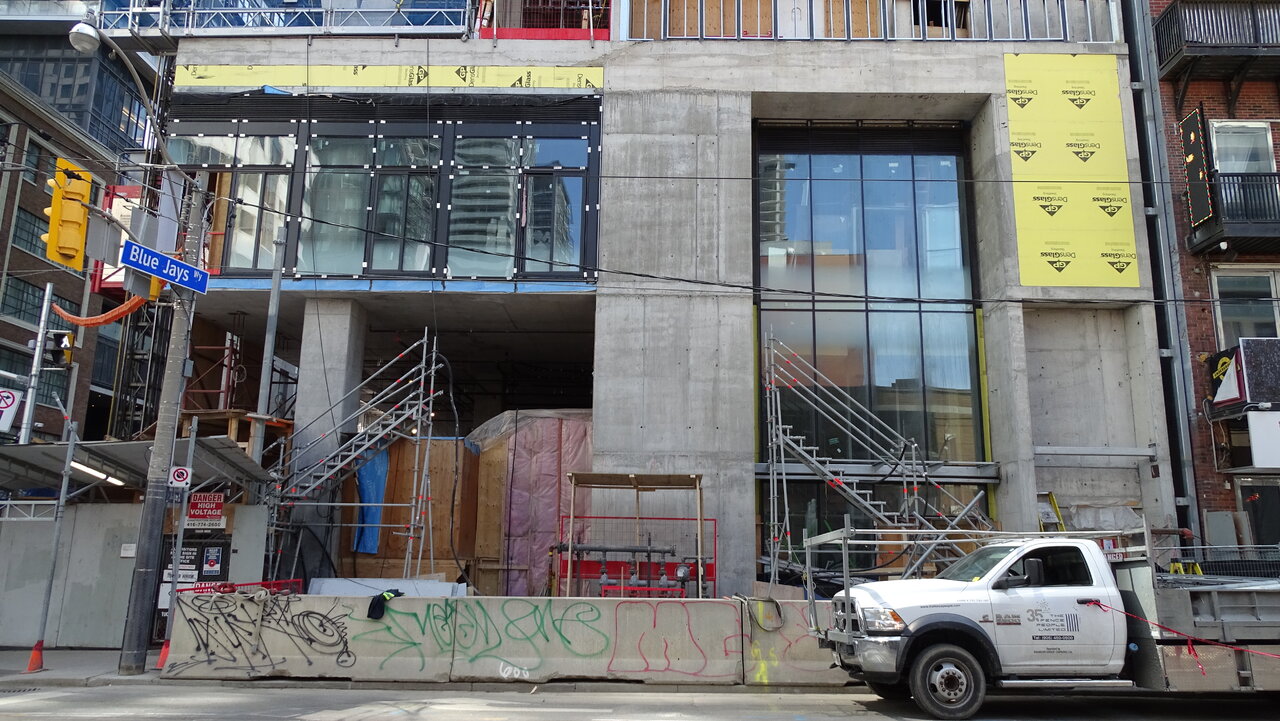
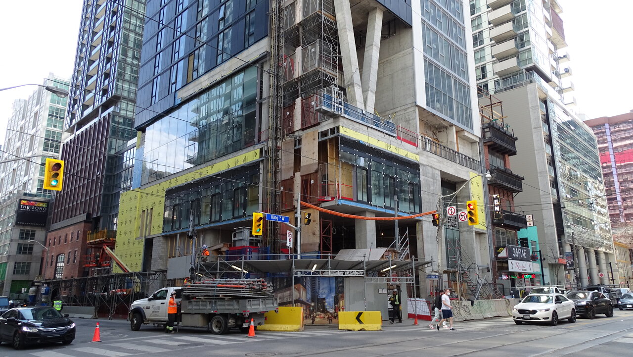
More hoarding removed.
Red Mars
Senior Member
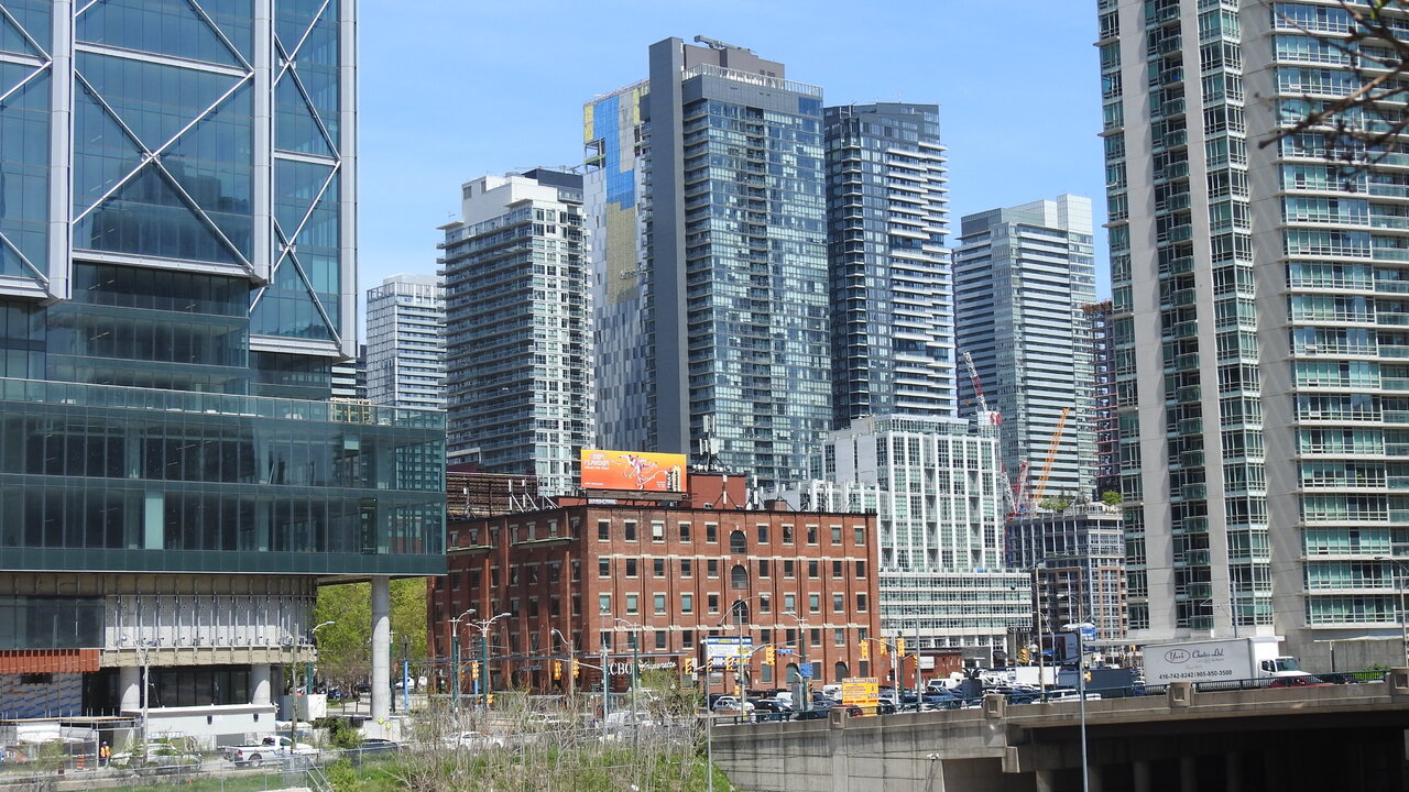
May 12, 2022
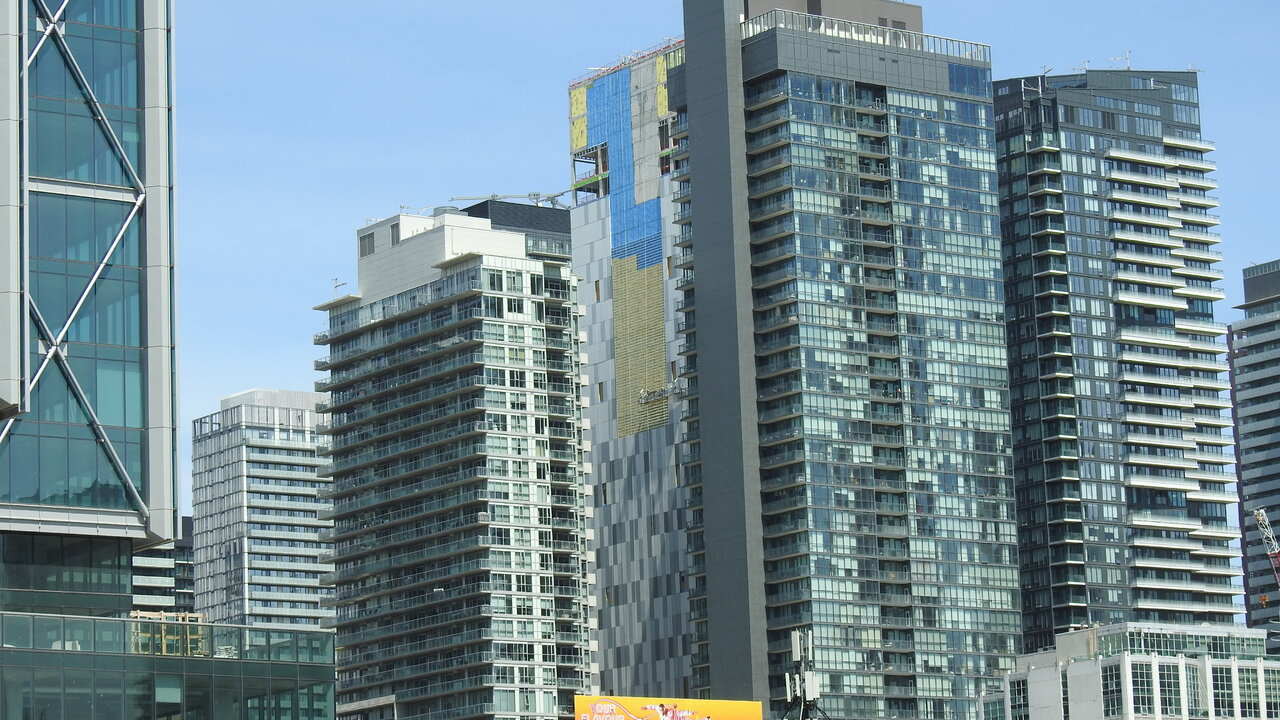
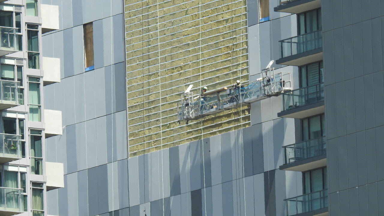
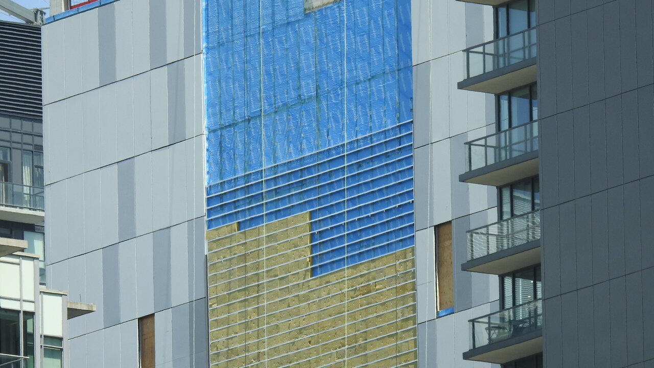
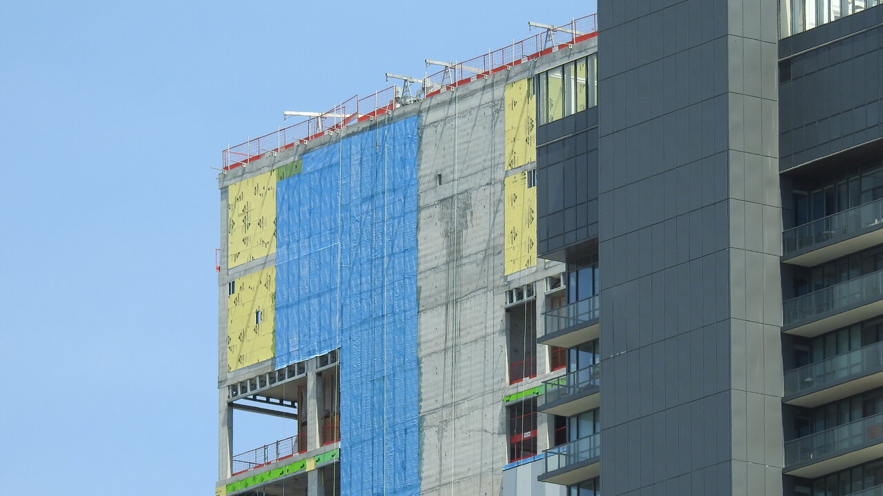
Northern Light
Superstar
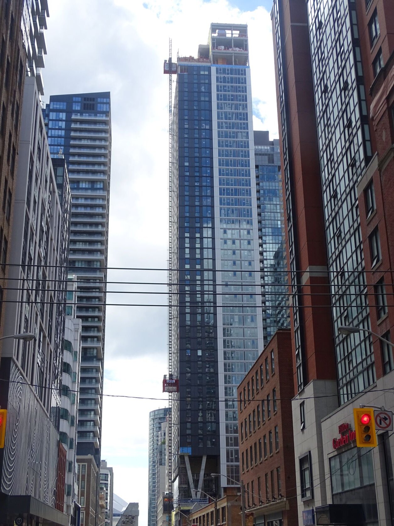
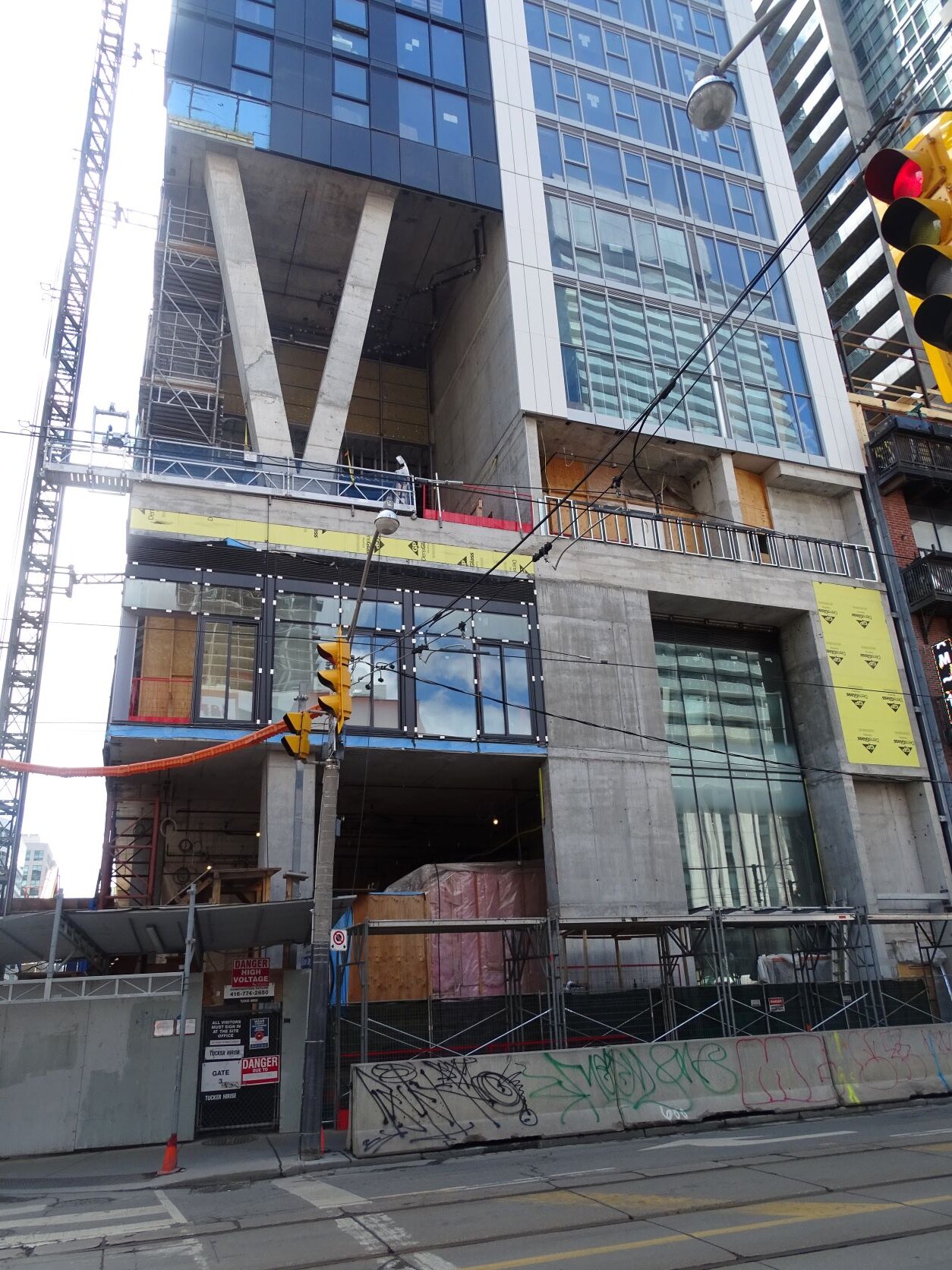
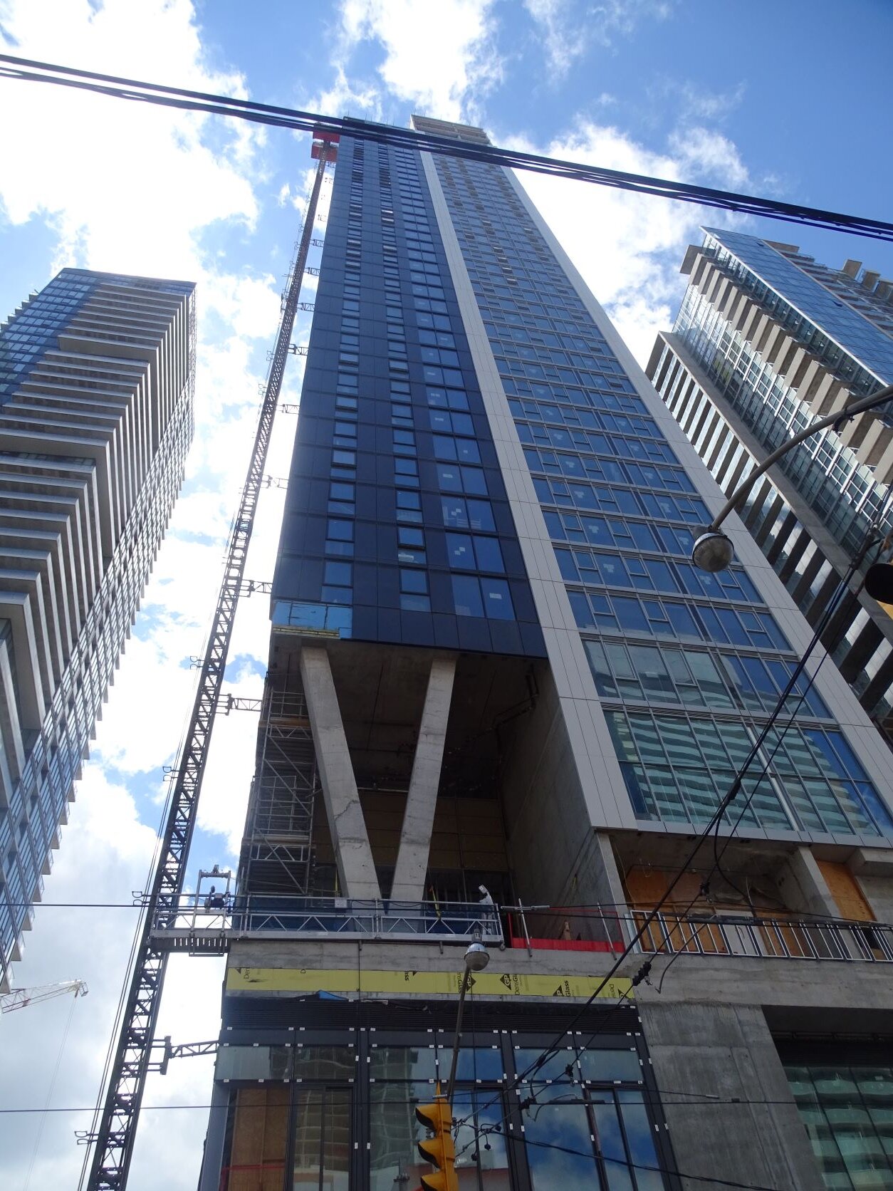
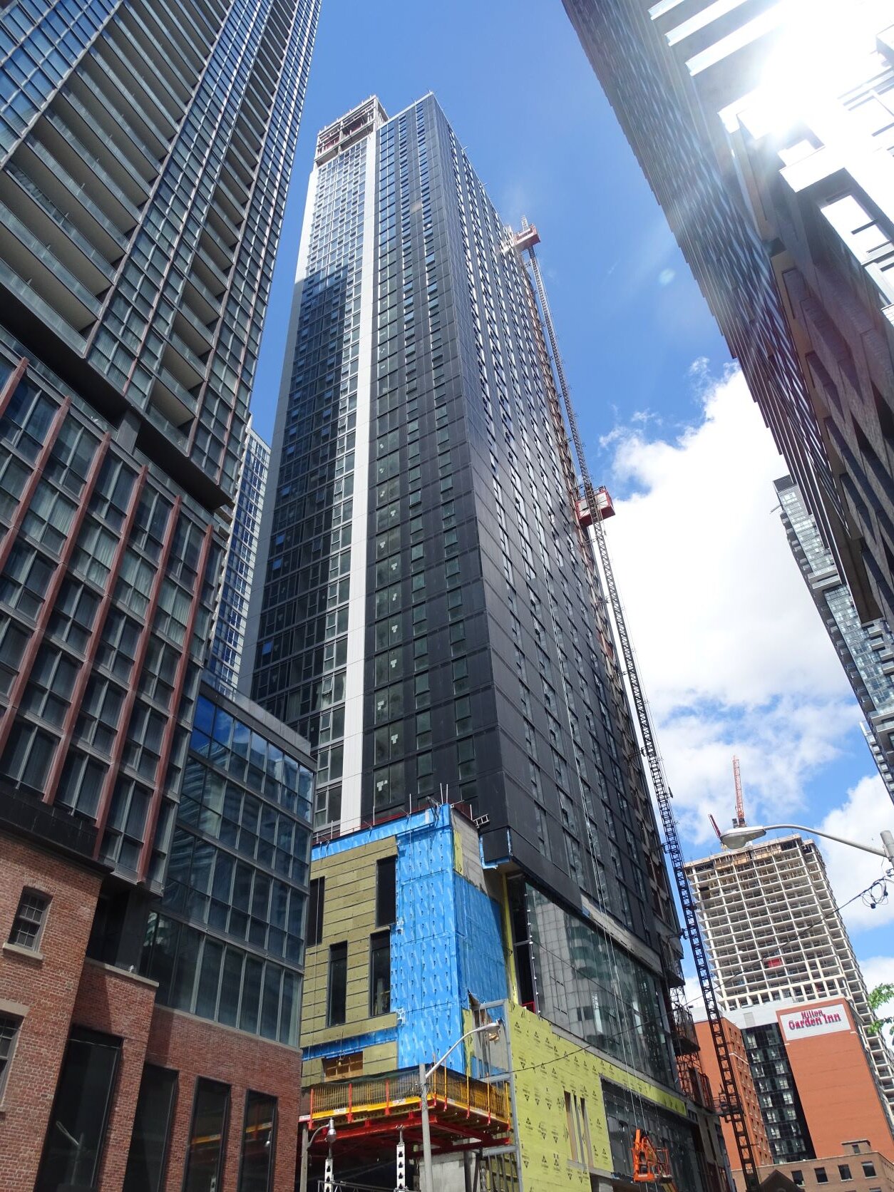
Photos taken May 28, 2022:
neuhaus
Senior Member
Or even just a light dotting of coloured panels would make it more interesting and attractive.Why can’t the mosaic be some nice colour instead of just shades of grey..
karledice
Senior Member
This is Toronto, the only colours approved are grey, black and green 
tstormers
Senior Member
Don't forget Blue!!This is Toronto, the only colours approved are grey, black and green
Dr. Snoot
Active Member
Why can’t the mosaic be some nice colour instead of just shades of grey..
Even more annoying to me is the random, “static” arrangement of the panels. It means nothing, conveys nothing; it lacks humanity. Are the architects really so devoid of imagination that they couldn’t use a pattern? Or, if it is some purposeful design, it’s completely unintelligible.
alklay
Senior Member
The whole building is unintelligible. Cheap materials and bad design. It is just a mess.