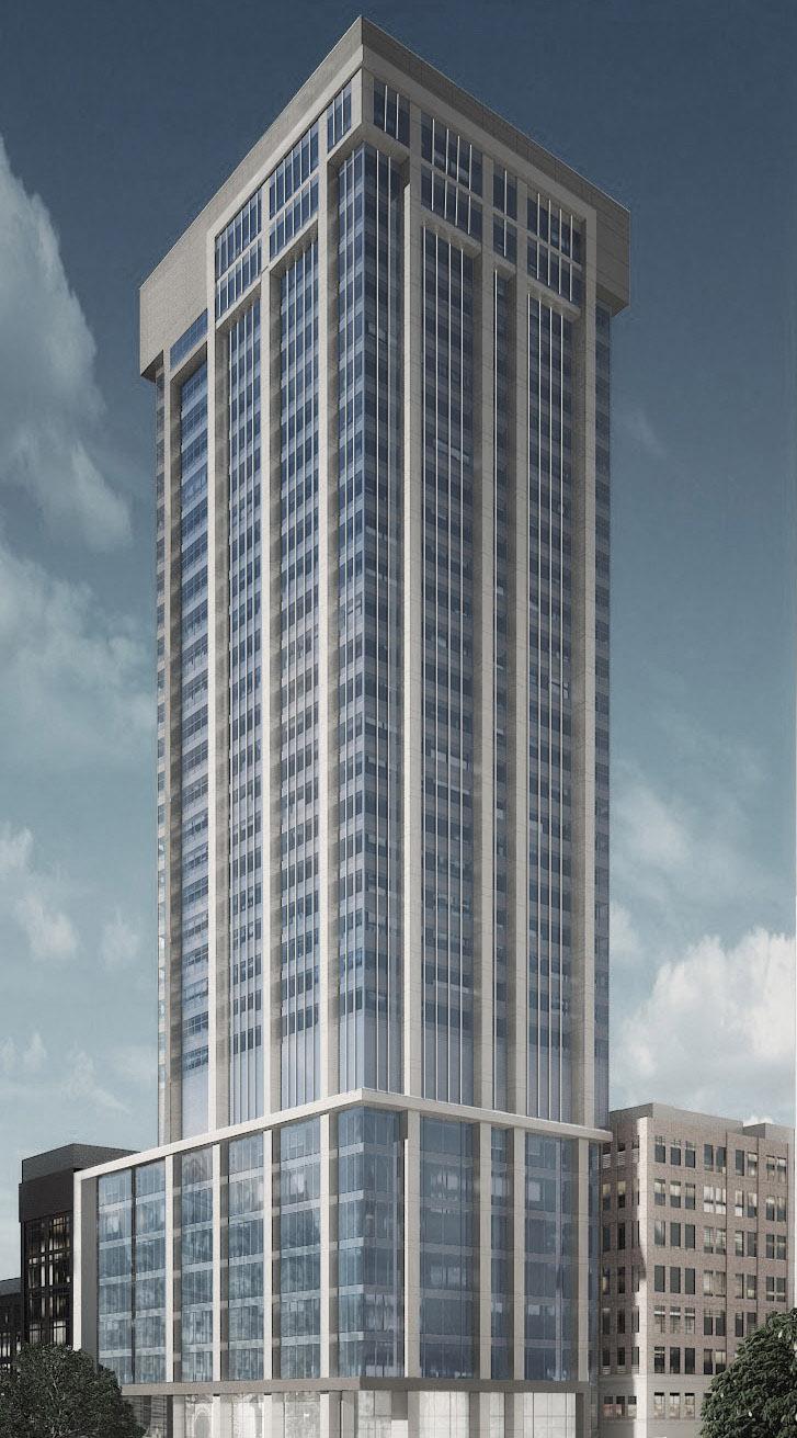
One of this building's great features was the lantern in the crown. Hopefully, they'll actually include the "frame" of LED strips seen in this rendering in the final product.

that lantern hasn't been fully lit in a while...shot by me from inside the crown:
20191231_191127.jpg
 
I was dead set against this re-clad when I first seen the renders... I have to say I'm shocked at how good this building is looking now!? Really do hope they are doing some LED lighting though package though to finish this off!
 
I was dead set against this re-clad when I first seen the renders... I have to say I'm shocked at how good this building is looking now!? Really do hope they are doing some LED lighting though package though to finish this off!

If the whole tower looked like those last 2 pics above, I wouldn't 100% hate it. Unfortunately, for some odd reason, the other side looks different and looks more like hack job.
 
The crown facing City Hall differs from the renderings
- and dare I say it looks better than the rendering because it's a bit more symmetrical and seems to have lost the two-tone colouring (or has it? hard to tell) and the horizontal elements
- but it's all relative.

18572-62574.jpeg

 
Its crazy - the south and east faces actually look quite good in those photos. Why the h would they choose 2 different types of cladding that clash so badly?
 
Last edited:
Cadillac Fairview should be forced to come out and give one good reason why they didn't clad the entire tower consistently like what's seen in the above photos. Had they done that, this re-clad actually would've look quite decent. Unlike the trash that it looks like now.

Agreed- from the rear it even looks like a late modernist design (sort of like the Foresters building), but the front is an absolute mess.

That light spandrel on the tower portion honestly feels like the stuff you’d find on a suburban office development, while the penthouse addition probably takes the cake for the most-unsympathetic facade alteration in the city.
 

Back
Top