You are using an out of date browser. It may not display this or other websites correctly.
You should upgrade or use an alternative browser.
You should upgrade or use an alternative browser.
- Thread starter Peepers
- Start date
Roy G Biv
Senior Member
Why not a bit of colour? Are architects afraid of it? Those racing stripes could have provided some great contrast against the overwhelming mass of grey/blue on the rest of the tower. One literally gets depressed when looking at it. Wait until winter...
The podium looks like someone brought it in from highway 7 on a flat-bed truck.
The podium looks like someone brought it in from highway 7 on a flat-bed truck.
stjames2queenwest
Senior Member
I wish this had been just a bit darker, it often looks a lot darker than in the above photograph and does have some good contrast. I would love to see some bold colour. In this circumstance I am definitely pleased that this was not a light grey, silver, barely blue or beige tower.
111
Active Member
3Dementia
Senior Member
This Casa homage has so many opaque window-wall panels I can only assume it was marketed to meth labs/dealers. Privacy and all that.
Architects and the developer are smacking their heads after reading that one!
42
42
111
Active Member
The design is nothing special, but I don’t mind this tower. I think someone mentioned in a previous post that it appears to be a knockoff of the tower at James Cooper mansion. There are certainly similarities between the two including the roof overhang, the stripe, and the cladding--this one being the discount version.
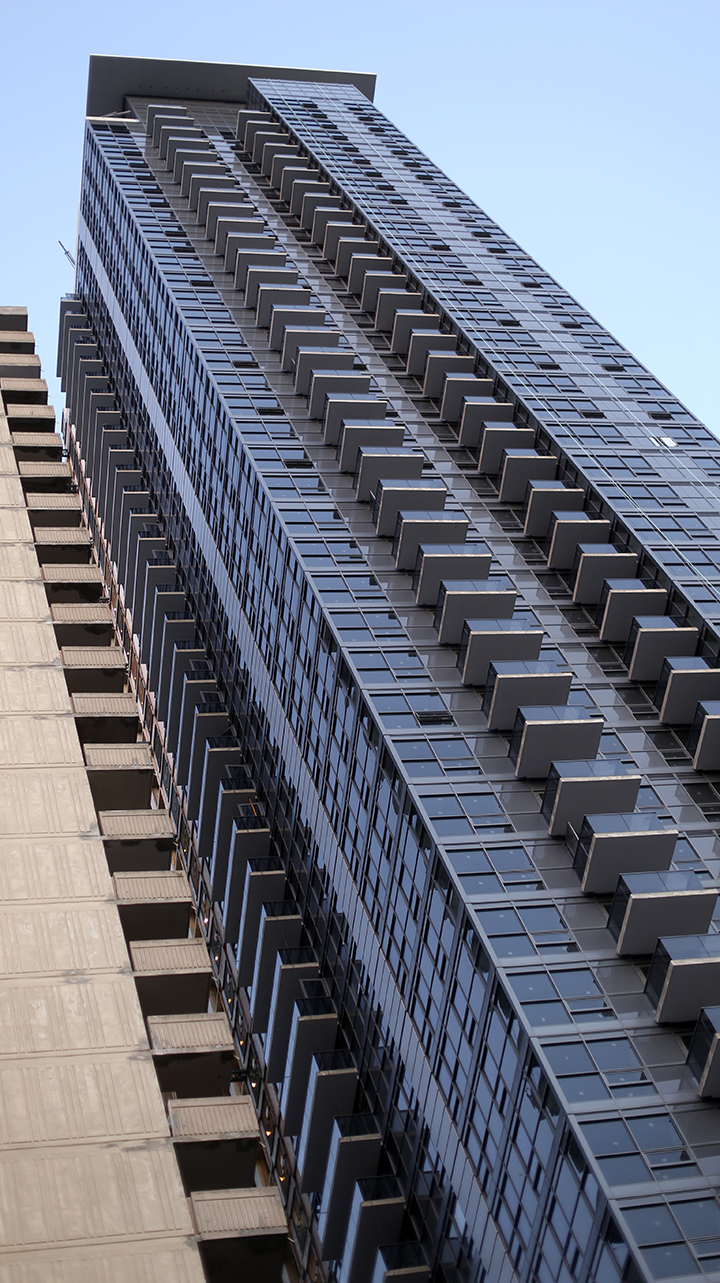
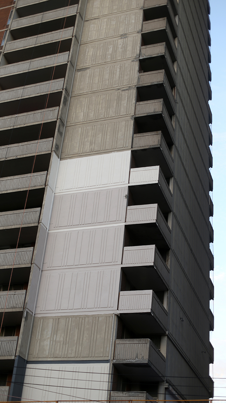
I really like that they are field testing options for repainting the old towers. Shows that they are putting some thought into it and not just going all-in with a predetermined choice.
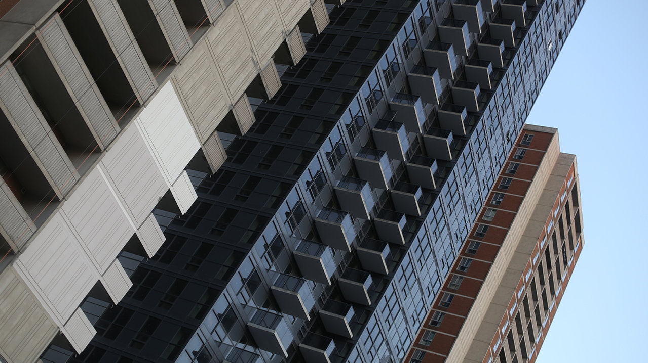
Yes, the base has a suburban strip mall or LCBO feel, but it will be a huge improvement on what was there previously. The sidewalk is quite wide so hopefully there will be planters, trees, benches, etc.
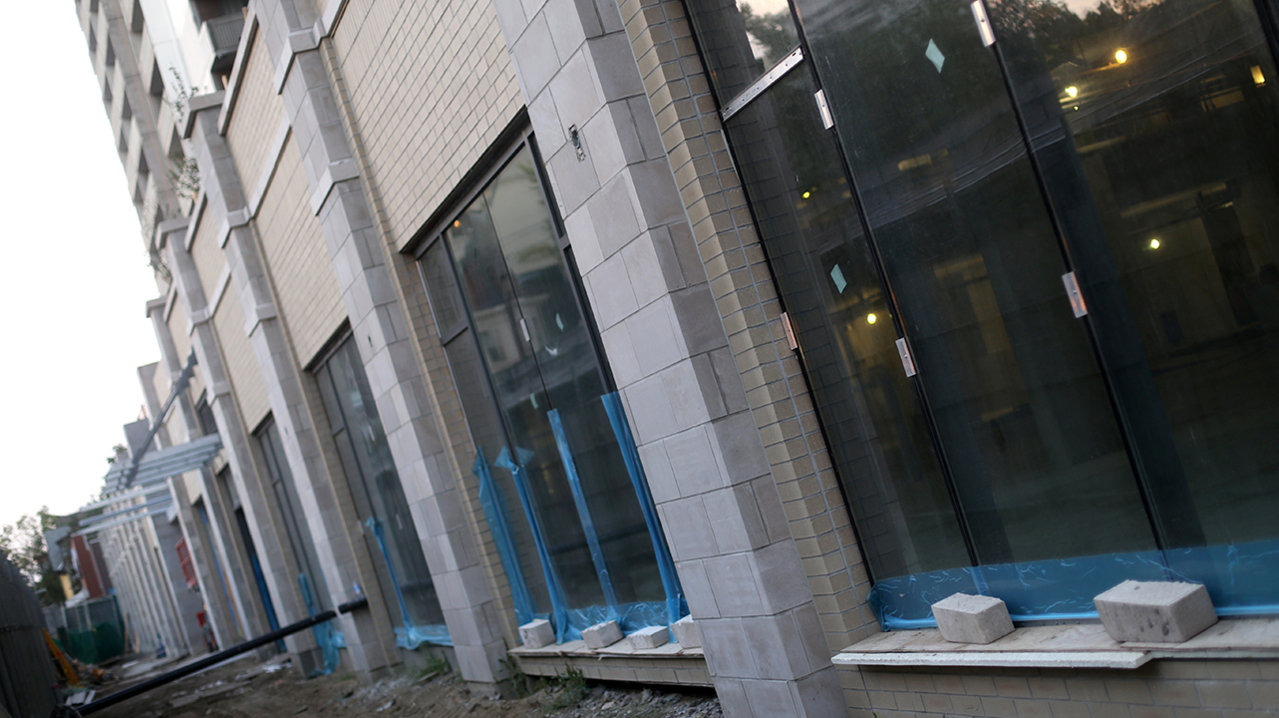
Overall, this is great development for Sherbourne. This is a super diverse area and once this and other projects closer to Bloor are complete, Sherbourne between Bloor and Wellesley will be quite a pleasant and bustling street.
I really like that they are field testing options for repainting the old towers. Shows that they are putting some thought into it and not just going all-in with a predetermined choice.
Yes, the base has a suburban strip mall or LCBO feel, but it will be a huge improvement on what was there previously. The sidewalk is quite wide so hopefully there will be planters, trees, benches, etc.
Overall, this is great development for Sherbourne. This is a super diverse area and once this and other projects closer to Bloor are complete, Sherbourne between Bloor and Wellesley will be quite a pleasant and bustling street.
Attachments
stjames2queenwest
Senior Member
Construction on the townhouses directly south of st james on bleecker have been well underway for a month or two now. North of st james they are not as far along. Last week they fenced off the entire block from Wellesley to st james for the community centre expansion. And cut down about a dozen or more trees (which was really unfortunate), following that they boarded around the remaining trees. Today they have broken ground. There is no drilling or boring equipment so I’m not sure if this is just a removal of sod or what exactly is happening.

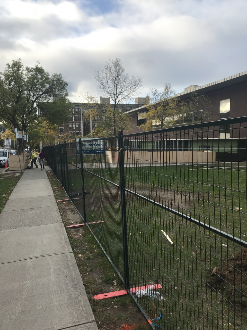
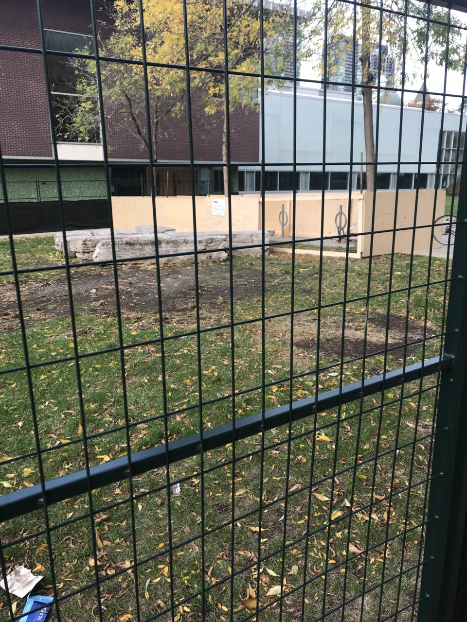
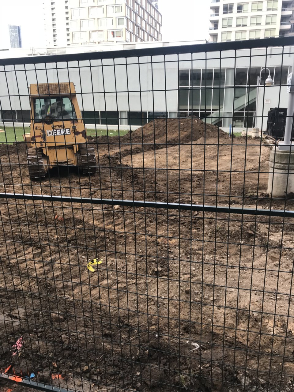
Attachments
stjames2queenwest
Senior Member
steveve
Senior Member
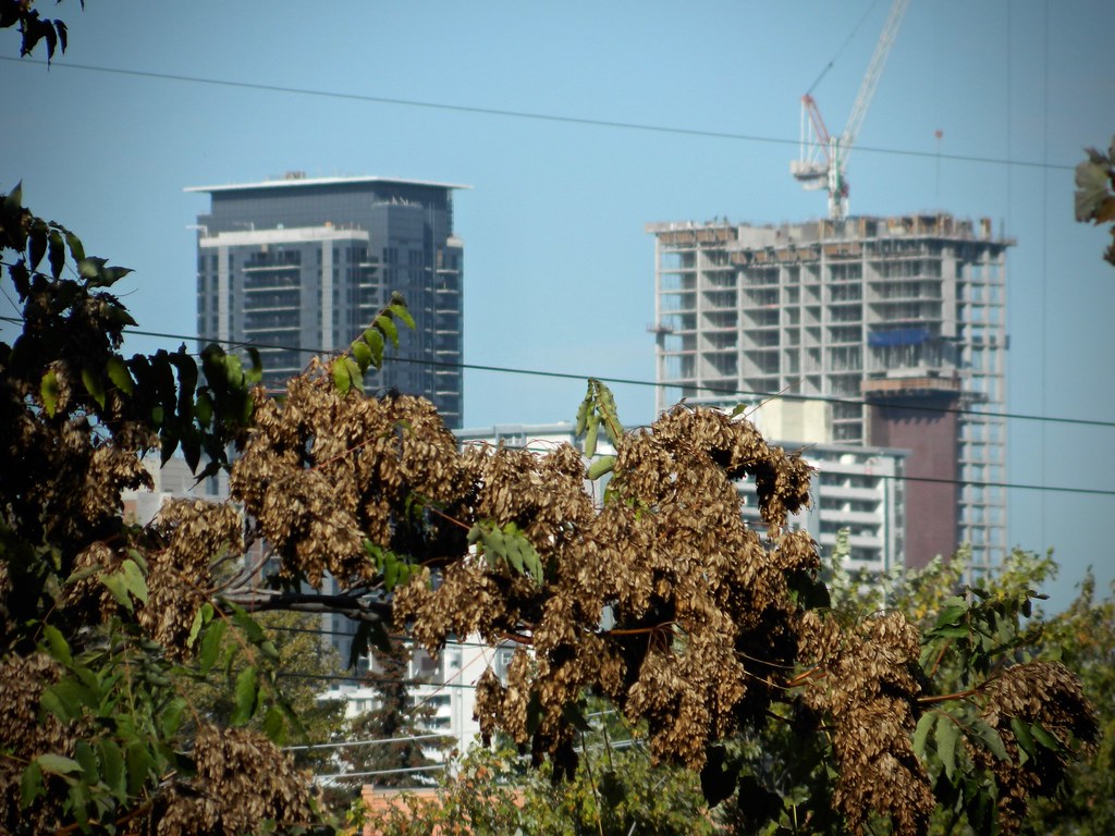
From afar:

44 North
Senior Member
I really like that they are field testing options for repainting the old towers. Shows that they are putting some thought into it and not just going all-in with a predetermined choice.
Just saw the front page article. This seems really silly to paint the old towers' concrete. It looks really good as-is, and imo certainly better than dull monochromatic choices shown in your image. Textures, hues, depth, and arguably warmth vs... grey. Bah, I don't get it.
Tuscani01
Senior Member
I really like that they are field testing options for repainting the old towers. Shows that they are putting some thought into it and not just going all-in with a predetermined choice.
View attachment 123902
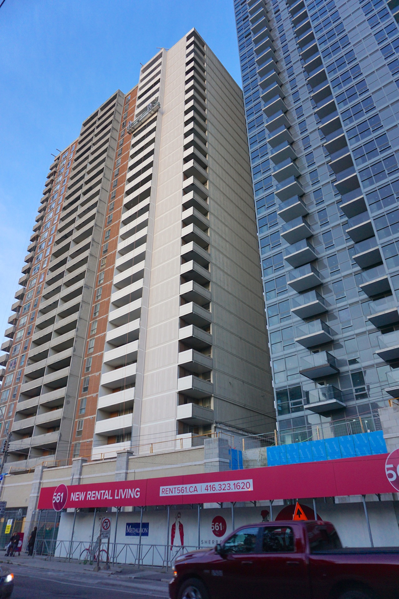
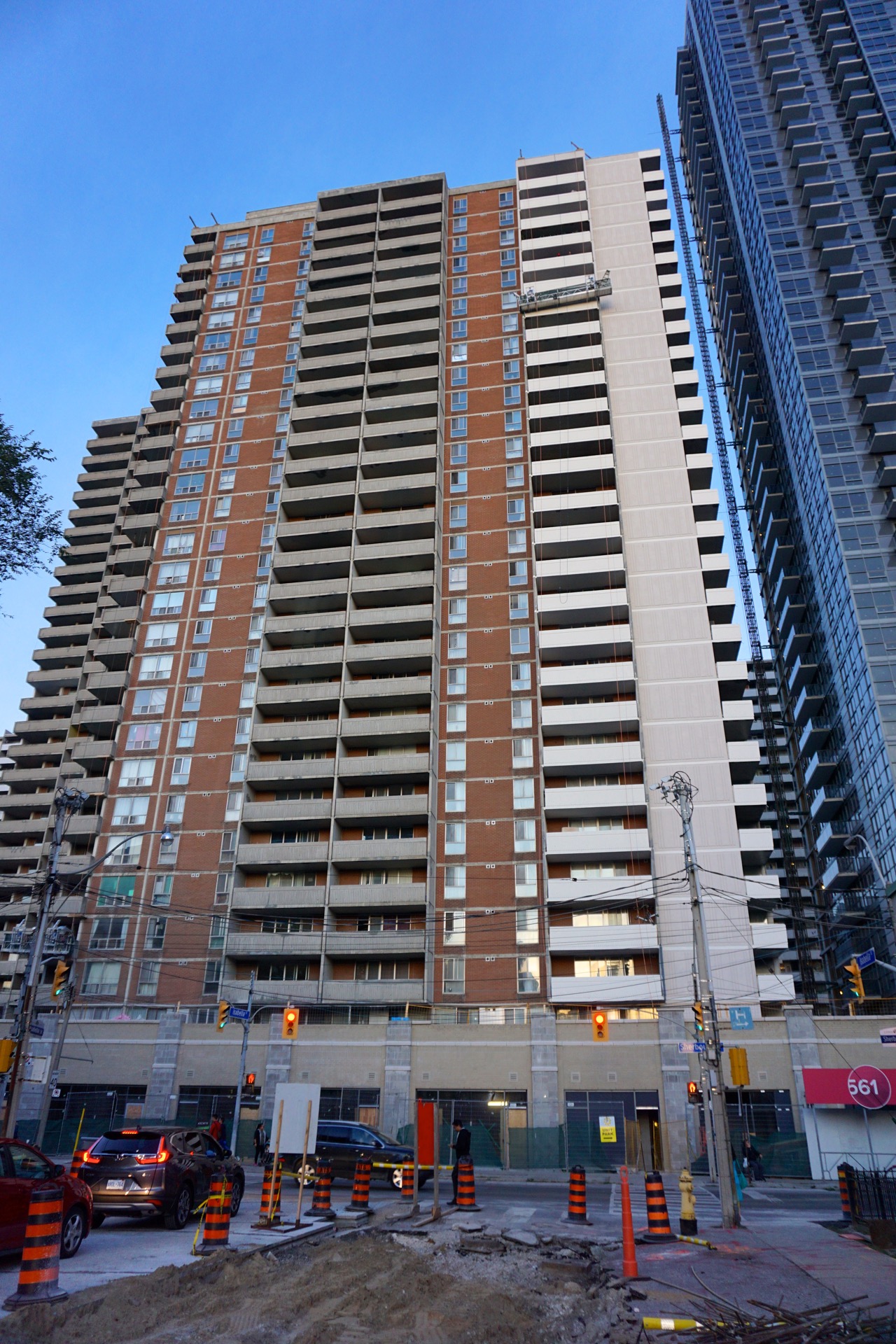
They have gone with the second option from the top. The entire strip from ground to top is now painted, with the horizontal bands painted a different shade, like the photo above.
111
Active Member
Wow, they move quick. This shot from this morning gives an idea of how dramatic the change will be.They have gone with the second option from the top. The entire strip from ground to top is now painted, with the horizontal bands painted a different shade, like the photo above.
Attachments
111
Active Member
A few hours ago:
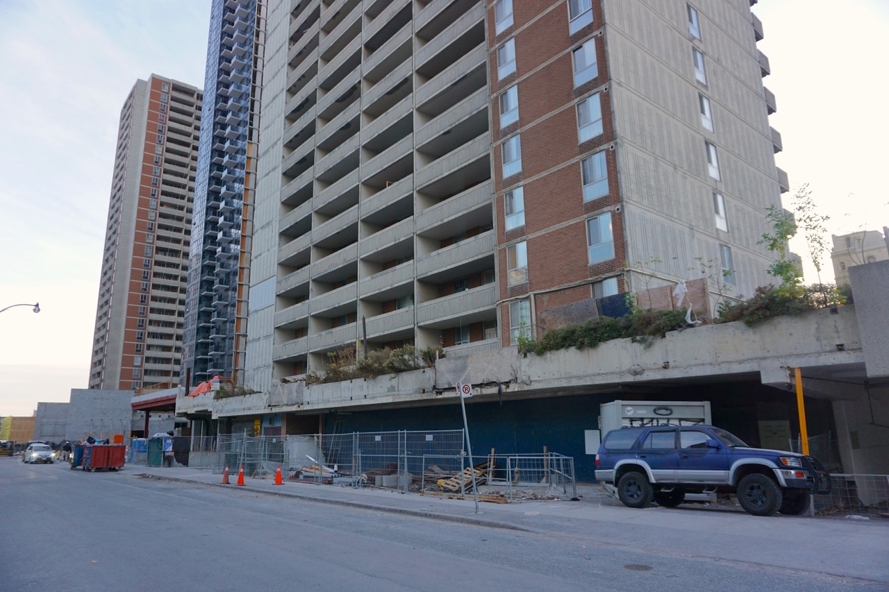
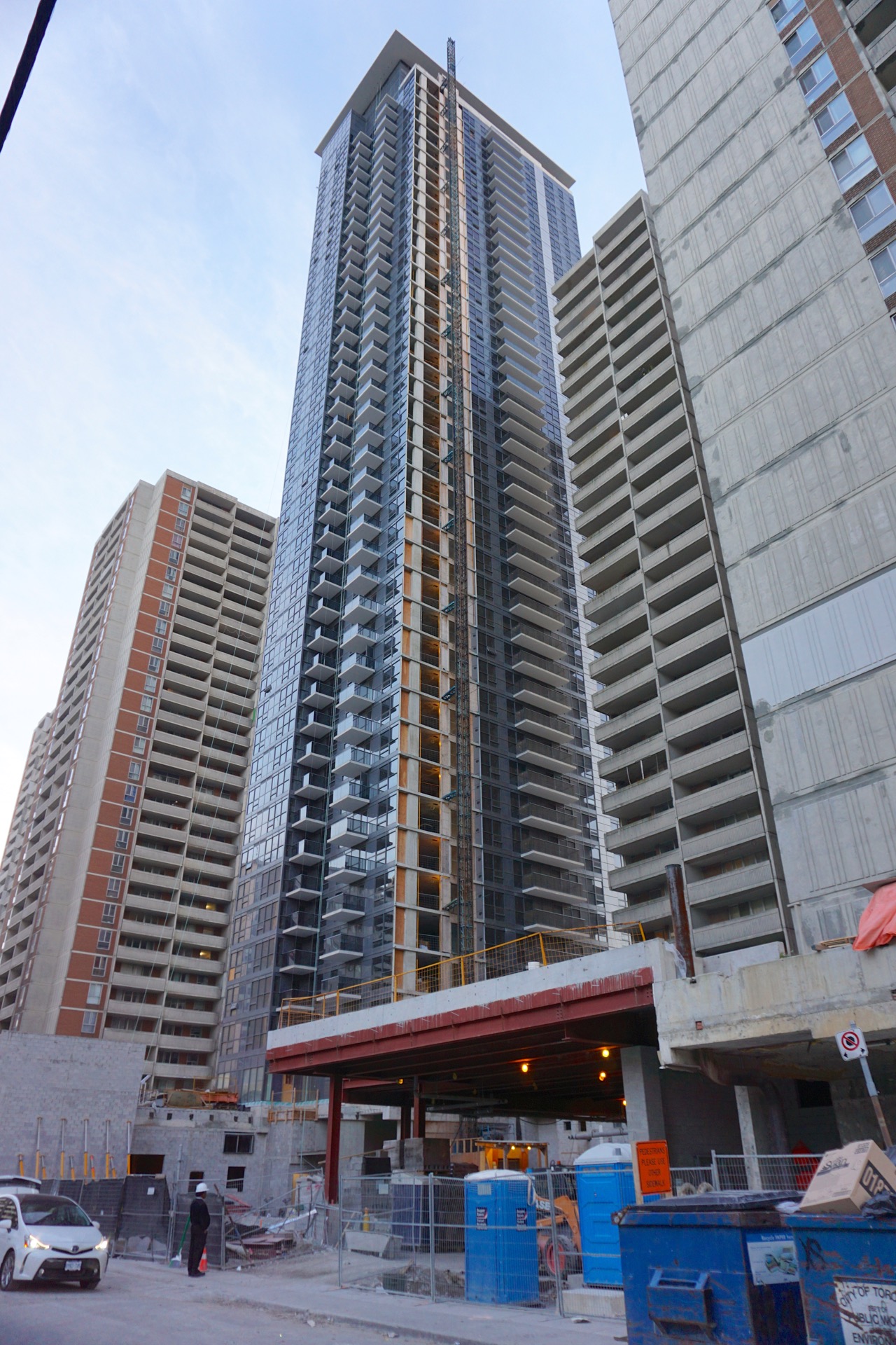
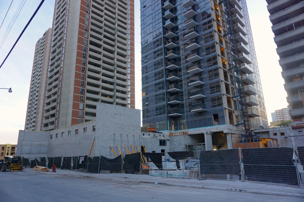
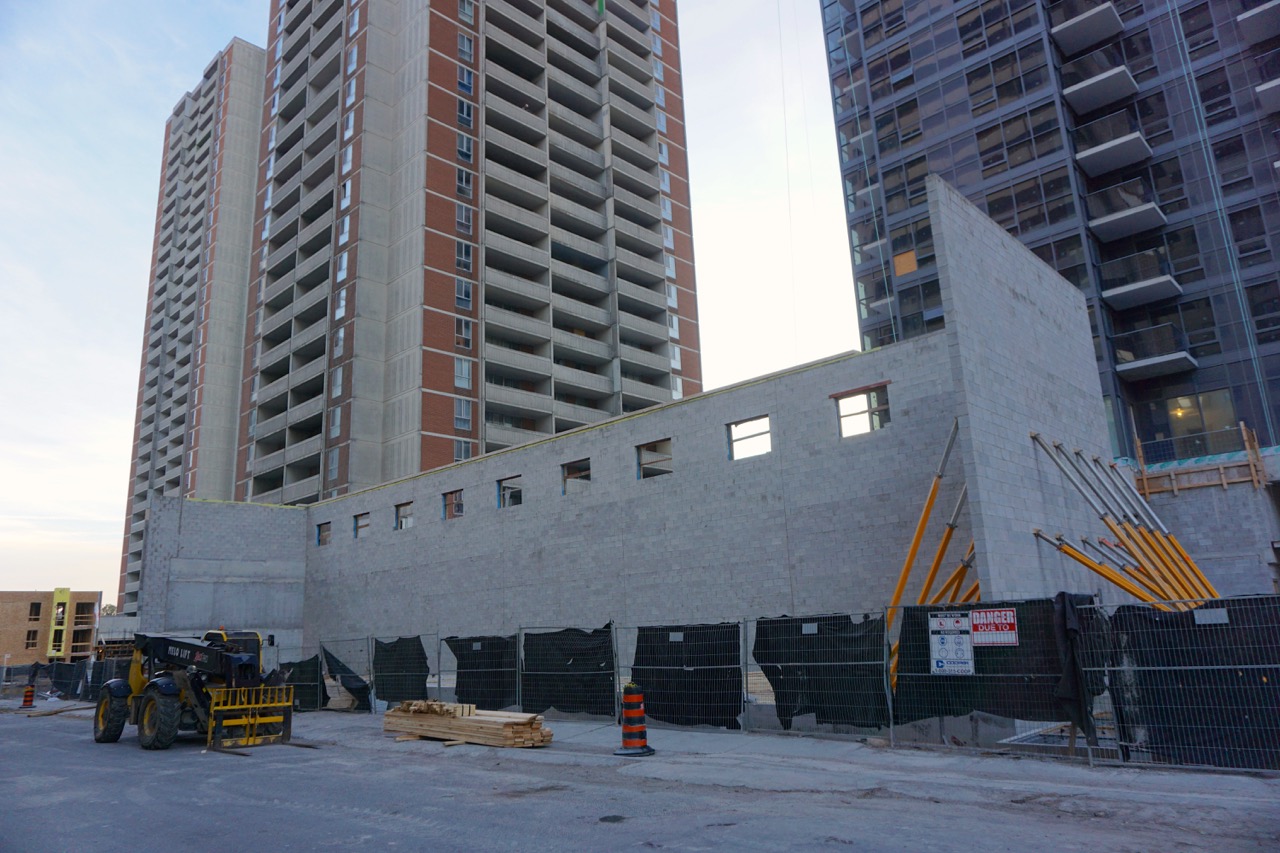
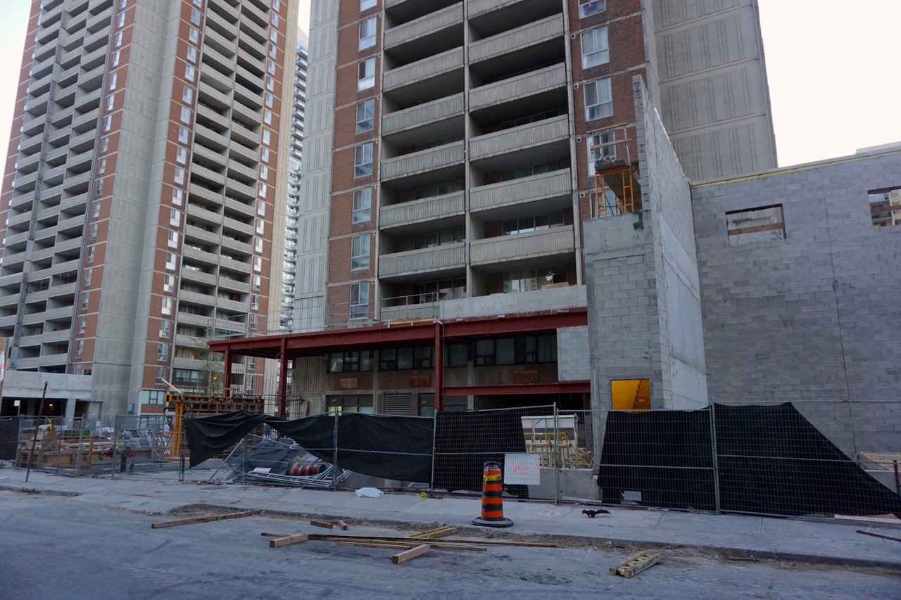
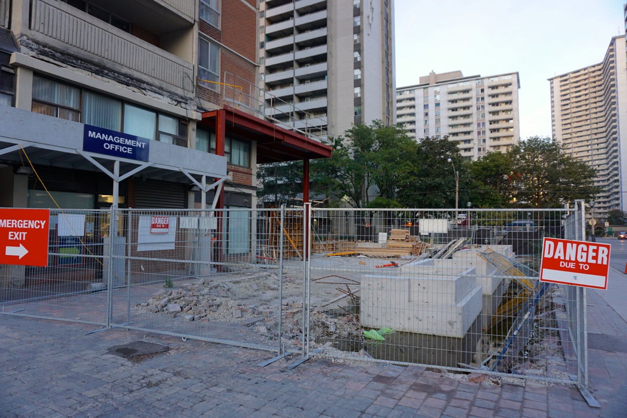
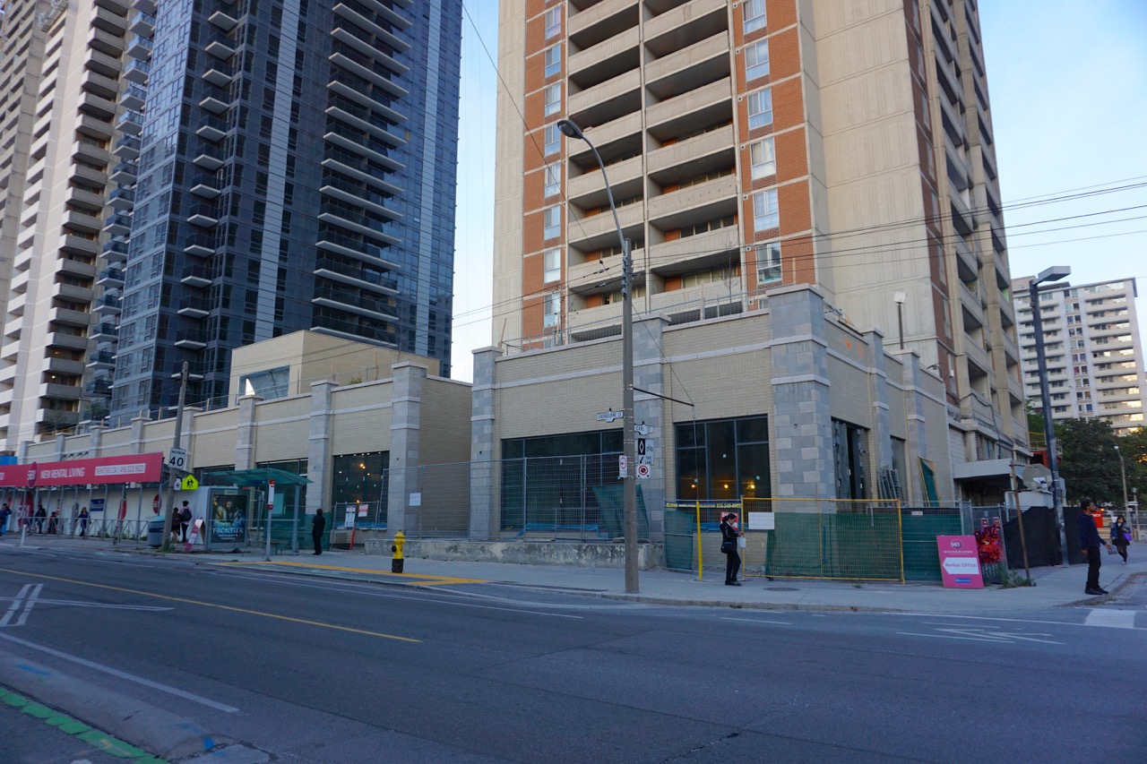
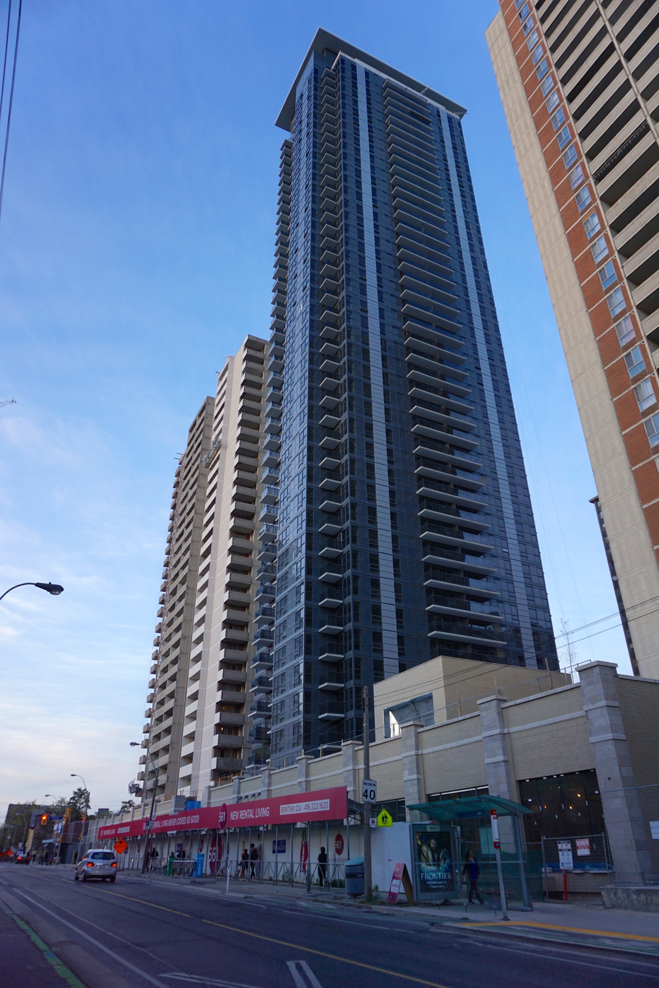
Looking a little weird painted partly light gray/white at this point. Maybe it'll work when it's all done…
42
Looking a little weird painted partly light gray/white at this point. Maybe it'll work when it's all done…
42
Attachments
-
 DSC04856.jpg283.5 KB · Views: 515
 -
 DSC04858.jpg676.1 KB · Views: 509
 -
 DSC04859.jpg328.2 KB · Views: 498
 -
 DSC04860.jpg289 KB · Views: 527
 -
 DSC04861.jpg304.8 KB · Views: 464
 -
 DSC04866.jpg361.3 KB · Views: 483
 -
 DSC04867.jpg319.5 KB · Views: 476
 -
 DSC04868.jpg581.1 KB · Views: 468
 -
 DSC04869.jpg731.4 KB · Views: 496
 -
 DSC04871.jpg735.7 KB · Views: 476


