My brain doesn't read that as bronze either - to me it's an insipid, putty-brown. But I also think the colour of the cladding on T3 Bayside is a nauseating shade of green while others find it lovely, so ... maybe this is another version of #the dress?
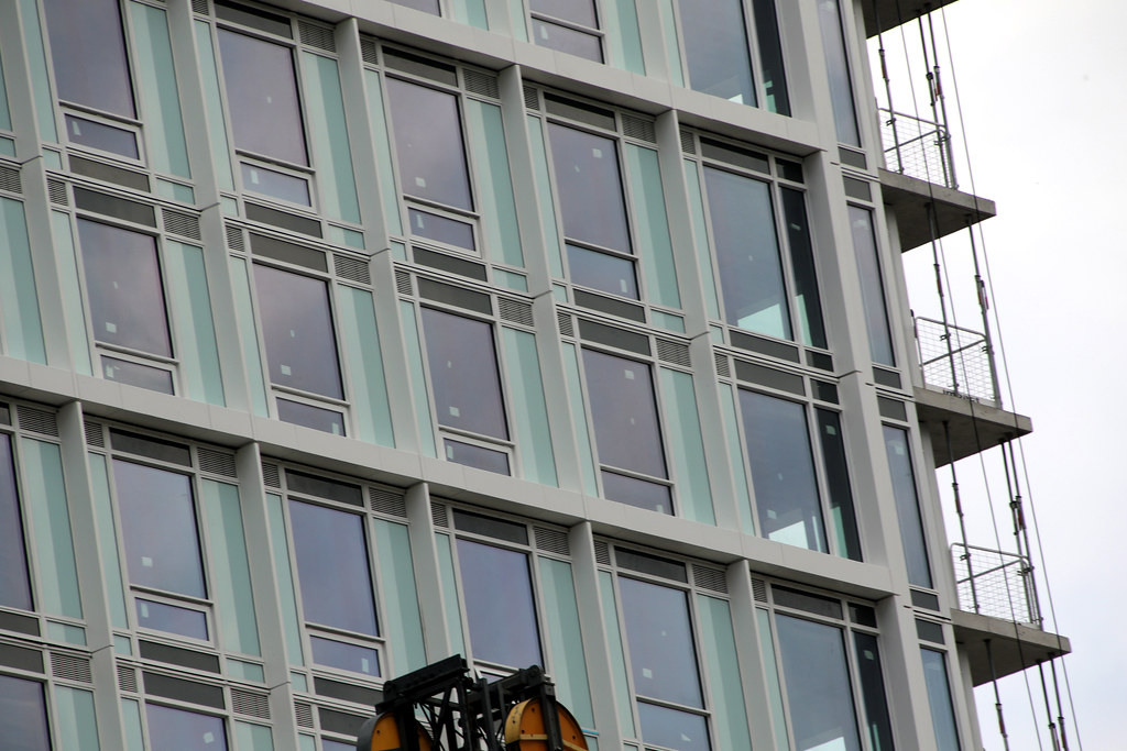
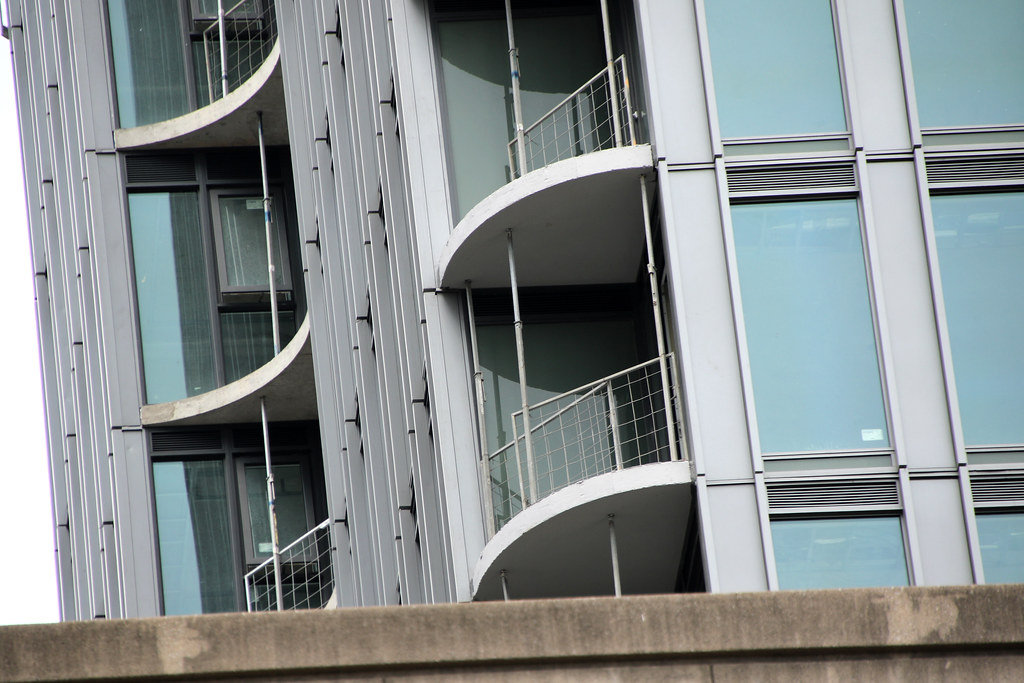
It reads as oiled brushed bronze to me , when I walk by it in person.

Screenshot 2023-07-09 at 12.39.37 PM.png
 
I too am disappointed by the the east and west cladding. However the east and west sides of 88 will be blocked from view mostly by two other tall condos. Perhaps this will be a blessing in disguise! If the cond on the west is moving forward. Is it?
 
According to the Farrow and Ball website, the green is a version of ‘ Theresa’s Green.’ I will wait until our winter when the northern light perhaps shows this to be an interesting choice! Think central Vilnius or Riga. 🙂

IMG_3404.jpeg
IMG_3403.png
 
"Interesting" doesn't mean it will work though... >.<
 
Sorry but this looks just awful. I don't know how anyone in this day and age could think that colour would be a good choice. Anything dark would have been much safer.
 
Last edited:
Sorry but this looks just awful. I don't know how anyone in this day and age could colour would be a good choice. Anything dark would have been much safer.
It's moreso how the dark glass clashes with the light spandrel and especially the white mullions. A lighter tinted/less reflective glass wouldve worked better than the current product.
 

Back
Top