someMidTowner
¯\_(ツ)_/¯
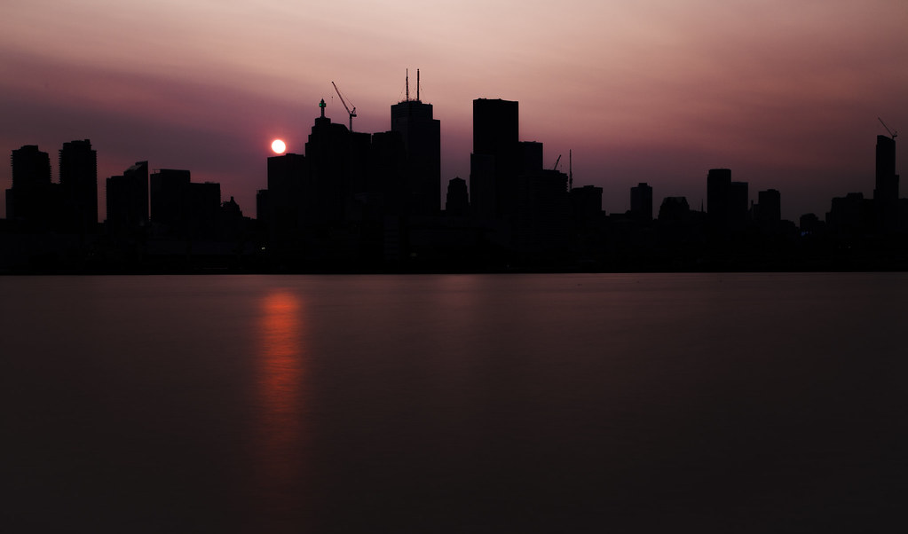
Aura is making a big impact from Polson Pier. It is visible on the extreme right in this photo from last night:
 Red Setting Sun by Jack Landau, on Flickr
 Red Setting Sun by Jack Landau, on Flickr
 Red Setting Sun by Jack Landau, on Flickr
What's the deal with these random grey horizontal stripes? Below them I also see a piece of spandrel of the wrong colour. So bizarre.
That's whimsy? Only if whimsy is an analogue for clutter in the G and C thesaurus.
will there be any lighting feature in the crown?
I don't think that the top of the tower excuses what's below.
Yes. And that question has been answered multiple times, including once within the last few posts. Googling "aura lighting feature" would have also given you that answer.
What does that have to do with anything? Use the forum properly. It's a wealth of information. Look up things like the rest of us do.sir when you have so much stuff going in your mind you cant remember a lot of things and im sorry I didn't Googled the thing.
I agree that from many parts of Yonge Street/vantage points to the south, the dominance of the lower portions/setbacks is less noticeable, in fact, Aura looks pretty darn good from NPS. But much of this is due to perspective and the way Aura was designed. Go anywhere east or north along Yonge and this all changes. The tallest setback still creeps up on the curved portion a bit too much to my liking. I've said this before but it would have helped if they reversed the east/west setbacks. It doesn't make sense to have one that high up facing east on an area of Yonge Street where there are essentially no high-rises.
