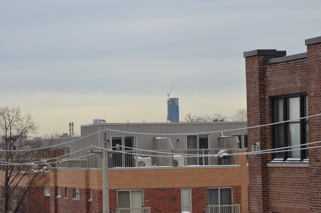
The public art installation atop The Met condos, "The Harbinger", hasn't worked since November or December of 2012. Then there's TRUM's failed installation.

Cant speak for what is going on at The Met, but the city is considering legal action against Trump in relation to that public art component. So my comment still stands.
 
I am probably one of the few here who feel this way, but I think light features are the architectural equivalent of the fins on cars of the later fifties. Some are relatively restrained and thoughtful but others are 1958 Plymouth excessive. Even if they don't shine directly into your window, they create ambient glare, especially if there are particulates in the air, as is very often the case in cities. They contribute unnecessarily to light pollution which is economically wasteful and ecologically harmful. Turn the CN Tower into a goal light during the Stanley Cup playoffs by all means, but otherwise let lighting serve a useful purpose, not mere display. I suppose the best that can be hoped for is that, like the fins, they will be out of style in five years time.

There, rant completed. Back to the usual conversation.
 
Saw the lights tonight and thought it was awesome. I'm really looking forward to the final product. In my opinion, Aura is looking better and better each month.
 
March 13
Didn't have my zoom with me as this was unplanned
13137817185_9a2698e493_b.jpg


13138096794_33c9ee9e4f_b.jpg
 
Aura_from_Bridgepoint_Mar2014.jpg

Aura looking dominate from Bridgepoint. MArch13/2014
 

Attachments

  • Aura_from_Bridgepoint_Mar2014.jpg
    Aura_from_Bridgepoint_Mar2014.jpg
    94.4 KB · Views: 719
The north view is decent...

The first shot thought...Can't wait until One Bloor is up, plus some of the buildings going up on either side of Yonge. Great canyon.
 
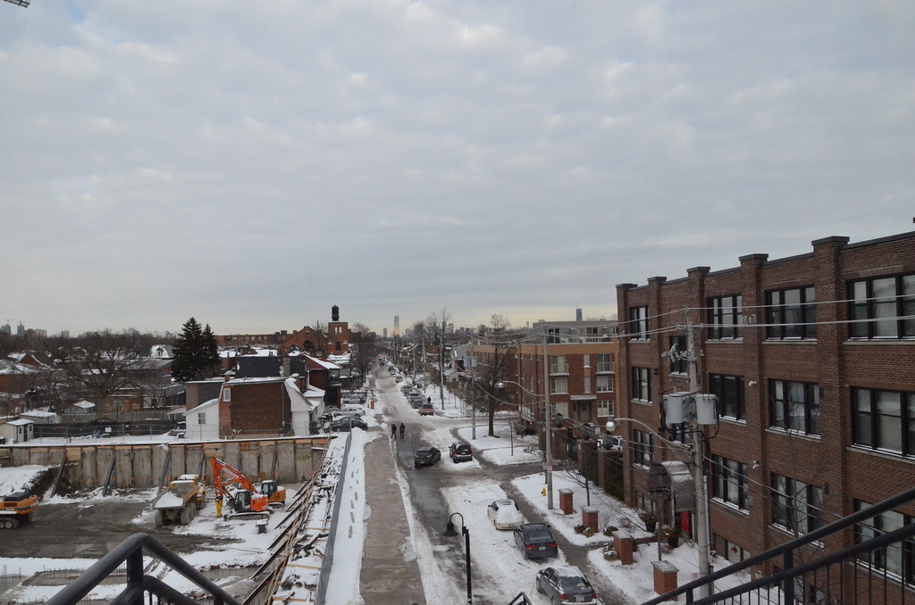
I don't get one thing. why in the first shot it looks tall and thin and in the second shot it looks fat and broad.
 
It's wider on the north side, so it's not all perspective. At least the lower portion, not the upper part.

65049_4.jpg
 
That second shot is definitely squished on the top, you can tell by the floors getting shorter, and especially the proportions of the crane and how it is curved. some kind of perspective correction filter must have been used.
 
Went to a get together at a unit on the 45th floor on Friday. The cornerunit faced east and north. Unbelievably spectacular views from the balcony, looking right down into the Ryerson Quad and campus, with a gorgeous long view of Yonge Street from the water to up north.

And to think it was only the 45th floor....only half way up the tower!
 

Back
Top