wmedia
Senior Member
Hear ye, hear ye!
That old CIBC logo is right up there with my all-time favourite logos. I'd love to see it return.
(Off on a tangent, but another favourite of that era is the old National Benzole logo.)
Hear ye, hear ye!
Kind of matches the building tooThat old CIBC logo is right up there with my all-time favourite logos. I'd love to see it return.
(Off on a tangent, but another favourite of that era is the old National Benzole logo.)
Stitched!Messy Friday Storm a'Comin'
Westside UP
View attachment 203749
Westside MIDDLE
View attachment 203750
Westside DOWN
View attachment 203751
Eastside
View attachment 203752
A closer look at the southeast elevator/stairs service tower, which shows the final height of the eastern lowrise building
View attachment 203753
Should have been over 300m taller than it's supposed to be. Or a 1000m taller.This building should have been taller. Should have been over 300m
Should have been over 300m taller than it's supposed to be. Or a 1000m taller.
This building should have been taller. Should have been over 300m
Stitched!
View attachment 203756
This building should have been taller. Should have been over 300m
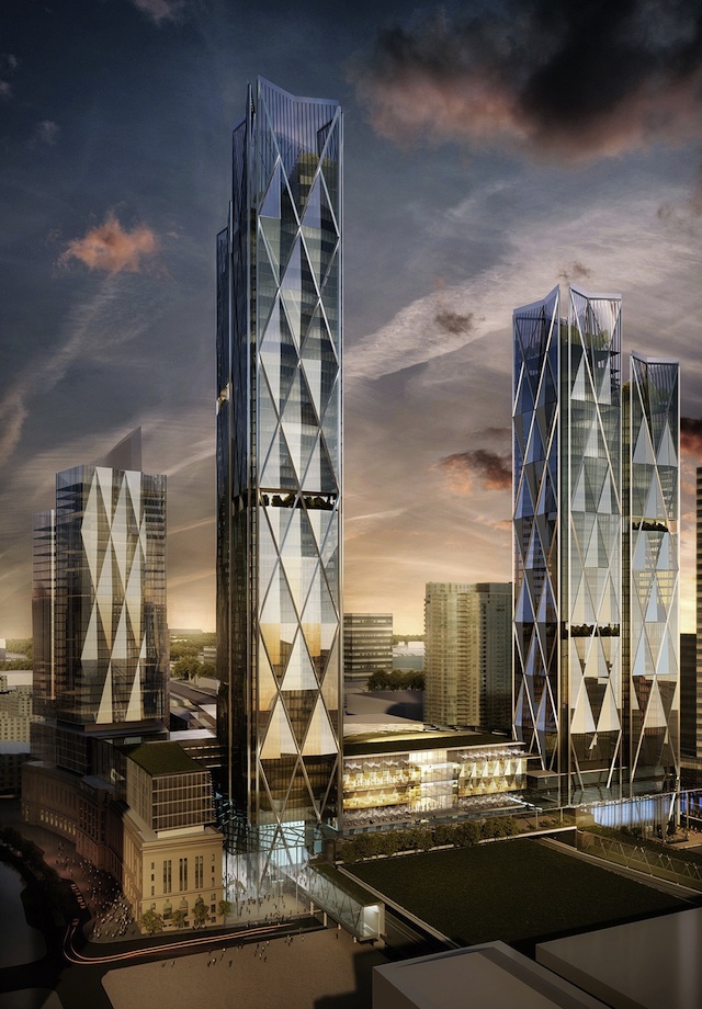
I just don't like this table top effect in Toronto skyline. Where all the buildings in downtown are mostly the same height with FCP being the lone tall building in the middle. It gives the skyline a very boring manicured look.
I like tall buildings thrown here and there...gives it a sense of more chaos and big city vibe.
New York Skyline is great because you have supertall buildings mixed with tall buildings.
