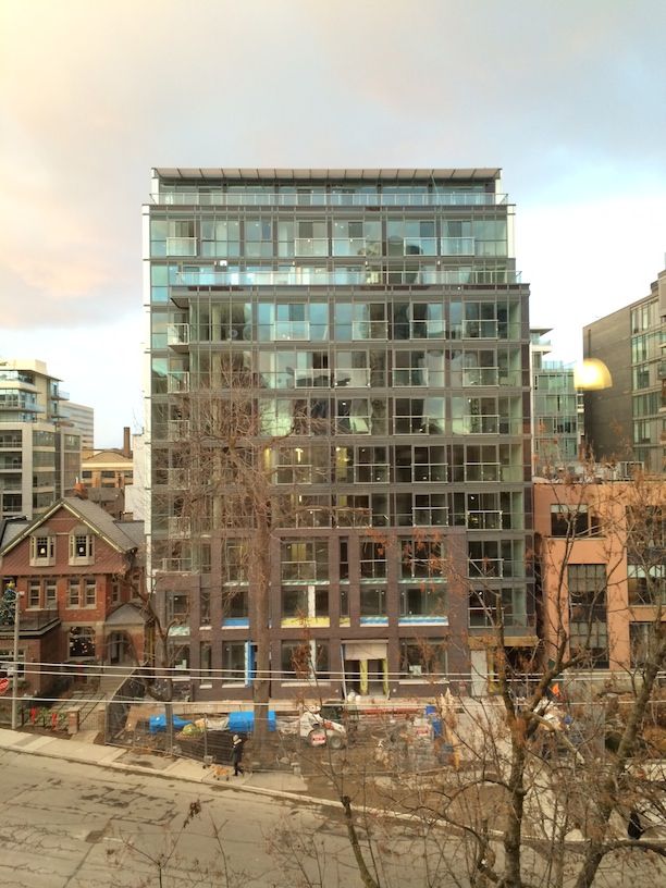
16 November 2013: My dog suddenly had an urge to ...
5gp7.jpg
 
Though I don't mind the overall massing, the detailing is poor. The brick treatment at the base looks half-hearted and lacking in substance. The renderings showed a much more robust projection to the brick - not the half-brick course-depth they ended up doing. The rest of the building is just sort of bloated and shapeless, cloaked in run of the mill window wall with nothing to visually reinforce it. The west wall is a dated and horrible eyesore. Makes you pity the Wellington Pub.
 
The grey brick blends in with the grey windows too much, making the building very bland, clunky-looking and monotomous.
Red brick would be more interesting and would tie in with the neighbouring buildings next door.
 
Last edited by a moderator:
Lovely set of pastels you photographed that with. A very pleasant building, that. Simple geometry. Minimal decoration.

42
 
The grey brick blends in with the grey windows too much, making the building very bland, clunky-looking and monotomous.
Red brick would be more interesting and would tie in with the neighbouring buildings next door.

Yes, something was lost in the translation from design renderings to actually specifying finishes and tones.
 
There's still some bits of wood siding that will need to be installed below the windows of the first couple levels and on the entrance canopy, so there's hope.
 
Yes, hopefully the wood details make the brick 'pop'. I hope this does the trick because this a prominent corner that deserves a high standard of design.
 
I don't mind the blandness on the outside but doesn't look too good on the inside either...based on the units I've seen.
 
There's still some bits of wood siding that will need to be installed below the windows of the first couple levels and on the entrance canopy, so there's hope.

Any hopes that the facade might be saved by the wood bits have been dashed. The wood panels have about as much radiance as fake wood flooring from Home Depot - from a distance it matches the beige EIFS on the building next door. This project has turned out to be a dog with bloat.
 
Struck by the cheapening?

Most likely struck by non-combustible cladding requirements as well. Fire codes can be a bit overzealous - uncompromising even where it makes no sense. In fact I wonder how Core was able to use wood soffits at 500 Wellington. It's possible that these had to be sprinklered from within (!?)
 
Pick taken Jan 23, 2014


LqV1D3S.jpg
 

Back
Top