You are using an out of date browser. It may not display this or other websites correctly.
You should upgrade or use an alternative browser.
You should upgrade or use an alternative browser.
FinchConnection
Active Member
Sep 18


urbandreamer
recession proof
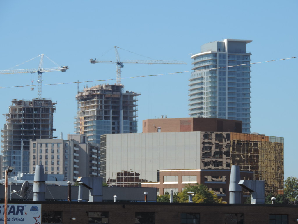
I find it sad that Toronto's chief city planner is heralding this project as a "model" for suburban redevelopment. I think it is more of the same terrible, short-sighted crap that's been going up for decades--it's today's equivalent of the shorter slab apartment blocks in the foreground above.
UrbanAffair
Senior Member
[SUB][/SUB]
Im sure he is referring to the overall use of the land in the project's entirity. And by project, he means the masterplan for that whole Don Mills and Sheppard parcel of land going south including all the next phases. Lastly, probably they aren't referring to the style of the buildings or lack thereof, but more the massing, placement, density, etc.
I find it sad that Toronto's chief city planner is heralding this project as a "model" for suburban redevelopment. I think it is more of the same terrible, short-sighted crap that's been going up for decades--it's today's equivalent of the shorter slab apartment blocks in the foreground above.
Im sure he is referring to the overall use of the land in the project's entirity. And by project, he means the masterplan for that whole Don Mills and Sheppard parcel of land going south including all the next phases. Lastly, probably they aren't referring to the style of the buildings or lack thereof, but more the massing, placement, density, etc.
urbandreamer
recession proof
You mean she is referring to ... as in Jennifer Keesmaat. She tweeted that the form, scale, even the architecture should be a model for Toronto's suburbs to follow!
I told her--via twitter --that is the wrong approach and gave her aA fine example of the right approach.
The master plan for the DM & S area is disgusting! It is stuck in c.2003 urban planning ideals, which were really influenced by c.1993 ideas. Toronto's suburbs need to re-introduce the concept of the local village as a neighbourhood focal point. That means every major intersection should become centres of around 2000-10,000 people with mixed use low and midrise developments featuring attractive architecture, great landscaping and commercial appeal with one or two "main streets." The Emerald City model, otoh, continues the same "ghetto" mentality of those '60s slabs.
I am beginning to fear JK is a redneck!
I told her--via twitter
The master plan for the DM & S area is disgusting! It is stuck in c.2003 urban planning ideals, which were really influenced by c.1993 ideas. Toronto's suburbs need to re-introduce the concept of the local village as a neighbourhood focal point. That means every major intersection should become centres of around 2000-10,000 people with mixed use low and midrise developments featuring attractive architecture, great landscaping and commercial appeal with one or two "main streets." The Emerald City model, otoh, continues the same "ghetto" mentality of those '60s slabs.
I am beginning to fear JK is a redneck!
Last edited:
wang888
Active Member
The Emerald City model, otoh, continues the same "ghetto" mentality of those '60s slabs.
It's all true. Don mills just still as ghetto looking. Emerald City isn't changing anything. Anything east of Don Mills on Sheppard just blows.
Torontovibe
Senior Member
I have to say, I agree with Urbandreamer here and his example, posted, speaks for itself. Those pics on aA's site, look good. That European style of urbanity works quite well and I wish we would learn from them. If our suburbs looked like that, we'd be very lucky indeed.
We have a story up on the front page looking at the evolution of the land here.
junctionist
Senior Member
Sep 18

Nothing beats a brick or glass facade with 30 balcony slabs in a neat little line. Architectural perfection, yes? No need to try anything different as the decades pass. North York-East Berlin forever!
christiesplits
Senior Member
Driving along the 401 DM & S makes Bayview & Sheppard, and particularly the New York towers look even more atrocious.
junctionist
Senior Member
Driving along the 401 DM & S makes Bayview & Sheppard, and particularly the New York towers look even more atrocious.
It's driving down the 401 that the scale of the mediocrity of high-rise apartment buildings in North York becomes apparent. The NY Towers are kitsch, but in their boldness and exuberance, most people enjoy seeing them. They're the architectural highlight of their drives on the 401 through the 416 When the bar for architecture is so low, even the kitsch can prevail.
FinchConnection
Active Member
You mean she is referring to ... as in Jennifer Keesmaat. She tweeted that the form, scale, even the architecture should be a model for Toronto's suburbs to follow!
I told her--via twitter--that is the wrong approach and gave her aA fine example of the right approach.
The master plan for the DM & S area is disgusting! It is stuck in c.2003 urban planning ideals, which were really influenced by c.1993 ideas. Toronto's suburbs need to re-introduce the concept of the local village as a neighbourhood focal point. That means every major intersection should become centres of around 2000-10,000 people with mixed use low and midrise developments featuring attractive architecture, great landscaping and commercial appeal with one or two "main streets." The Emerald City model, otoh, continues the same "ghetto" mentality of those '60s slabs.
I am beginning to fear JK is a redneck!
I have to say, I agree with Urbandreamer here and his example, posted, speaks for itself. Those pics on aA's site, look good. That European style of urbanity works quite well and I wish we would learn from them. If our suburbs looked like that, we'd be very lucky indeed.
I also agree. That's a brilliant example of what I've also felt to be the direction Toronto should be headed in.
I have to say I was surprised by the Emerald City plan and how it failed to incorporate some of these "progressive" design concepts. I feel like the Don Mills community (the area I've personally grown up in) would be a perfect area to develop projects that resemble the Pan Am village. A precedent for these sorts of projects being constructed uptown needs to be set. I'm still weary about the Concord development just west of this based on what I've seen with their downtown development.
drum118
Superstar
Sept 27
The last 2 towers are being top off or about to. Lot more shots up on site.


The last 2 towers are being top off or about to. Lot more shots up on site.


someMidTowner
¯\_(ツ)_/¯
Views from the top of the 36-storey 1st phase. Check it out!
http://urbantoronto.ca/news/2013/10/dramatic-views-predominate-elads-emerald-city-condos
http://urbantoronto.ca/news/2013/10/dramatic-views-predominate-elads-emerald-city-condos
Torontovibe
Senior Member
I wish they had used a bit more of a vibrant colour on this, like maybe emerald. The colour is so muted and dull. Toronto seems to be so afraid of beautiful, rich, vibrant colour, yet that's what it desperately needs.


