Fly.jpg


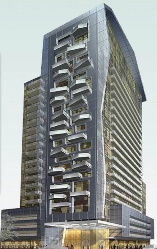
The thick glass on the side of the buiding with it's uneven edges is very unique... and the windows are actually indented... not flush. There is also other, smaller, accents like the canopy above the front entrance... It will be a nice building if it can stay true to the rendering

I have to say, those balconies look like absolute crap. It looks like G+C tried to summon Liebeskind and failed miserably. It resembles a stick of rock candy that you'd get from the ROM or Science Centre gift shop (not in a good way), or a cheesy indoor rock climbing wall. If they toned down the balconies and kept the angular glass frame wall, it would be a perfectly fine little modernist box, but I'd still be concerned about that square tile cladding which could easily make it look right at home in a low-rise business park in Mississauga.

I love the (way more) edgy designs of some of the proposals in the Entertainment District, but this is really cheesy.

Grey, it doesn't appear reminiscent to me of Libeskind at all. You really think G+C are trying to do Libeskind just because of angled balconies? It looks to me more like they are taking Clewes most recent angled balcony designs and making them jarring instead of undulating. A giant pushing up against the west wall of this building would get his eye poked out.

42
 
I will give them points for trying but ultimately, I am not sure they succeeded. These attempts at something different, like wavy balconies or even more so these balconies, come off as attempts to compensate for a lack of real design that is distinquishing. And I am not sure they will stand the test of time (the ultimate test).

But again, we are getting something a little different and for that, I am thankful.
You say it so much more eloquently. I agree, G+C deserves an A+ for effort.

Grey, it doesn't appear reminiscent to me of Libeskind at all. You really think G+C are trying to do Libeskind just because of angled balconies? It looks to me more like they are taking Clewes most recent angled balcony designs and making them jarring instead of undulating. A giant pushing up against the west wall of this building would get his eye poked out.

42
Yeah, half-assed Clewes was my first thought, but the angular shard-like glass wall and roof line in conjunction with wacky balconies is how I arrived at quarter-assed Liebeskind.
 
I will give you this, it is trying to be different and well, maybe it has succeeded in one way or another. However, I would bet that the irregular pattern of the balconies would be one of the first things to get watered-down, then the 3 foot thick glass wrapping etc.

I will also admit/agree that developers are trying harder to market more progressive and interesting designs, but again, we have a long way to go before we can really be proud of residential architecture in this city- at least for the most part.

p5
 
Actually, it reminds me of Uno Prii's Annex designs: conservative commie blocks at heart, with "flair" added via wacky balconies. (Clewes himself has been doing the same thing lately, at the Distillery and Market Worf.)

I'm not getting much sense of coherence from this render. I'm getting more a sense of "look, look, angles!"
 
Buildings like this are why God created design review.

That is very funny (and true. I wonder what they are going to do with this. "Can you make your intended wackyness, a little less..well, wacky and a little ...well...better designed?")
 
Better designed? To make it more provoking? Isn't it provoking enough?

42
 
I don't think they want this building looking tidy. Otherwise it wouldn't look like this. They want edge, and design review tends to smooth out rough edges.

42
 
Design review isn't intended to trash what's there, but to improve it. I think that happened with another G&C design, the Aura condo - those involved in the process on all sides came away speaking well of it. It can still be an "edgy" building after review - just a better sort of edgy, less car crash edgy.
 
Hmmm... it's interesting but I don't like it. Market Wharf is cute, but this is a bit hard on the eyes.
 

Back
Top