Yes and no. There is a floor on living/sleep/dining area but not a minimum bathroom as I'm aware. If the structure required it the Freed shower could be smaller and you could probably get down to 260 sft.
View attachment 553725

This type of thing applies to dorms, hostels, and rooming houses with shared washrooms too.

It's largely up to the market to decide they won't purchase something.
 
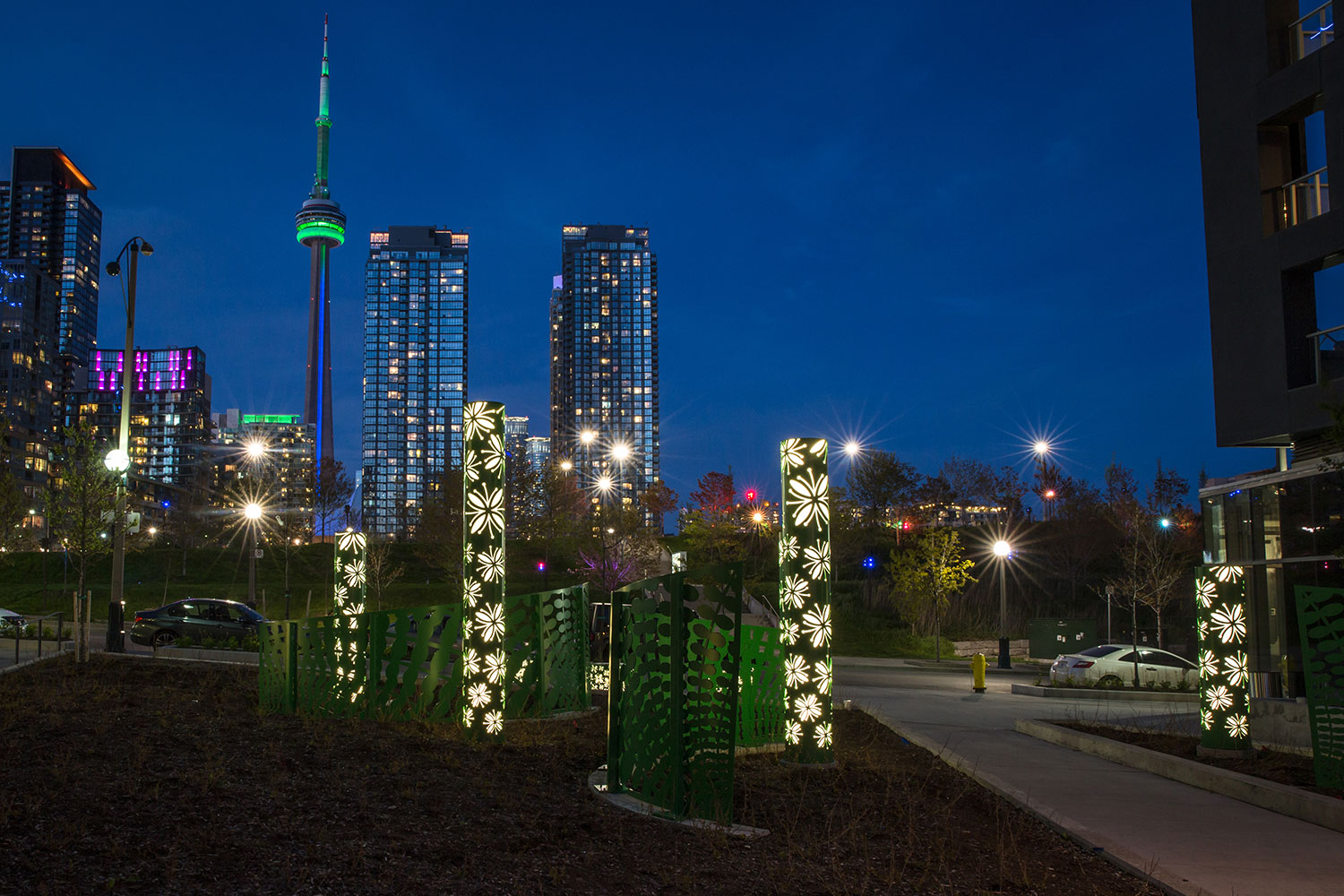
CityPlace has also successfully maintained all of its lighting features - however those were secured as public art and all of the condo boards are required to maintain them. The artist already got into a squabble with Harbourview Estates when they started keeping the lights off to save money.
I like the concept at CityPlace but all that was done was installing coloured lights to the mechanical penthouse levels which at certain angles, and especially seen from other condos, highlights the not so attractive mechanical equipment and other stuff inside. Adding a simple frosted film (or in my opinion a smartly designed frit pattern) to the glazing would have better emphasize these “artistic” elements and tied all of these buildings together. I always find that these illuminated mechanical penthouses are like a not so thought out afterthought and the overall appearance to be very weak. It was a missed opportunity to do something nice and cool, I love art but I don’t find this artistic nor impactful.
 
I have been a longtime fan of Murakami’s work, and though his colourful smiley flowers have been a major theme to his work (it has nothing to do with gay pride) he is inspired by ancient and traditional Ukiyo-e Japanese art, often rooted in mythology, and interprets then in a contemporary pop or psychedelic style. Some of his art could be seen as very chaotic and sometimes nightmarish (like a bad acid trip) which is in contrast to his happy cartoonish flower pieces which he is most well known for.

IMG_2932.jpeg
IMG_2938.jpeg
IMG_2930.jpeg
 
Last edited:
I like the concept at CityPlace but all that was done was installing coloured lights to the mechanical penthouse levels which at certain angles, and especially seen from other condos, highlights the not so attractive mechanical equipment and other stuff inside. Adding a simple frosted film (or in my opinion a smartly designed frit pattern) to the glazing would have better emphasize these “artistic” elements and tied all of these buildings together. I always find that these illuminated mechanical penthouses are like a not so thought out afterthought and the overall appearance to be very weak. It was a missed opportunity to do something nice and cool, I love art but I don’t find this artistic nor impactful.

Since I'm not living near CityPlace... I grudging have to compliment the lighting design plan (I think it was called "Warm By Night') because
a) it looks great from a distance and
b) it still works. Can't believe I paid that joint a compliment.

The complainers about 160 Front W/TD Terrace lighting being too over the top (which frankly pales compared to the swaths of night lighting in NYC, Phillie etc) won't like this but... I want more night colour drama in the core. eg. CIBC Square is way too polite given its crown LEDs are equipped to present an infinite number of colours (and animations/combinations).

As someone said a while back "Let there be light" Genesis 1:3-25

concord-65_26500448843_o.jpg

cityplace.ca
 
I like the concept at CityPlace but all that was done was installing coloured lights to the mechanical penthouse levels which at certain angles, and especially seen from other condos, highlights the not so attractive mechanical equipment and other stuff inside. Adding a simple frosted film (or in my opinion a smartly designed frit pattern) to the glazing would have better emphasize these “artistic” elements and tied all of these buildings together. I always find that these illuminated mechanical penthouses are like a not so thought out afterthought and the overall appearance to be very weak. It was a missed opportunity to do something nice and cool, I love art but I don’t find this artistic nor impactful.
I love the functional parts of buildings being shown or highlighted. Why shouldn't they be? I'll always advocate for simple, clear, mechanical glazing vs. some terrible spandrel or butchered 'effect' that never seems to work because the scaling of the frit doesn't work at the distance at which it's perceived.
 
I love the functional parts of buildings being shown or highlighted. Why shouldn't they be? I'll always advocate for simple, clear, mechanical glazing vs. some terrible spandrel or butchered 'effect' that never seems to work because the scaling of the frit doesn't work at the distance at which it's perceived.

The purple mech-PH lights at Luna does look good (as seen in 3dementia’s photo) as it highlights selected glazing panels creating an interesting pattern on the glazed facade. I don’t mind seeing the mechanical equipment as long as it looks cool and it’s kept in a good and tidy state. I remember seeing the mech-PH spaces through the clear glazing and seeing lots of stuff being stored there. Frosted or fritted glazing would create a nice pronounced coloured glow to the glazing and hide some of the unattractive bits inside, but I think it looks more of an afterthought on some of the buildings.
 
Some of his art could be seen as very chaotic and sometimes nightmarish (like a bad acid trip) which is in contrast to his happy cartoonish flower pieces which he is most well known for.
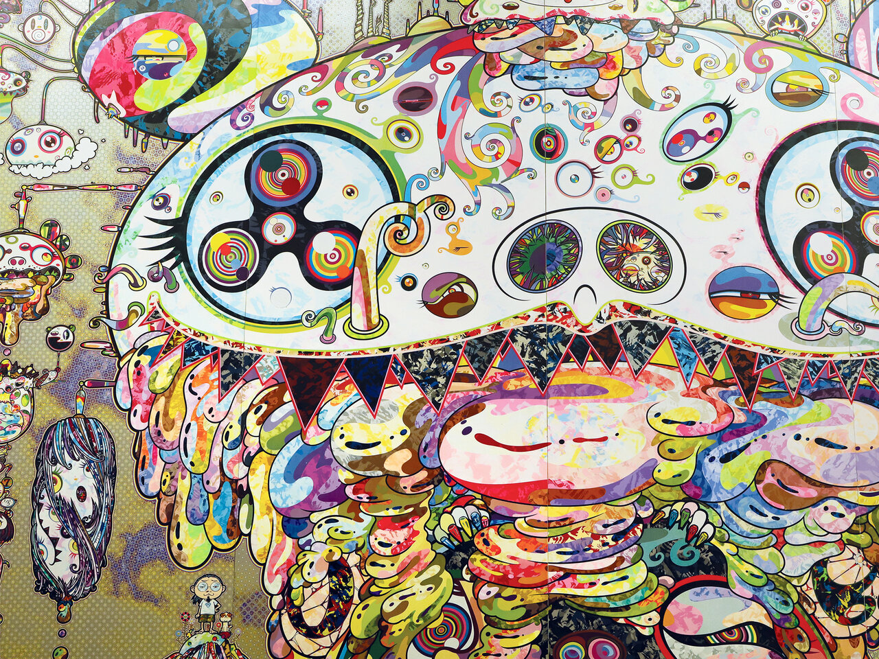
...sometimes for where artwork is concerned, that's the best kinda trip, IMO.

(Note: Emphasis mine.)
 
Does anyone know when the construction starts?

While the demolition permits for all the properties are in place; there have been no 'new build' permits even applied for; given typical turnaround times, even if sales surprised to the upside, it will be at least several months.

That said, when @ProjectEnd stops by a thread to wish a fellow developer 'good luck' while clearly mocking their asking price per unit............ I would be inclined think sales here might be a tad slow.
 
Last edited:
...nothing bolster sales more when the asking prices makes potential buyers go "twitch". /s
 
Honestly, the best thing that could happen to the Toronto market is if investors weren’t able to load up on condos. I’m tired of seeing layouts that are completely non-functional for living.

I say this as someone who lived for a loooong time in a tiny studio. I really, really get that there is a market for small units - but the Freed layout is just unlivable IMO.
 

Back
Top