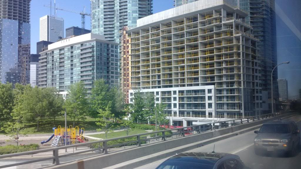
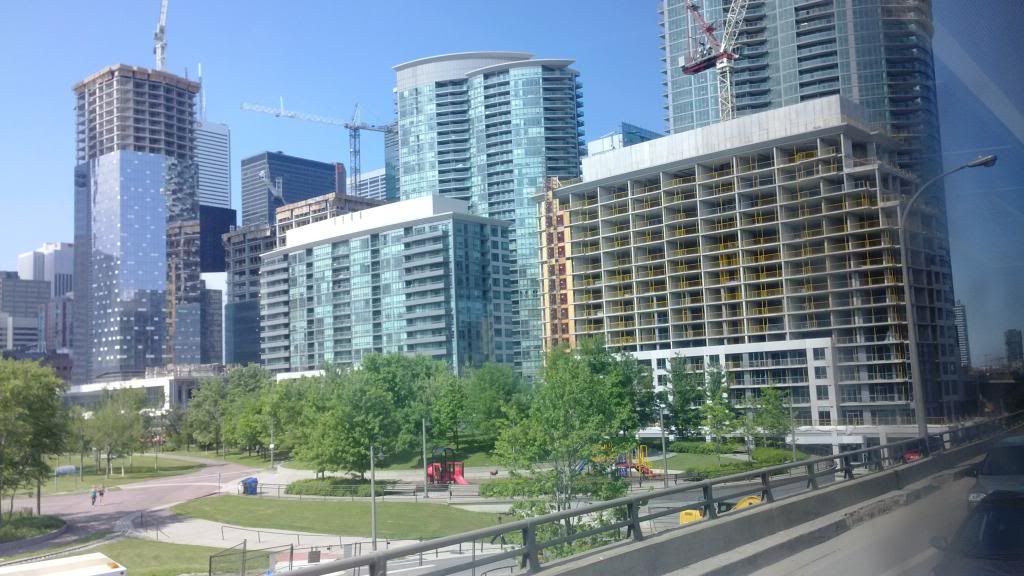
I like the retail on these buildings. Adds to the street life in a positive way. I also like that they are different looking than everything else in the area. Otherwise very forgettable.
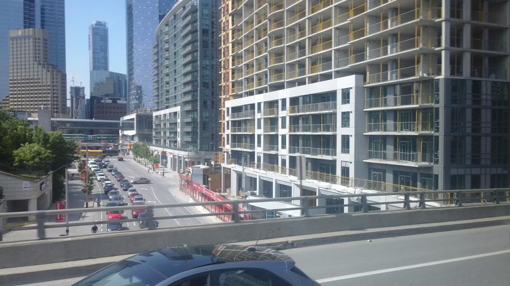
 
From a cellphone, from the gardiner, on a bus:

I find it disturbing that this condo set, which I am so loathe to even compliment, actually is not without some streetwall and streetscape virtue in this shot. Then again, you could probably stack skulls along Lower Simcoe and they'd be more fascinating.

Interesting that all three buildings in this shot have a tidy white bib stuck on them at about the same height.

IMG_20130612_161759_zpsb93a3bdd.jpg


And suddenly, with a mere change of angle, blandness appears.
IMG_20130612_161811_zpsce1ec14a.jpg


Oh Look! The Delta has arisen to rescue us from monotony! Er, um...well - uh...

IMG_20130612_161817_zps6d1f1eab.jpg
 
Amazing shots today, MafaldaBoy! Beautiful colours :)
 
Why, why did these matching heaps of garbage have to be so damn prominent from the largest tourist destination in the city. Such a mistake.

And thanks Mafaldaboy for the great updates tongiht!
 
^ If only it was possible to demolish buildings in real life as in SimCity. These Infinity eyesores really could use a fresh start.
 
Were these ever part of the original city plan for this area? I recall the model at City Hall having something different, like one larger tower and more green space..
 
These buildings are embarrassing but being surrounded by such sexy towers (Delta, Ice, etc), certainly doesn't help either.
 
Last edited by a moderator:
I actually don't mind the infinity buildings... It's a nice break from all the sheet glass and metal. Although I do agree the "copy-and-paste" of the two buildings is repetitive.
 

Back
Top