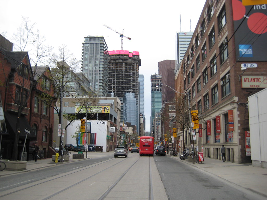
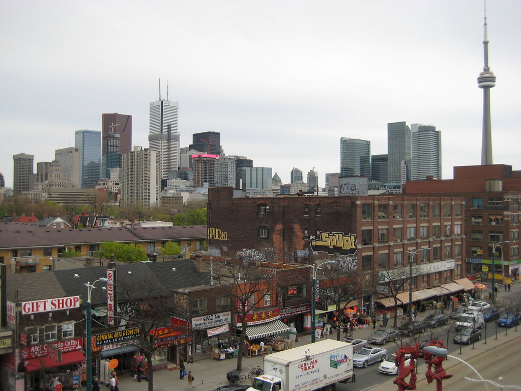
Vu is too short and too far away that it looks kinda silly smack in the middle of Adelaide. especially with these ginormous skyscrapers that are Bay Adelaide, scotia, and trump.

I wouldn't mind its height if it simply reflected the fact that it was a view terminus. It doesn't even look like it's facing Adelaide.
 
Vu is too short and too far away that it looks kinda silly smack in the middle of Adelaide. especially with these ginormous skyscrapers that are Bay Adelaide, scotia, and trump.

Getting closer to Vu doesn't help. It is an uninteresting building and a total waste of a potentially great view corridor. Yep, another opportunity wasted but at least it has retail on the ground floor, so it will add some animation.
 
I agree. That an architect/designer should squander such a plumb site, one that is a view terminus fronting a gorgeous urban park, is unfathomable to me. You can't get much better than this.... and Vu is what they came up with? They spent more time coming up with the name which is sort of ironic in that it doesn't seem like they really considered the 'view' at all.
 
Sorry about the camera shake, but this pic shows what a nice grouping this will be once Shangri-La shows up in right half of the picture. In fact, you can see a little bit of the hot pink if you look closely.

5692392352_114c58f4b6_b.jpg


And you can almost see the Ritz lighting up more and more by the day...
 
Last edited:
Apocalyptic Shangri-la today:

5697621470_c49ecfee7d_b.jpg


5697620830_d7db0cdba7_b.jpg


5697622092_97f4bc5f12_b.jpg


5697622660_d77cc813a9_b.jpg


All photos by me: steveve


EDIT:
video:

[video=youtube;Gl5w-AdGPso]http://www.youtube.com/watch?v=Gl5w-AdGPso[/video]
 
Last edited:
Some pics from St Andrews

dscf0298.jpg


dscf0293s.jpg


dscf0291pw.jpg
 
From University & College

Click on the thumbnail to enlarge, then click again on the image for full size.


Back
Top