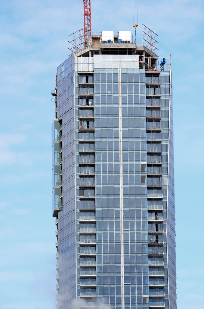
A building that turns its side to University's view corridor isn't a win in my estimation. The north and south elevations are afterthoughts.

Agreed. One wonders how much time the architect actually spent - when he came to town - really looking at the site. It was one of the few opportunities to design a tall building, in the heart of our increasingly built-up city, that's visible from top to toe, and to make something of that fact - the jog in University Avenue also provides a view terminus when viewed from the north.

I also think the base is a shantytown-like jumble, reminding me of the overdesigned Vü - the way the new building plugs into the heritage block has none of the elegance of KPMB's work at the National Ballet School addition, for instance, or their Royal Conservatory addition, or how their Gardiner Museum defers to the heritage building to the north of it, or how the south east corner of their Bridgepoint hospital defers to the old Jail. And when you're at street level looking up at the north and south sides of the Shangri-La tower the focal points are the undersides of the base of the balcony stacks, or the downward extensions of them. I expect that's why we rarely see images from those perspectives posted. But from a distance, on Queen West especially, the tower looks rather good.
 
FYI, they are in the process of putting up what looks like the public art right now (2100) - looks like some kind of silver/pewter horse.

AoD
 
The top of Shangri-la today (Mar. 31) from my POV

 
US's point about the University view corridor is valid. It is an inexcusable wasted opportunity, plain and simple. US also mentions Vu, and as I recall there was also a wasted view corridor there too? Toronto is so obsessed with building tall buildings on parking lots that context often seems to get lost.
 
Then Scotia Plaza is a "wasted opportunity". As is Manulife Centre because it turns its side on Bloor.. etc etc

Ridiculous. It has its interesting fronts on the east and west because it fronts onto a North-South street. Would you rather it "turned its side" on University itself?

It is not valid at all, just looking for something to hate about a building that isn't a box.
 
It is not valid at all, just looking for something to hate about a building that isn't a box.

A petulant and dismissive response to a different opinion, Architect; rudeness does not strengthen an argument.

I concur with Shocker and Tewder: the lack of attention paid to the north face of this building is a major oversight, as if the architect forgot that our grandest municipal boulevard is even there. It seems the opposite approach to Correa's due diligence when designing the Aga Khan complex - i.e. grab a bike and feel out all sight lines and site conditions thoroughly.

Shocker, I find you generous re: the Queen St West view. While I can dig the blingy luminescence of the angular planes, the tower makes me think of my own flabby, post-winter waistline. For all its height, I find it heavy on its haunches, big boned and squat.
 
The faceted north and south sides of Scotia Plaza do offer something worthwhile - serial setbacks that define the lozenge-like aesthetic of the building as a whole; the downward notches at the top of the east and west sides of the tower repeat the motif. Burano swipes Scotia's lozenge idea, in a simplified form, and Safdie's Monde - though I think it's too fussy - adopts a similar approach by impressing the tower's "footprint" into the south end of the podium as a motif that's intended to unify tower and podium. I think that, with the Manulife, the designers fully accepted the "end-on" aspect of the east and west sides and played it up as part of the overall aesthetic, whereas with Shangri-La the north and south sides are rather just left there.
 
It is not valid at all, just looking for something to hate about a building that isn't a box.

Yellow Card - The_Architect's Law may be invoked!

The_Architect's Law states that: "As an Urban Toronto critique of a second-rate piece of architecture grows more effective, the probability that an expression such as 'well at least it's not another derivative modernist box ...' will be introduced to derail the discussion approaches one."

... although, on a technicality, I don't think that anyone - and certainly not I - has claimed that Shangri-La is "second-rate".
 
Having the skinny side face north-south would reduce the shadowing on University Ave to the north.

Isn't there supposed to be a light feature running up the north and south facades?
If so, that'll create a focal point at nighttime. That probably won't be installed until well after the building is completed.
 
March 27
6893144994_78c837658a_b.jpg


6892639620_9bfdd14f6f_b.jpg


7038728531_b7de1bcde5_b.jpg


7038420839_9ffa7997b1_b.jpg


6892327500_a60d250be5_b.jpg
 
A petulant and dismissive response to a different opinion, Architect; rudeness does not strengthen an argument.

I concur with Shocker and Tewder: the lack of attention paid to the north face of this building is a major oversight, as if the architect forgot that our grandest municipal boulevard is even there. It seems the opposite approach to Correa's due diligence when designing the Aga Khan complex - i.e. grab a bike and feel out all sight lines and site conditions thoroughly.

Shocker, I find you generous re: the Queen St West view. While I can dig the blingy luminescence
of the angular planes, the tower makes me think of my own flabby, post-winter waistline. For all its height, I find it heavy on its haunches, big boned and squat.

What in the hell are you talking about? The most interesting face of it is fronting University Ave... They did anything but ignore it.
On the North and South sides it was given vertical lines going up the entire building and emphasize its verticality.. Not to mention an LED strip to do the same at night. As for your comment about the west face, big boned? This thing is 700 feet tall and not even as wide as many shorter buildings than it in the downtown area.. I assume you find TD Centre to be "big boned heave on its haunches and squat" facing the north and south? Of course not because that doesn't go against popular opinion and take away from the appearance of being on the high pedestal you seem to hold yourself on.

They did anything but ignore University Ave. What a ridiculous claim backed by subtle hypocritical rudeness to me. Not a good start to the site. You best watch the way you speak to people you've never replied to before else people start to treat you with the same respect you show them.


As for US... I'm not even dignifying that incoherent rambling with a response.
 
Last edited:
And... what did it look like thus far?

Well, when I saw it being moved into place on Saturday it was shiny and silver and sinuous, and it looked incomplete - as if there were appendages yet to be bolted into place - and now it's wrapped up in a shroud of tarps.
 

Back
Top