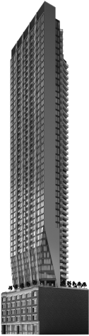
If this building goes through it's going to be a classy looking one when built as you can see in the photos in the previous page .
 
Last edited:
I feel like they're probably going to be grey not gold and what we're seeing is just the usual "make it look warm in renderings by depicting it under sunset or warm lighting" situation, but still this design looks promising. Fingers crossed for golden columns!

This seems to be inspired by/share some resemblance with 1 Yorkville and some of what we're seeing in Pinnacle Yonge. This is a nice growing trend — solid materiality catching the light in different angles is great! Makes an otherwise relatively straightforward glass/spandrel/mullions situation much more interesting and dynamic.

Happy to find that I was wrong about the colour being just sunset glare! Lighting and restoration of the heritage facade looks good too.
 
Project website:


Home_Building_2x.jpg
 
*Not official*

Photoshop of how the corner of John and Adelaide will look with this design. I imagine we'll get a better render of this angle shortly.

Side note: While i do think this design has its rough spots (the odd blank side towards john) and slightly odd proportions, I applaud that this design does a lot that people on this forum always beg for, so I can't help but laugh at the irony of the comments above.

Anyways (Via Google streetview):

sb12.jpg
 
Oh...so this is neighbouring PJ's. That explains the shape of it.
 
OMG what kinda 90s throw back mess is this?
lol! Lanterra
Could you explain why? It keeps a distinct, ‘human scale’ podium in brick with a distinct retail section. The actual tower has a unique shape and isn’t generic glass tower. This seems...fine?

Not a fan of that weird band of concrete up the side though. Maybe they could dress it up with a ginormous mural :)
 
Other than the base and the little 'angly' thingy copy cat of PJ it looks like the Sheraton Centre.
 
Could you explain why? It keeps a distinct, ‘human scale’ podium in brick with a distinct retail section. The actual tower has a unique shape and isn’t generic glass tower. This seems...fine?

Not a fan of that weird band of concrete up the side though. Maybe they could dress it up with a ginormous mural :)

I thought about it more and it's not as bad as when I initially saw it
I think that orange hue is very something from the 90s.

Kinda give me these vibes:
Would it look better with brick red? Possible ala PJ condos adjacent
I think it is better than something white and grey to add more colour to the Entertainment District

1617467846102.png

Source: https://depositphotos.com/4835133/stock-photo-construction-work-site.html

1617467911582.png

Source: https://depositphotos.com/3425557/stock-photo-new-brick-house.html
 
I think that orange hue is very something from the 90s.
Gotcha.

I do think a bold color would work well here. That said, like you, I’m glad that that they are considering something other than ‘glass and grey’.

I guess we’ll have to wait until later in the process to see the exact materials and colors?
 

Back
Top