Big Daddy
Senior Member
I wouldn't worry about it - this group has paid a great deal of attention to the details - this will be fixed or will blend with the final design for sure.
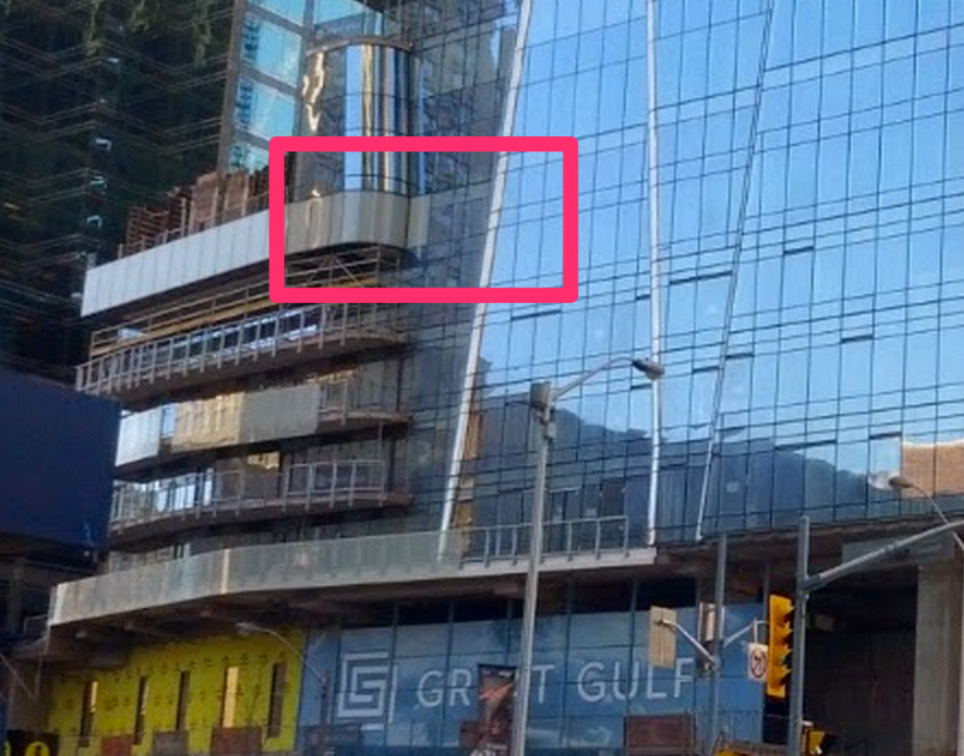
As awesome as this project is, I'm not a fan of the podium balconies. Too much going on and too many jagged lines for me. Maybe once the balcony glass on the tower goes up it will make the podium looks less jarring..
So is this by design, or a mistake? The ones below do not have a white panel for the body.

I'll post some update photos when I'm back in Toronto this Sunday hopefully.
And BTW, Hariri Pontarini Architects are passing along a thank you for all the photos which allow them to virtually visit the building on an ongoing basis! The aerial shots are especially appreciated so I hear, but I'd say that all the photos are appreciated.
I have to disagree - it's their attempt to bring life to the podium since these balconies will likely have people on them a great deal of the time. The alternative would be another wall of glass which would sterilize this great corner. I believe it will be one of the best locations in the city for nightlife etc. because it is open on so many levels.