dt_toronto_geek
Superstar
Hardly show? They show up quite clearly to me, and that's why I made the comment.
I'm with you, I'm not so sure they haven't made their first mistake with the execution of the balconies.
Hardly show? They show up quite clearly to me, and that's why I made the comment.
POW is not a factor as Mirvish himself said he has more theater seats than he can fill and he would build a new one if and when required.
We didn't "win" anything.
Jan 17
Lot more up on site
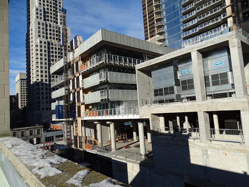
Not a fan of the off-white colour of the balcony glass. It distracts things. It would have been sleeker if it matched the colour of all the other glass. I'll wait and see of course what the final product looks like.

In One Bloor's case, I think the exception can be made. In order to highlight the design and the 'waves', a high-contrasting balcony glass is the way to go.
In the photo below, imagine if the balcony cladding matched that of the inner skin. The waves would be much less noticeable.
Source: http://ad009cdnb.archdaily.net/wp-content/uploads/2010/06/1277171962-one-bloor-model-03.jpg
How typical is it for builders to put down crushed stone on balconies before putting the tiles down. I don\'t think I\'ve seen this before.


