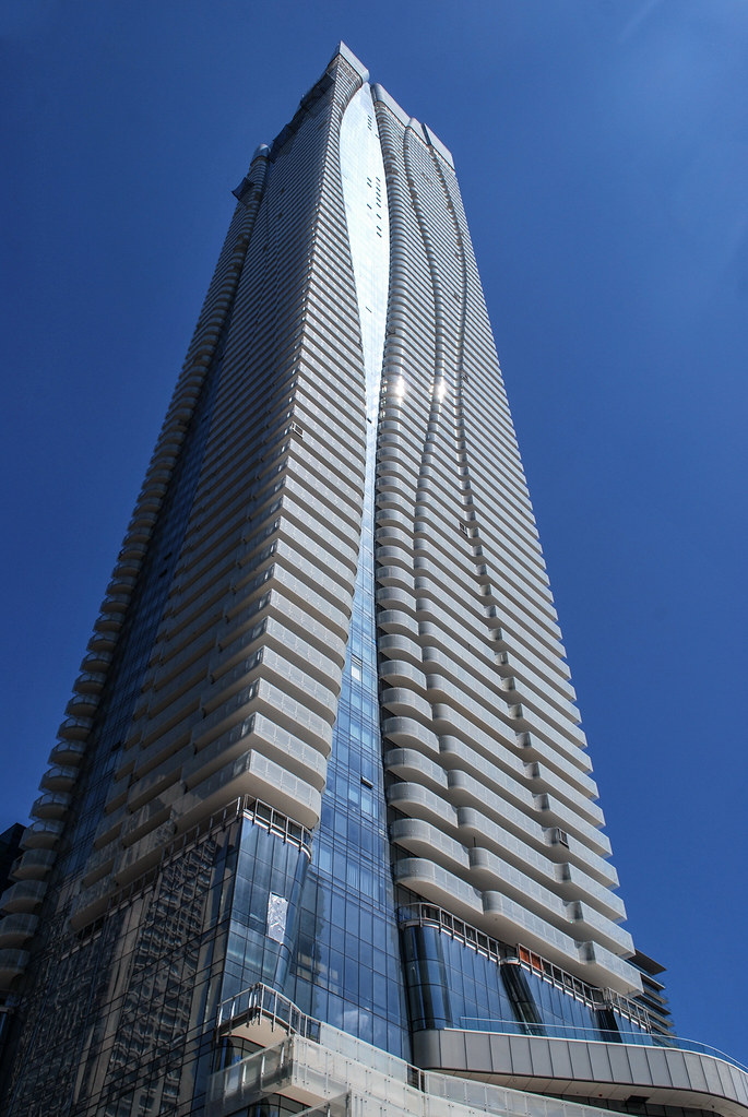
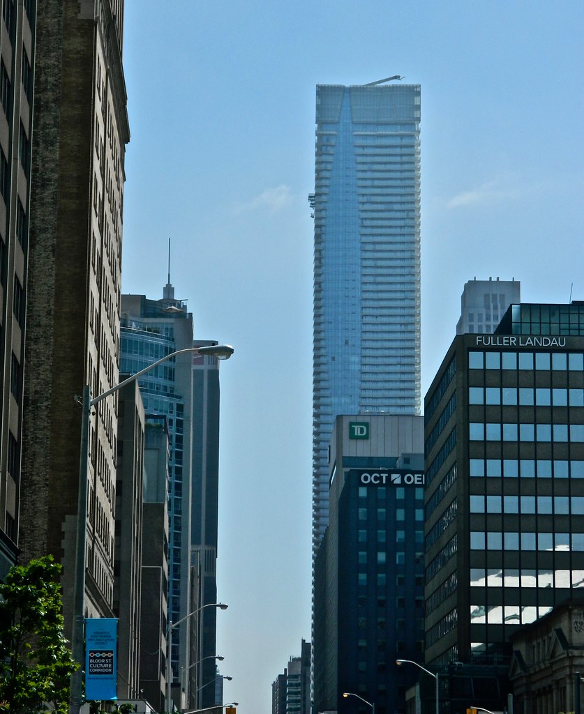
Is the lobby's exterior wall even the finished product? It looks so strange to see the contrast between the retail and residential entrances. And those weird doors to nowhere coming out of the second floor? It feels like the Bloor St frontage is missing some fairly large pieces still
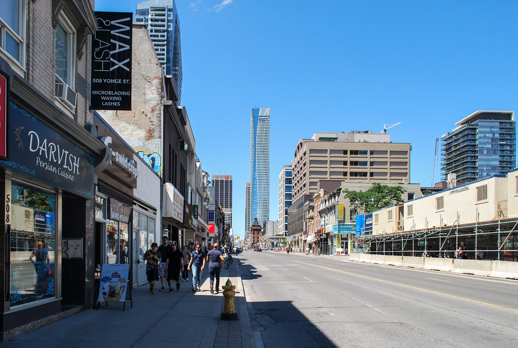
 
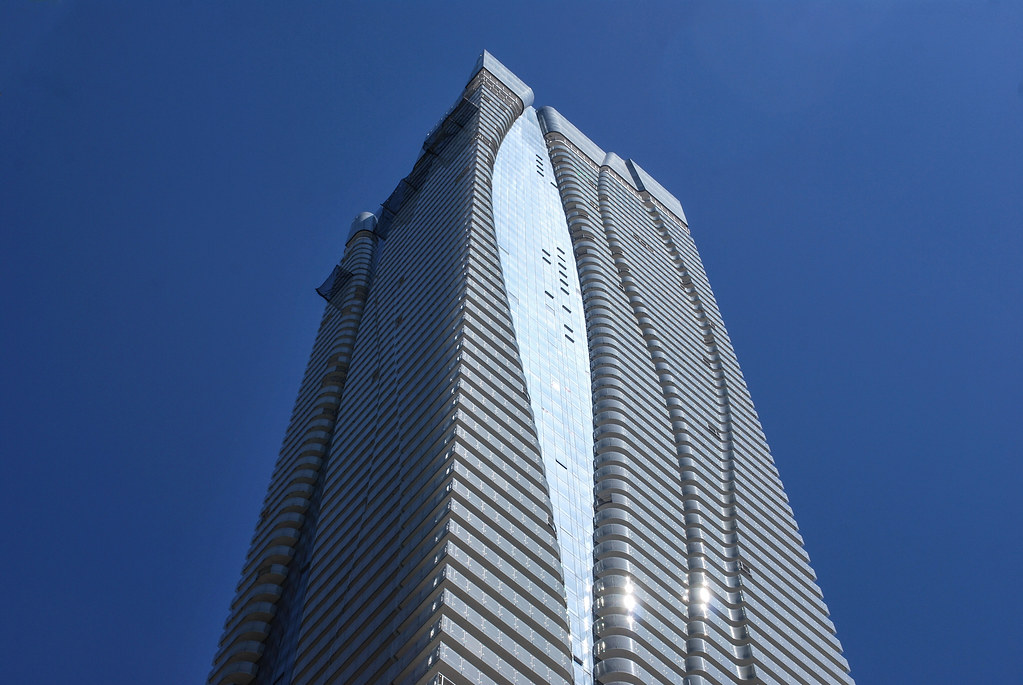
Real question is how long it will take to replace those missing balcony pieces scattered around the building, especially with their supply issues.
 
Today. They are making such a mess of the outdoor space. They've let weeds grow all summer and have just pulled them out along with some of the plantings.
IMG_5745.JPG
IMG_5746.JPG
IMG_5747.JPG
IMG_5748.JPG
IMG_5749.JPG
IMG_5750.JPG
IMG_5753.JPG
IMG_5754.JPG
IMG_5755.JPG
IMG_5756.JPG
 

Attachments

  • IMG_5745.JPG
    IMG_5745.JPG
    842.2 KB · Views: 484
  • IMG_5746.JPG
    IMG_5746.JPG
    1 MB · Views: 446
  • IMG_5747.JPG
    IMG_5747.JPG
    1,009.6 KB · Views: 460
  • IMG_5748.JPG
    IMG_5748.JPG
    971.6 KB · Views: 436
  • IMG_5749.JPG
    IMG_5749.JPG
    941.7 KB · Views: 443
  • IMG_5750.JPG
    IMG_5750.JPG
    888.3 KB · Views: 437
  • IMG_5753.JPG
    IMG_5753.JPG
    665.5 KB · Views: 412
  • IMG_5754.JPG
    IMG_5754.JPG
    1.1 MB · Views: 435
  • IMG_5755.JPG
    IMG_5755.JPG
    1.3 MB · Views: 462
  • IMG_5756.JPG
    IMG_5756.JPG
    1.3 MB · Views: 467
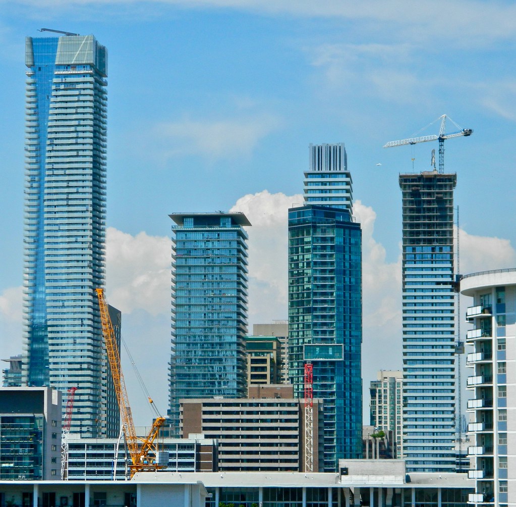
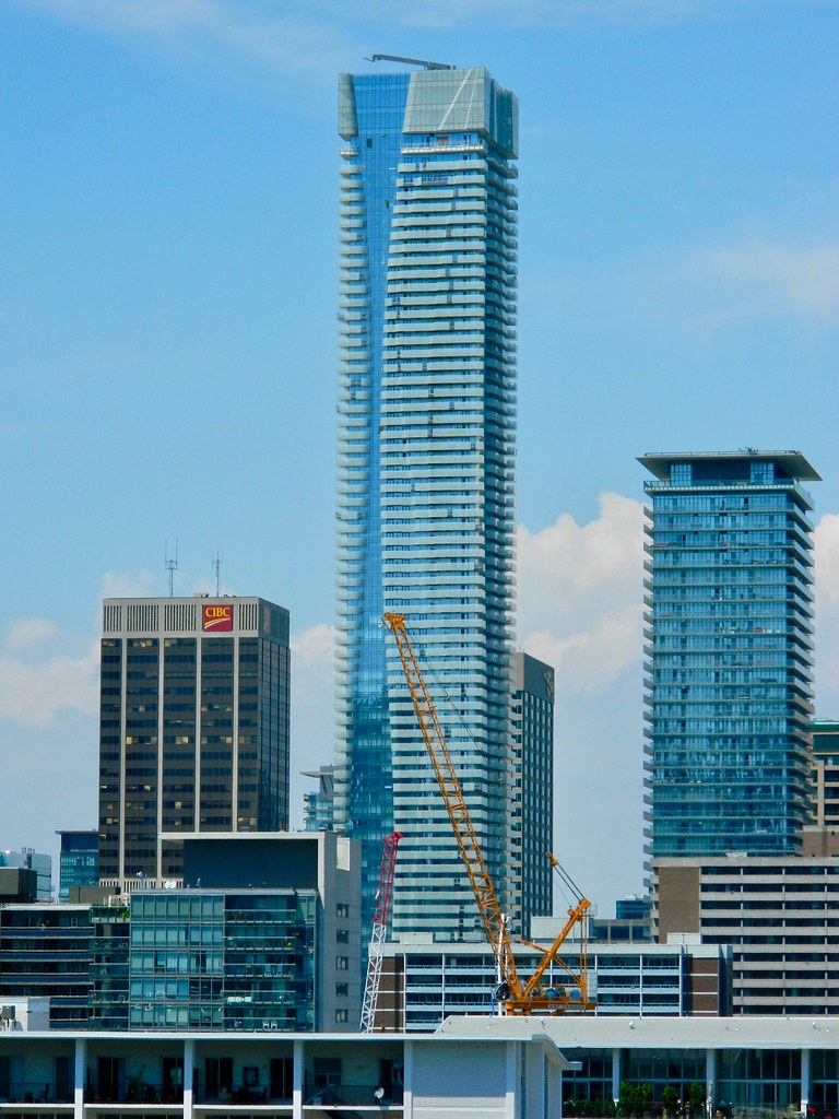
Yeesh, that Casa cluster could sure use some brick or stone.
Yeah, individually (mainly in renders) they all looked half-decent. As a collection they don't exactly seem like a 1,2,3 deal - not to mention they're incredibly boring. Luckily with One Bloor and The One we'll get some quality in there.
 
Yeah, individually (mainly in renders) they all looked half-decent. As a collection they don't exactly seem like a 1,2,3 deal - not to mention they're incredibly boring. Luckily with One Bloor and The One we'll get some quality in there.

In the cluster's defense, I feel like it looks better in person. I'm always impressed walking up Church and seeing the groupings together. Agreed there is a little bit of sameness with the balconies, yet it works. The above photo might not be the most flattering, when you see them more offset, stacked up, there is a density that is quite appealing.
 
Yeesh, that Casa cluster could sure use some brick or stone.

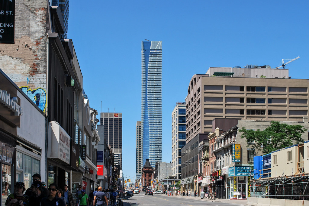
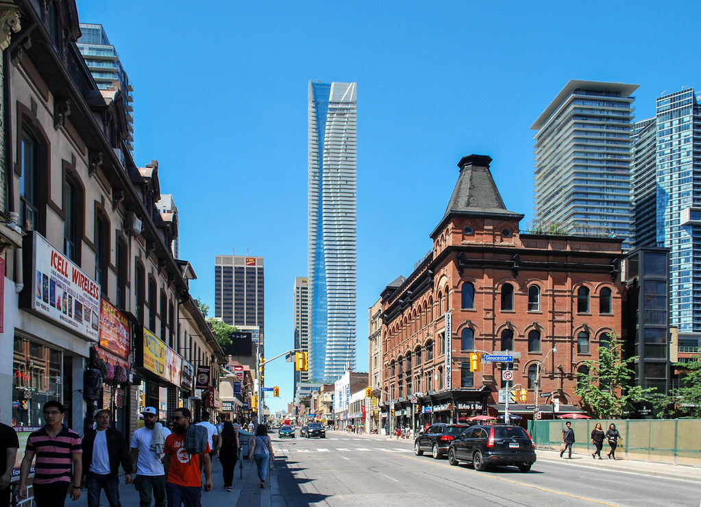
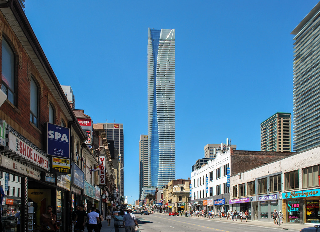
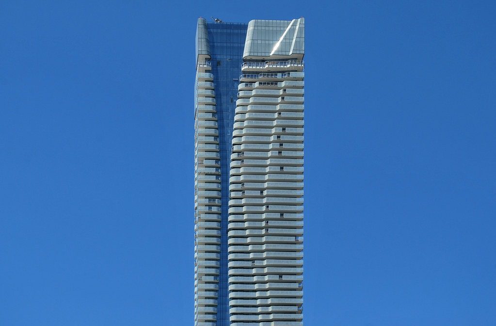
One issue with Casa's glass box style with fully transparent balconies is that the balcony doors appear as a darker shade of grey. They're seemingly randomly placed along the facade, giving the building a messy and unfinished look from a distance.

In fact, the random balcony doors scattered along the facade look similar to the random missing glass balcony railings on One Bloor East, except that the missing railings will eventually be installed on One Bloor East. When completed, One Bloor East will be a stunning focal point for the area, shifting the focus away from Casa and the monotony of the adjacent glass boxes.
 
It is indeed very disappointing, but I thought lobby will remain this way. What else needs to be finished? It is not much of a lobby anyway, most smaller buildings in the area have larger and more impressive lobby.

Here are some photos of the lobby/entrance:
http://eventscape.com/portfolio/one-bloor-condos/

The LED lighting is very bright and harsh, which feels very retail store-like and not as dramatic and refined as depicted in the marketing rendering.
This overly-trendy interior will look dated and tired very quickly and would be very expensive to remodel in the future.
I agree that it's rather small and narrow, not-so inviting and lacking a luxury feel/quality that you would expect in a condo or address like this.

And it doens't attempt to speak the same design vocabulary as the building either (granted it's by a different interior design firm) - which would have been the greatest asset.

AoD
 
Quite like the lobby. Reflects the colouring of the building and is a memorable way into the building.
 

Back
Top