You are using an out of date browser. It may not display this or other websites correctly.
You should upgrade or use an alternative browser.
You should upgrade or use an alternative browser.
- Thread starter AlbertC
- Start date
modernizt
Senior Member
Thanks for posting that, raptor.
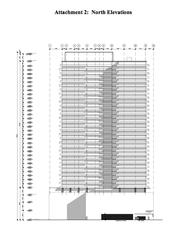
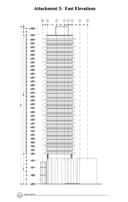
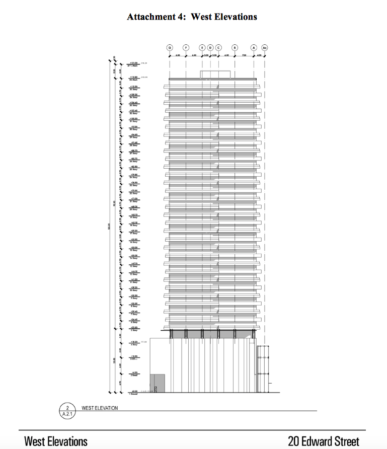
Glad to see it will be an aA project taking this spot! Thread title can be updated: aA, 35s. Also, I find it refreshing to see something that is more slab than point tower. Hopefully the unit layouts will benefit from this.
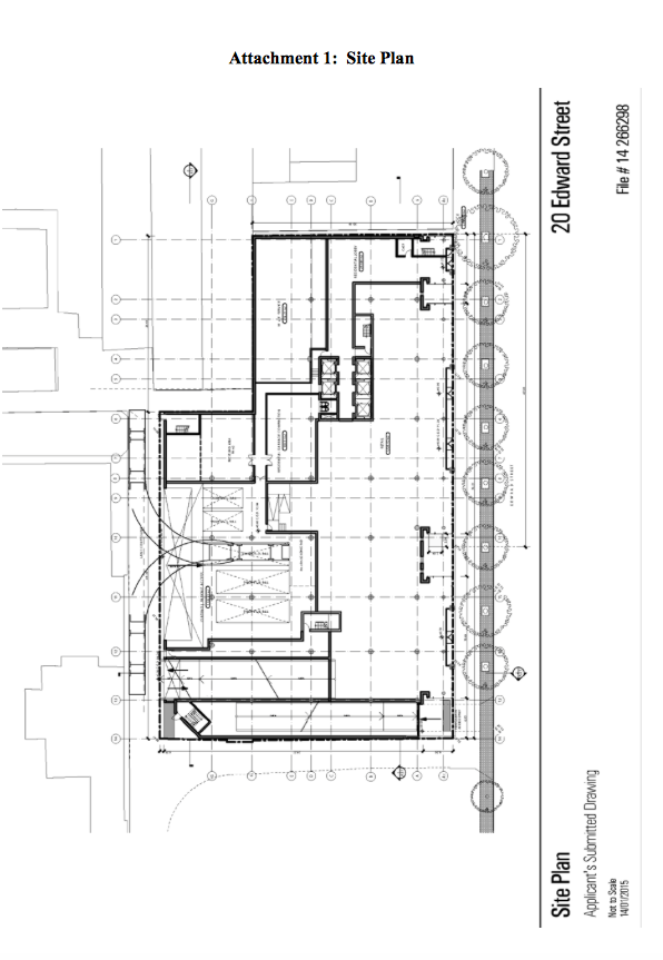
Edit 1: The report states that the podium is three levels of commercial with a mezzanine, which is interesting. Also, it states "There are five levels proposed below grade, with four levels of vehicular parking and
one level with a retail concourse." Perhaps they already have a good idea of the type of tenant that would go in here and the requirements they have for the commercial space? Based on the size of the retail area and the 3 levels of commercial in the podium, perhaps a larger-format store is envisioned for here.
Edit 2: "8,832 sq.m. of commercial/retail space in the 3-storey base including the (below-grade) concourse level retail", "...office uses on the third floor"
Last edited:
Midtown Urbanist
Superstar
Sounds like the PATH is expanding north of the Atrium.
I wonder if it would be feasible to have a connection at Yonge-Gould on the east side of Yonge (access to Ryerson) going to the this site and then connecting to the Atrium.
I wonder if it would be feasible to have a connection at Yonge-Gould on the east side of Yonge (access to Ryerson) going to the this site and then connecting to the Atrium.
innsertnamehere
Superstar
What a total piece of crap. Reject, please and thank you. These types of towers are a total waste and should not be being proposed in 2015. The whole thing reeks of a developer who has no interest but earning a final buck.
am29
Active Member
seriously they should just cut that in half and half two slim towers and go a bit taller, that tower looks like it belongs in Scarborough.
Automation Gallery
Superstar
YikesI find it refreshing to see something that is more slab than point tower"
modernizt
Senior Member
I appreciate variation; the midrise and slab form have their benefits, so let's stop pretending that point towers are the way to go. One of the biggest issues with point towers are how awful the unit layouts often end up being. Very important when you consider that the point of a residential building is to be home to hundreds of people.
Don't read too far into the elevation drawings; this proposal is in its early days.
Don't read too far into the elevation drawings; this proposal is in its early days.
stjames2queenwest
Senior Member
Yikes, total shite
yea... pretty clunky, the only way I might like this is if it has a really exciting finish. But I doubt it. Would they really approve a slab building in this location?
ksun
Senior Member
I appreciate variation; the midrise and slab form have their benefits, so let's stop pretending that point towers are the way to go. One of the biggest issues with point towers are how awful the unit layouts often end up being. Very important when you consider that the point of a residential building is to be home to hundreds of people.
Don't read too far into the elevation drawings; this proposal is in its early days.
haha. folks here most don't care about this. They care about prettiness.
I have seen so many awfully shaped condos in glitzy new towers. I honestly don't know how people manage to live their triangle living-rooms and star-shaped bedrooms.
Tewder
Senior Member
I'm inclined to side with modernizt on this.
What is so inherently wrong about a slab? It's all about context. This is a relatively small and minor side street. The slabbyness won't block anything, and in fact will contribute to a strong street wall that balances the existing strong street wall already there (along the other side of the street, and on the same side towards Bay). In fact, this will create a nice little side street canyon with strong street level commercial (finally) and liveable units for residents. So the problem is?
What is so inherently wrong about a slab? It's all about context. This is a relatively small and minor side street. The slabbyness won't block anything, and in fact will contribute to a strong street wall that balances the existing strong street wall already there (along the other side of the street, and on the same side towards Bay). In fact, this will create a nice little side street canyon with strong street level commercial (finally) and liveable units for residents. So the problem is?
Automation Gallery
Superstar
Would they really approve a slab building in this location?
I guess, if you can't go tall go wide
Truthfully i would rather see a couple well designed 20-25 storey bldgs., than this monstrosity
A Torontonian Now
Senior Member
With the below-ground retail, at least it sounds like there will be an extension of PATH
ksun
Senior Member
With the below-ground retail, at least it sounds like there will be an extension of PATH
one step close to being connected with Aura/College Park.
More elevations.


Attachments
-
 Screen Shot 2015-02-06 at Friday Feb 6, 2015 12.07.06 PM.png158.5 KB · Views: 1,555
 -
 Screen Shot 2015-02-06 at Friday Feb 6, 2015 12.23.38 PM.png127.8 KB · Views: 1,512
 -
 Screen Shot 2015-02-06 at Friday Feb 6, 2015 12.23.00 PM.png93.6 KB · Views: 1,518
 -
 Screen Shot 2015-02-06 at Friday Feb 6, 2015 12.23.53 PM.png161.8 KB · Views: 1,541
 -
 Screen Shot 2015-02-06 at Friday Feb 6, 2015 12.23.13 PM.png121.2 KB · Views: 1,540
The thick slanted line on the South Elevation at the top of Ed's post is the SickKids heliport flightpath line, and it's drawn on there to show how this proposed building intrudes slightly into the flightpath.
42
42


