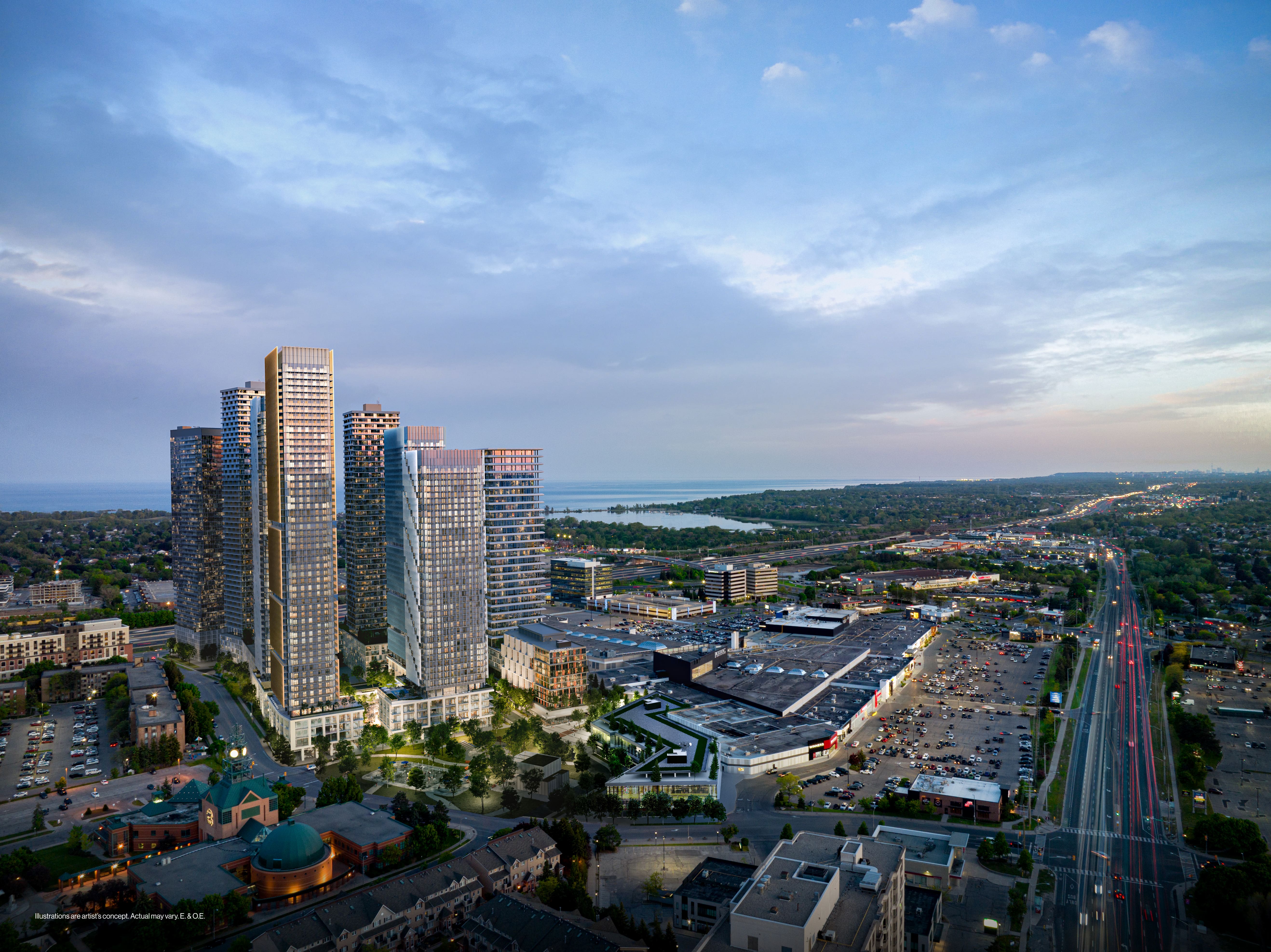
Plans for 7-storey hotel at old Famous Players site. Development also includes a new plaza/square, with ground floor retail and a renovated mall entrance. Building designs are subject to change. The hotel will have 3 storeys of underground parking and 6 elevators ( 2 of them are for parking levels only)

Rendering taken from Pickering Accessiblity meeting.
D9092C68-23CC-4F67-8D5C-47667BF13017.jpeg
 
Front Page story on the rebrand here to 'The Shops at Pickering City Centre"


Branding and minor tweaks aside, the main investment in the mall seems to be a Food Court refresh slated for Fall '24.

****

Not mentioned, but they will likely need to contemplate a future without Hudson's Bay an anchor store, in the unlikely event the chain remains as a going concern and they maintain an outpost here, that store will need a comprehensive re-do.

On the common area, all I ask..........lose the carpet.........I don't get carpet in a mall common area........just saying. I look at that the same way any realtor looks at a home they're about to market that has carpet in the bathroom. Somethings are passe, others are 'What were you thinking?" Inaptly located carpet is most definitely the latter!
 
Last edited:
Inaptly located carpet is most definitely the latter!
Personally the carpet is fine the way they layed it out. I believe they replace it quite often (it looks to have been recently replaced this spring). I'd rather they repaint and retile. There are sections of ceiling that show clear signs of leaks, stains and broken tiles throughout. Also get rid of that awful white secondary/primary? lighting that cheapens the look.
 
Personally the carpet is fine the way they layed it out.

Tastes will differ.

I'd rather they repaint and retile. There are sections of ceiling that show clear signs of leaks, stains and broken tiles throughout. Also get rid of that awful white secondary/primary? lighting that cheapens the look.

Certainly any stains should painted over; though hopefully the leaks would be fixed first!

Not sure what you're referencing w/the lighting, I'd probably agree, but can't picture it, its been a couple of years since I was last out there, and I've only ever been a handful of times.
 
Certainly any stains should painted over; though hopefully the leaks would be fixed first!
If you ever make it out, go to the food court and look way up. Not hard to miss.
Not sure what you're referencing w/the lighting,
Screenshot_20240515_171638_edit_57300427458963.jpg

It's really the colour temperature they chose for these lights. They are quite harsh, I'd estimate over 5 or 6000k. They do not match the rest of the warm lighting.
 
Front Page story on the rebrand here to 'The Shops at Pickering City Centre"


Branding and minor tweaks aside, the main investment in the mall seems to be a Food Court refresh slated for Fall '24.

****

Not mentioned, but they will likely need to contemplate a future without Hudson's Bay an anchor store, in the unlikely even the chain remains as a going concern and they maintain an outpost here, that store will need a comprehensive re-do.

On the common area, all I ask..........lose the carpet.........I don't get carpet in a mall common area........just saying. I look at that the same way any realtor looks at a home they're about to market that has carpet in the bathroom. Something are passe, others are 'What were you thinking?" Inaptly located carpet is most definitely the latter!
They already changed the carpets so not sure if they will remove it fully in the future
IMG_8981.jpeg
 
They already changed the carpets so not sure if they will remove it fully in the future View attachment 564243

Yeah..........I got to admit, nothing I like about that corridor for a mall. I don't like the carpet, I don't like the tile, I don't like the narrowness, I don't like the ceilings and I don't like the way the retailers are framed.
 
Yeah..........I got to admit, nothing I like about that corridor for a mall. I don't like the carpet, I don't like the tile, I don't like the narrowness, I don't like the ceilings and I don't like the way the retailers are framed.
I have to agree, there’s no uniformity. I think they need to redo all the tiles in the mall(something durable, a lot of the tiles are cracked), remove the carpet, maybe even put windows above the store fronts similar to Yorkdale, just to let some natural light into those narrowed wings. In addition to leveling all the storefronts to the same height.
IMG_9073.jpeg
 
Design for the park within this project area has been awarded.


Back
Top