You are using an out of date browser. It may not display this or other websites correctly.
You should upgrade or use an alternative browser.
You should upgrade or use an alternative browser.
- Thread starter Northern Light
- Start date
yofal
New Member
skycandy
Senior Member
PL1
Active Member
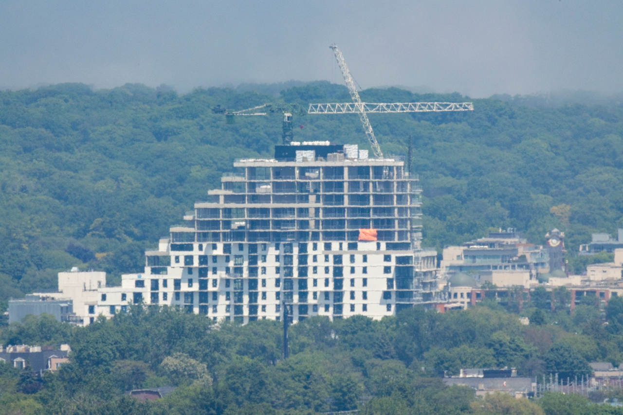
As an aside, I've decided I really hate the angular step back on so many buildings. I know this is some Toronto Planning Dept BS, but damn it looks bad
flonicky
Senior Member
It looks so bad.
PL1
Active Member
I thought the panels don't look that bad, but I wasn't wearing glasses, so take that with a grain of salt! 
Photos from today. They're removing the crane from the building furthest east.


Photos from today. They're removing the crane from the building furthest east.
mburrrrr
Senior Member
June 3

flonicky
Senior Member
flonicky
Senior Member
These photos were taken during The Rendering Hour; that brief, magical moment when proposed condos are rendered.
Lenser
Senior Member
Personally, I'm OK with it. I like the idea that not everything needs to be a slab-sided box. These buildings loosely reference much older architectural styles - they're rather like pyramids modded by digital glitches. Plus, with the lake in view, some of these stepped-back buildings remind me of ship's prows and hulls; it's not an unpleasant association.As an aside, I've decided I really hate the angular step back on so many buildings. I know this is some Toronto Planning Dept BS, but damn it looks bad
In the end, I enjoy a variety of building appearances and typologies in Toronto.
LUVIT!
Senior Member
I actually like the overall look and feel of this development. I also look forward to more people being in this area and the retail that will be on its way. However there is too much WHITE! I believe that the look could have been more appealing with more varied material and colour other than what's happening on the Queen E stretch.
flonicky
Senior Member
Personally, I'm OK with it. I like the idea that not everything needs to be a slab-sided box.
It makes sense in this location. The building sits next to a waterfront park and beach and the terraces give it a "connected to the outdoors" character.
egotrippin
Senior Member
Agreed, setbacks increase visual interest and provide more useable outdoor spaces for residents. Also with that mediocre cladding, anything that reduces the visual bulk is appreciated. That said I'm shocked to see real hand laid brick here.Personally, I'm OK with it. I like the idea that not everything needs to be a slab-sided box. These buildings loosely reference much older architectural styles - they're rather like pyramids modded by digital glitches. Plus, with the lake in view, some of these stepped-back buildings remind me of ship's prows and hulls; it's not an unpleasant association.
In the end, I enjoy a variety of building appearances and typologies in Toronto.
flonicky
Senior Member
ash_iwn95
New Member
Excited to see the brick facade coming up!