From Thursday:
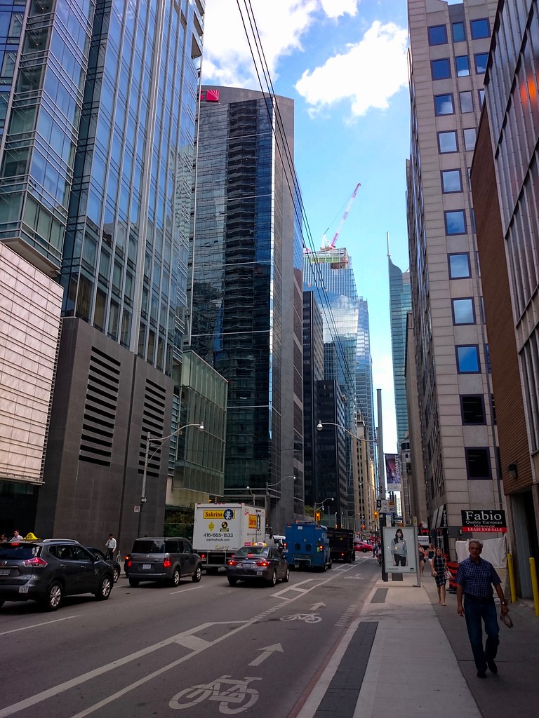
Although barely visible, EY is a fantastic addition that, while mostly obstructed, it's signature roofline is still emphasized by the silver banding around it which plays nicely in direct sunlight. Boy would this have looked great 50m taller.

29107058005_08b083ceeb_b.jpg
 
DSC06015.jpg


The Concourse Crown on the EY Tower will be all lit-up when the building is done. Lights are going in:

DSC06024.jpg

DSC06023.jpg


42
 

Attachments

  • DSC06015.jpg
    DSC06015.jpg
    627.6 KB · Views: 1,110
  • DSC06023.jpg
    DSC06023.jpg
    342.8 KB · Views: 1,097
  • DSC06024.jpg
    DSC06024.jpg
    282.1 KB · Views: 1,107
The new structure is OK but they did an excellent job on the reconstruction of the old building an kept it's architectural integrity.
Kudos to the architect and developer, a job well done.
 
I was just pondering about what those black things sticking out near the top of the building were. It just occurred to me - THEY'RE LIGHTS! (Im assuming)

I dont ever remember this building being illuminated, so Im certainly looking forward to it.

edit - just read I42s post - confirmed :)
 
A little taller might have separated it from the Index thingy beside it. The juxtaposition of these two looks awkward to me when seen from the north.
 
I'm not quite at...'phenomenal.' But it's a welcome addition, for sure.

Whatever adjective is used to describe it, my take away is that, while I appreciate the angular design allowing for all four sides to be unique, not all of them look equally as good. Its strong suits are the western and southern face imo, or where at least one of them is visible. Certain angles don't quite do it for me, that being said, this is a breath of fresh air as far as major office towers in the core are concerned. The southcore collective of office towers are way too similar in form for my liking and a missed opportunity; to a certain extent, the Bay-Adelaide complex hasn't added much architectural flare to the core either. They are all class A office buildings, but the design language of EY puts it in a league of its own (hopefully to be joined by others in the near future).
 
I seem to be of a minor demographic but I like the northern facade as seen from city hall the best. It is one of, if not the most simple of its facades but I think it's very elegant. That perspective is also not distracted by the fins and looks just like a mirror shard.
 
Yeah, don't get me wrong. I think the building is a winner, completely. But, and perhaps I was being pedantic, but it's not phenomenal to me. It's well done, and we should be able to expect this kind of design regularly.

The Scotia tower--now that to me is phenomenal. What a beaut.
 
I agree about the north facade. I think all faces of this building have their strong points.

I love the south elevation because of the heritage facade and distinct shapes.

I love the scale and clean lines of the North facade. This might be my favourite view of the building. The glass is so reflective that on a sunny day it looks truly fantastic.

The east facade is impressive for its sheer height. It also has the heritage facade but for my money, the best feature is the 200m flat canyon wall effect.

All told, the west is probably my least favourite, but it is still pretty cool with the sloping glass and columns, plus the fold out canopy will be really nice at the base.
 

Back
Top