I didn't realize the architectural lighting towards the top was original. It's interesting that it was preserved.
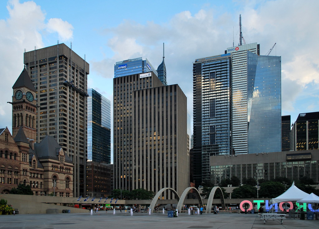
 
They've really done a cracking job with the historical preservation. Looks superb and almost stands alone viewing from the South East corner.
 
Handsome from all angles. From near and afar.

EY.1.jpg


EY.2.jpg


EY.3.jpg


EY.4.jpg


EY.5.jpg


EY.6.jpg


EY.7.jpg


EY.8.jpg
 

Attachments

  • EY.1.jpg
    EY.1.jpg
    2 MB · Views: 1,256
  • EY.2.jpg
    EY.2.jpg
    2.1 MB · Views: 1,421
  • EY.3.jpg
    EY.3.jpg
    3 MB · Views: 1,422
  • EY.4.jpg
    EY.4.jpg
    1.9 MB · Views: 1,270
  • EY.5.jpg
    EY.5.jpg
    2.4 MB · Views: 1,313
  • EY.6.jpg
    EY.6.jpg
    2.3 MB · Views: 1,351
  • EY.7.jpg
    EY.7.jpg
    2.6 MB · Views: 1,272
  • EY.8.jpg
    EY.8.jpg
    2.5 MB · Views: 1,310
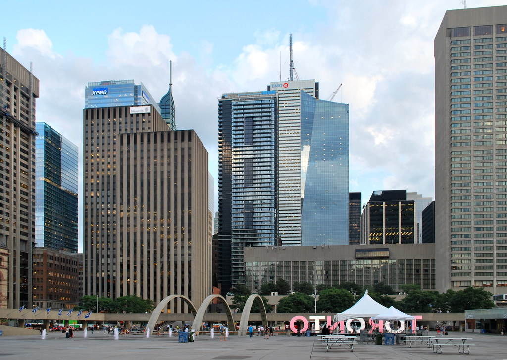
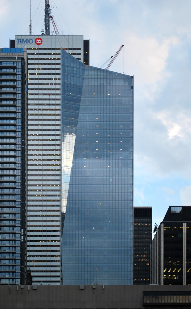
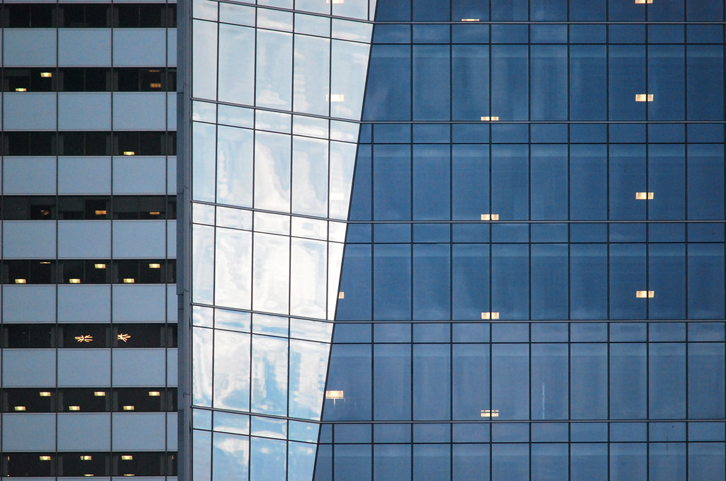
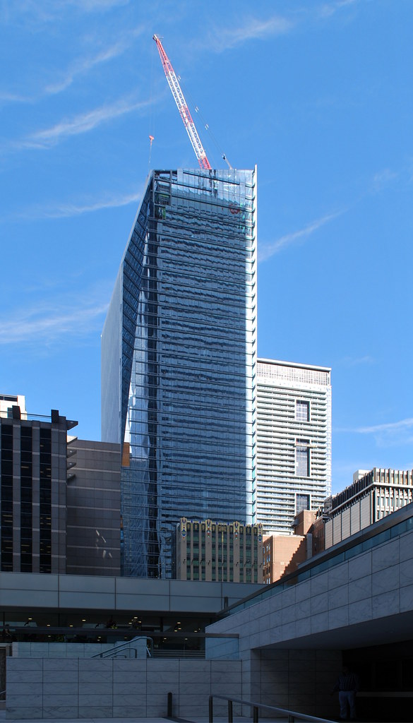
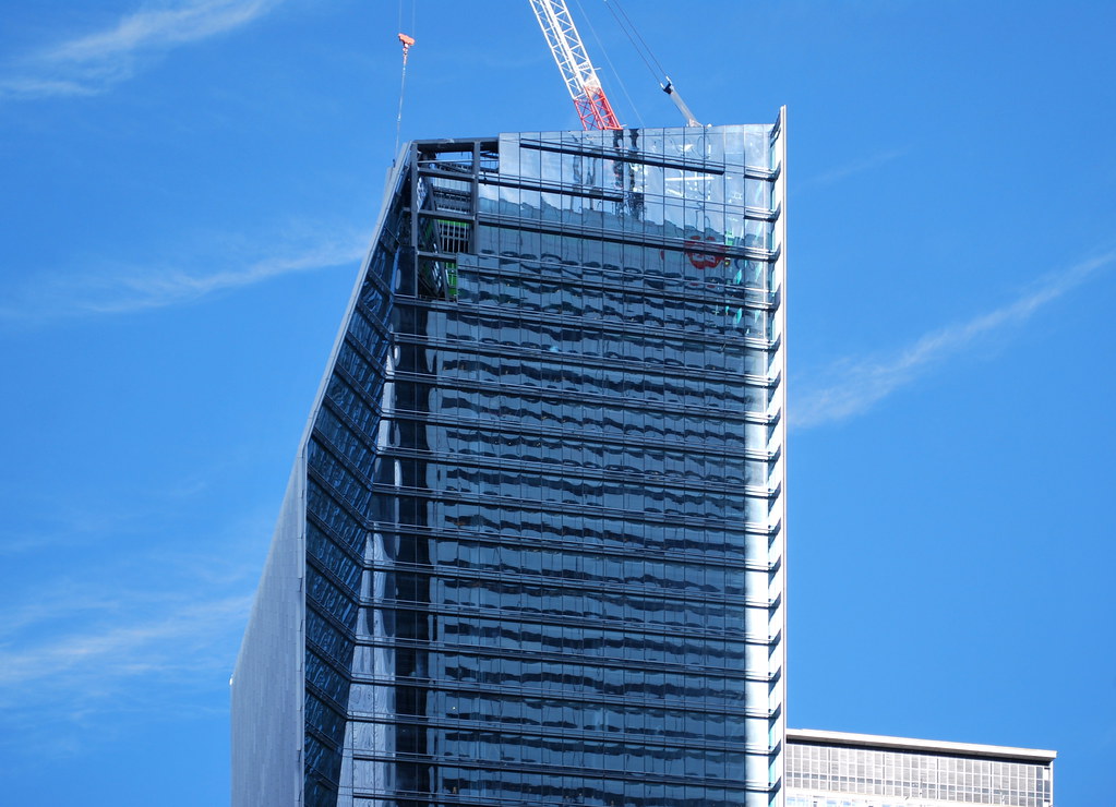
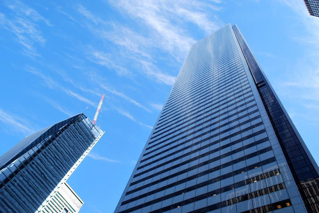
I for one look at this project as the type of world-class office development usually found cities like London or New York, usually characterized by their terrific design excellence and technical achievements. I have long envied many of the newer and more innovative office towers built in these cities, such as the Leadenhall Building or One Bryant Park, which always seem far beyond anything that gets built here. Although historically, we have seen some incredible office towers built here, like the TD Centre and Scotia Plaza, no recent examples have produced anything close, not anything in SouthCore nor the Bay Adelaide Centre.
EY Tower has set the bar high for office tower design in this city, and hopefully a trend set to continue.
 
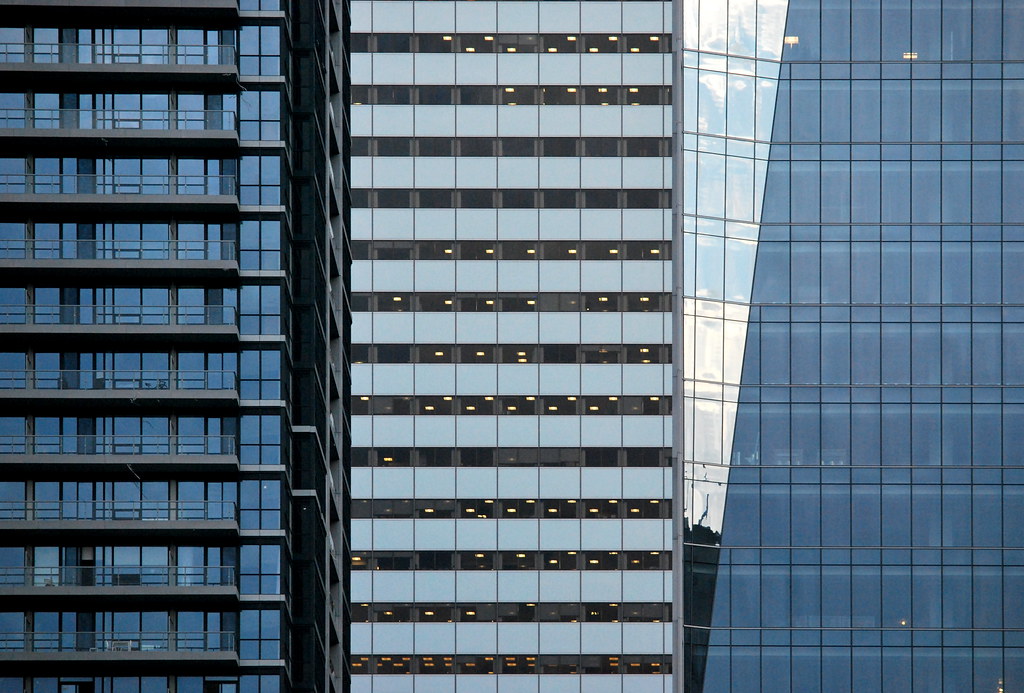
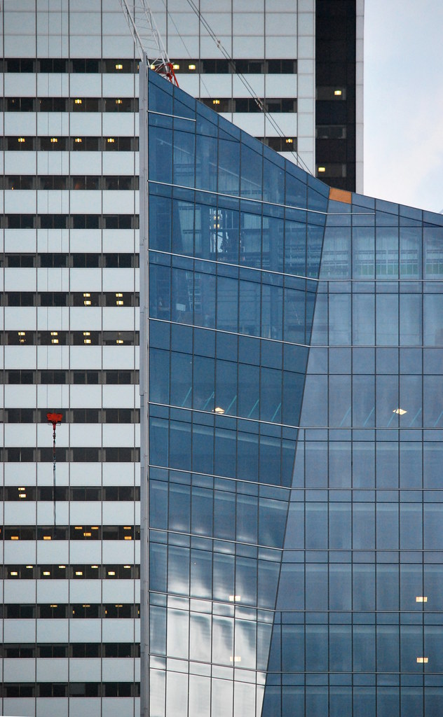
I like this tower however, it just has some angular lines and projections with glass brise soleils and vertical fins. Under that, it's still a unitized single skinned curtain wall tower. I also find the lines/massing awkward from a number of angles. I don't necessarily agree that this design is better than a couple of those boxes which, despite their blandness in their simple execution, are still pretty damn good boxes. This is just different.
 
I m proud of this building.
More like that please instead of boxy building.
 
I for one look at this project as the type of world-class office development usually found cities like London or New York, usually characterized by their terrific design excellence and technical achievements. I have long envied many of the newer and more innovative office towers built in these cities, such as the Leadenhall Building or One Bryant Park, which always seem far beyond anything that gets built here. Although historically, we have seen some incredible office towers built here, like the TD Centre and Scotia Plaza, no recent examples have produced anything close, not anything in SouthCore nor the Bay Adelaide Centre.
EY Tower has set the bar high for office tower design in this city, and hopefully a trend set to continue.

I fully agree, but I would also like future towers to have some other cladding or colours than just blue glass. Almost every tower built recently looks the same, just in different shapes.
 
I fully agree, but I would also like future towers to have some other cladding or colours than just blue glass. Almost every tower built recently looks the same, just in different shapes.

It true. Toronto is not able to keep from building boxy building.
I think this building is an exception that we not gonna see for a while.
I don t think Union centre or 160 front will be built soon.
Just watch what happening to the design of newly proposed condos tower.
It so sad that architects only build condos with ugly balconies and without harmony at all.
These architects should go back to school.
Our architecture totally suck and is retarded when we compare to other cities in the world.
There is a lot of work to do.
:(
 
Narrow minded to view all boxes as inferior to the latest fashion trends.

I'm in full agreement we need more diversity in our commercial architecture but, diversity alone doesn't make for great architecture or a skyline.
 
Narrow minded to view all boxes as inferior to the latest fashion trends.

I'm in full agreement we need more diversity in our commercial architecture but, diversity alone doesn't make for great architecture or a skyline.

To make thing change, there most be a beginning at all.
I hope to see more tower like Ey tower or union centre and less boxy tower.
Architecture is a good way to judge a city. And if toronto should be judged by it architecture, we would have a very bad rate. Go to see Dubai, Shanghai , Melbourne or Montreal construction and you will see there is a terrible problem.
 

That's going to be a big EY logo! I guess the same massing as every other tower but just 2 letters vs a whole word

Looks like those lights are there to stay. Too bad they couldn't be a bit less pronounced.

I am assume part of the heritage preservation requirement. But it'll be nice at night to have a focal point 10 stories up. Gives a variety of perspectives along this highrise canyon.

The EY logo has a yellow beam shooting upwards and will be on this building. To be 100% tacky add a new spot light that shoots out from the beam. the Toronto Batman signal!
 

Back
Top