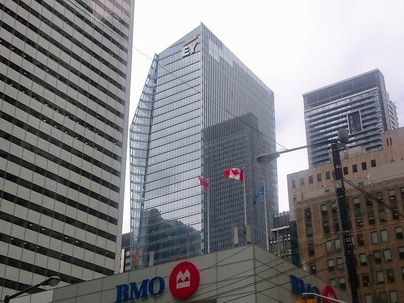
The 'E' and the eyebrow are up:

34025593722_82cb2ecb00_c.jpg
 
I tried to draw this building for skyscraper page just recently but my drawing did not turn out as well as i had hoped. This building really has width to it and for once we have a skyscraper that stands out when seen from the CN tower. has anyone else noticed how much it sucks that Trump hotel and both of the Bay Adelaide buildings are pretty much completely blocked from the view of the cn tower?
 
I really like this building, but some of the detailing just doesn't quite cut it. There are lines that end too abruptly, patches of discoloration, and varying window sizes out of pattern. The first photo from SomeMidtowner really shows what I mean. But to fully see the flaws you have to see it in person. You can see a lot of issues in the lines from King. For an example of better line completion see River City 1 which has minute details cut into the angling of the curtain wall system.

I love the form of this building, but I can't unsee bad details. We have to live with them for at lifetime of the cladding.
 
Having recently moved to Toronto from Vancouver, this tower reminds me very much of the recently completed MNP tower in Vancouver. From the incorporation of the heritage facade, the way the exterior glazing flares outward and creates a cover at the base of the entrance, the color of the glass, that little side twist as the height increases, the long slots along the side of the tower, how the roof is at a slant at the top, etc.

Funny enough, it's the exact same folks involved (Kohn Pederson Fox / Oxford properties) in both the EY Tower as well as a MNP Tower in Vancouver so I'm not surprised of the similarities.

My apologies if this has already been mentioned before, but please see below from a few shots of the MNP Tower.
Images taken from Oxford Properties' + Bridge Electric Corp's website.

pic1.jpg pic3.jpg pic4.jpg pic6.png
 

Attachments

  • pic1.jpg
    pic1.jpg
    671.6 KB · Views: 271
  • pic3.jpg
    pic3.jpg
    457.8 KB · Views: 269
  • pic4.jpg
    pic4.jpg
    305.3 KB · Views: 306
  • pic6.png
    pic6.png
    1.9 MB · Views: 257
Hanging out way over the edge, earlier today:

DSC09606.jpg

DSC09605.jpg

DSC09604.jpg

DSC09603.jpg


42
 

Attachments

  • DSC09603.jpg
    DSC09603.jpg
    471.6 KB · Views: 430
  • DSC09604.jpg
    DSC09604.jpg
    257.4 KB · Views: 440
  • DSC09605.jpg
    DSC09605.jpg
    129.3 KB · Views: 422
  • DSC09606.jpg
    DSC09606.jpg
    449.1 KB · Views: 451
If it encourages companies that we would otherwise consider staid to look for more architecturally progressive offices, then, hey, go nuts EY!

42
 
May 11th:
eyIMG_1240.JPG
eyIMG_1241.JPG
eyIMG_1242.JPG
eyIMG_1277.JPG
 

Attachments

  • eyIMG_1240.JPG
    eyIMG_1240.JPG
    984.4 KB · Views: 414
  • eyIMG_1241.JPG
    eyIMG_1241.JPG
    760.5 KB · Views: 436
  • eyIMG_1242.JPG
    eyIMG_1242.JPG
    2 MB · Views: 443
  • eyIMG_1277.JPG
    eyIMG_1277.JPG
    836.7 KB · Views: 423

Back
Top