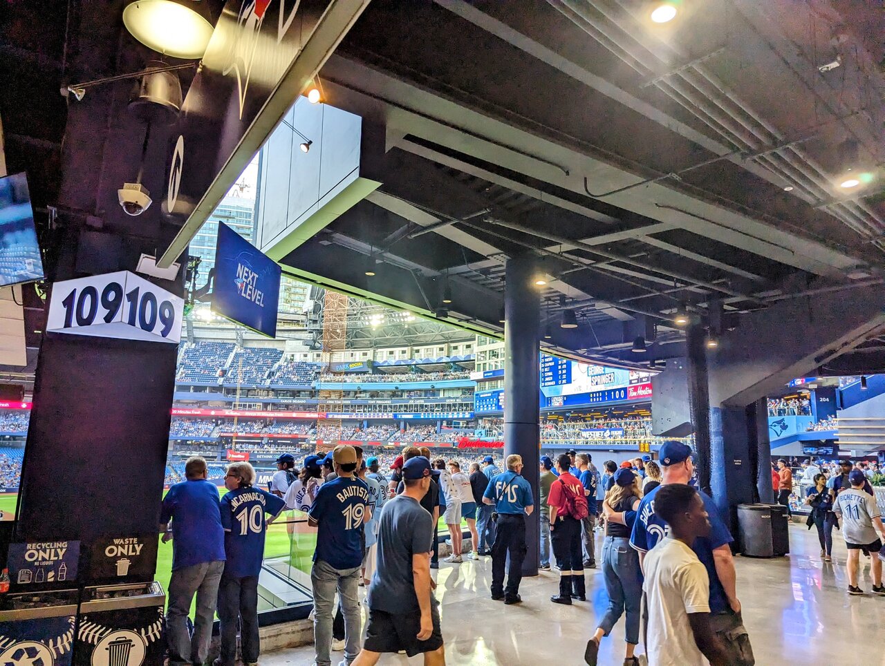
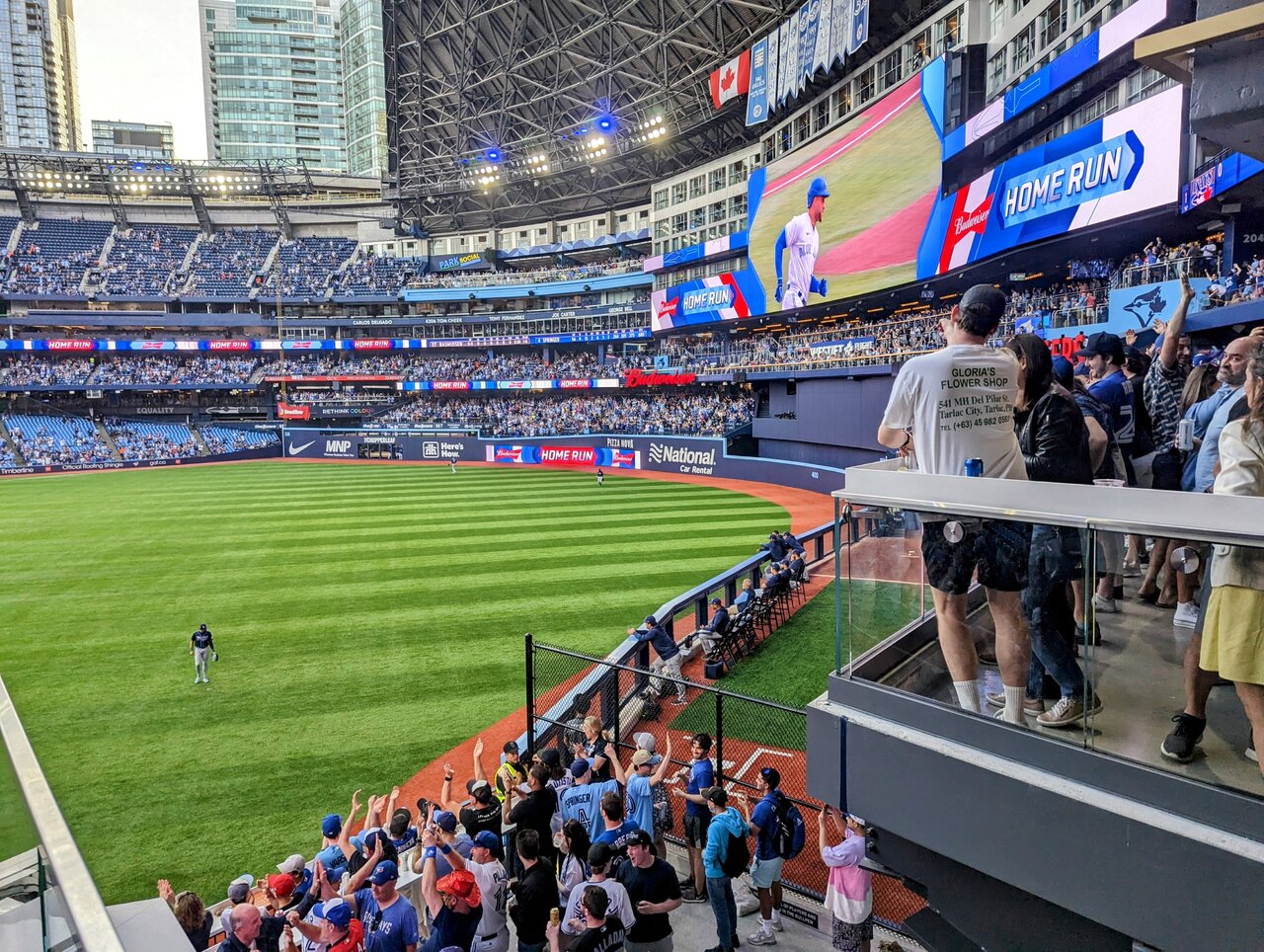
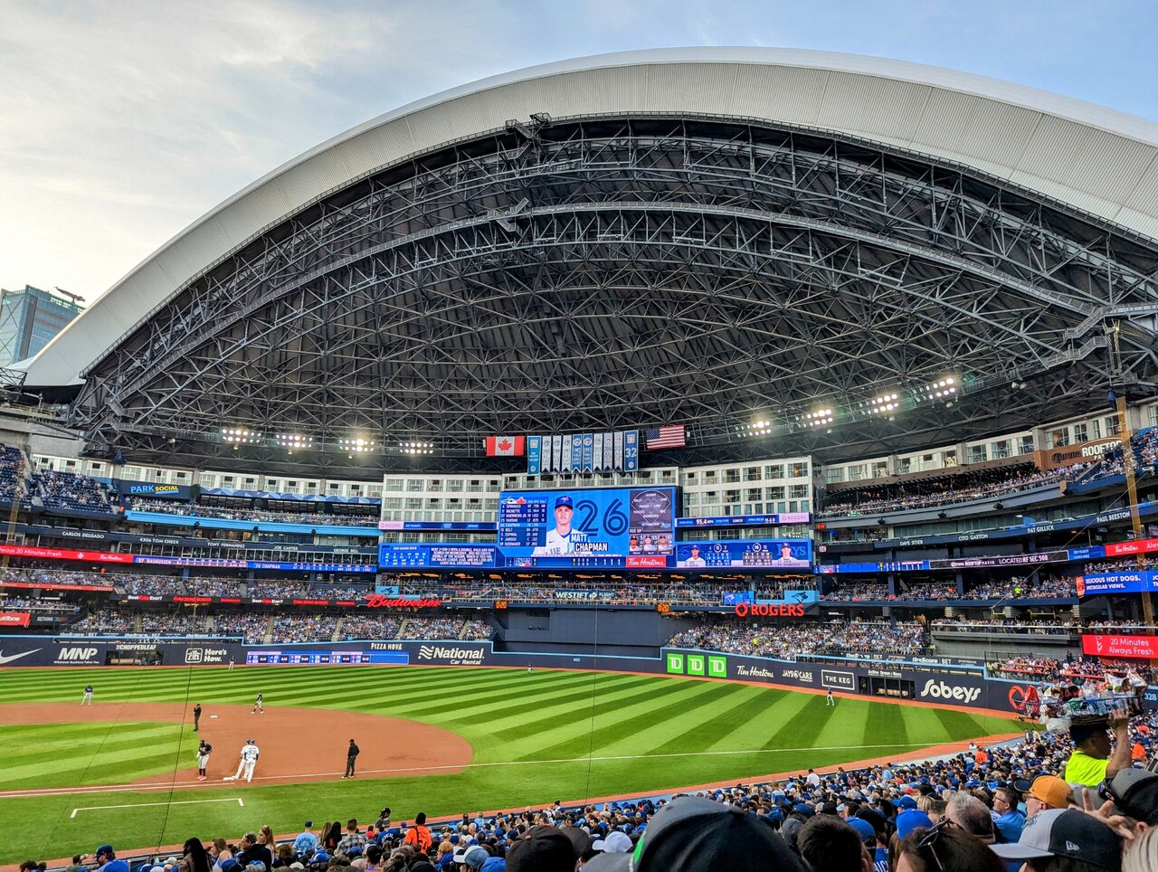
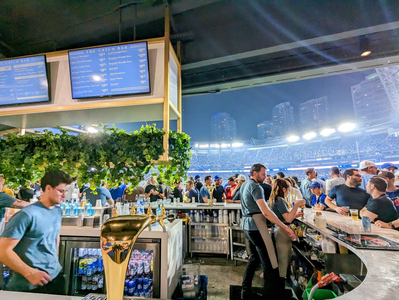
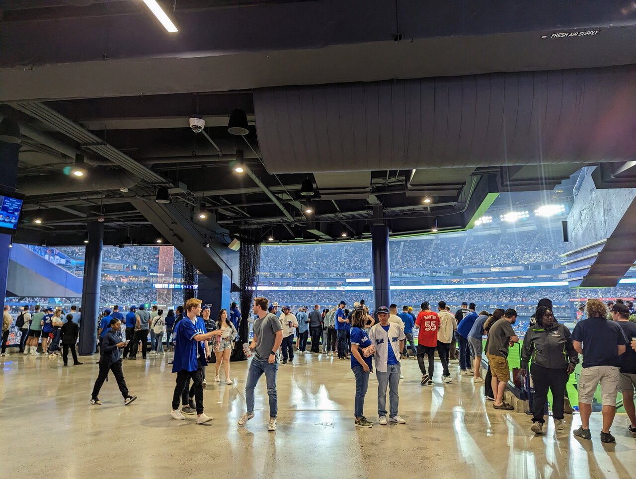
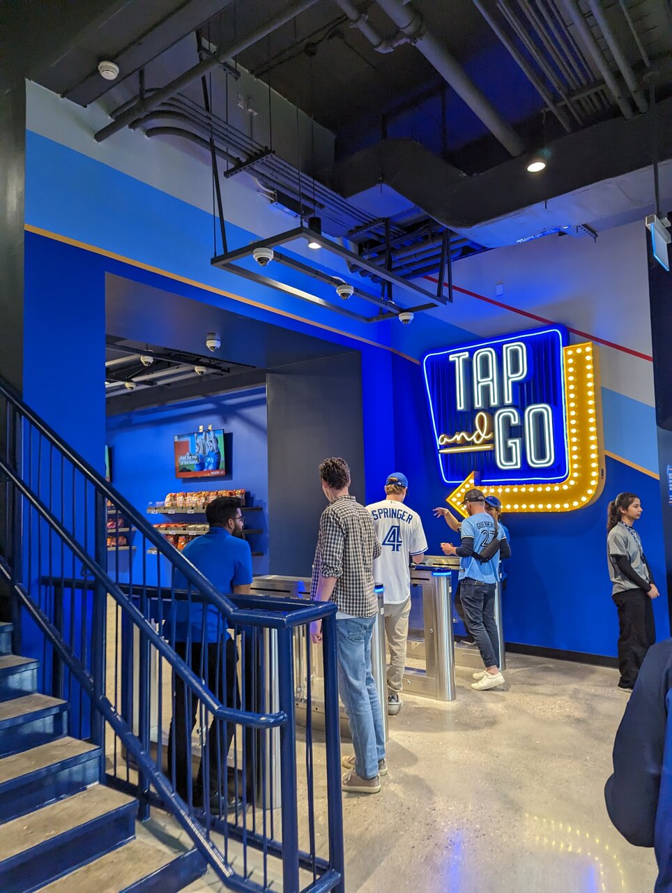
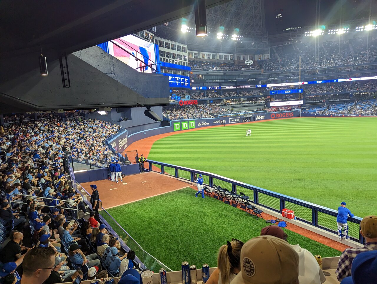
Shots from Friday night's game.
PXL_20230414_231319428~2.jpg

PXL_20230414_231336131~2.jpg

PXL_20230414_232001096~2.jpg
PXL_20230415_010917760~2.jpg

PXL_20230415_011535606~2.jpg
PXL_20230415_010816558.jpg

PXL_20230415_005823123.jpg
 

Having been to 4 games already. This renovation has been amazing, everyone seems to be having a great time, the product on and off the field has been tremendous.

I'm extremely excited for infield phase 2. Those wide open concourses makes it feel a lot less like 'concrete bowl' and a lot more like a field.
 
First images I've seen where there's actually some atmosphere/vibe at the Rogers Centre.

I hope they'll add more of these public terraces down the road if these are a success, and perhaps consider adding some rim lighting to the inside of the dome to reduce that 'inside-ness' feeling when it's closed?
 
The only thing I don't like is how wonky the outfield wall looks. I know they didn't want the stadium to feel "cookie cutter", it just looks awkward to me.
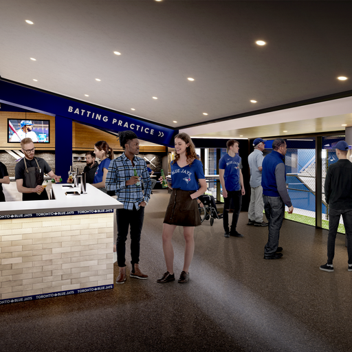
 
The only thing I don't like is how wonky the outfield wall looks. I know they didn't want the stadium to feel "cookie cutter", it just looks awkward to me.

yeah I'm trying to decide what I think of it too. The nice thing is that's an easy fix. If they don't like it they can fix it next year when they do the whole lower bowl.
 
It's the outer limits of the playing field (within fair territory). It's covered in various ads and goes up and down in height. If the ball is hit over this wall, it's a home run. If the ball bounces then goes over the wall, it's a ground-rule double.

I agree with @T.E.C.II, it looks like they are trying too hard to make the wall interesting the way it goes up and down. Some gradual transition in height would have been fine.
 
Looks and feels very open space concept from those pics. Almost like you can go use the washroom without ever missing the game...
 

These are the first shots of the stadium interior I've ever seen where it looks genuinely friendly. I've been skeptical about the renos, but from these shots, they look great!
The people milling about, the proximity of the players, colour, new controlled but open spaces...it all seems to work well with the stupendous views of the interior one gets. That's a heady contrast.
Good stuff!
 

Back
Top