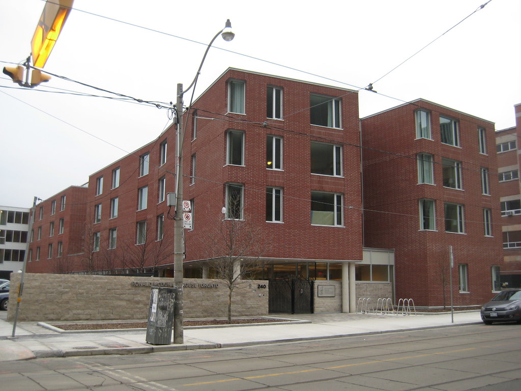
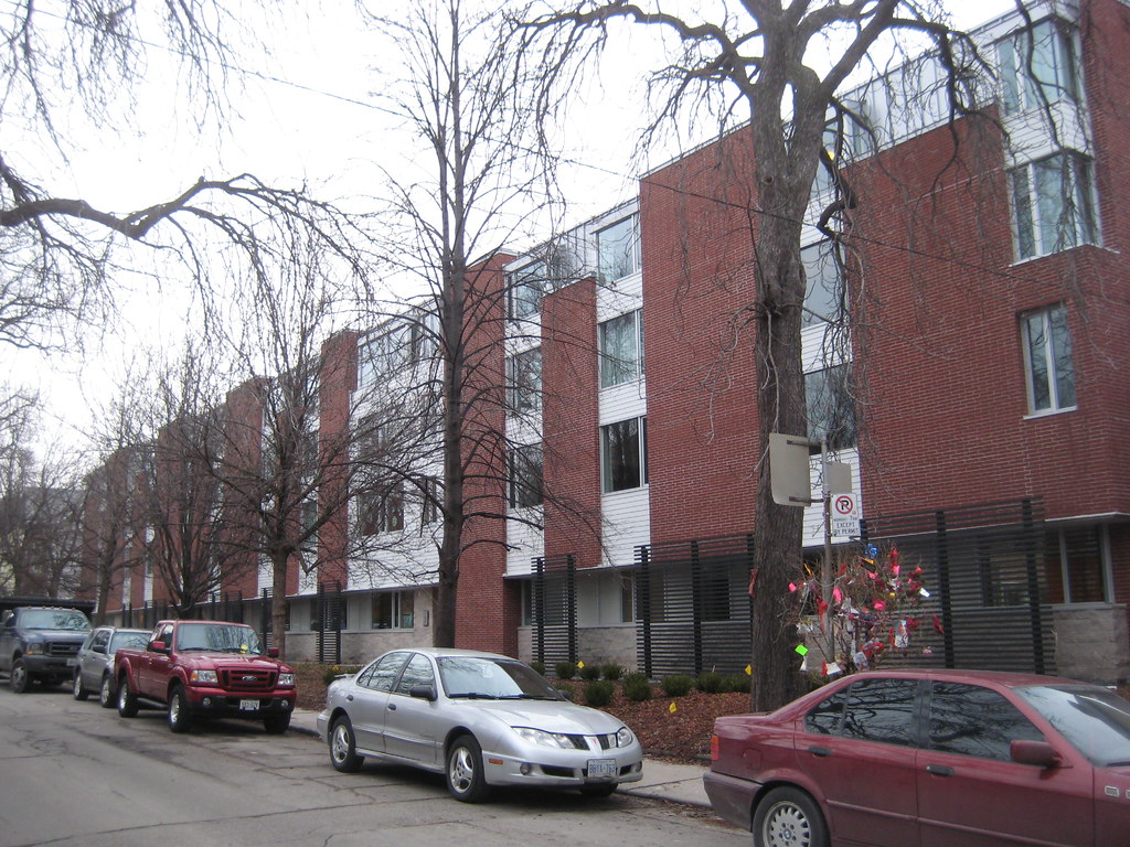
Painfully uninspired. So many architecture firms could have created something much more interesting, even on a minuscule budget.

I wouldn't go this far, but the end result is a little bit disappointing. Particularly considering that this is designed by our current RAIC Firm of the Year, who have executed excellent projects elsewhere (including directly across the street).

I still like the way the plan relates to the site, creating some interesting courtyard spaces, but the brick is so blandly contextual that it's basically invisible and the aluminum siding infill panels make me grit my teeth every time I walk by.
 
Ronald McDonald House Reception

Lindsay updated her blog with the RMH reception.

“The gift of construction management services for this project was an enormous boost for a small charitable organization trying to build a dream,†says Jane Marco, RMH Executive Director. “The expertise and care that have been extended to us from every member of the extraordinary Tridel team has been outstanding. We could not have asked for a better partner in any way.â€

But after all the congratulations, there was a contemplative moment about what it all really meant. A mother told her story. She and her family have been staying at the current house since December 2010, when her baby was born with a heart condition. They spent over $1000 on accommodations in their first week in Toronto and knew they would never survive financially.

“This place is everything to my husband and I,†she said, her voice cracking. “It allowed us to be with our other children at Christmas and not at the hospital in the waiting room. Being here together as a family has been life changing and through the Ronald McDonald House we have had many blessings.â€

Read the full article.
 
Good article by Rochon, thinking beyond just the bricks and mortar. I occasionally think she is too grinch-like, but this time, has hit the bulls-eye in terms of highlighting what is really important about RMH as a city-building facility. Similar thoughts come to mind when we look at MaRS, two or three newer hospital buildings, etc.
 
February 3, 2012


6813994135_5c3ca29644_b.jpg


6813994723_31276c0269_b.jpg


6813995589_196fcda3ec_b.jpg
 
why are you dissapointed? it has your beloved brick, and is a nice and short 4 floors. exactly the sort of thing you seem to be advocating for.
 
Have you seen it up close? There's no way anyone with any architectural sensitivity wouldn't be disappointed with that.
 
Yup, you read that title correctly.

The site of the Ronald McDonald House on McCaul is set to be reborn as a new, much taller RMH, the existing building here has a UT thread all its own, having been completely in only 2011! Assuming this were to get underway by 2024, the existing building would have had a 13-year lifespan.

That thread is here: https://urbantoronto.ca/forum/threa...ation-240-mccaul-st-4s-montgomery-sisam.7428/

First, the streetview of the site as is:

1659001198975.png


Above: McCaul frontage frontage; below Henry St. frontage:


1659001282545.png


Proposal:


1659001332705.png


1659001493072.png


From the Planning Report:

1659001707584.png

1659001832525.png


Quick notes:

- Great Cause

- No material shadowing issues on Orde-McCaul Park

- Some marginal shadow issues on College St.

- Some surface parking....??

- Not fully compliant w/angular plane guidelines

- Seriously ugly

- Are Montgomery Sisam aware that children stay in this building, perhaps we could soften it just a bit and make it seems a bit more child-friendly/warm in appearance?
 
Last edited:
I’m hoping the design and materials will evolve to something that is easier on the eyes.
The black brick base and silver/grey cladding on the tower looks so brutal and cold, very institutional-like in a bad way and not very welcoming nor warming to families and kids in need. I would like to see red brick instead with wood-like accents, and tower having a more playful aesthetic instead of looking like a hospital.

The firm in question isn't known for anything but institutional. I thought HP would have been a good fit for this kind of facility? Claude Cormier Associes designed landscaping would be a perfect foil.

AoD
 

Back
Top