condovo
Senior Member
Hopefully this will form a gateway with the Mackenzie Investments building across the street and that's it.
How is this a good addition when it sits on the south-side of the street in a Northern-hemisphere city? It's going to massively increase shadowing. Microscopically, it's going to be worse for shadowing than the disaster at 629 King West.
People on this forum seemingly do not realize that the biggest reason Queen St. has as much charm as it does is the fact that it's mostly made of row houses with very small retail fronts forcing lots of variety of shop per block, and letting in tons of sunshine.
This development is the start of Queen St.'s charm being completely ruined by a short-cited city. Soon enough, Queen St. will be as depressing as the stretch of Bay St. from College up to Bloor. Try walking on Bay St. on that stretch if you want to become depressed.
Hopefully this will form a gateway with the Mackenzie Investments building across the street and that's it.
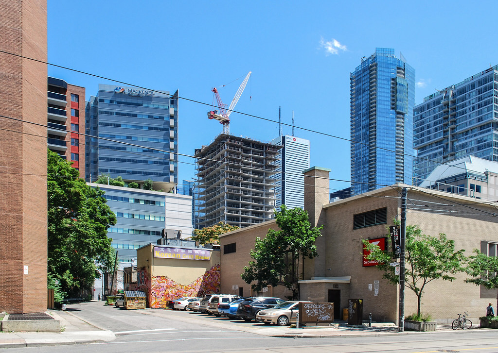 Smart House by Marcus Mitanis, on Flickr
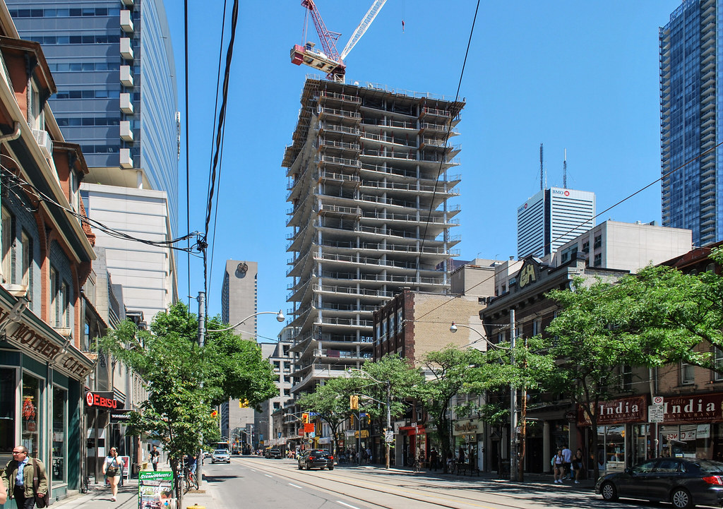 Smart House by Marcus Mitanis, on Flickr
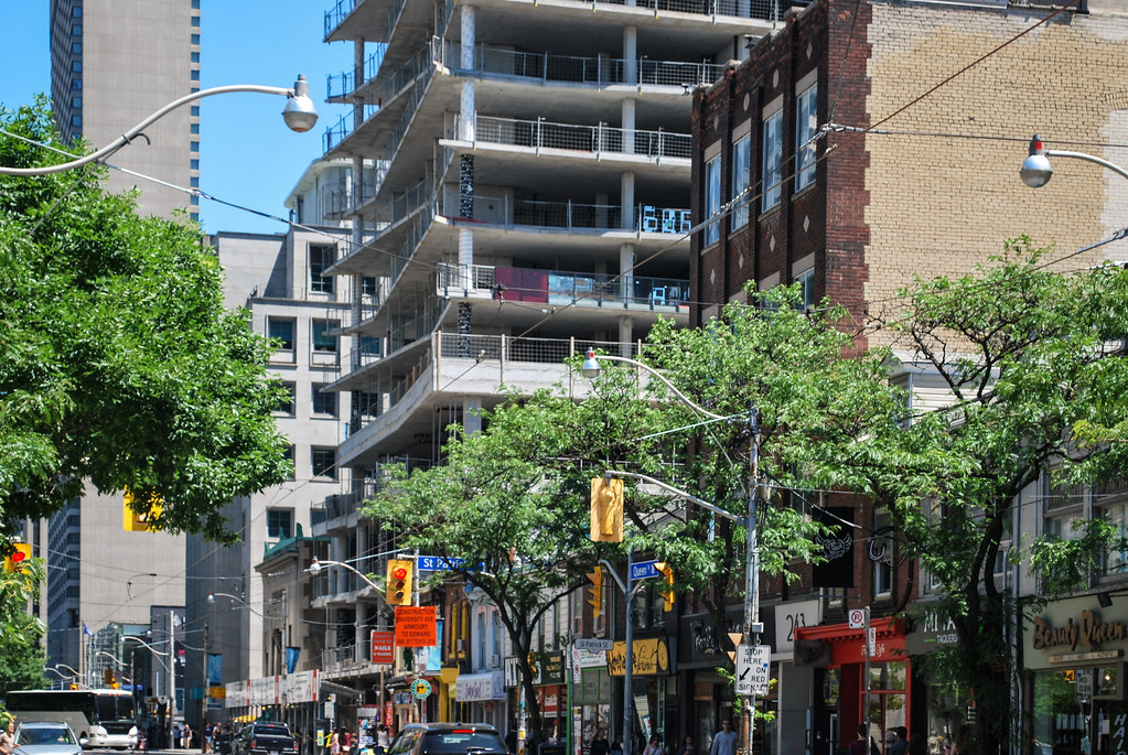 Smart House by Marcus Mitanis, on Flickr
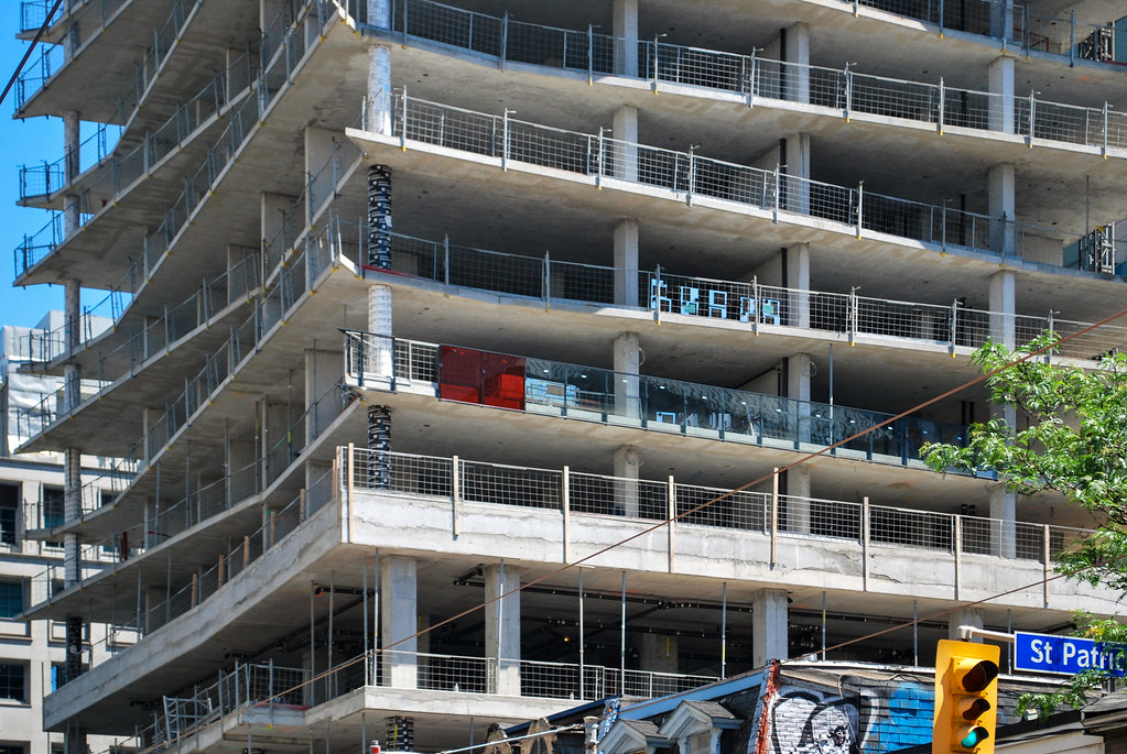 Smart House by Marcus Mitanis, on Flickr
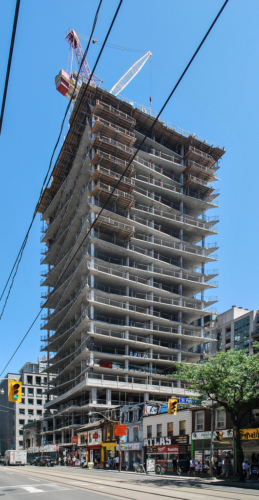 Smart House by Marcus Mitanis, on Flickr
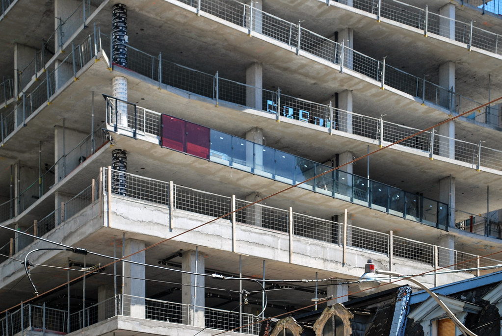 Smart House by Marcus Mitanis, on Flickr
Not necessarily. Looking at the renderings it shows half of each north facing floor in red, half not. They haven't wrapped the red glazing around the corner where you see it now and across the west half side on the north face of the building.Looks like they are going more clear than red...a little disappointing.
This looks nothing like the rendering! They are clearly removing most of the red and that is very disappointing to me!