C-mac
Senior Member
You're kidding, I hope.
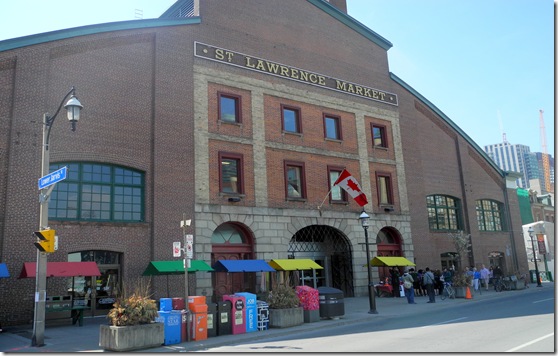
Not at all. The original/south building is gorgeous. The north building doesn't even come close to south building.
You're kidding, I hope.
I assume you remember its predecessor...It's not a bad building, but to me this perfectly illustrates how much we've gone in reverse from an aesthetic point of view when it comes to architecture as it's not nearly as nice as it predecessor..
The original market is not the original market though. It’s several additions onto old, old city hall.Not at all. The original/south building is gorgeous. The north building doesn't even come close to south building.
No, this is the building (built in late 1960s) that was demolished about 5 years ago to clear the site for what is being built right now. (It's predecessor looked somewhat like the current South Market and was, for many years linked to it by a 'bridge' over Front Street.)This is the predecessor to the predecessor.
No, this is the building (built in late 1960s) that was demolished about 5 years ago to clear the site for what is being built right now. (It's predecessor looked somewhat like the current South Market and was, for many years linked to it by a 'bridge' over Front Street.)
View attachment 404280
The original market is not the original market though. It’s several additions onto old, old city hall.
While there are nice features of it, it’s got some real problems. The bottlenecks at the north entrances, the terrible basement, etc. as far as global food market buildings go, there are a great many that outclass SLM South by a long shot. Mercado Central in Valencia, English Market in Cork, or just about any big bazaar in the Middle East topple SML for both beauty and functionality.
Let’s not discount North just yet. Form (which I think is quite nice, myself) is useless without function, and nobody has yet to see that in play.
You seem to be somewhat geographically (if not aesthetically) confused. This thread is on the NORTH Market, you appear to be talking about the South Market which is, as noted above, by @Zhang, a market building added onto the (very) old City Hall (Before the 'Old City Hall")I'm not referring to the functionality or the food that's in the building, I'm talking strictly aesthetics.
You seem to be somewhat geographically (if not aesthetically) confused. This thread is on the NORTH Market, you appear to be talking about the South Market which is, as noted above, by @Zhang, a market building added onto the (very) old City Hall (Before the 'Old City Hall")
Well, glad that's cleared up but the confusion was started by you earlier today when you posted, in this, the (North Market) thread:Yes I know that. I'm not confused at all. I'll clear it up for you. The current St.Lawrence Market, (Old City Hall) which is on the south side of Front Street is gorgeous. The new one that being built as per this thread on the north side of Front Street is not nearly as nice.
Not sure where the confusion is.
But even aesthetics-wise there’s nothing that really stands out. It was far more pleasing in its original form.I'm not referring to the functionality or the food that's in the building, I'm talking strictly aesthetics.

No, this is the building (built in late 1960s) that was demolished about 5 years ago to clear the site for what is being built right now. (It's predecessor looked somewhat like the current South Market and was, for many years linked to it by a 'bridge' over Front Street.)
View attachment 404280
Good gawd. I mean, it’s nice in that it mirrored the south market in many ways, but the random upper windows read like the cookie-cutter-suburban-starter-home-washroom-window-placement-guide.This is a photo of the actual north market built in the early 1900s:
View attachment 404327
(via BlogTO - https://www.blogto.com/city/2010/05/st_lawrence_market_north_building_designs_are_unveiled/)
AoD