C-mac
Senior Member
But even aesthetics-wise there’s nothing that really stands out. It was far more pleasing in its original form.

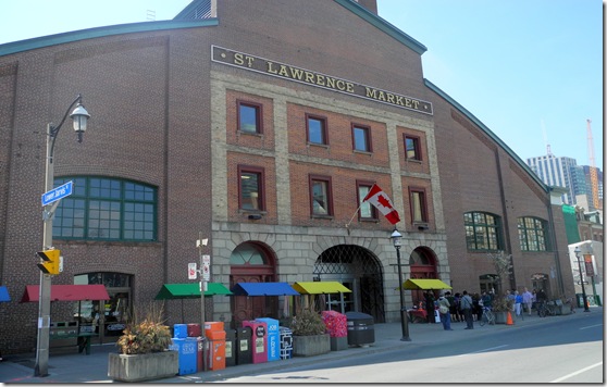
Toronto’s first City Hall - now a part of the St. Lawrence Market - Historic Toronto
Today, when people visit the south building of the St. Lawrence Market on Front Street, they enter through archways were once a part of Toronto’stayloronhistory.com
It has kinda nice exposed girders, but any design comes across as a total afterthought to building a quick hall onto another building. Compare it to other Edwardian markets and tell me this thing is a beauty of its time. Let alone Victorian markets like the original Les Halles or other Edwardian buildings of any sort.
I mean seriously, they couldn’t even be arsed to match brick colour on the addition.
South Market undeniably looks better than the 1968 North Market, but there are fallout bunkers that look better than that walmart slab cake of a building.
ADDED:
Because it's always reminded me slightly of SLM, the old Consumers Gas Purifying House No. 2 at Front & Berkeley. It's of a similar size and shape and is just a few years older than SLM South. But it's far more cohesive, ornate and is arguably a beautiful work. It was built at the time for purely industrial purposes, and not as a community meeting place or unique symbol of Toronto. It was just a building in the middle of an industrial area, surrounded by a good many buildings that look nearly as good. The refurb of Old Old City hall into SLM wasn't anything exceptional—especially during a time of prosperity and growth—and doesn't look much different than any random warehouse of the time. I know it's subjective, but I don't think I'm wrong in saying SLM South isn't anything special for either the time, or now.
I disagree.