tripwire
Active Member
Yeah the PATH connection is a bit dubious to me, as Sugar Wharf relies on Pinnacle having it. I'm really hoping it does happen, but I wouldn't say it's 100% certain.
You should have added "for Toronto" after each example.
You really think 60 Colborne is a bold project? The Well has already been "Toronto-ized" where the design was changed. Lets wait till it's built. Would say the same for CIBC Square. Bold by Toronto standards but would need to wait till it is built to judge. This city does a good job of value engineering projects that end up not looking quite like the render.
Selby was supposed to be red, but ended up being a much tamer color.
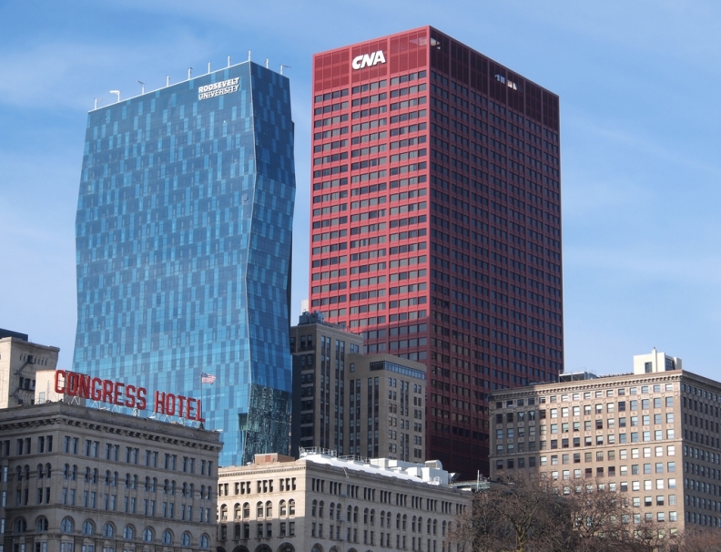
Was hoping for something like this:

John Picken Photo/Flickr.com
But I know nothing like this would get built in Toronto. 561 Sherbourne? I won't even bother responding to that one.
Please spare me with the condemnation. It's not like I'm talking out of my ass about the blandness and "same-ness" of every project. The city has a love affair with grey, blue or green boxes!
https://business.financialpost.com/...is-also-running-out-of-commercial-real-estate
James MacDonald/Bloomberg
Do you see much color? The color and varying shapes come from buildings that were built decades ago.
Always hurt feelings when it isn't a giant love fest for every project especially if it's aA designed.
Why did you bring up Chicago in this thread anyway?
The City requires the PATH connections to be built, in any new development where they have been designed in. They are part of the zoning bylaw amendments approved for the building. So, it'll all come together as the various phases are built, but this first section of Sugar Wharf will not be connected to the greater PATH system for years.Yeah the PATH connection is a bit dubious to me, as Sugar Wharf relies on Pinnacle having it. I'm really hoping it does happen, but I wouldn't say it's 100% certain.
Also, not for nothing, but I'll take EY Tower over the one on the left and almost anything half decent "by Toronto standards" over the one on the right.
"Toronto has more bland buildings than city x/y/z" is a silly sentiment when x/y/z is literally *any* other city, because every single city in the world has more bland than beautiful contemporary architecture. There's bad filler in fully all of NYC, Chicago, Seattle, Vancouver, London, Tokyo, Hong Kong, Shanghai, Dubai, etc.
What are you talking about? Some cities are esthetically prettier than others. Toronto, isn't aeshtetically "pretty" IMO and apparently I'm not alone. No one is talking about filler. London's best takes a dump on Toronto's best and can probably say the same about the other cities you listed. It's not about the filler and moreso about the premier buildings and locations.
There are older residential and shopping areas of the city that are very attractive and interesting. The ravines and the islands are pleasing, and the entire waterfront downtown area is being transformed almost overnight. Why this constant dumping on Toronto ? I think most people posting on this site are well aware of the many deficiencies in the evolution of this place, but still value the potential that's just unfolding. Now, if we can just get the storm sewers to perform.
Are you actually pleased with the "transformation" of the waterfront? I guess you are. I fear it's the same old, same old.
It's not about dumping on Toronto, and moreso about wanting the best for the city! If I hated the city I wouldn't be here. We had a great opportunity to rebuild the city and really make it something special. I think some ways we are doing a good job but in others we are not. Why not look at other cities (not just Chicago) as a reference and take the best parts of those cities to make our city better?
We have some great projects but IMO they are few and far between. And even then we are presented with a watered down version of the renderings.
So I look at this large project near the waterfront and get worried that it will just be another forgettable building. Just a missed opportunity. Happens too often. I wish this project wasn't so bloody boring.
Speaking of colour, The Picasso is conveniently just out of frame on the right side... but regardless that's just one buildingDo you see much color? The color and varying shapes come from buildings that were built decades ago.
Always hurt feelings when it isn't a giant love fest for every project especially if it's aA designed.
66 were shot last weekend, out of which 12 were killed. Chicago can teach us how to build a beautiful city. We can teach Chicago how to build a beautiful society. Both are important and we should find ways to learn from other, although I suspect that Toronto's not really on Chicago's radar.Yes, Chicago is beautiful, but weren't there 47 people shot in one day (last Sunday)? I'm getting off topic, but if we're going down the path of comparing Toronto vs Chicago, I must defend our beloved city.
66 were shot last weekend, out of which 12 were killed. Chicago can teach us how to build a beautiful city. We can teach Chicago how to build a beautiful society. Both are important and we should find ways to learn from other, although I suspect that Toronto's not really on Chicago's radar.
(Caveat: Obviously we're not perfect in our strengths and neither are they.)
Since some feel the crime rate is relevant when discussing architecture, isn't Toronto on pace for its most homicides in a single year? Our homicide rate is higher than New York! Maybe we're not as "great" as some of you think we are.

No color, no shapes, just same old same old. I don't expect every project to be unique but these guys don't even try and you have people fist pumping.