Sugar Wharf will be the first project, maybe the only one that from the east of Yonge street that has direct PATH connection. Walking time from Sugar Wharf to Union Station would be approximately 10 minutes, to me, this is a big deal. With all the available components, location, retail, commercial, day care, elementary school, it will be a city in the city. This is a fantastic project.

And yet I don't feel that way. If we're speaking from a density standpoint? Sure. But that's where it ends with me. Typical run of the mill project that gets called "fantastic" because of its height. We should set a much higher bar. We're not talking about the burbs. We're talking about rebuilding the waterfront area and not making the mistakes we did in the past.

A ritzier version of cityplace isn't what I had in mind.
 
@dwg in all honesty I think a lot of forum members go too easy on aA, and over criticize certain other firms like IBI. No doubt menkes is the issue here but I think the criticism is warranted.
 
"This is a fantastic project." Are you a realtor, because I hear them say that about every single project out there: "Fantastic investment opportunity! You cannot miss this amazing project! There's none like it!"

If what you describe is all it takes to be considered a "fantastic" project, it's a pretty low bar to set. This is what our cities would look like if it was up to Menkes:

500.jpg


Also, Menkes is absolutely unreliable when it comes to construction. One York has been closed since Wednesday due to flooding damage in the parking lot and the roof (and will be closed until Monday at least). So you get the opportunity to pay $1,100+ psf for not only a cheap-looking condo but for a downright cheap building.

What shoddy craftsmanship, oh sorry... I meant, what fantastic craftsmanship!

Sugar Wharf will be the first project, maybe the only one that from the east of Yonge street that has direct PATH connection. Walking time from Sugar Wharf to Union Station would be approximately 10 minutes, to me, this is a big deal. With all the available components, location, retail, commercial, day care, elementary school, it will be a city in the city. This is a fantastic project.
 
Just getting back from Chicago, we are really going about re-imagining this city the wrong way. We need to see better, bolder projects. Not the same old crap. Everything seems to be blue/green glass rectangle. We can't even change the shapes. Can't have stepbacks. Why can't we have a red or black tower? It's the same old shit. And you understand why sometimes the way people applaud this kind of stuff. Another forgettable project taking up important space.
The Well is a bold project. King West is a bold project. CIBC Square s a bold project. Sixty Colborne is a bold project. Church and Wellesley is a bold project. None of the buildings going up in Bayside are the same old shape. The Selby is a red tower. 561 Shelbourne, practically across the street from it, is a black tower. There are others.

Sure, there is a sameness out there to average projects, but not all is lost. Lodging complaints without sweeping—and therefore less meaningful—statements could actually be valuable. The generalizations, which can be easily disproven through concrete examples, are tiresome however, and do not help your cause.

42
 
Sugar Wharf will be the first project, maybe the only one that from the east of Yonge street that has direct PATH connection. Walking time from Sugar Wharf to Union Station would be approximately 10 minutes, to me, this is a big deal. With all the available components, location, retail, commercial, day care, elementary school, it will be a city in the city. This is a fantastic project.
Sugar Wharf will not be the first project east of Yonge with a PATH connection. Pinnacle One Yonge will be, once its third phase is built. Sugar Wharf's later residential phases will connect to Pinnacle, and then this earlier phase to connect through that.

42
 
The Well is a bold project. King West is a bold project. CIBC Square s a bold project. Sixty Colborne is a bold project. Church and Wellesley is a bold project. None of the buildings going up in Bayside are the same old shape. The Selby is a red tower. 561 Shelbourne, practically across the street from it, is a black tower. There are others.

Sure, there is a sameness out there to average projects, but not all is lost. Lodging complaints without sweeping—and therefore less meaningful—statements could actually be valuable. The generalizations, which can be easily disproven through concrete examples, are tiresome however, and do not help your cause.

42

You should have added "for Toronto" after each example.

You really think 60 Colborne is a bold project? The Well has already been "Toronto-ized" where the design was changed. Lets wait till it's built. Would say the same for CIBC Square. Bold by Toronto standards but would need to wait till it is built to judge. This city does a good job of value engineering projects that end up not looking quite like the render.

Selby was supposed to be red, but ended up being a much tamer color.

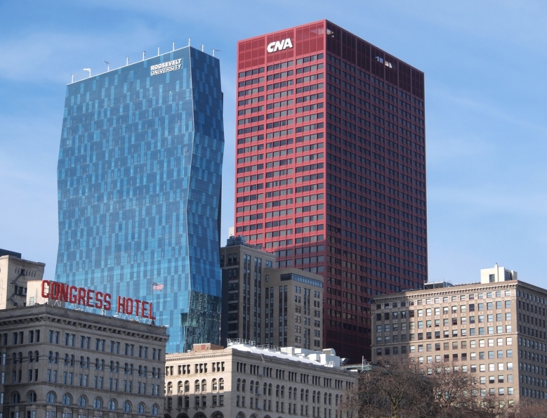
Was hoping for something like this:
CRED03-160329875-AR.jpeg

John Picken Photo/Flickr.com

But I know nothing like this would get built in Toronto. 561 Sherbourne? I won't even bother responding to that one.

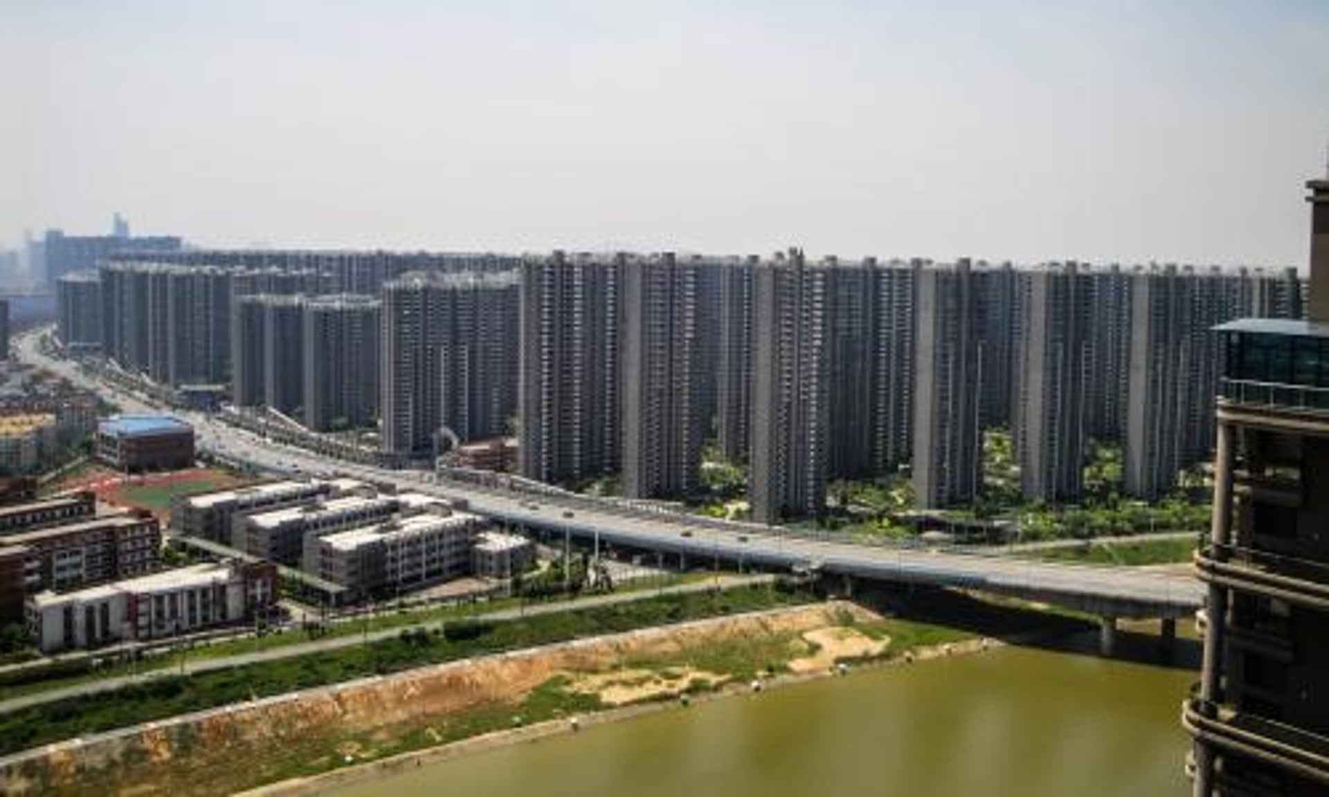
Please spare me with the condemnation. It's not like I'm talking out of my ass about the blandness and "same-ness" of every project. The city has a love affair with grey, blue or green boxes!

0621_biz_wire_condo.jpg

https://business.financialpost.com/...is-also-running-out-of-commercial-real-estate
James MacDonald/Bloomberg

Do you see much color? The color and varying shapes come from buildings that were built decades ago.

Always hurt feelings when it isn't a giant love fest for every project especially if it's aA designed.
 
Last edited:
You should have added "for Toronto" after each example.

You really think 60 Colborne is a bold project? The Well has already been "Toronto-ized" where the design was changed. Lets wait till it's built. Would say the same for CIBC Square. Bold by Toronto standards but would need to wait till it is built to judge. This city does a good job of value engineering projects that end up not looking quite like the render.

Selby was supposed to be red, but ended up being a much tamer color.

Was hoping for something like this:
CRED03-160329875-AR.jpeg


But I know nothing like this would get built in Toronto. 561 Sherbourne? I won't even bother responding to that one.

Please spare me with the condemnation. It's not like I'm talking out of my ass about the blandness and "same-ness" of every project. The city has a love affair with grey, blue or green boxes!

0621_biz_wire_condo.jpg


Do you see much color? The color and varying shapes come from buildings that were built decades ago.
Please cite sources for these photos.
 
Yes, Chicago is beautiful, but weren't there 47 people shot in one day (last Sunday)? I'm getting off topic, but if we're going down the path of comparing Toronto vs Chicago, I must defend our beloved city.
 
Yes, Chicago is beautiful, but weren't there 47 people shot in one day (last Sunday)? I'm getting off topic, but if we're going down the path of comparing Toronto vs Chicago, I must defend our beloved city.

My point exactly. Why we're talking about crime when discussing the aesthetics between two cities is beyond me.
 

Back
Top