Another missed oppurtunity to erect a building outside of the box. There is plenty of room to build another condo that doesn't resemble all the other glassworks in the area. It does change the exterior enough to separate it from the others, but in the end? I guess if this as good as it's going to get, then we accept what's coming as the best Toronto is going to see . Obviously my opinion only, but man, is there a lot of architects out there who have great ideas that we are obviously not going to experience.
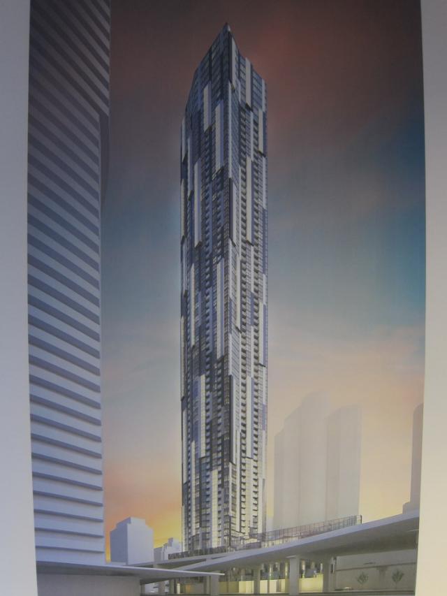
 
Now that the podium has been lowered, the wedge shaped podium will no longer be visible as you drive into downtown from the West on the Gardiner. Too bad!!
 
The podium has indeed been lowered however a glass element still remains at the point along to the tower that would be more than visible from the Gardiner. There was probably a sightlines issue, or concern. I think it will look quite nice and allow a little more light onto the Gardiner, if not for but a few hundred feet.
 
Now that the podium has been lowered, the wedge shaped podium will no longer be visible as you drive into downtown from the West on the Gardiner. Too bad!!

You sure about that? Look at the bottom of the picture:

urbantoronto-5288-16460.jpg


Anyway, I'm not a fan of the changes to the tower.

Previously it had a simple expression whereas now it's much fussier. For example, the now two-toned protruding boxes only serve to obscure rather than emphasize that feature, and whereas before the protruding boxes ran only on separate vertical planes than the balconies, now they sometimes run on the same plane as the balconies and sometimes not. Throw in some random "articulation" and the result is that rather than adding "visual interest" all they've done is make it difficult for the eyes to focus on any particular feature of this tower. Furthermore, the vertical fins running along the length of the tower which separated the protruding boxes from the balconies were a nice touch, but now have been replaced with haphazardly placed precast panels.

This thing's a mess. I suspect the dull suburban minds at Tridel are responsible for hacking up an otherwise sophisticated Wallman design.

edit: I will say that I like that the mechanical box is no longer a clearly separate element from the rest of the tower. In that sense, at least, the redesign looks more cohesive.
 
Last edited:
Nobody would be saying "missed opportunity" if this was 2001 or 1995 or any other non boom year. If it's such a missed opportunity i guess you should write them a letter to keep it as a parking lot, but if you ask me, I'ts 250 meter infill. Obviously there are flaws, but even if theres a bank or crappy dry cleaners in the podium, its better than the parking lot that has been there for years. Here we are getting and angled roof, height and not much else. The design is weak but can any of you honestly say that you want the parking lot back?
 
It appears enough people are satisfied with mediocre design, and bland architecture. If that's all the builder/architects need to sell the units, then that's what you will get. Toronto has waited decades for a boom like this, that is then envy of cities everywhere, and then you get buildings that look like they were made in the same cake mold, and had different frosting applied to the exterior. There are minor exceptions, but not many.
Missed opportunities, absolutely. The powers to be are happy, buyers are happy, who could ask for anything more. Maybe it should be left as a parking lot until someone with cajones comes along, but it appears that won't happen.

You are expecting too much. 10 York is not such a great location to start with (imagine to walk through the Gardiner everytime you go somewhere), and Toronto is not a city famous for architectural excellence. Look at all those bland glass towers along the lake and on Bay street and you should know people are easy to be happy here. If Toronto is fine with having Harbour Square condos (show up in every skyline photos but Yuck!) at Queen's Quay and Bay, 10 York already exceeds my expectation.

http://www.toronto-condos-lofts.com/4a_custpage_13871.html
 
Last edited:
My thought on the new design as i posted on SSP:
I'm fine with the new design changes to 10 york! that one really did hit rock bottom for me, so naturally the only place to go was up.

the ugly shortened podium is less visible and lines up with the gardiner, leaving the tower looking more on its own.

and ya, the roof is still a major wtf. not from street level because the facades taper a bit. but from a skyline perspective, complete flat roof
 
You are expecting too much. 10 York is not such a great location to start with (imagine to walk through the Gardiner everytime you go somewhere), and Toronto is not a city famous for architectural excellence. Look at all those bland glass towers along the lake and on Bay street and you should know people are easy to be happy here. If Toronto is fine with having Harbour Square condos (show up in every skyline photos but Yuck!) at Queen's Quay and Bay, 10 York already exceeds my expectation.

Keep in mind that the same argument you are making about Ten York (i.e. that expectations for design should be lowered due to the terrible location) also applied to Harbour Square when it went up. At the time, the entire waterfront was literally a rail yard & industrial wasteland. It's developments like Harbour Square that took the risk of making the waterfront a livable place. Of course if you look at it now without the benefit of knowing its history, it's nothing more than a bland piece of architecture and a wasted opportunity, but if you consider the context in which it was built, it deserves a little credit.
 
Another missed oppurtunity to erect a building outside of the box. There is plenty of room to build another condo that doesn't resemble all the other glassworks in the area. It does change the exterior enough to separate it from the others, but in the end? I guess if this as good as it's going to get, then we accept what's coming as the best Toronto is going to see . Obviously my opinion only, but man, is there a lot of architects out there who have great ideas that we are obviously not going to experience.

+1. This was a decade when architects were designing bold, striking skyscrapers everywhere in the world...except here, the city that is building more skyscrapers than the rest of North America combined. When Calgary and Philadelphia are throwing up Fosters and Robert AM Stern skyscrapers (to say nothing of what;s going on in New York, Asia and Europe) and our tallest U/C is a Grazziani & Corazza, we can't really use the tired excuse that we aren't worldly, big or old enough to get top-notch architecture.

I'm actually more interested to follow the mid-rise developments around town these days. For some reason, architectural quality is inversely proportional to the height of the building in Toronto.
 
Last edited:
Keep in mind that the same argument you are making about Ten York (i.e. that expectations for design should be lowered due to the terrible location) also applied to Harbour Square when it went up. At the time, the entire waterfront was literally a rail yard & industrial wasteland. It's developments like Harbour Square that took the risk of making the waterfront a livable place. Of course if you look at it now without the benefit of knowing its history, it's nothing more than a bland piece of architecture and a wasted opportunity, but if you consider the context in which it was built, it deserves a little credit.

What you said is right, that it was risky back then to build condos down there. However, whether the current waterfront is a livable space is another debatable matter. I would rather live in Regent Park than Bay/Queen's Quay area, where there is nothing but condos and getting into the real city is still a hassle. I don't even consider it "downtown", which starts north of the railway.

Among major large cities, Toronto's failure in planning its waterfront absolutely stands out like no one does. Even in the 21st century, I still don't see a single classy highrise along the lake that doesn't look cheap. Why can't we have a nice tree line boulevard along the lake with bike lanes, retails and cafes, and some buildings that are not made of green glass? We need more building like the Royal York Hotel that says history, culture and class, not Hong Kong style glass condos with no design whatsoever. 10 York probably won't be an exception.

Look at buildings along Chicago River and ours

http://www.waterfrontoronto.ca/uploads/crops/2641_9_21_2005_3_14_11_pm_1_870_450_both_.jpg
http://www.umastewart.com/blog/wp-content/uploads/2011/06/BuildingsLiningChicagoRiver.jpg
 
kkgg7 I agree absolutely. There is no class to any off the new construction, and there doesn't appear to be any on the horizon. Whatever happened to the waterfront planning committee? I thought your idea of the tree lined boulevard was part of their mandate.
 
kkgg7 I agree absolutely. There is no class to any off the new construction, and there doesn't appear to be any on the horizon. Whatever happened to the waterfront planning committee? I thought your idea of the tree lined boulevard was part of their mandate.

It is part of the mandate, and construction starts this spring.
 

Back
Top